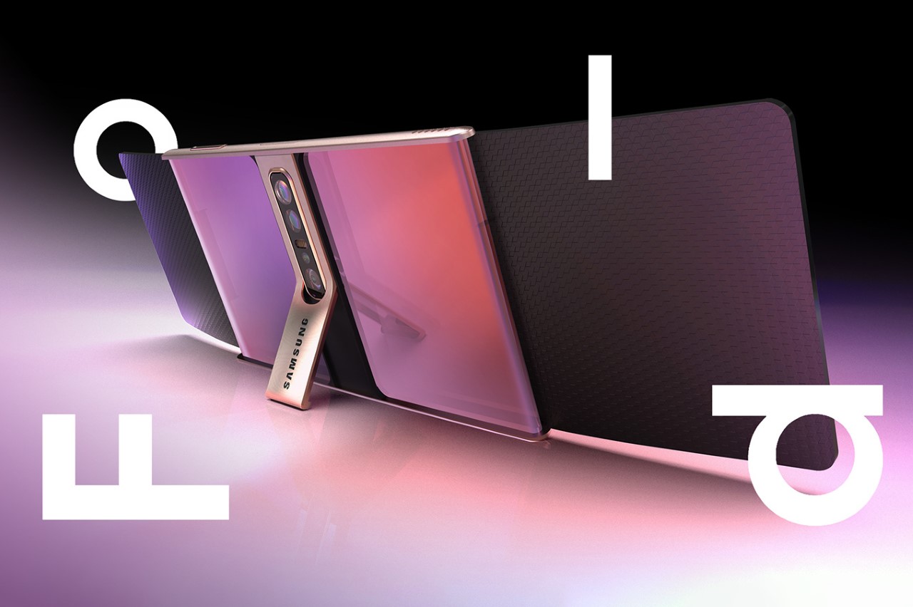
The only part of the phone that isn’t a screen is its camera bump.
It’s safe to say that we’re still in the age of folding displays, although the pandemic, a supply chain crisis, and a war have definitely caused innovation to slump a bit. That being said, if there’s one company that still has any bandwidth to push out folding phones, it’s probably Samsung. (In fact, just this Sunday, images of the Galaxy Z Flip4 leaked online to confirm the company’s efforts)
The biggest problem with folding displays isn’t the crease, contrary to popular belief, it’s the lack of a proper template. Before the iPhone defined what phones would look like for the next decade, mobile phones came in all sorts of shapes and sizes. You had the popular candybar, the clamshell, the slider, and whatever the Nokia N93 was. As we move towards a new era of folding displays, the age-old problem makes a comeback – what’s the perfect format? Samsung’s explored the book-inspired format with the Galaxy Fold, the clamshell format with the Z Flip, and it seems like this new concept proposes yet another direction – I call it the ‘parchment scroll’ format.
Designer: Alexander Bazilewskiy
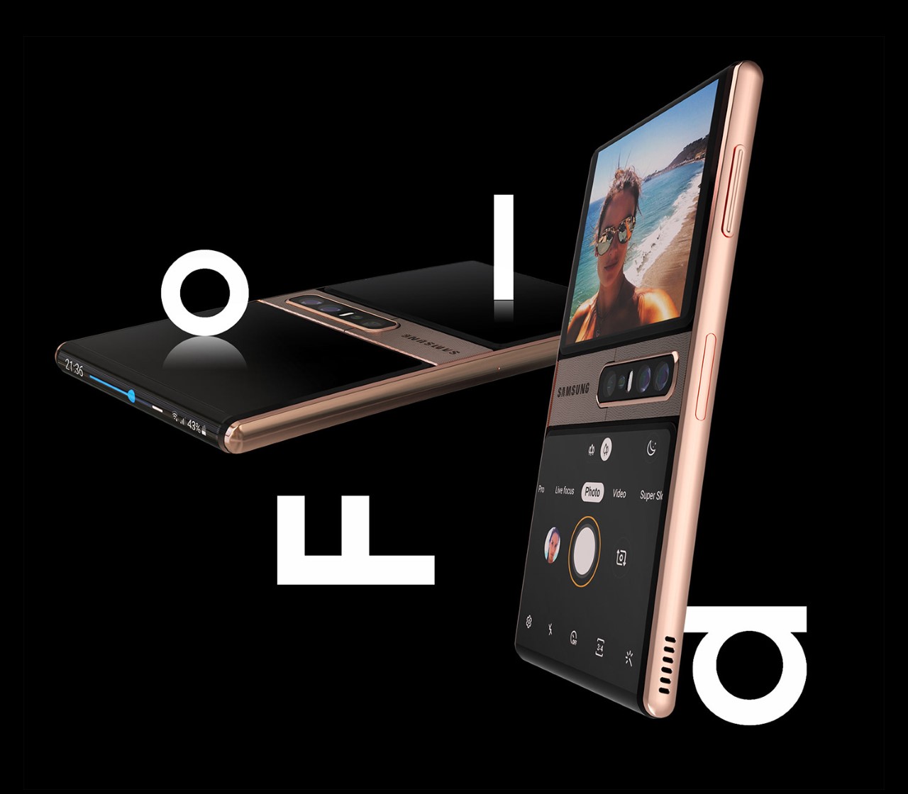
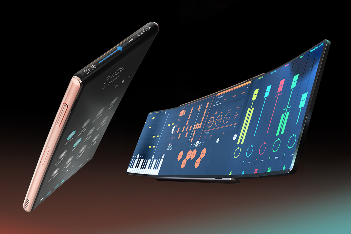
The Samsung Galaxy Fold Mini builds on the company’s folding range with a new format. Colloquially dubbed the ‘parchment scroll’ format, this concept comes with a single vertical display that comes with two folding points – on the upper and lower edges of the phone. Sort of like a scroll that can be expanded vertically either by unrolling the top or the bottom, the Galaxy Fold Mini can open out on the top and the bottom, making a dramatically longer phone. Tilt it over horizontally and you’ve got an incredibly widescreen display that’s perfect for multitasking.
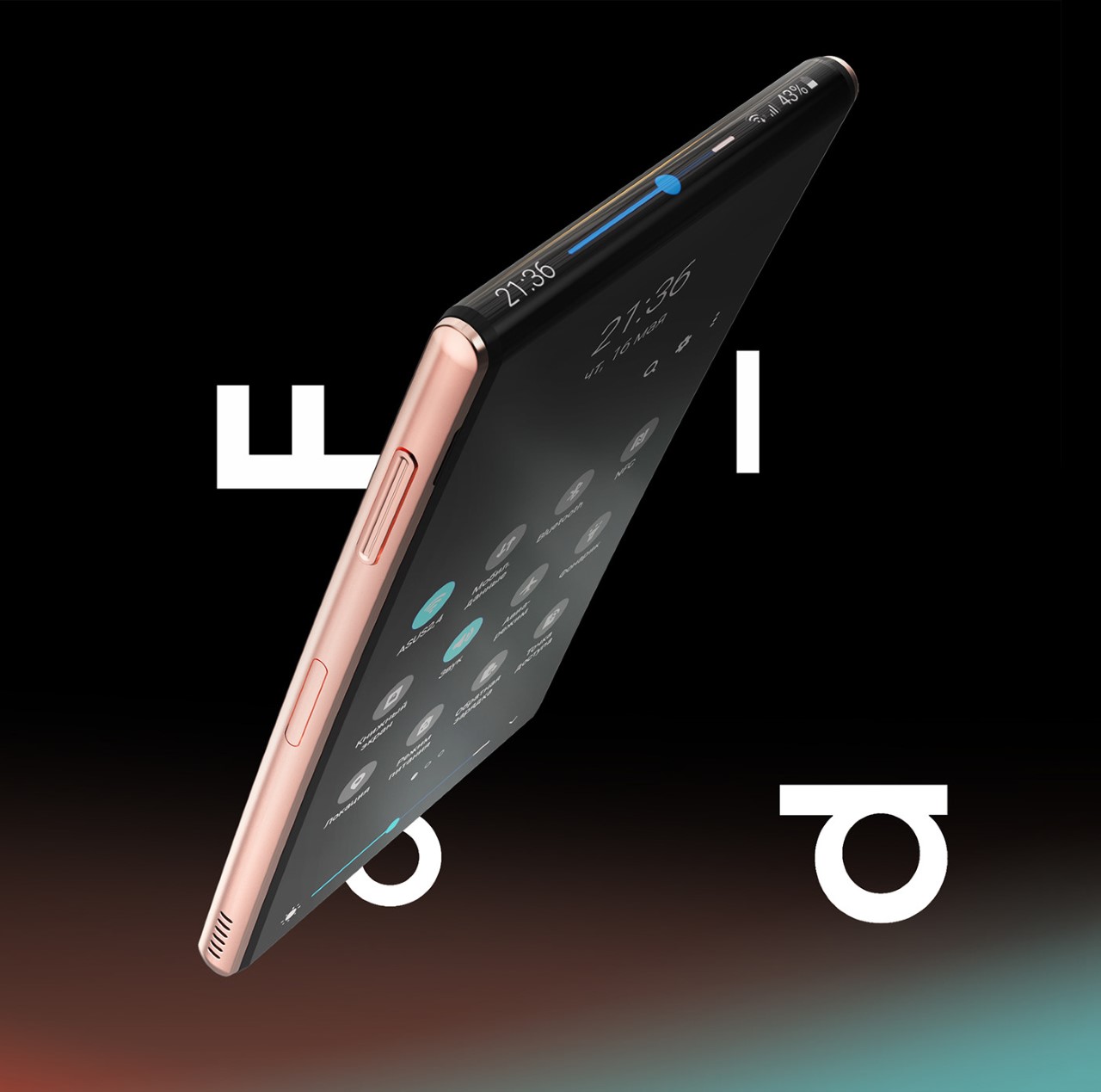
While unlocking multitasking capabilities, and providing a screen long enough to watch two movies simultaneously, what the Fold Mini also does is create a unique screen layout when closed. The wraparound screen’s edge acts as an incredible notification bar (the image above), while the smaller halves of the screen that fold backward create an interesting camera interface that allows you to use the primary camera lenses for clicking natural selfies. The upper screen serves as a viewfinder, while the lower houses the camera controls, creating something that feels incredibly natural.
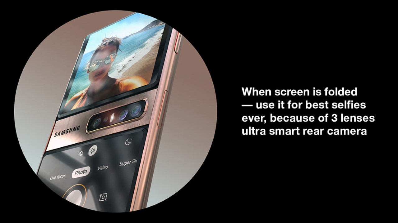
This format has some great pros. A single-screen means less worrying about what to do when your phone is closed (the Galaxy Fold and Z Flip needed a secondary screen), and this layout doesn’t just cut the number of screens, it cuts the number of cameras too, since there’s no ‘front facing’ camera on this concept the way there is in other folding phones. Just turn your phone over and you’ve got a camera as well as a screen waiting to greet you, whether it’s for selfies or video calls.
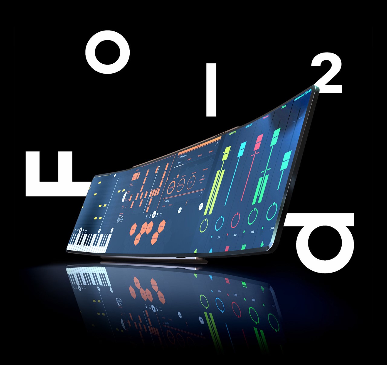
The most obvious con, however, is that there isn’t an immediate need for a phone with such a widescreen display. When opened, the Samsung Galaxy Fold Mini concept has what I imagine is somewhere near a 30:9 ratio, considering it’s a 16:9 screen multiplied by 2 (the front as well as the back). Aside from multitasking (how much multitasking is anyone really doing?), the need for a wider screen isn’t entirely apparent, although it’s the kind of thing only the future can tell us. I didn’t think we needed screens on our wrists, but here we are with smartwatches being such a runaway success. What this concept does, however, is speculate – which is arguably one of the most important acts in designing for the future. What are your thoughts?
