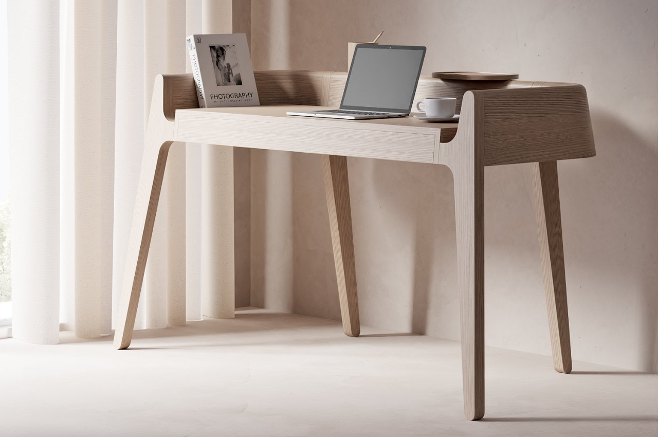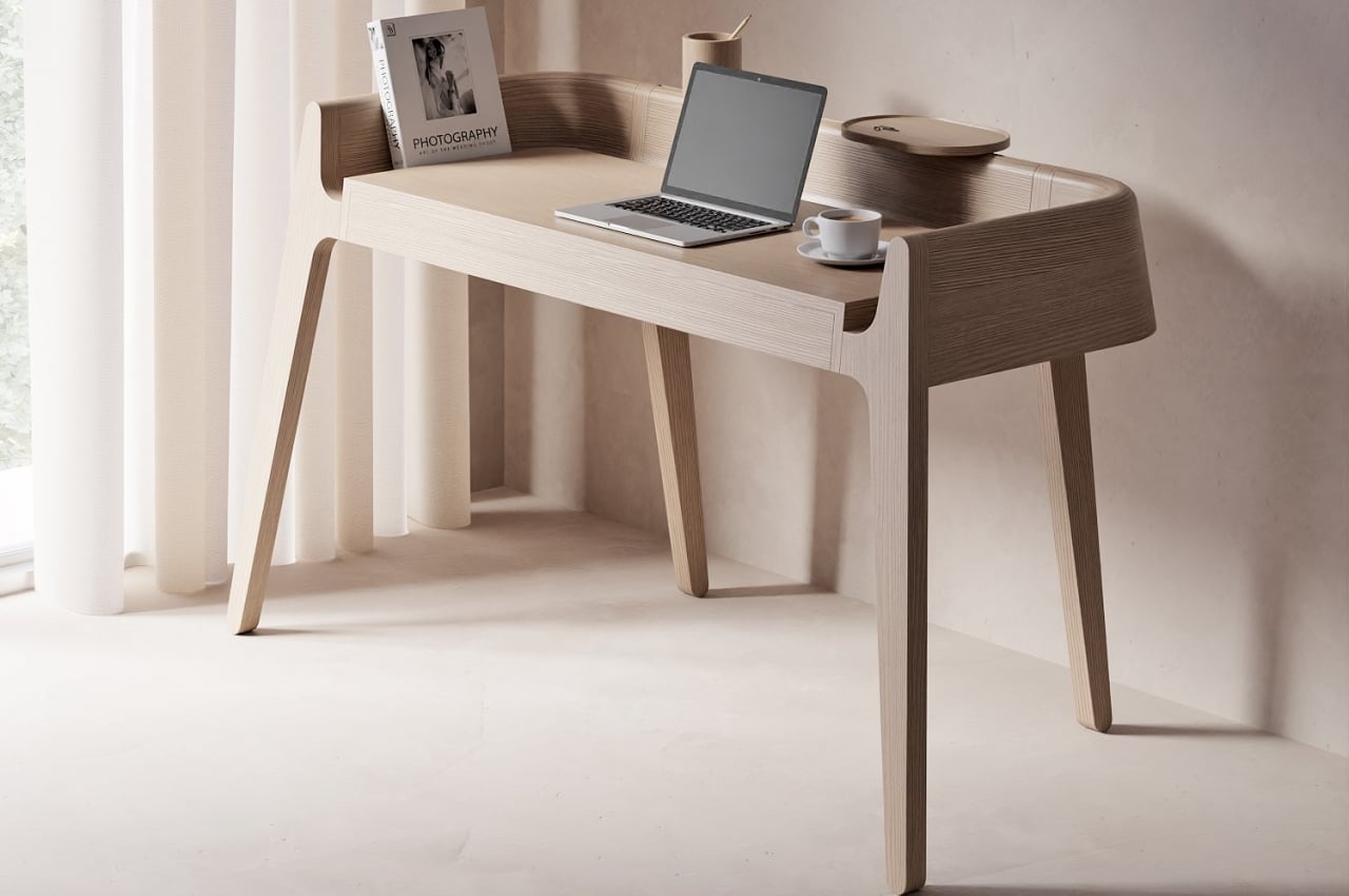
A desk doesn’t have to be barren and featureless to be considered minimalist, though some purists might argue that to be the case. Paring the furniture down to its essentials doesn’t necessarily mean there will be no room for the things you need to be on your desk, whether all the time or in passing. Of course, an owner has the freedom to make their minimalist desk as clean or as messy as they need it to be, but it will definitely be a big help if the desk itself helps in keeping things tidy. Minimalist desks are great at sneaking organizational features into hidden nooks and crannies, but this striking work table has those compartments and spaces hiding in plain sight.
Designer: Joao Teixeira
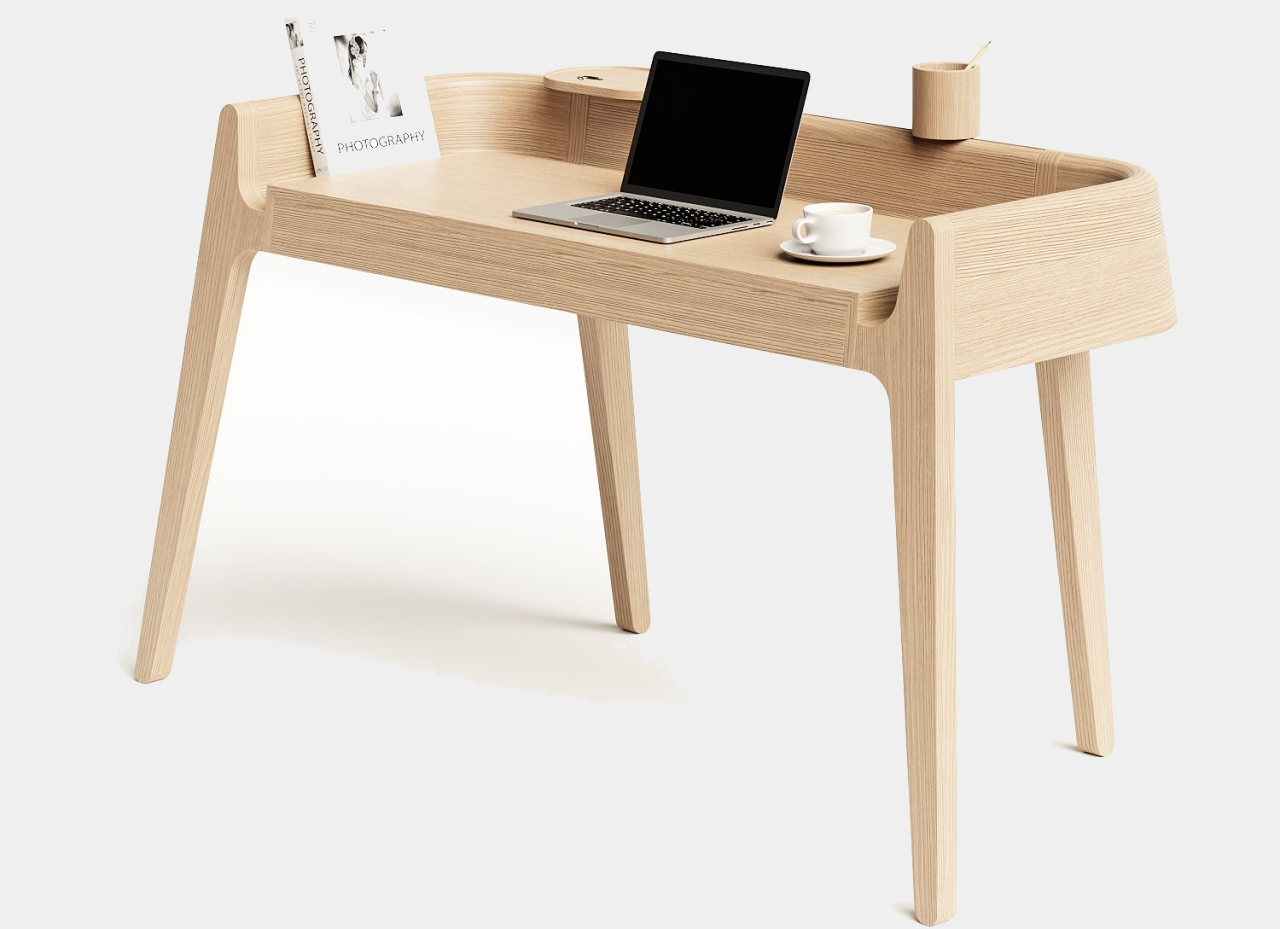
Given the desk’s simple yet beautiful appearance, it might come as a surprise to learn that its form is actually inspired by three very different people with very different personalities. Or, to be more precise, the desk is named after the famed Portuguese writer Fernando Pessoa, whose different “heteronyms” (he doesn’t want to call them pseudonyms) have different and sometimes extremely conflicting ideologies. But almost like a metaphor for that situation, the Pessoa table still retains a unified appearance and beauty, just as all of Pessoa’s seventy-five heteronyms spring from the same man.
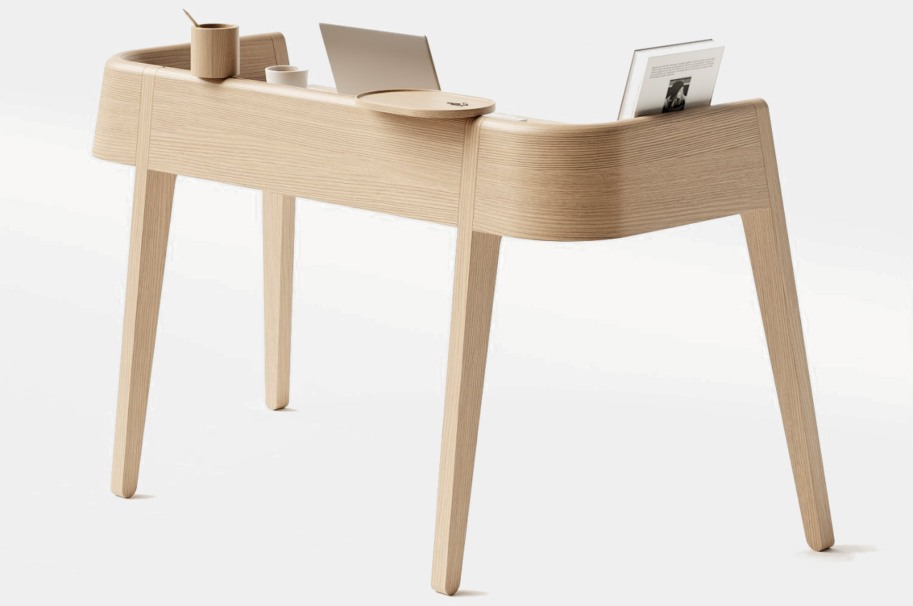
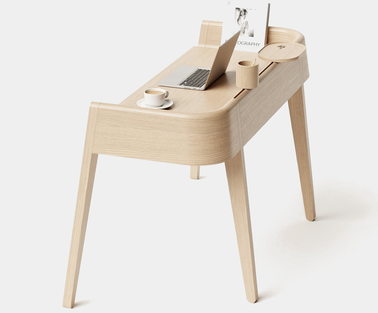
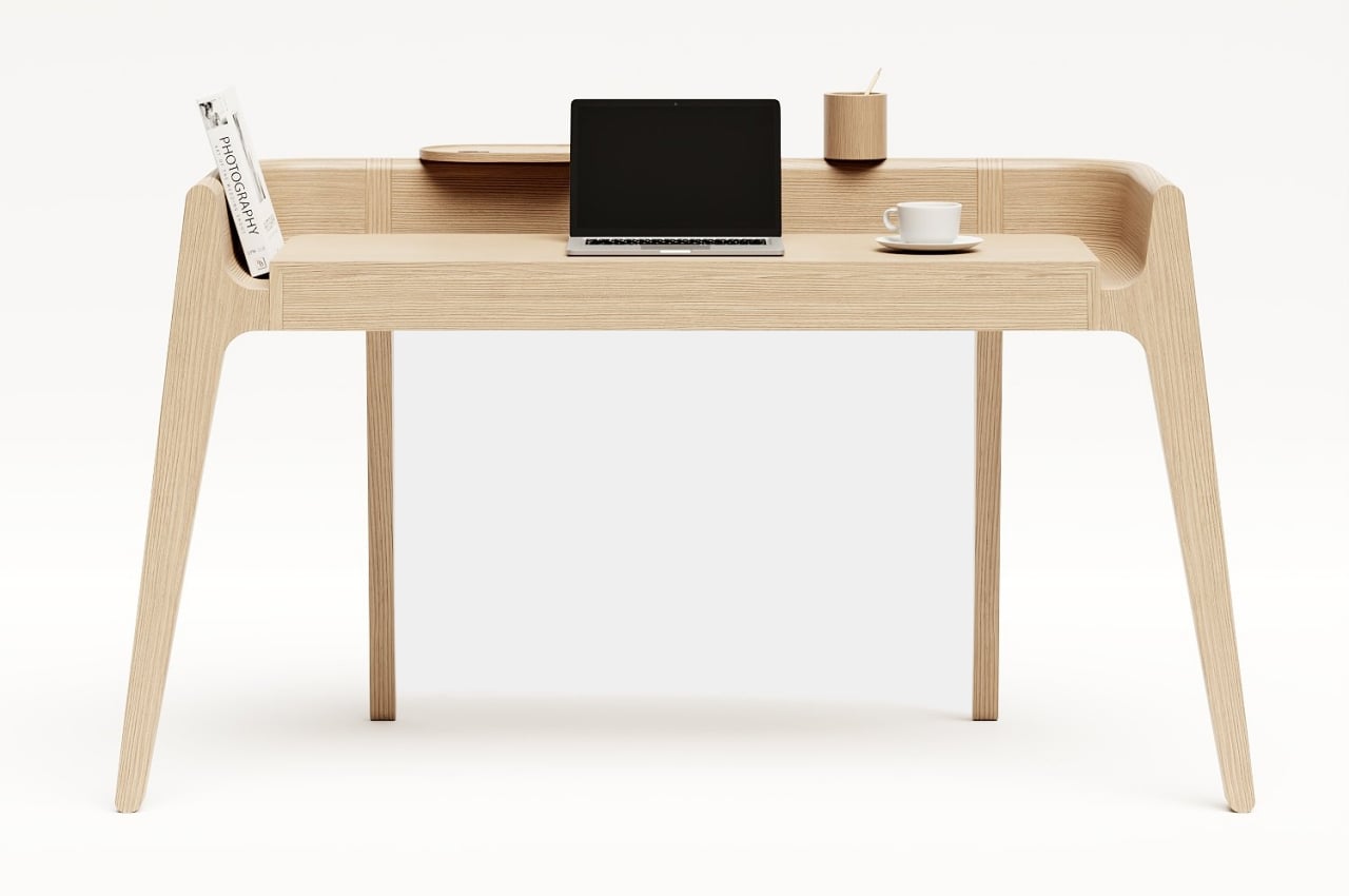
The desk has a subtly vintage look, with its clear, flat surface and a panel that runs around its sides and back. That perfectly complements its natural beauty provided by the wooden material and simple lines and contours of the desk’s form. If not for the two containers that seemingly float on the back panel, the Pessoa desk would have been passed off as typical and ordinary wooden furniture.
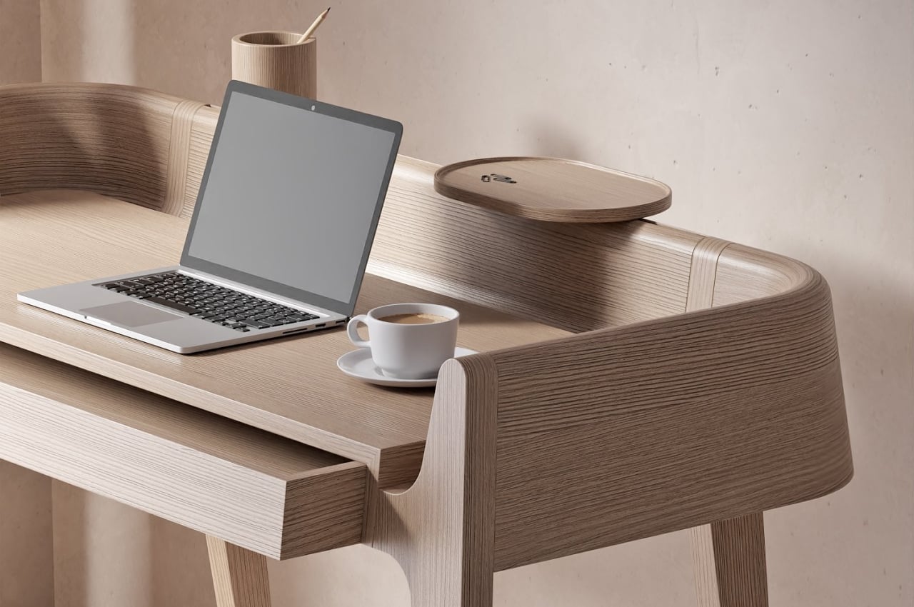
The table, however, has a few non-obvious places to keep things that would otherwise clutter the top of your desk. Of course, there is a drawer that you might not have noticed until you see the seem that separates it from the rest of the desk. There is also a curved gap between the top of the table and the panel surrounding it, creating a space for objects like books, cables, and other trinkets. It’s supposed to be a metaphor for how the present connects the past and the future, but it could also be a metaphor for the unknown valleys where most of our stuff vanishes into.
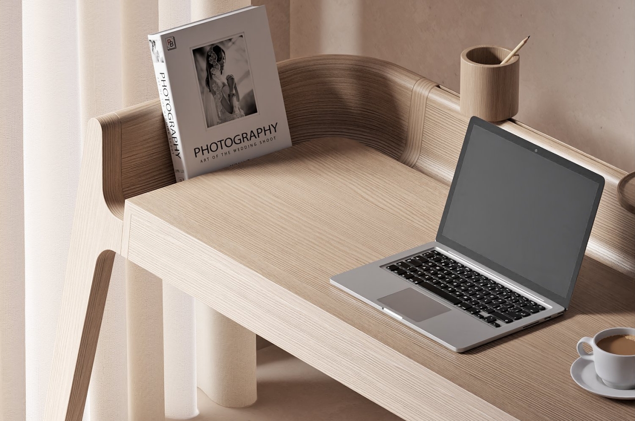
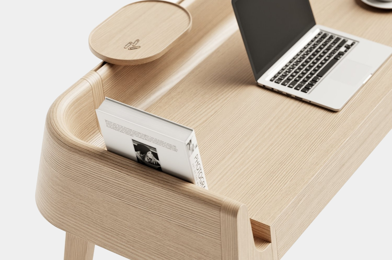
The most interesting part of the desk might actually be the one that violates the principles of minimalism. That wooden tray and canister actually slide across the back panel thanks to a cutout. In theory, it could accommodate other accessories that fit that slot, opening the doors to more organizational containers and, to some extent, a less minimalist appearance. That unique rail system was meant to convey indecision, expansion, and breaking the rules, and it definitely projects a sense of contrariness when considered against the entire theme of the desk.
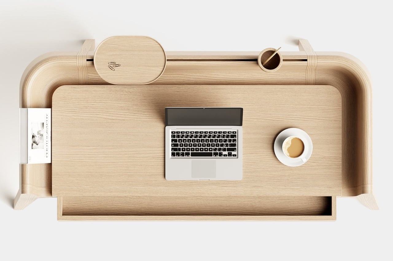
Already beautiful and functional on its own, the Pessoa writing desk becomes even more fascinating when you hear about the different and almost conflicting themes that informed its design. Those themes continue to the practical level, where the owner gets to decide whether to utilize all those secret containers and compartments or to keep the table completely clean of any unnecessary artifacts.
