The pervasive minimalism trend in design has made many products, particularly furniture, almost too plain. Of course, there is beauty in simplicity and uniform colors, but that doesn’t mean it’s the only way to go. In fact, there’s almost a sort of counter-culture flowing in the undercurrents today, offering maximalism as a salve to soothe many of the mental and emotional ills of today. One doesn’t have to go overboard, of course, in spicing up everyday life, and a new collection of everyday furniture shows how mundane objects can become the literal and figurative highlight of a room, with just the right interplay of colors, materials, and shapes.
Designer: Lisa Brustolin
On their own and with their peculiar designs, these pieces of furniture would have pretty much fit the description of minimalist products. Their basic shapes and base color schemes are not that uncommon, but as with anything in life, it’s the different ways you mix these elements up that really make a difference. And in this collection, it’s exactly that interaction of elements that makes them stand out without removing their primary function as usable pieces of furniture.
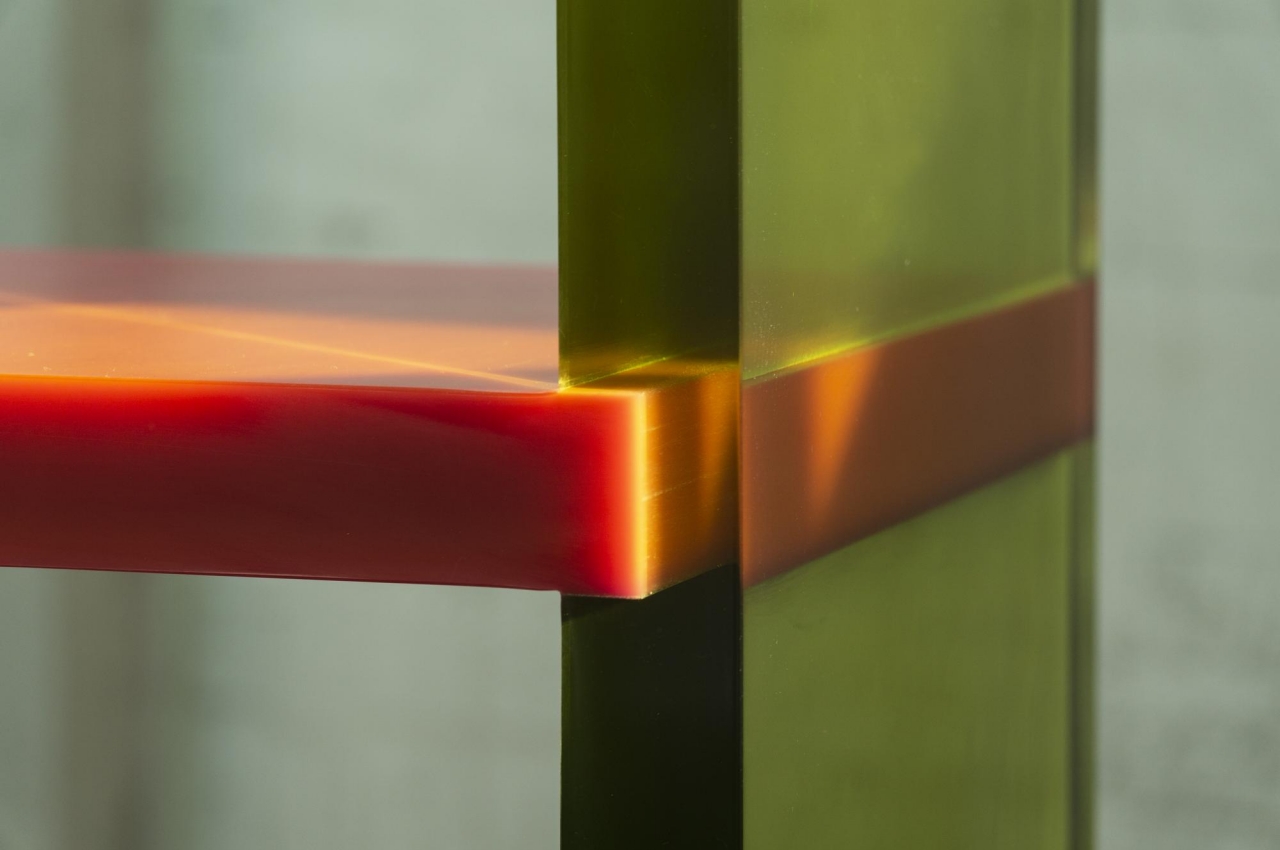
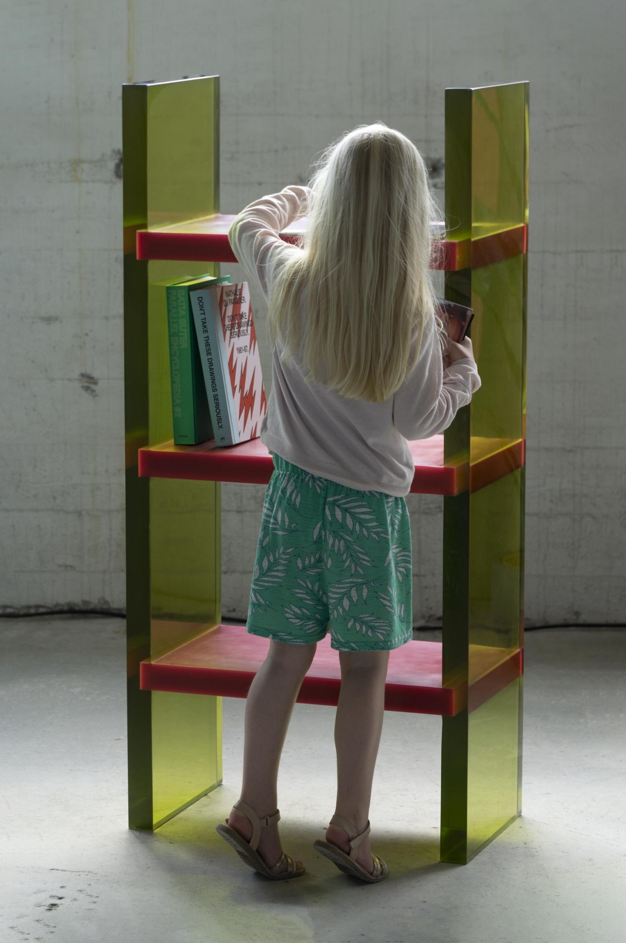
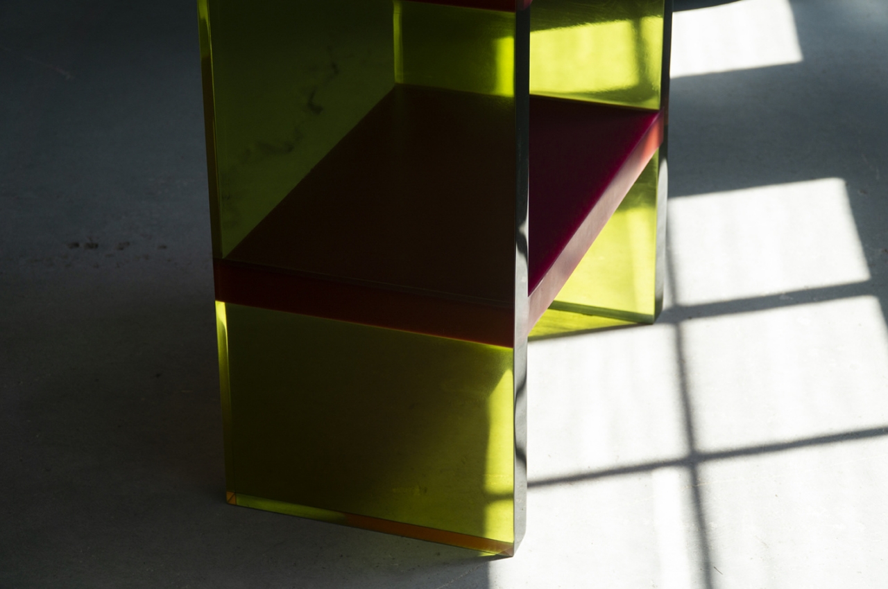
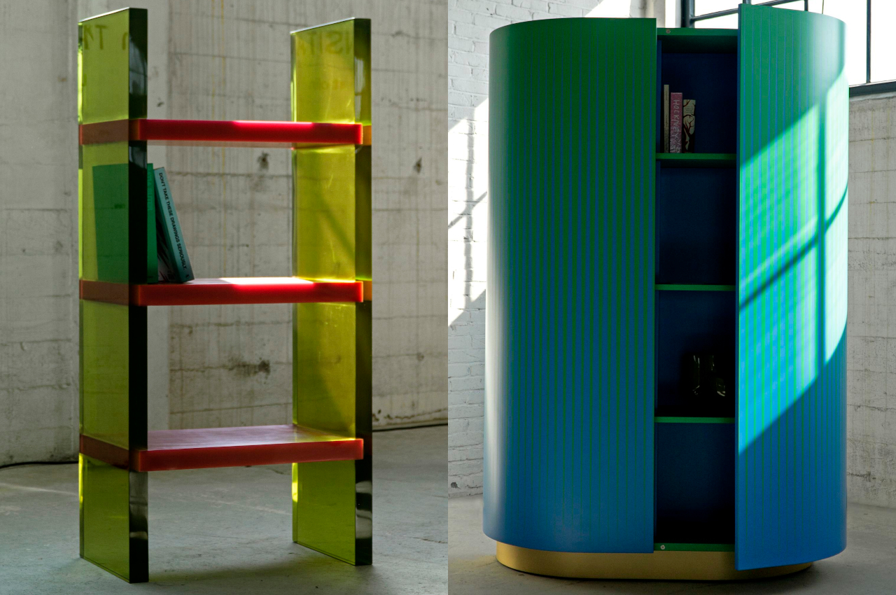
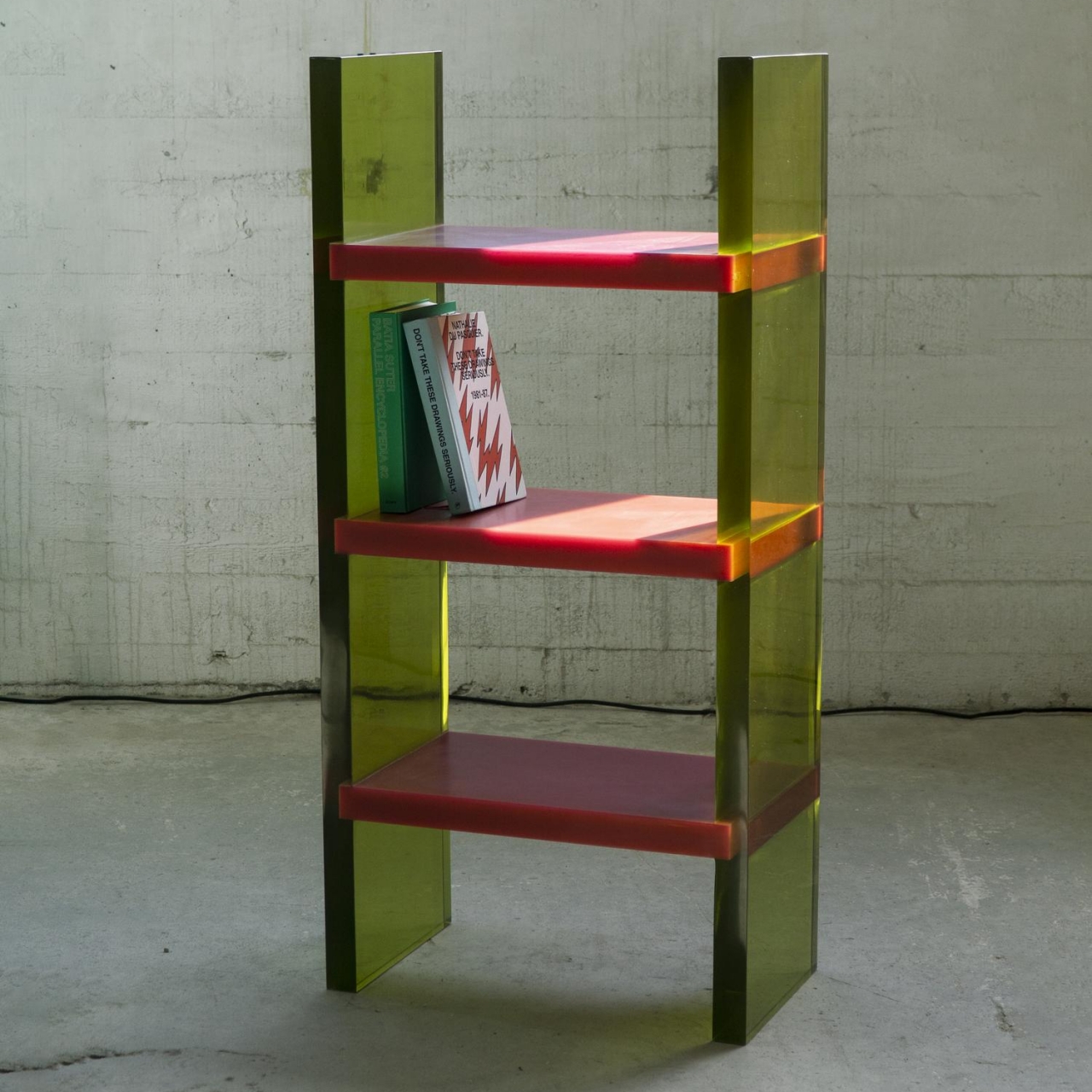
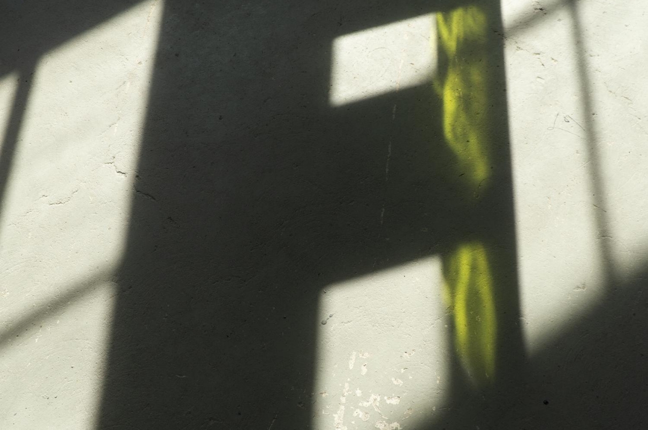
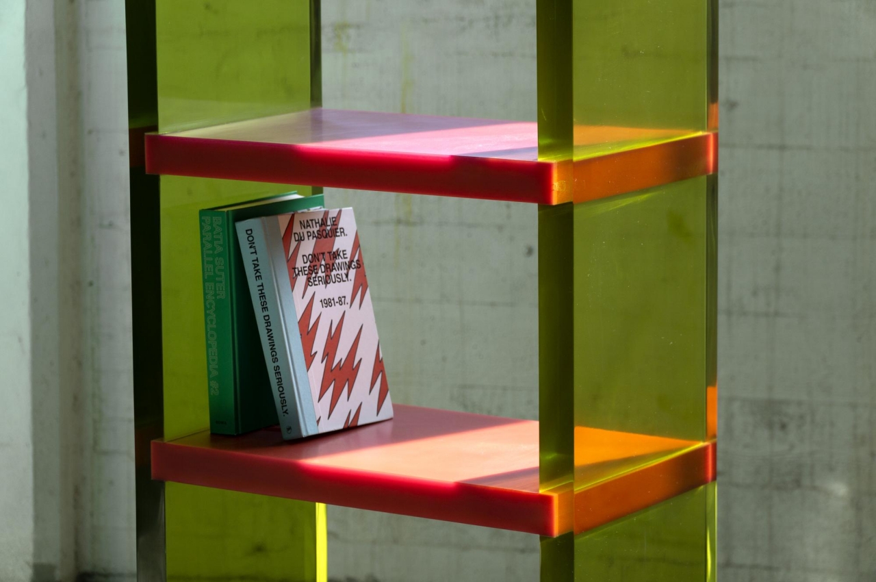
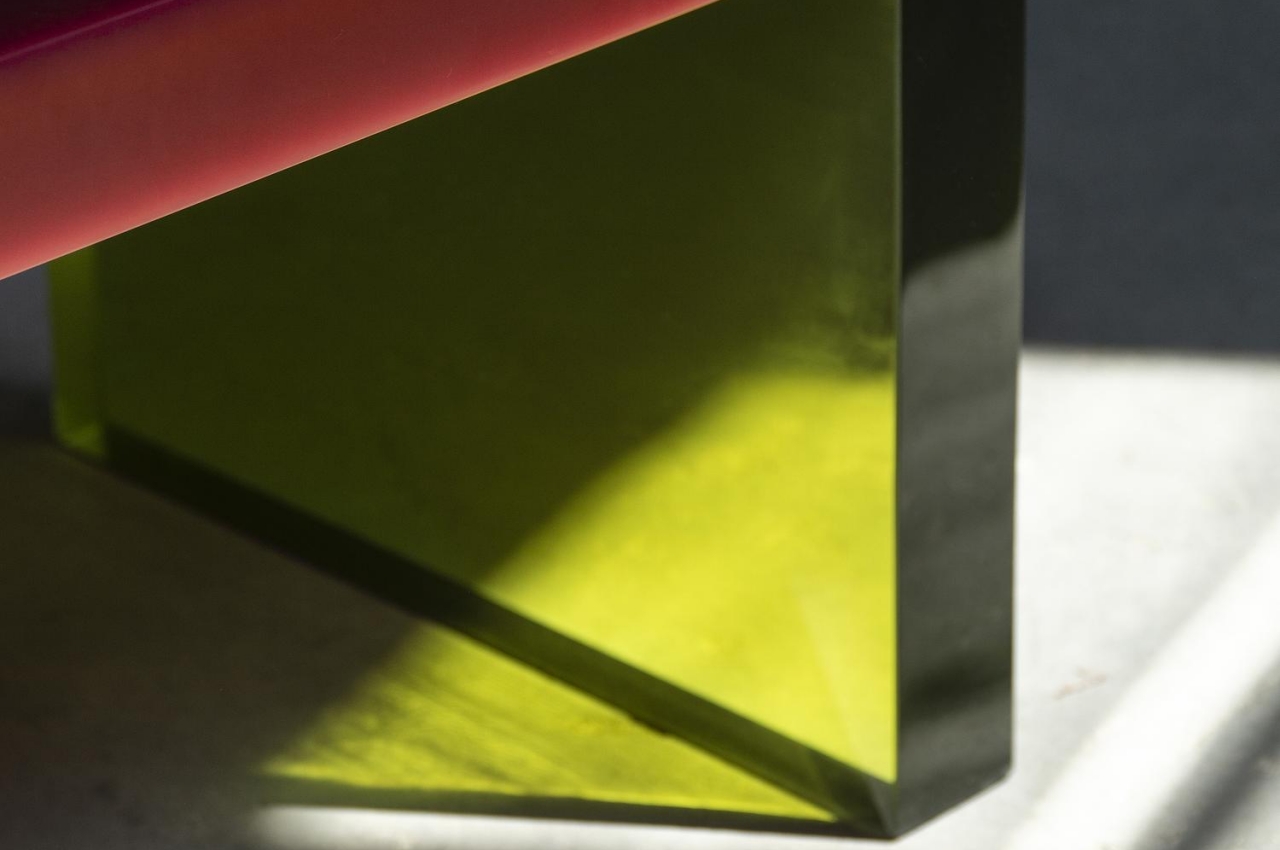
The translucent epoxy resin legs and opaque shelves already give the Differ Shelf a sharply contrasting motif. It is, however, the way the light bends, reflects, and refracts through those yellowish panels that turn the shelf into an almost dazzling light show, depending on where you stand. Given its unique visual properties, this shelf is designed to stand in the center rather than against a wall so that people can walk around it and view it from different angles. It truly differs from other shelves.
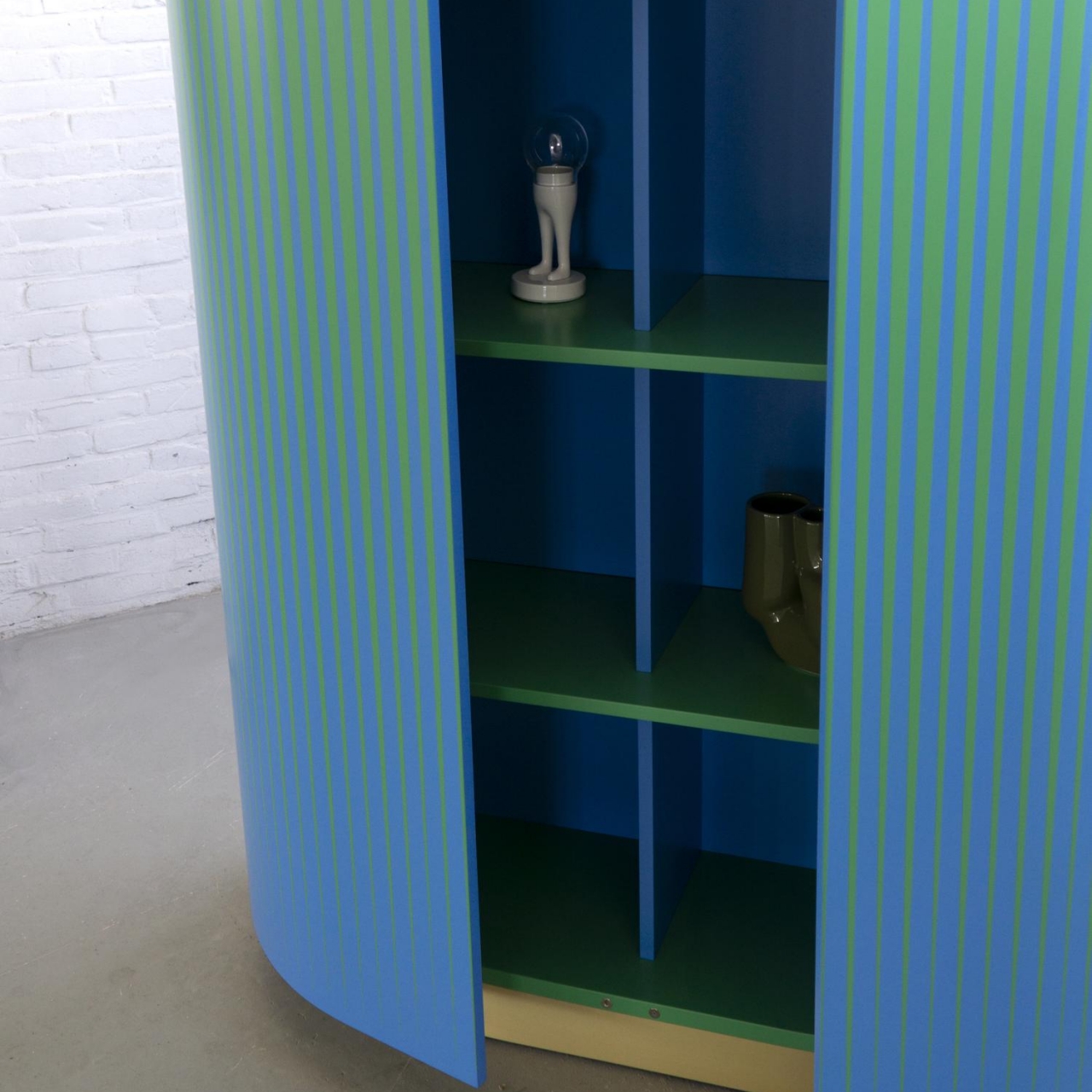
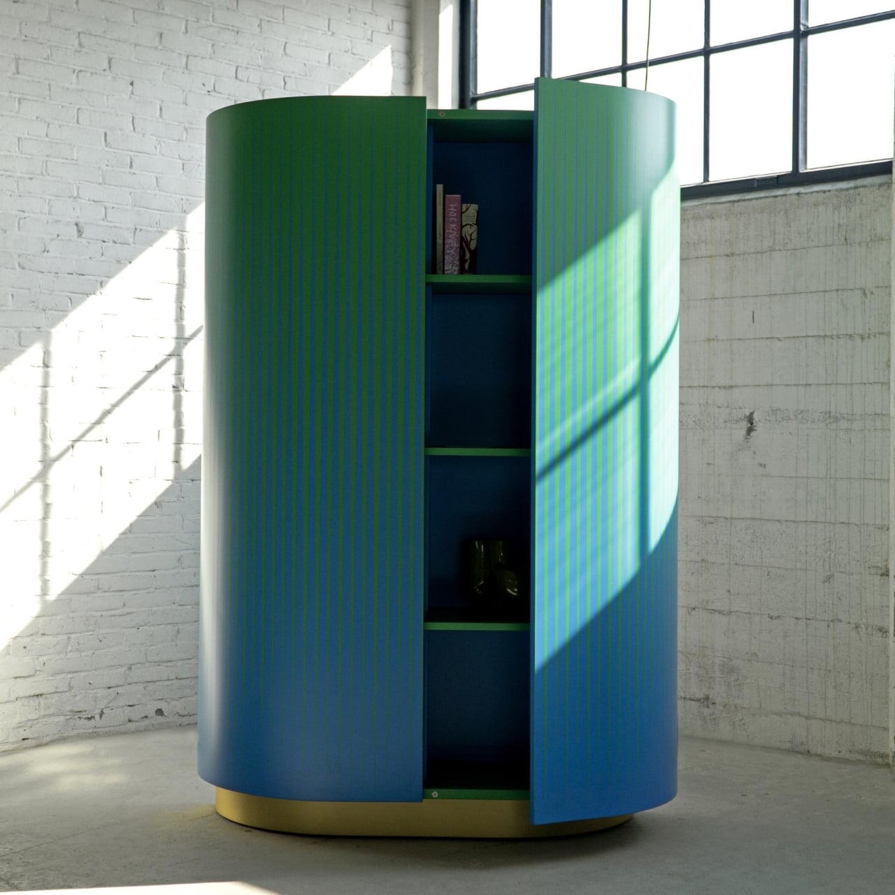
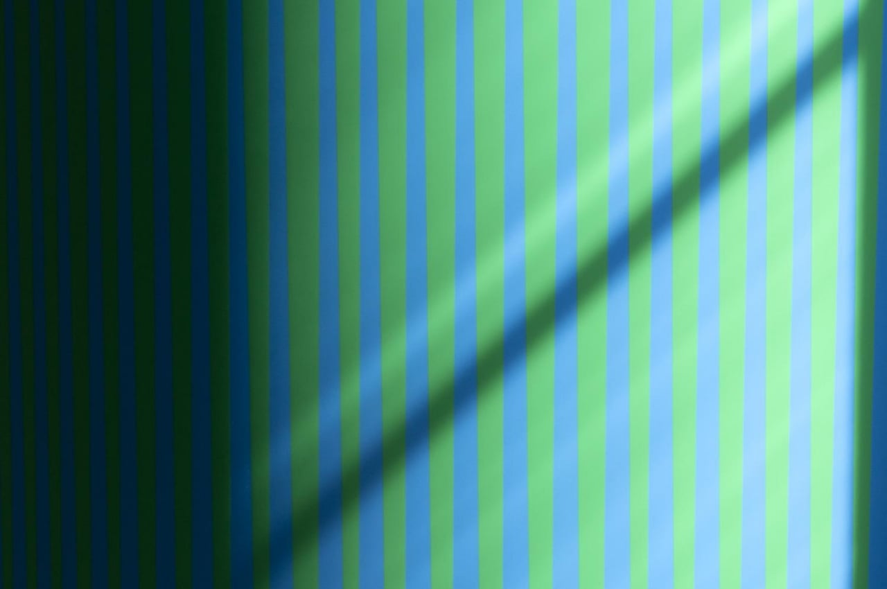
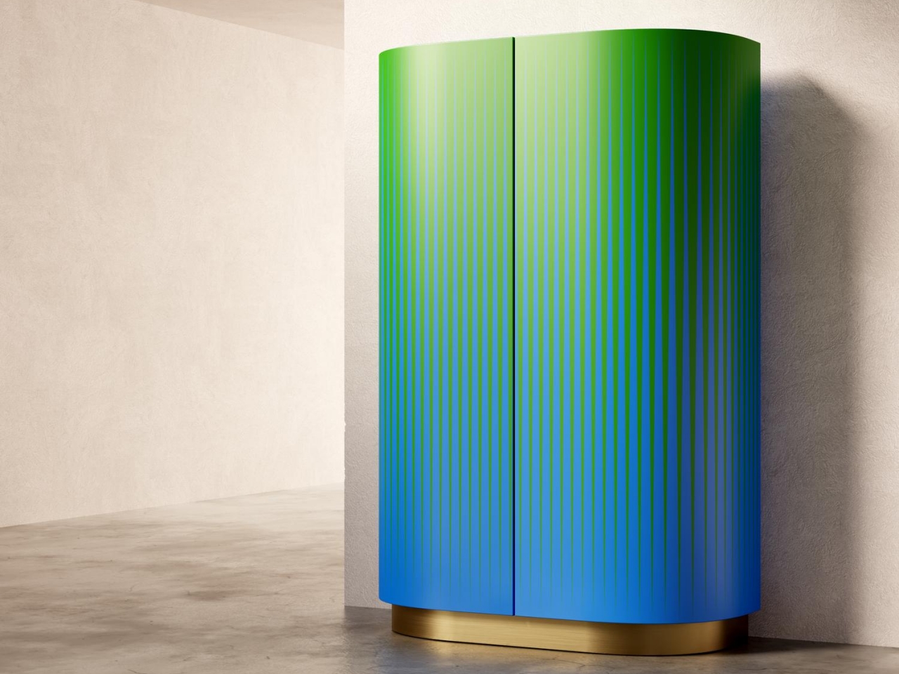
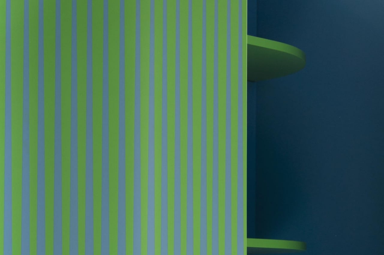
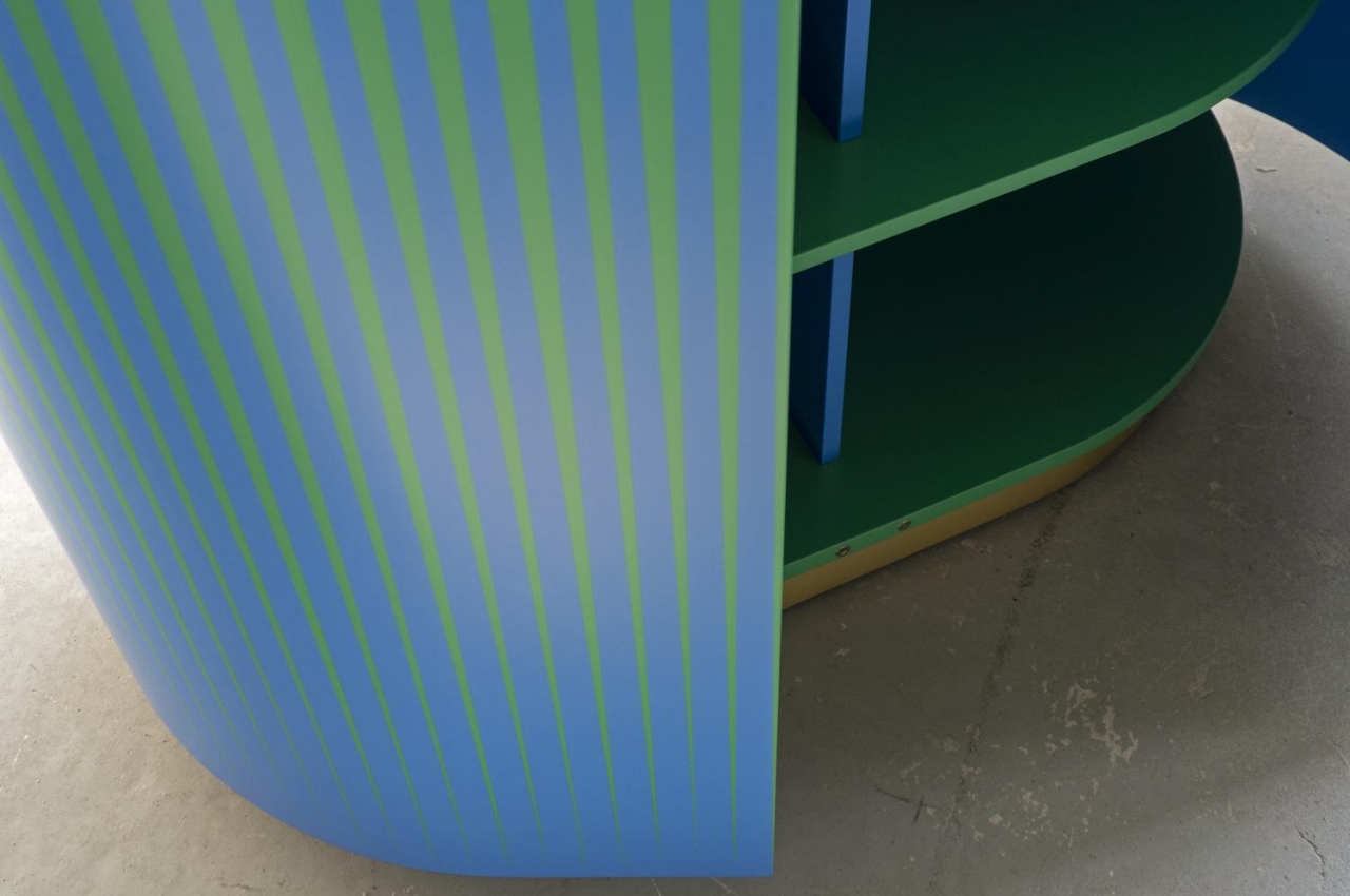
In contrast, the Opticabinet is meant to be viewed from afar in a corner or an edge of the room. Made by Venetian craftsmen from wood on a brass base, the alternating patterns of blue and green make it look like the cabinet’s exterior was expertly painted with a gradient color. Upclose, however, you can clearly see it’s all just an optical illusion created by shapes and contours.
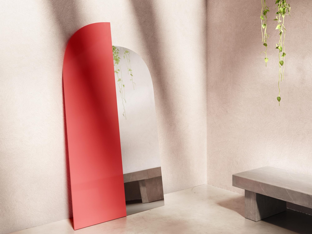
The Wrong Mirror is both the least complex but also the boldest of the collection, providing only half of the function it’s supposed to give. It puts a modernist twist on a classic arch mirror design, visually splitting a mirror in half and using the wrong scale and wrong material on the non-reflective half. Admittedly, you’ll feel a bit wrong looking into the mirror, but perhaps it could also be a thought-provoking metaphor like a glass that is half full or half empty.
Brustolin’s furniture collection displays an interesting way of giving shape to color, whether through a play of light or through optical illusions. At the same time, the quirky designs also give shape to expression at home or in your room, providing functional furniture that also stands like art pieces to complement your personal style and inclinations.
