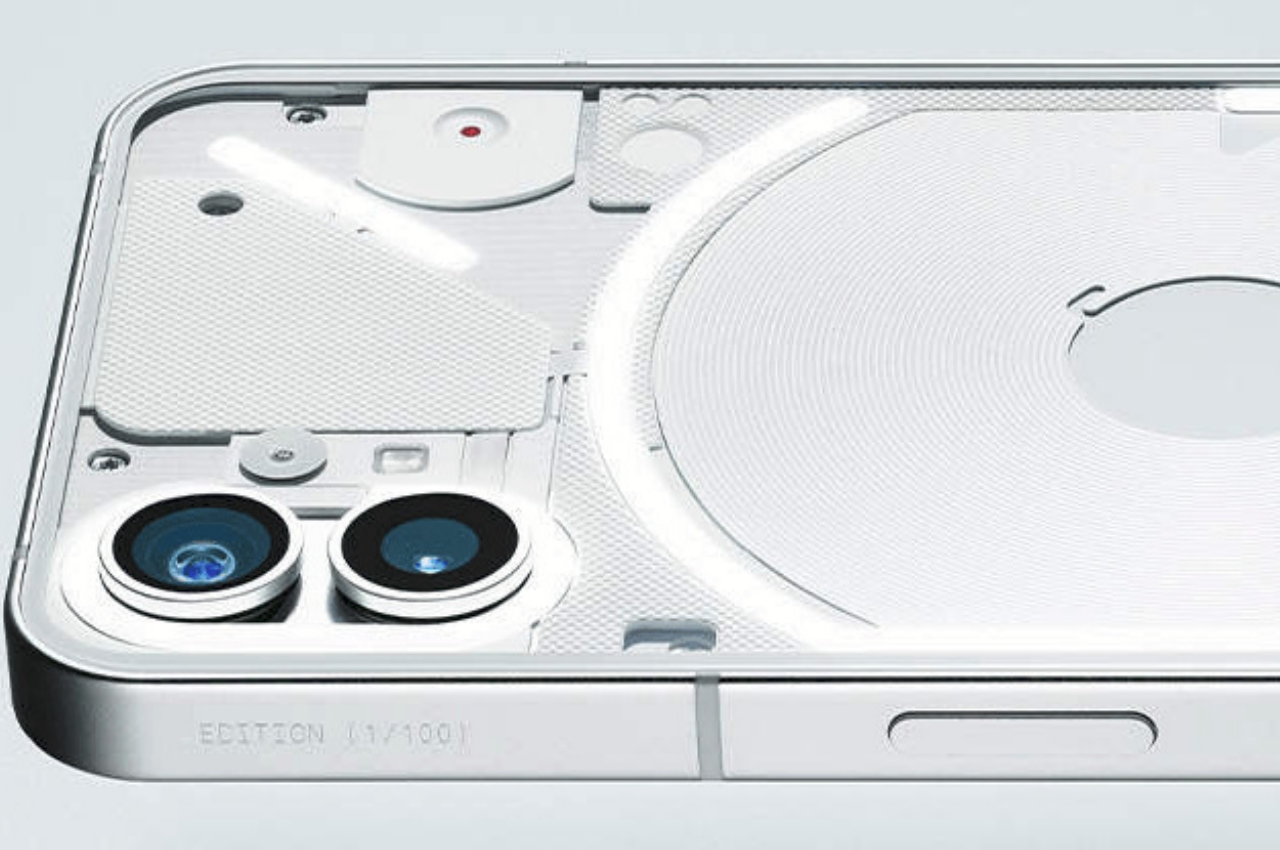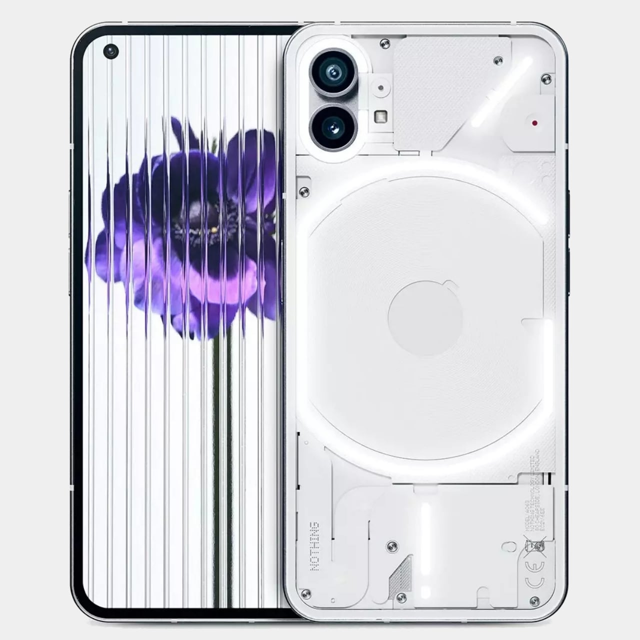
There is probably nothing more frustrating than being emotionally invested in an upcoming product, only for its very creators to take the wind out of its sails. That is undoubtedly what some of the believers of Nothing’s inaugural smartphone felt when the company officially revealed what the phone would actually look like. On the one hand, the startup tried to beat leaks to the punch so that no one could claim they didn’t protect their secrets well enough. On the other hand, they are tempting fate by either confirming fears or calming them, and, as expected, camps are split on whether the white Phone(1) does live up to the hype that Nothing itself built. Fortunately, the story doesn’t end there completely, and the black finish of the same phone could still win some people over. Or it could cement their decision to stay away completely.
Designer: Nothing (via Roland Quandt)
It almost seems like Nothing’s early years will be marked by a lot of controversies, partly thanks to how it has been building up expectations about the company’s mission. Just like OnePlus, which Carl Pei also helped found, Nothing presents itself as a revolutionary that is trying to go against the excesses of the smartphone industry. Well aware of the current trends in the design industry, Nothing espoused values like transparency and minimalism, which would translate to both product design and company management.
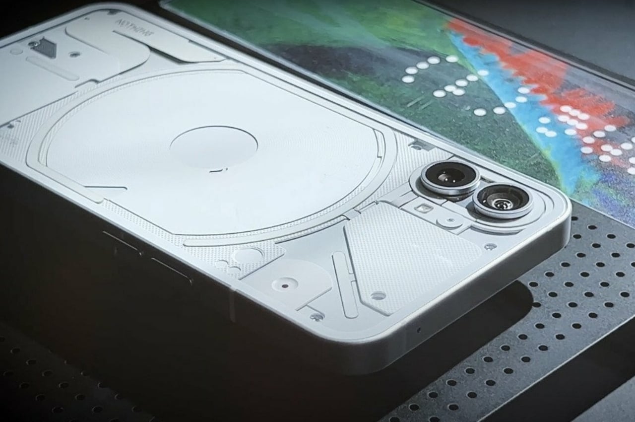
Its first product, the Nothing Ear(1) TWS buds, already divided people between those who lauded its unique, partly transparent design and those that felt short-changed from the brief hype that preceded it. History is repeating itself with the Phone(1), which Nothing has been teasing as nothing short of revolutionary, pardon the pun. That, however, might only be in relation to what is available in the market, so it’s not exactly lying in that regard.
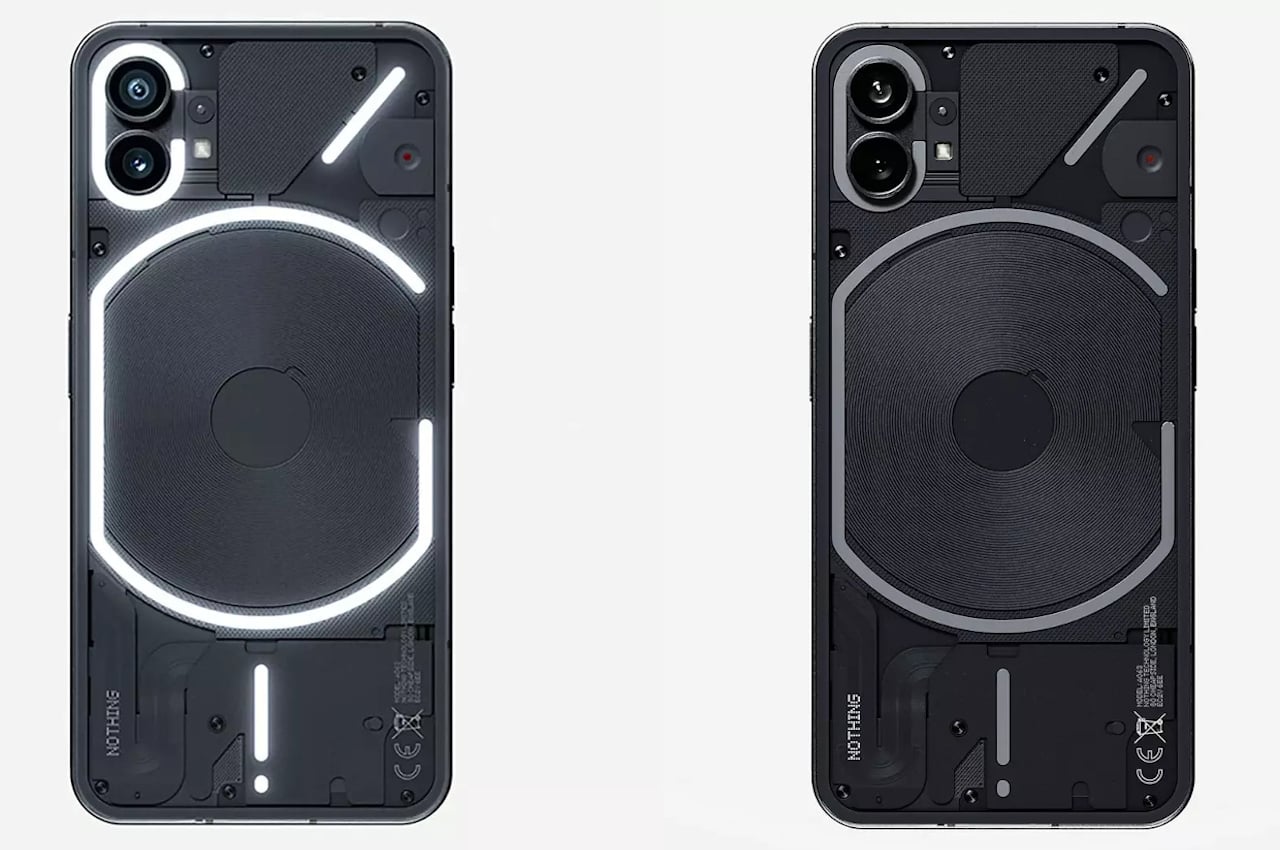
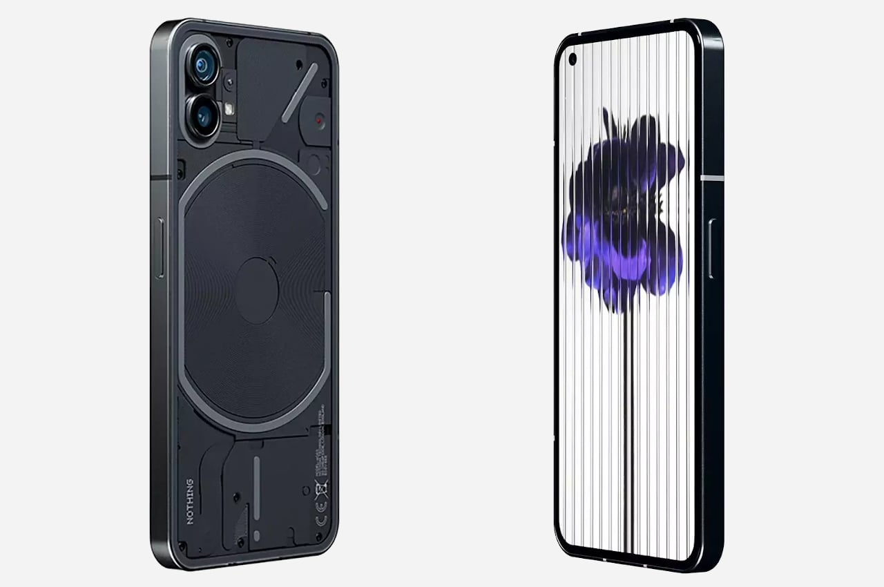
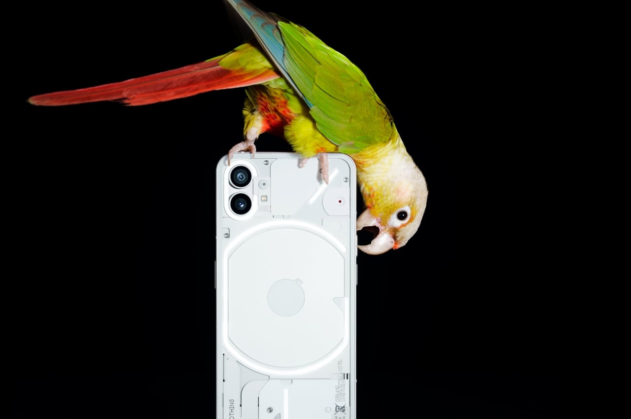
After official revealing the transparent yet occluded back of a white Nothing Phone(1), unofficial images of a black variant have now become available for everyone to see. Compared to the white phone, the black plate underneath makes the “glyph” lights even more visible. In a way, this makes the back look even busier compared to the white model, which sort of takes away from the minimalism appeal of the phone. Then again, if the Nothing Phone(1)’s back were completely transparent, it would definitely be a lot more chaotic inside.
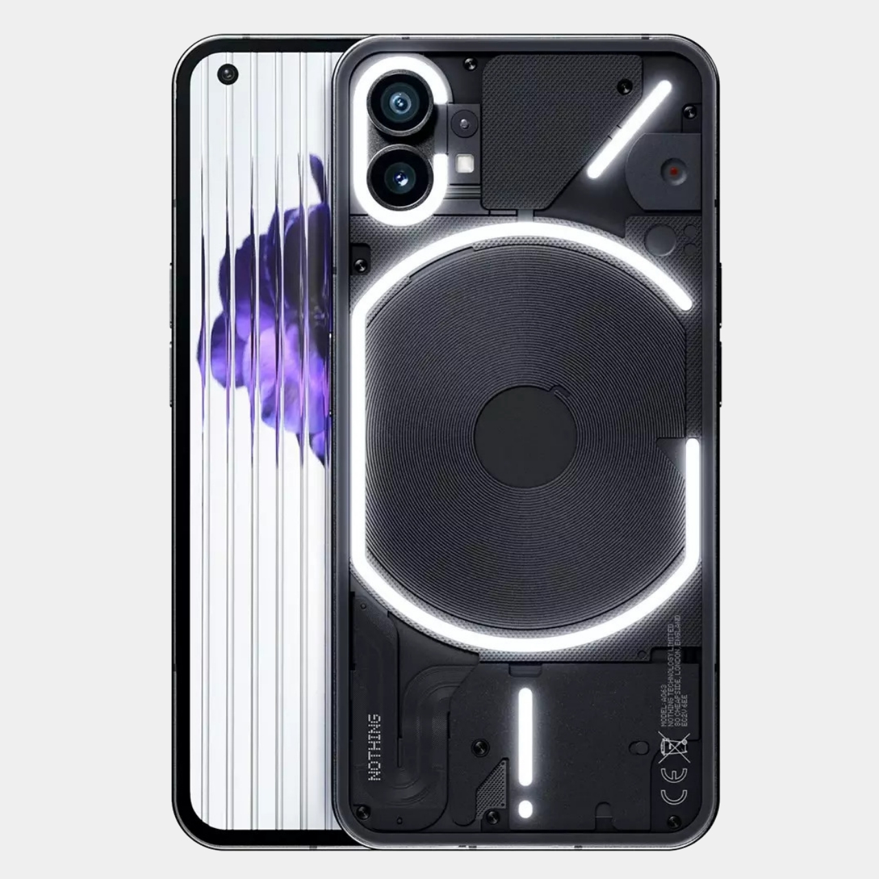
There is also some disappointment or at least growing concern about the choice of hardware that will go inside the Phone(1). Nothing has already confirmed that it will use a custom Snapdragon 778G+ processor, which was made specifically for it, adding wireless charging and reverse wireless charging capabilities that are absent in the plain version of the silicon. It is, however, what would be considered a mid-range chip, which sounds a little disheartening for a new flagship phone. Pei explains to Input magazine, however, that the choice goes in line with the company’s message that tech specs aren’t always relevant. In terms of balancing performance, thermal management, efficiency, and overall sustainability, the Phone(1) will do just fine.
Whether that will be enough to translate interest into sales, we’ll see in two weeks when the Nothing Phone(1) is officially launched. The company is taking a more cautious approach, however, mimicking the chaotic invite-only system from the early years of OnePlus. Of course, that also creates an artificial scarcity that makes the product look like a very limited edition, pumping up the hype even more.
