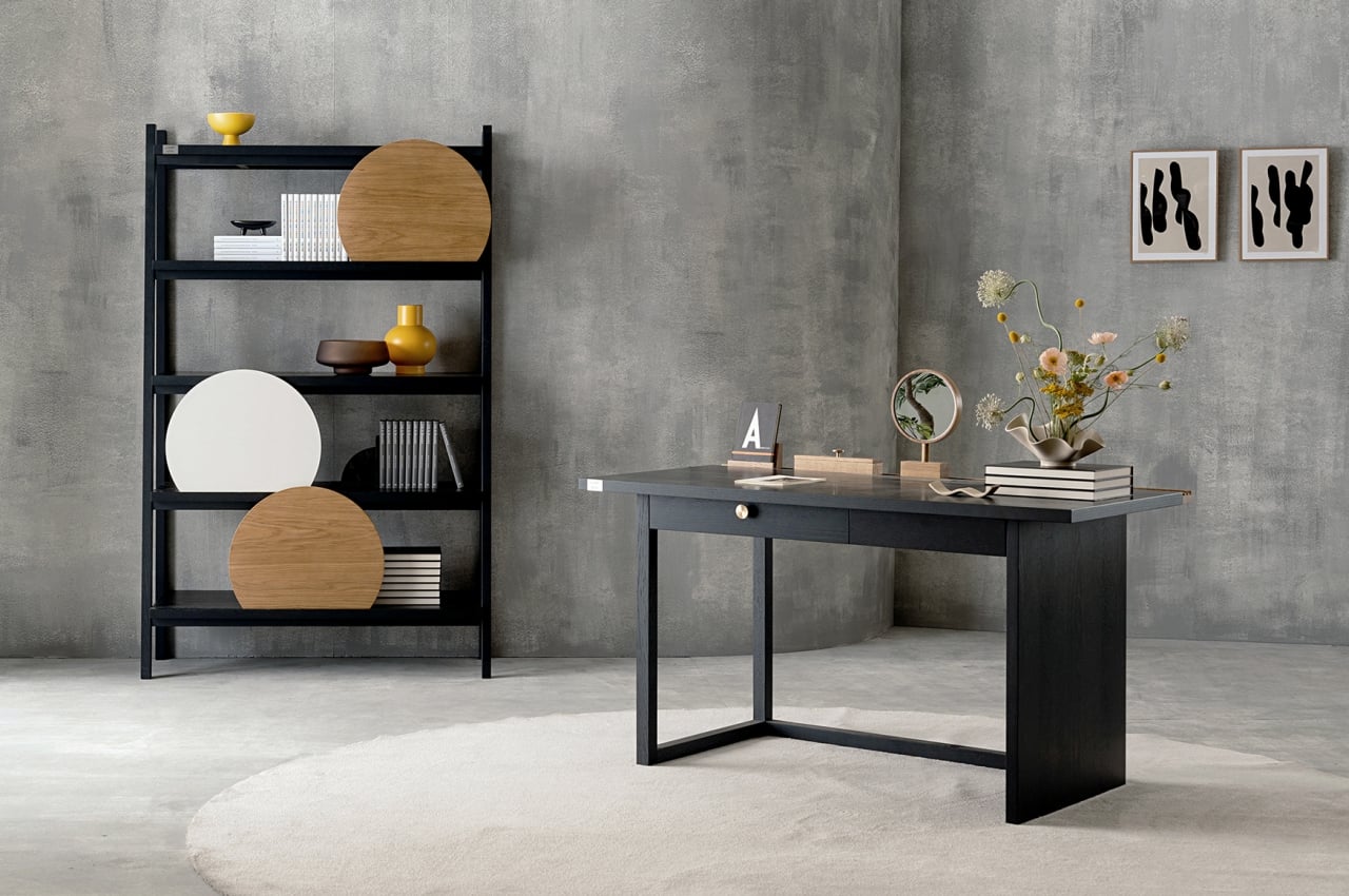
It’s not easy to find furniture or products that perfectly fit our needs and our aesthetic tastes, not unless we buy bespoke editions or commission someone to make them for us. Once in a while, we do come across a table or a shelf that sings to us, but most of us have to settle for furniture that carries a generic design for mass production. We often end up personalizing these home pieces with photos, organizers, vases, decor, and other things that make them unique and different from others of the same design. What if you could actually customize a mass-produced desk or shelf easily without having to buy additional accessories? That is the idea behind Spray, and it delivers customization in a simple yet effective way that doesn’t take anything away from its minimalist beauty.
Designer: Pavel Vetrov
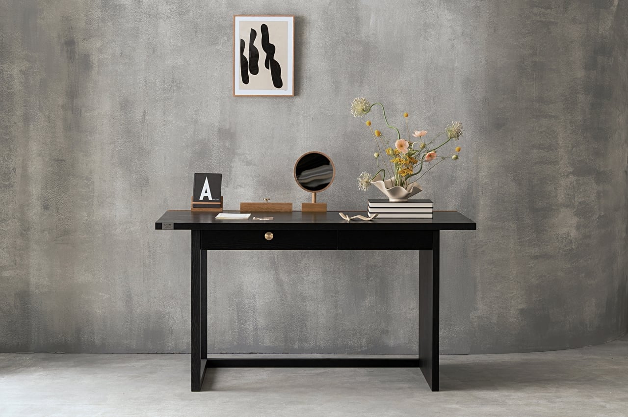
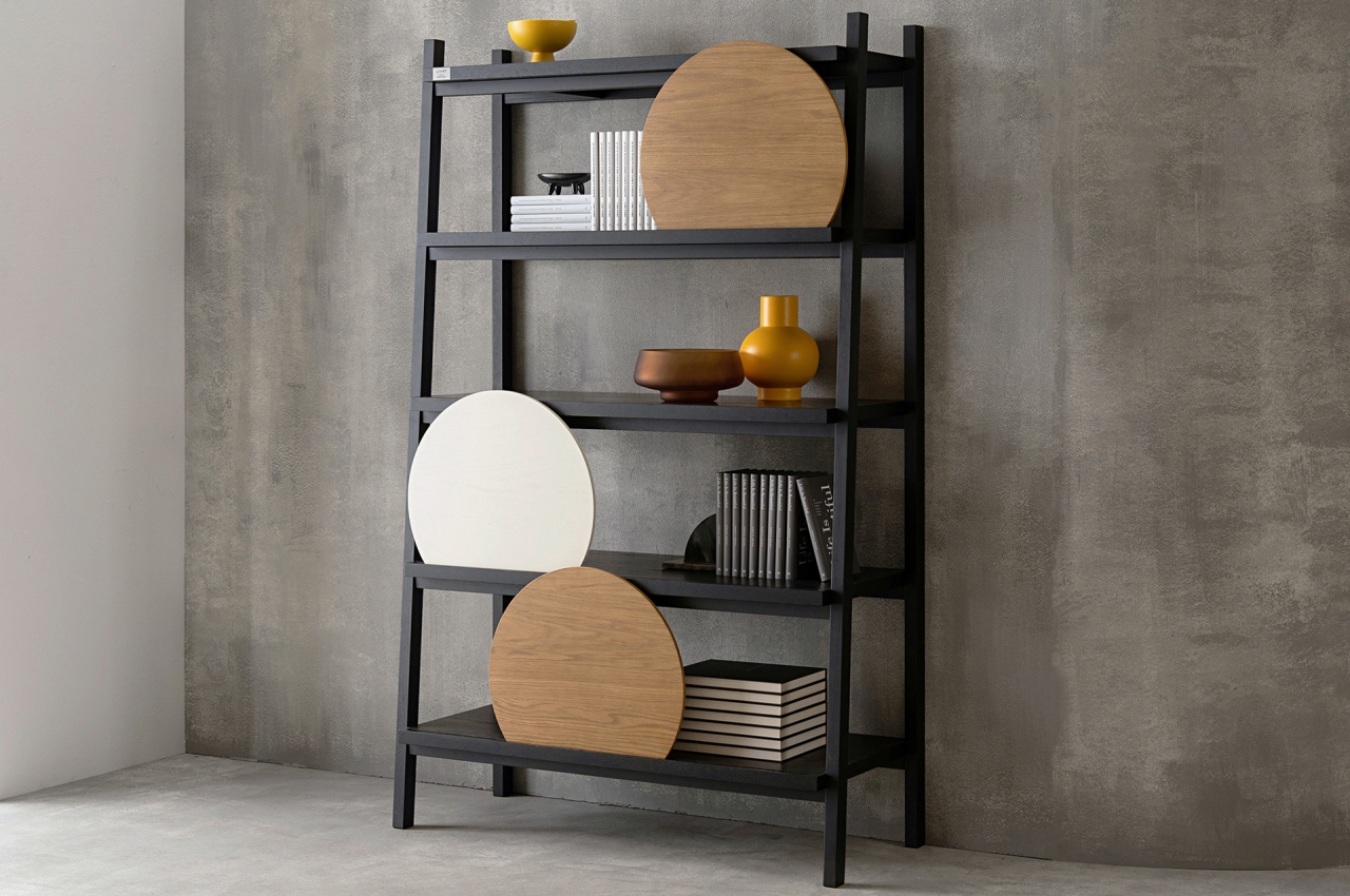
Admittedly, there are plenty of furniture these days that try to flaunt their minimalism and configurability. Sometimes, however, the system is only visually simple but inherently complex. Hidden mechanisms, detachable modules, and moving parts might be out of sight, but they also make the product more prone to wear and tear, not to mention making them harder to repair or replace. In contrast, almost every option is within plain sight with Spray, and nothing requires screws, hinges, or anything metal for that matter.
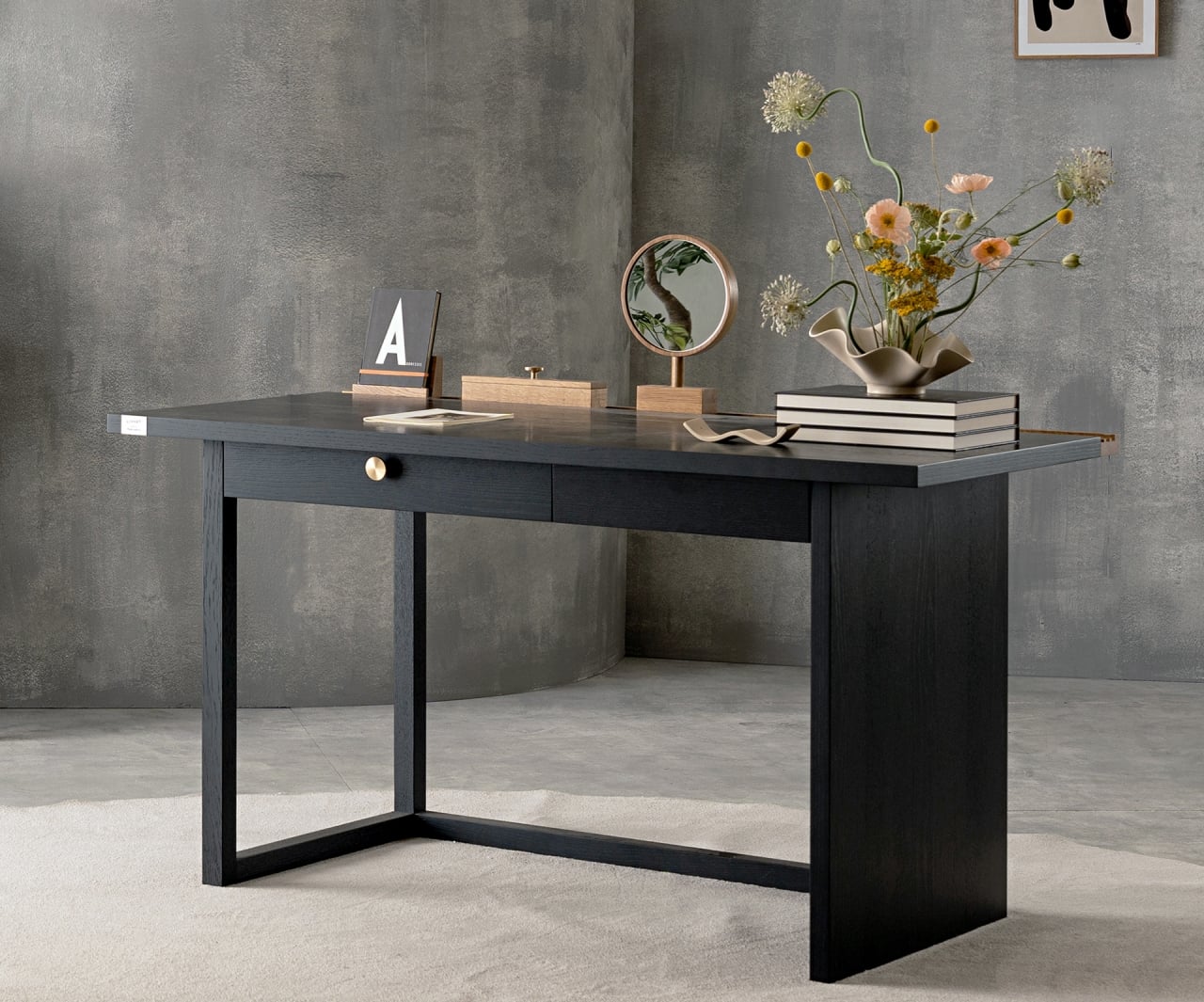
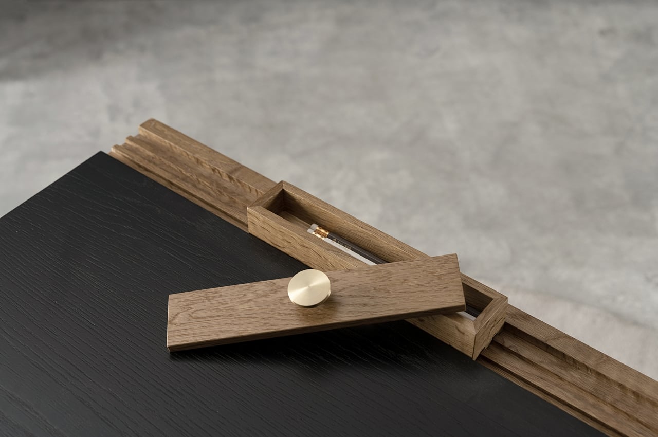
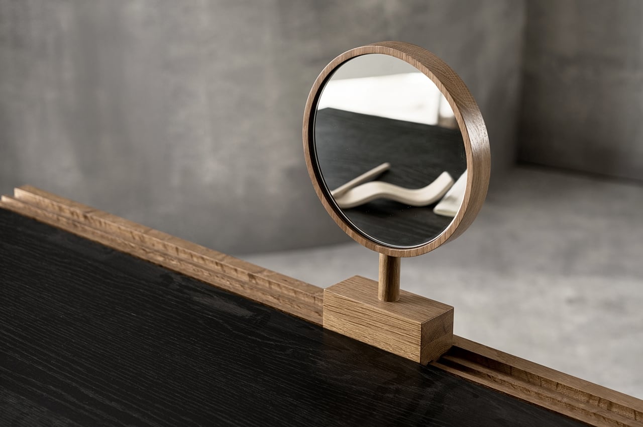
The desk, for example, offers a clean and open surface to work with, with no borders or hidden pockets other than a traditional drawer. There is a rail system on the back that does let you add certain functional pieces as you need. It’s all made of wood, so there are fewer chances of sliders getting unhinged or deformed. Although the concept already includes at least three of these “modules,” there’s plenty of room to add more if necessary, presuming they’re available.
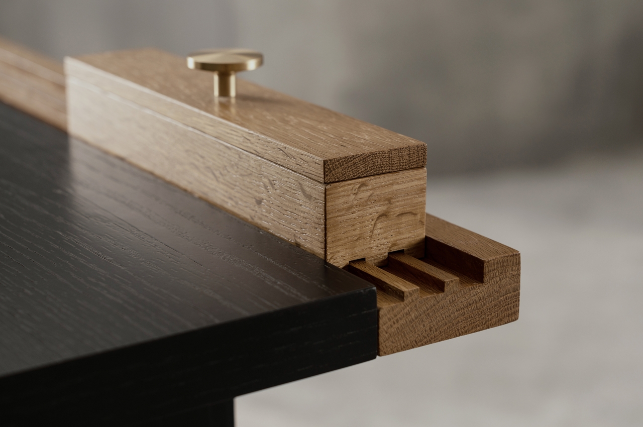
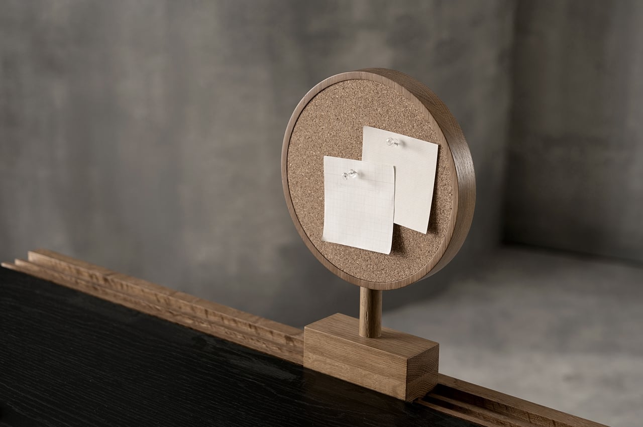
Interchangeable parts for the desk include a box for holding pens or other small items, a book stand, and a circle that has a mirror on one side and a corkboard on the other. In addition to being functional, they also add visual accents to the desk, their brown hues complementing the table’s black surface quite nicely. You can mix and match and put them in any order or position you prefer. The book stand, for example, can be easily detached when you need to read something up close. And at the end of the day, all these parts can retreat to the back, leaving your desk space clean and tidy.
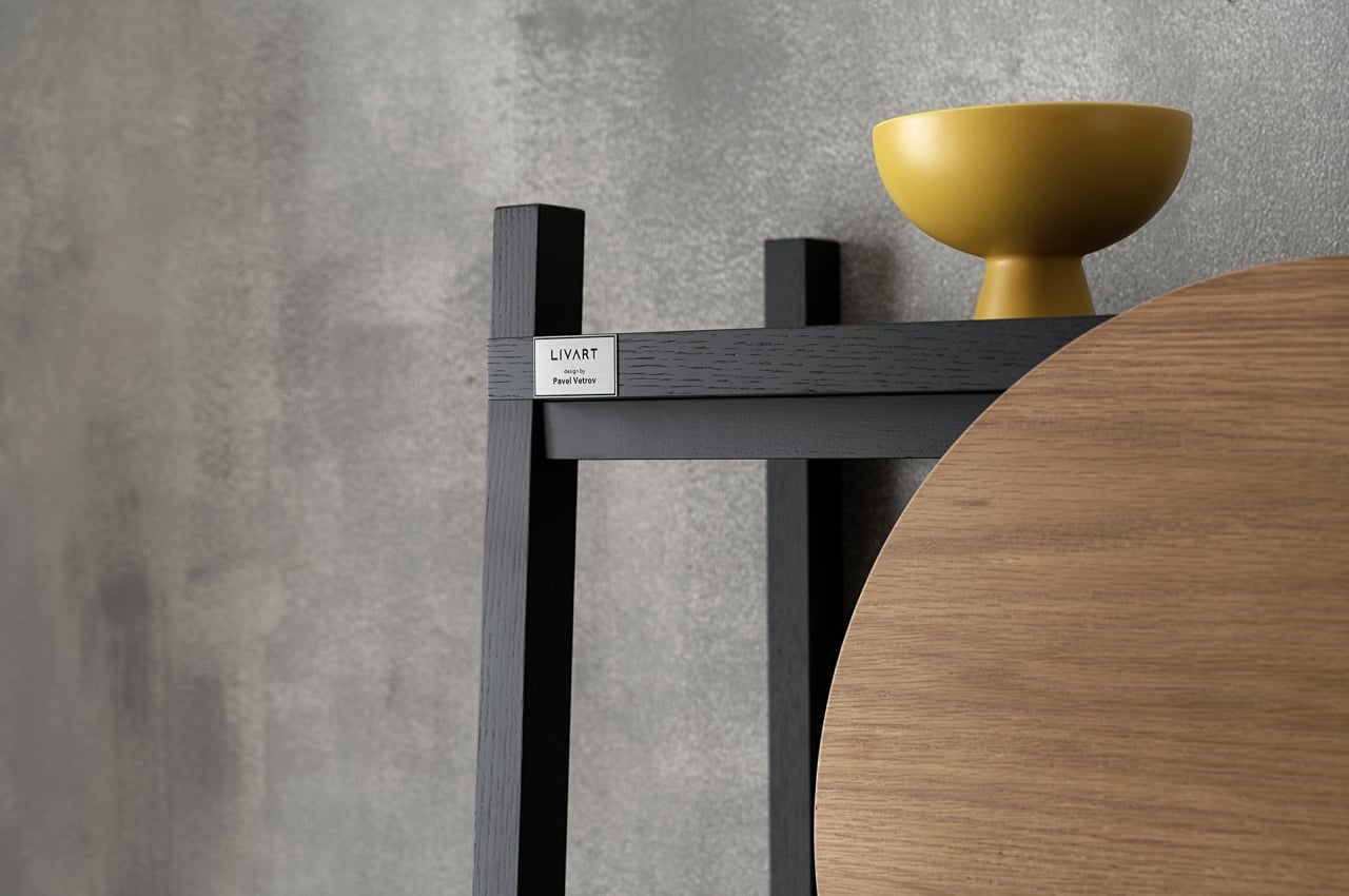
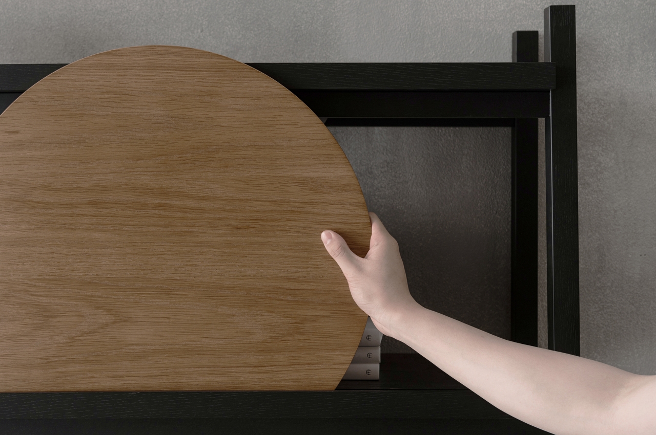
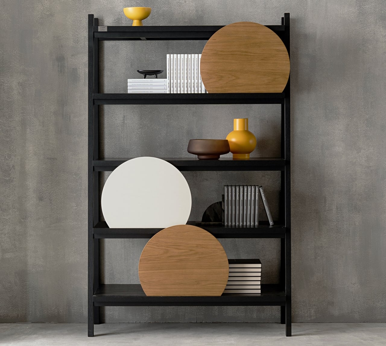
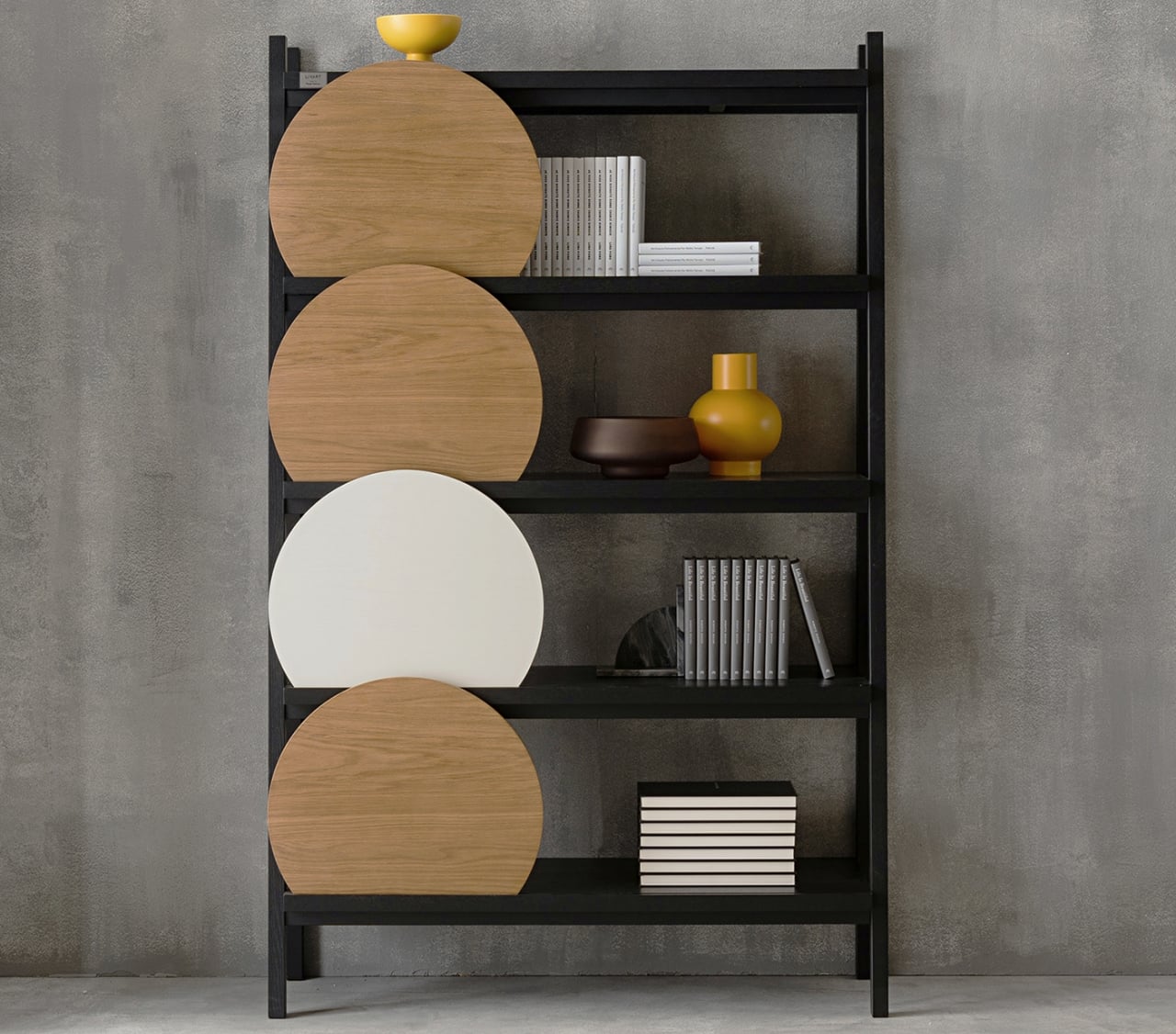
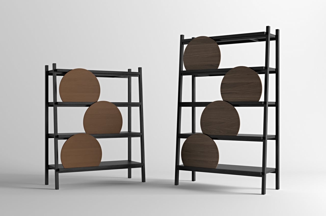
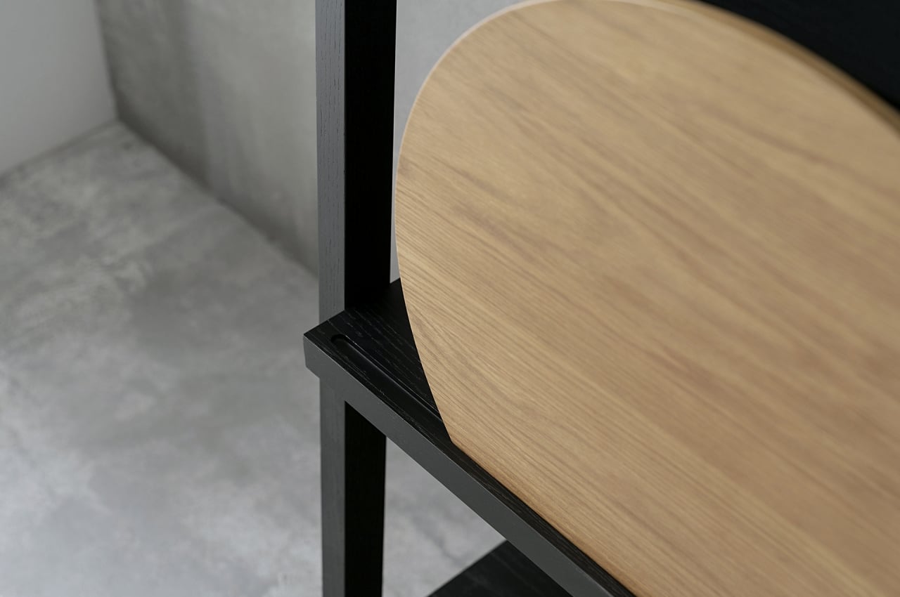
The Spray shelf uses the same rail concept but with a simpler, single groove in the front of each shelf. This is where wooden discs slide into place to add some variety to the furniture that is pretty much a simple wooden frame. These discs act as shields to hide things behind, and they can be positioned anywhere you like. They’re also entirely optional, in case you want to show everything you have on display.
Spray doesn’t do anything extraordinary to provide personalization options, and that is actually its biggest strength. It is simple, pure, minimalist, and beautiful, and it doesn’t let its flexibility get in the way. It’s definitely a refreshing take on a growing trend of products, both furniture and accessories, that start to go to the opposite extreme of becoming more complex in the name of flexibility.
