One problem that never seems to leave us, especially f you’re living in a major city – is the lack of space! If you’re an independent millennial who recently moved out of their family home and into their own, then a major issue that you may be dealing with almost every day…is space constraint in your own home. Our modern millennial homes have many virtues, but one thing they lack is space! Space constraint is something most of us end up dealing with every day. Smart storage solutions can be lifesavers in such tricky and compact situations. And to make your lives easier, we’ve curated a whole collection of storage solutions that come in the form of furniture designs that, to be honest, are going to completely organize your home! Not only do these products comfortably store your belongings, but they’re also perfect for displaying those special items that you don’t feel like shutting away in a dusty cabinet. From a Wolf stool concept to shelves that look like abstract art of faces gazing at you – these innovative storage and display solutions are the additions your home needs!
1. The Plot Twist Bookshelf
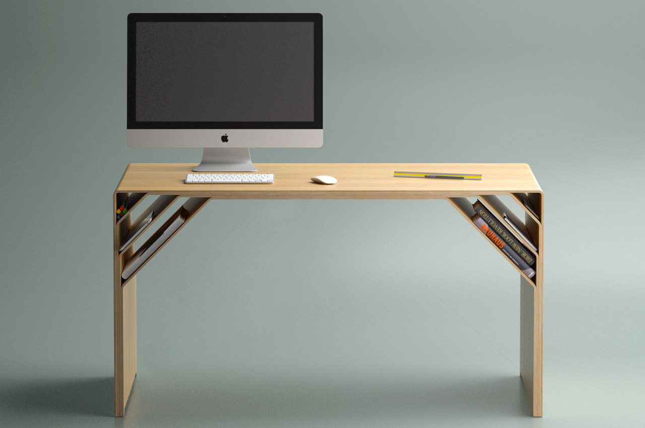
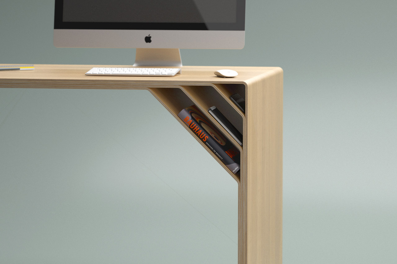
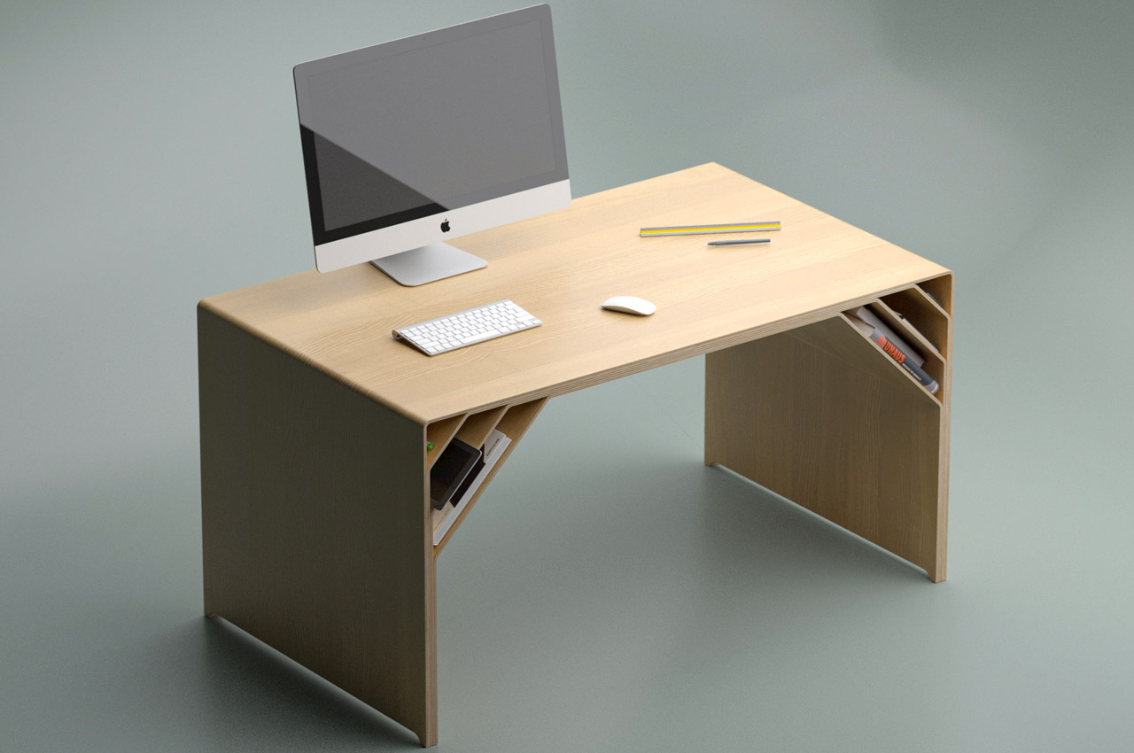
The Nook desk right from its appearance and thereafter has a story of material molding, matte finish, and a simple idea that’s still more than an ordinary desk. The Nook desk surface, and nifty selves at the edges, hold key to the table’s idea of maximizing productivity with minimalistic use of material.
Why is it noteworthy?
New desks surfacing on our computer screens day in and day out are generally drenched heavily in the wave of maximizing gadgetry on the tabletop courtesy of cable organizers, built-in wireless chargers et al. Atkay keeps it simple and undistracting. His idea of a desk will therefore not revibrate with most hybrid/work-from-home taskforce. However, if you’re someone like me who loves the desk clear of clutter and only wants a book or two in close proximity; this is where the search can end.
What we like
- Nook desk’s personalized design aesthetics shall help you have most of your reading/writing material well within your reach
- The personalized design is achieved by separating multiple layers of plywood at the edges of the table, creating storage layers on the bottom of the tabletop
What we dislike
- No complaints!
2. The Bond
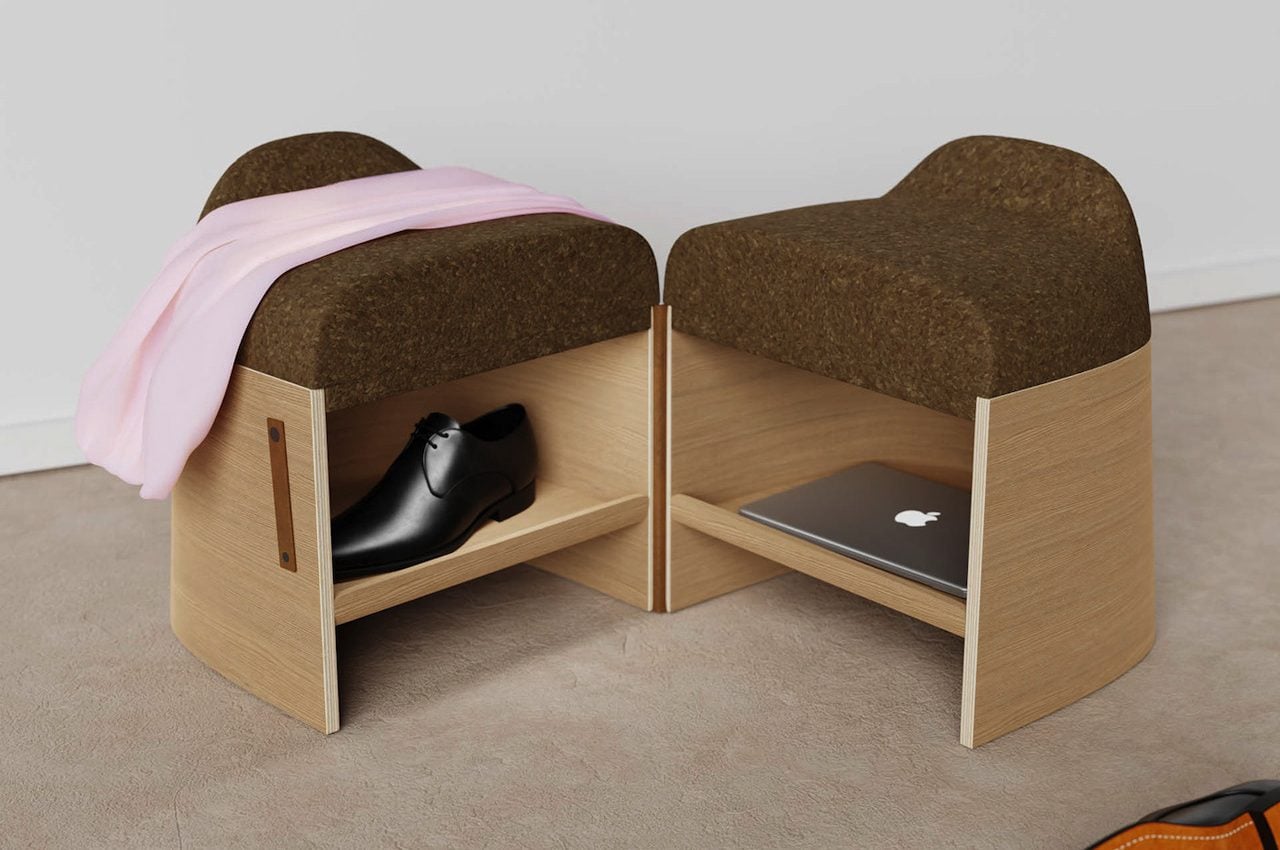
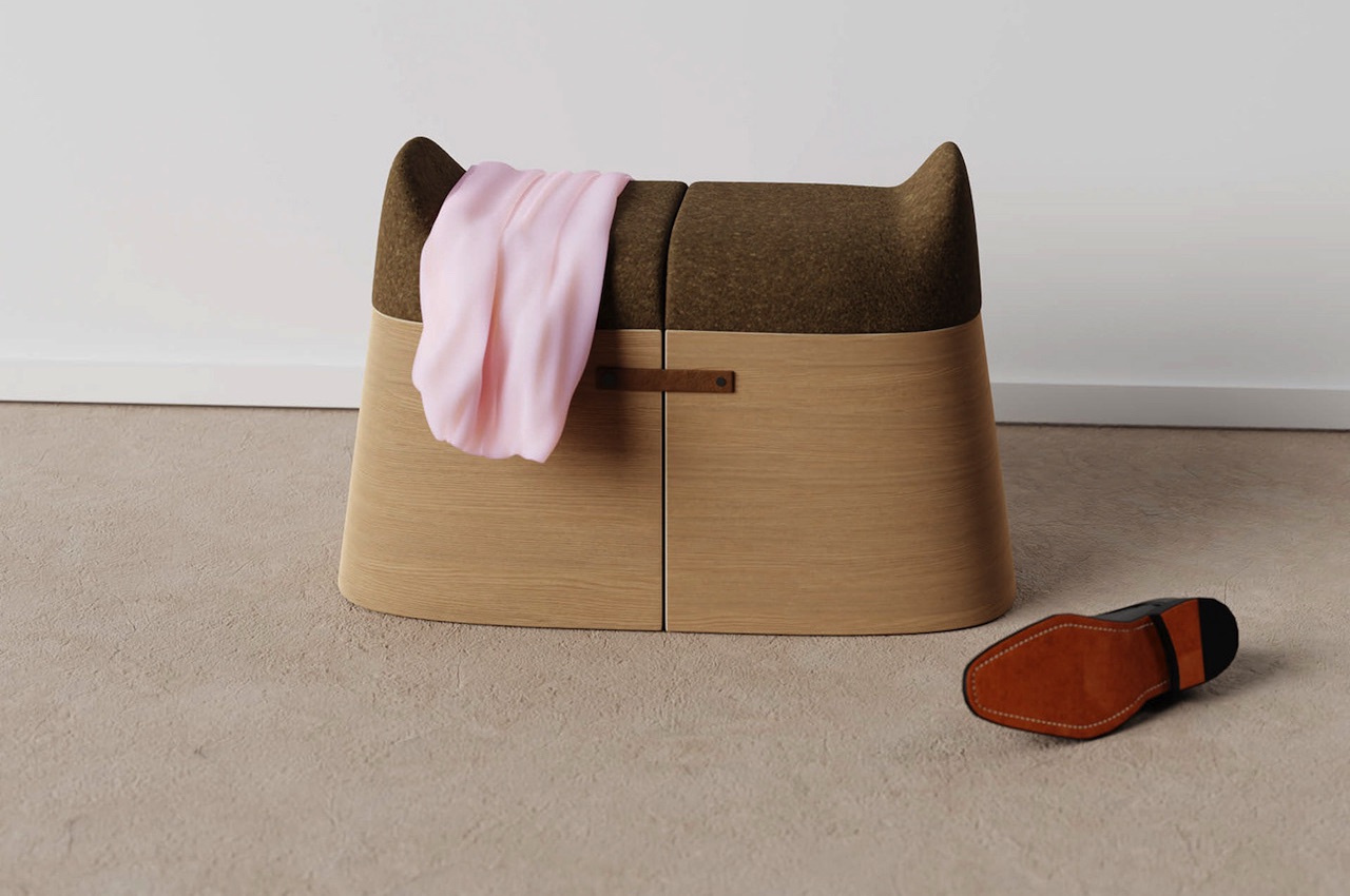
This is just a stool, but its particular purpose is to make two persons live in unity. How? You open the stool system and separate the parts to seat two persons. Some people will probably not understand the point because the stools are too close, but the Bond can be perfect for couples always on the go.
Why is it noteworthy?
If you and your partner love going out, you can sit together on the stools while you wear your shoes and before you head out the door. Bond is just to be closer with one another because, you know, some couples just can get enough of each other. The Bond stool system also features some storage space inside. You can put anything inside, like maybe your shoes or your laptop. Likewise, you can probably put there your purse or just about anything you don’t want to forget.
What we like
- The Bond is mainly made of wooden material, so you know it’s durable enough to withstand the test of time
- Space-saving form
What we dislike
- No complaints!
3. Spectator
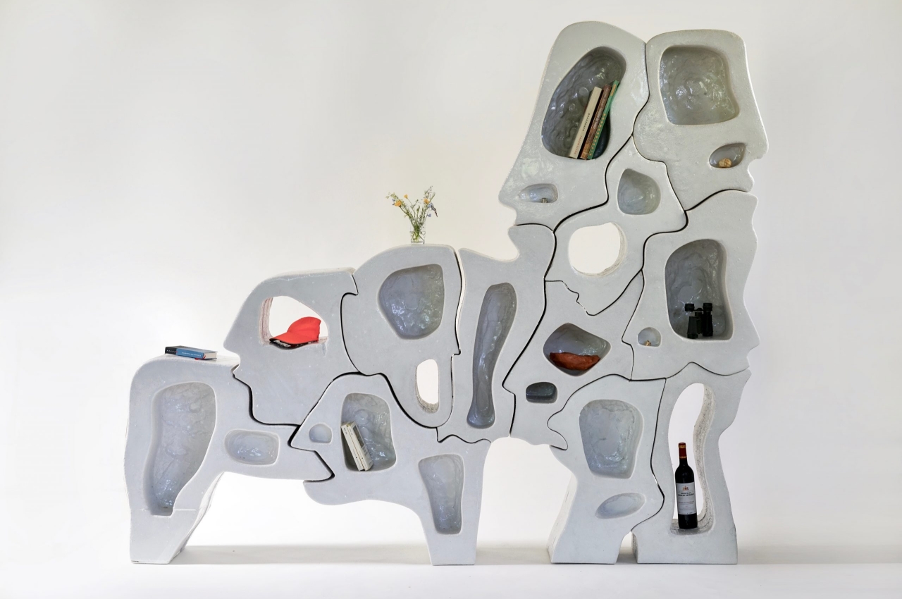
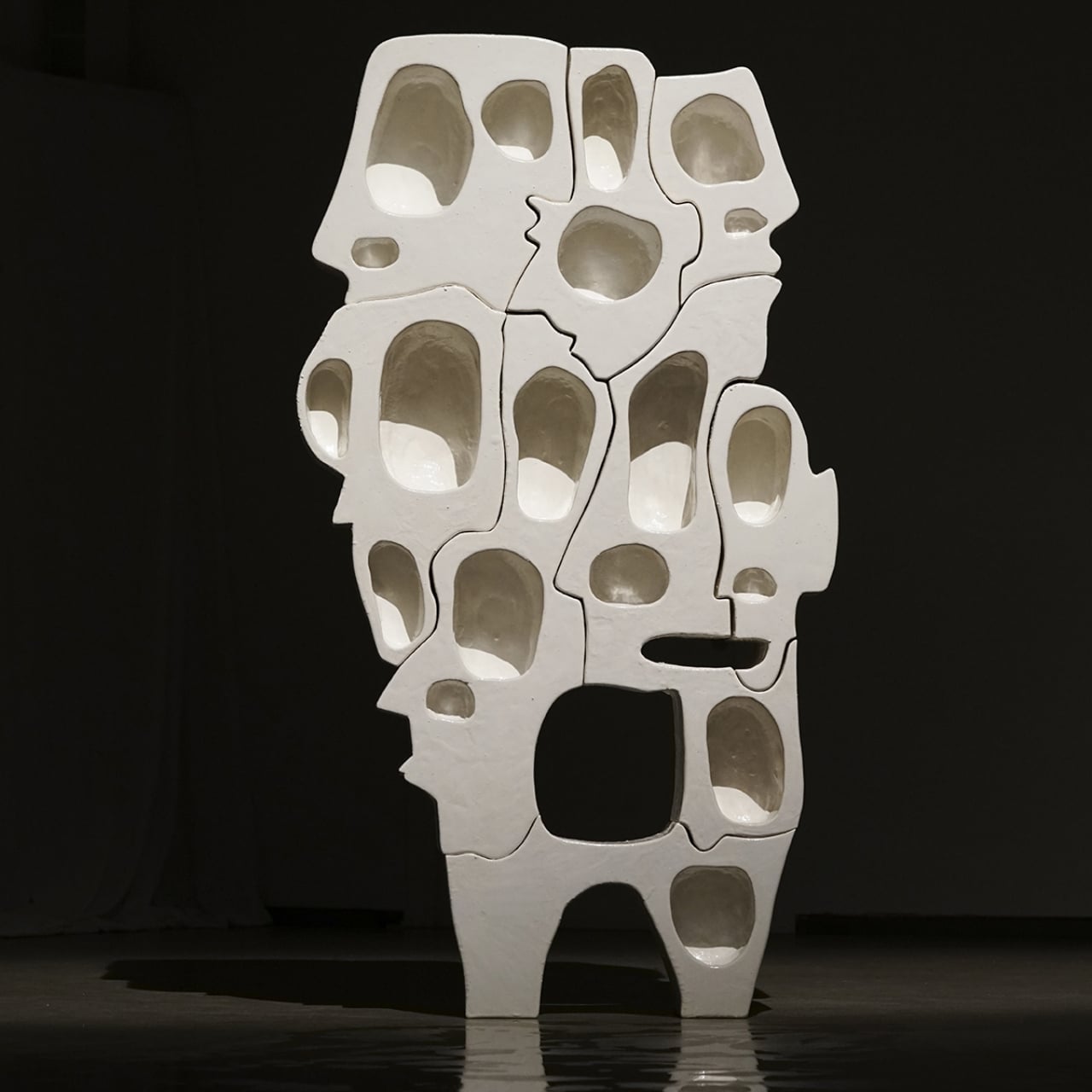
Named ‘Spectator’, this intriguing bookshelf definitely looks as if it’s staring right back at you! It seems to be made of interlocking jigsaw puzzle pieces, and each piece looks like a distorted human face!
Why is it noteworthy?
The Spectator Series of shelves is as much a psychological art piece as it is a piece of furniture. In its small way, it demonstrates the wonder of our brains that try to fill in the gaps to complete forms and ideas, like how it is able to see faces in shapes that are so far removed from human heads. With so many faces hiding in plain sight, the roles of observer and observed are also reversed, at least in our mind’s eye again.
What we like
- The shelf adheres to minimalist design principles despite the odd shapes of its pieces
What we dislike
- Not everybody would like the aesthetics of this piece
4. The Nook Desk
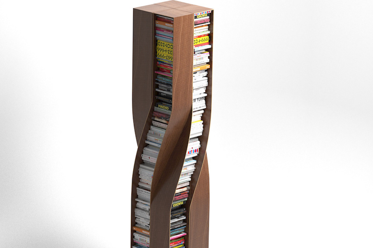
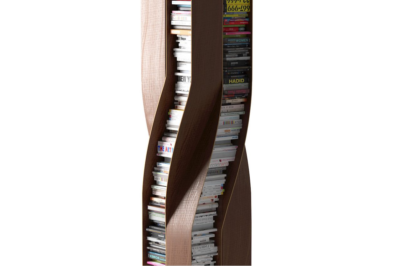
Prolific German furniture designer Deniz Aktay has recently introduced the Plot Twist Bookshelf. It’s a piece of furniture that features four separate twisted wooden elements. They are connected to each other, shaping and creating a stable form.
Why is it noteworthy?
The bookshelf’s design allows it to be accessed from every side. As with most of Deniz Aktay’s product designs, this bookshelf is oddly satisfying. The curves are present as with the designer’s other projects. In addition, most of Aktay’s works have undergone some bending or twisting, as with the Wavelet, the Tie Stool, and The Pet Table.
What we like
- The shelves can accommodate similarly sized books for a clutter-free look
- The bookshelf is stable and stands on its own
What we dislike
- Space consuming design
5. The Zipper Bookshelf
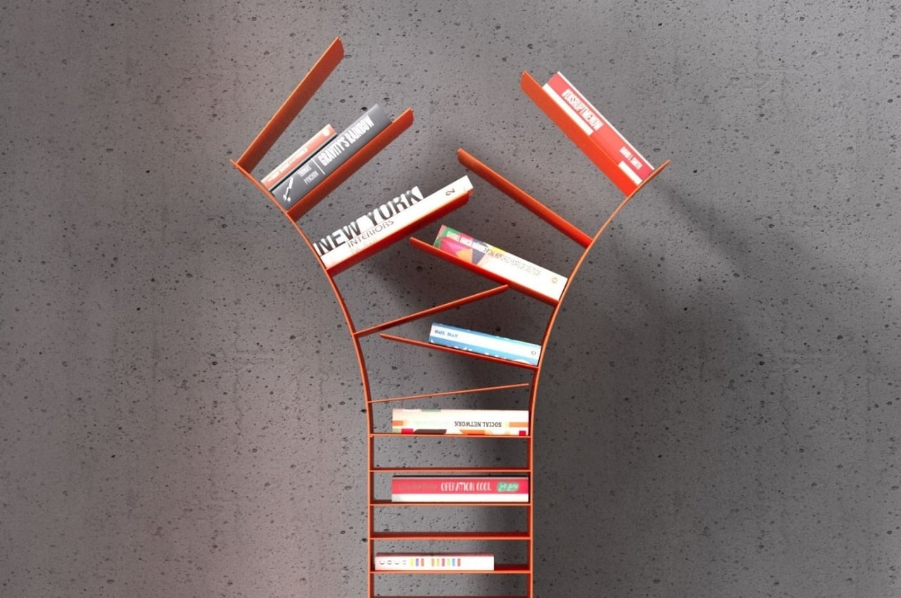
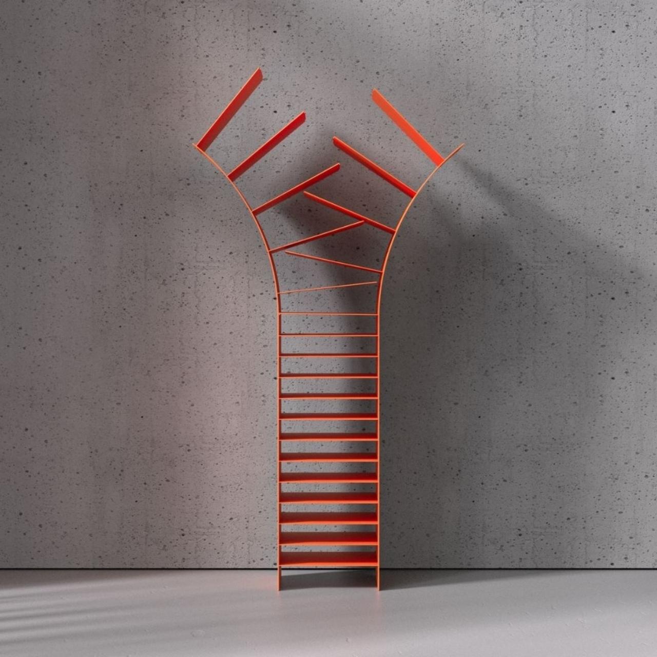
What you normally look for in a bookshelf is functionality over form. You need something where you can store your books and decorations. But sometimes, you also need something that looks good and will show off just some of your selected titles. For that, you can choose some kind of unique design that will make it not just a piece of furniture but a decorative showcase for your favorite books. The Zipper Bookshelf is one such creative execution for a metal bookshelf.
Why is it noteworthy?
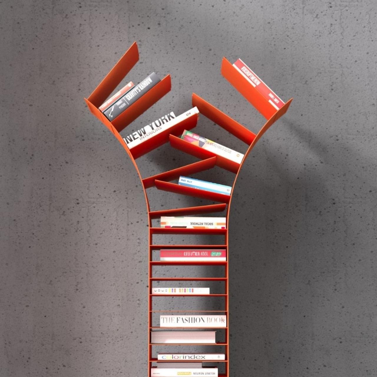
The Germany-based designer thought of creating a bookshelf that can represent the analogy of opening a book “where the pages diverge”. For this, he got inspiration from an unlikely source: the zipper. The bottom of the structure starts out simply enough with some regular-looking shelves that will fit some thin books or at least one thick coffee table book. It then breaks apart as you go to the top and open up, just like you would a zipper.
What we like
- The top can display your books like they were on tree branches
What we dislike
- No complaints!
6. Mate
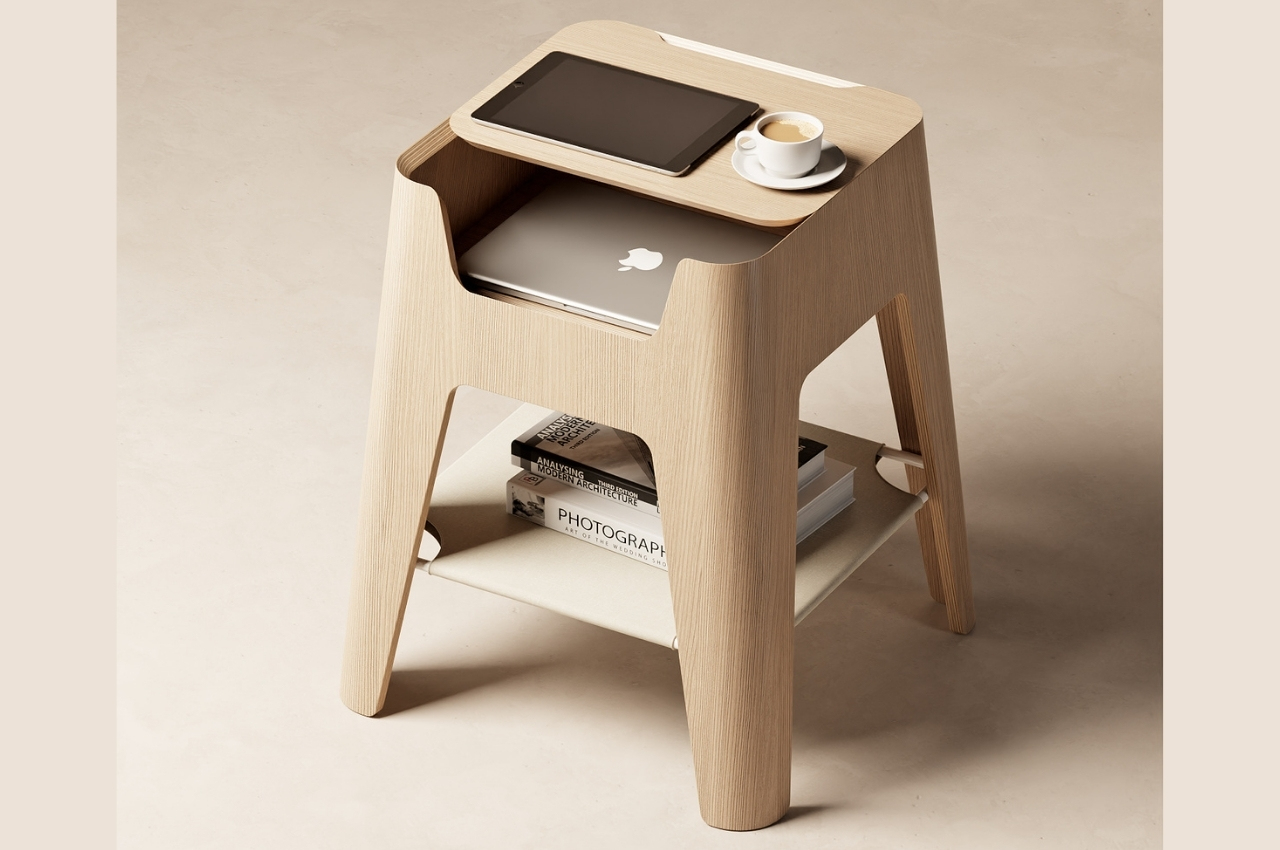
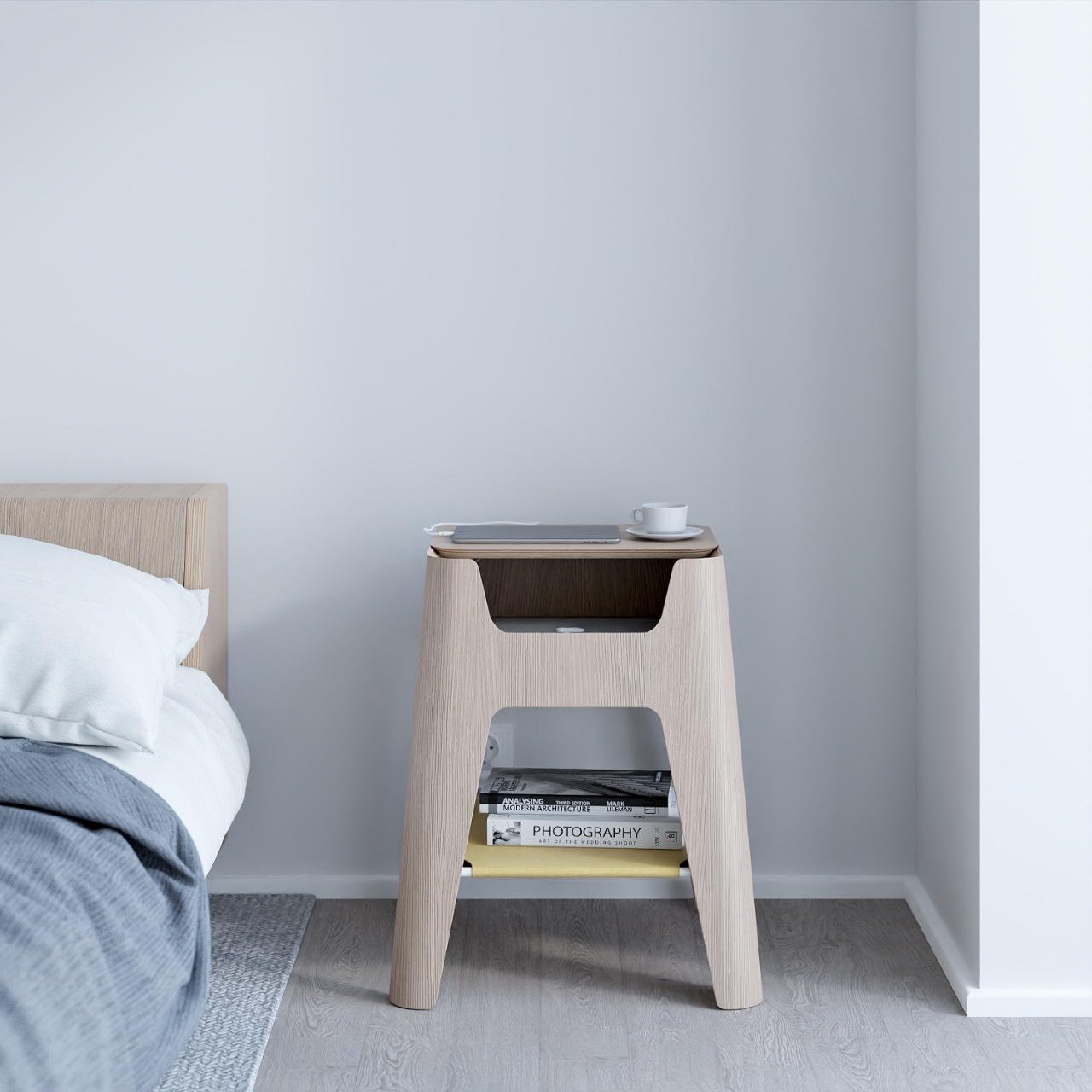
For those who don’t have actual side tables in their bedroom, the next best thing would be a chair or stool. That became the inspiration for the design of this bedside table called Mate. It is designed to look like a stool but its main purpose is to store all of the things that you “need” before you sleep and that includes devices.
Why is it noteworthy?
The top view actually looks like a breakfast tray or a laptop tray that you would use to eat or work (or both) in bed. And yes, that is actually the other component of this clever design. So you get a chair-inspired design for your bedside table with a minimalist but functional feel. Your laptop and other gadgets can fit at the top part and you can have other stuff like books, journals, and other bedside needs at the “shelf” at the bottom.
What we like
- Has rounded corners and some holes where you can fit in your cords so you don’t get strangled by the tangles of wires that accompany your devices
- Slidable and removable tabletop
What we dislike
- No complaints!
7. Wave Bookshelf

Usually, our idea of bookshelves is just square or rectangular boxes or shapes where you can just store your books. But every once in a while we get some that are designed not just to display our well-loved books but also to add a bit of style to your living room or bedroom. The Wave bookshelf is one such item as it is pretty eye-catching and can serve several purposes aside from just being a piece of furniture where you can place your books.
Why is it noteworthy?
This bookshelf has a traditional rectangular frame and at first glance seems like something that would be at home in your bathroom because of the grid-shaped pattern. But the geometric intershapes built within the structure and the metal wireframe construction give it a different look and allow you to place books in different positions within the entire shelf. You can place books at a 45-degree angle and you can place the thin ones or the magazines in the small spaces in between.
What we like
- The top of the interspaces can also be used as a sort of “bookmark” for your books
- Interesting-looking bookshelf
What we dislike
- No complaints!
8. June
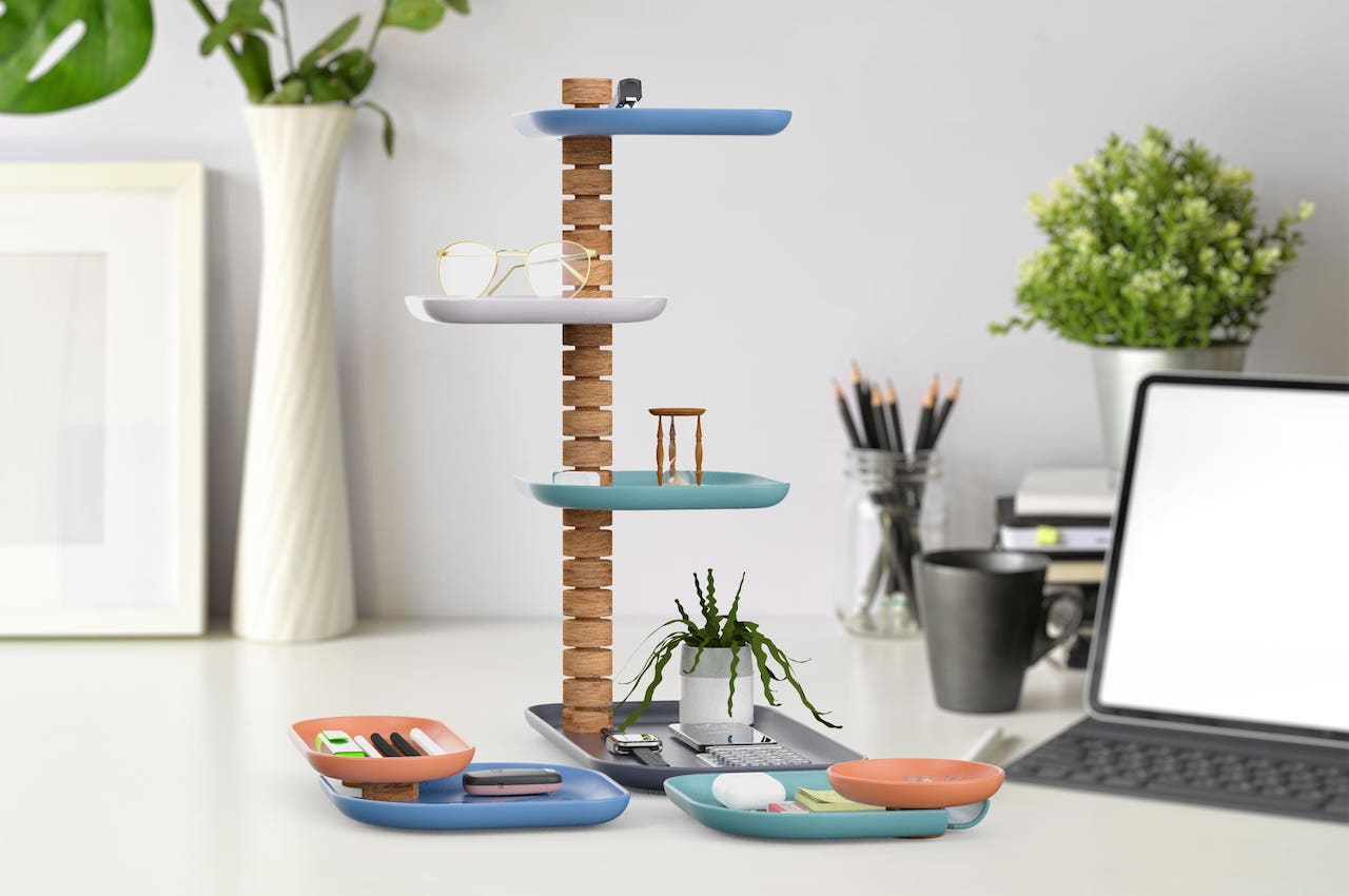

June is a new system or storage and display trays that may be helpful to those who want to Marie Kondo their stuff. No, this won’t really carry all your things, but it looks like a fun and stylish way to keep things clean and tidy. Of course, having a clean and clutter-free desk is necessary, especially if you want to get work done quickly and smartly.
Why is it noteworthy?
June is designed as a versatile system of storage and display trays. This desk accessory is very functional and practical for anyone with a work desk. This modern organizing system is based on the idea that storing things vertically can be more efficient. Such vertical solutions save up desk or counter space.
What we like
- The aesthetics of June is modern with a hint of mid-century
- You can use it in your office, bedroom, dining room, or kitchen
What we dislike
- No complaints!
9. Wallganize
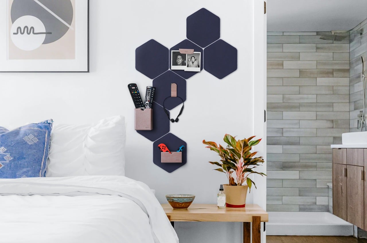
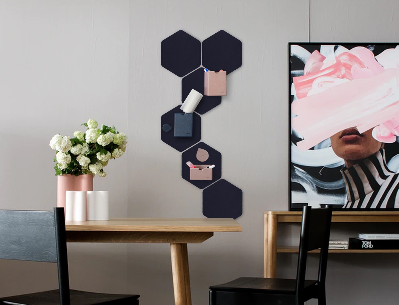
Organizers and containers that stick to walls aren’t exactly new, but Wallganize adds a touch of magic to them. It isn’t simply a collection of boxes, clips, and rings that you stick on a wall. It is, instead, a system that offers both a platform and a set of modules that firmly attach to those platforms using strong magnets, letting you mix and match as you need and please.
Why is it noteworthy?
Wallganize has three platforms or bases that you “stick” your containers on. The BlankStatic is your most basic, rectangular sheet of magnet where you can attach boxes or whatnot willy-nilly. There’s also an “Attachnote” platform, which is practically a magnetic notebook organizer for those times when you can’t take your wall with you.
What we like
- You can create your own pattern of hexagons to liven up your wall while still helping you keep your life uncluttered
- You can simply rearrange the boxes or even relocate the platforms to another part of the wall
What we dislike
- No complaints!
10. Wolf Stool
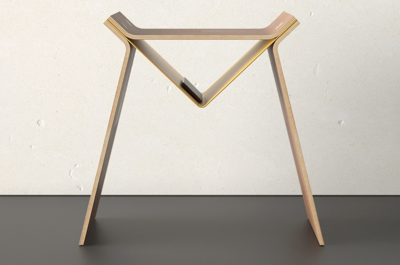
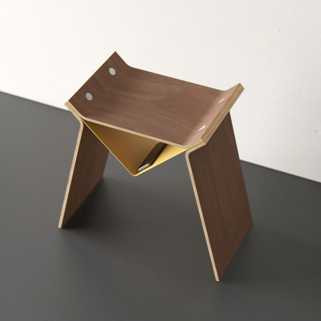
Are you the kind of person who would look at clouds and try to see what shapes or creatures you can see there? If yes then you’re probably a pretty creative person who can see all sorts of things in different figures and structures even without hearing the name of the product concept. So even though there’s no description or explanation, you probably understand why this new product concept for a stool is called Wolf.
Why is it noteworthy?
The German-based designer is making a name for himself with his unique takes on simple furniture like bookshelves, lamps, and chairs. This new concept for a stool is called Wolf and if you let your imagination run a little wild, you’ll be able to see a wolf in the shape of this minimalist piece of furniture. In fact, the shape of the stool looks like a logo for a new video game or a brand that gives off a scary, wolf vibe.
What we like
- The triangular middle part can actually be turned into a small storage area
What we dislike
- Doesn’t seem like a very cozy seating space

