All the hype around the mid-range rockstar, Nothing Phone (1), is not a mere fad as the smartphone is designed for simplicity and deeper interaction. The brand’s inaugural product, the ear (1) TWS earbuds also garnered attention for good reason. So, what direction will Car Pei’s adventure head onto next? If we are to believe this concept design, it’s going to be a classy wearable.
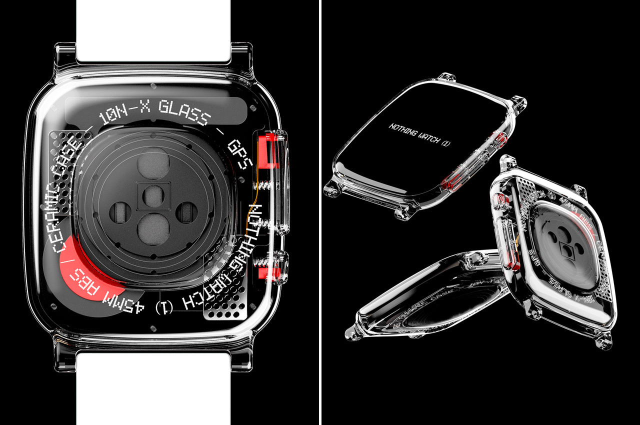
A smartwatch that carries the brand’s signature see-through aesthetics and a simple design that lays focus on functionality. What’s it going to be called from all the presumable options? Well, quite obviously the Nothing Watch (1). What else could a Nothing gadget be named other than this.
Designer: JunSeo Oh
The concept design smartwatch is as attractive a wearable could be imagined as, and the Apple Watch influence is predictable. That’s because the official Nothing Phone (1) has the evident structural semblance to the iPhone 13. That transparent dial, sides and the backplate makes me wish this product actually hits Carl’s checklist for the next winning product to create ripples in the market.
This one is not the sole concept design envisioning an incoming smartwatch gadget from the company – Gian Luigi Singh’s Wrist (1) smartwatch concept is a prime example. That one though had more of an iPhone 13 like design inspiration to it, while the concept by JunSeo is more eye-pleasing according to my perspective. The see through character is more attractive, and the renders created by the designer clearly display the unique persona of this 45mm ceramic case smartwatch.
The crown and the mode selector buttons on the side expose the innards just like on the backplate made of clear glass. For ergonomic comfort and better readability for the sensors, the glass is a slightly raised from the middle section to sit flush on the skin without any discomfort. The glass-skinned look is complemented by the high quality strap in white.
Looking at the logical aspect of things, it’ll be pretty unlikely that Nothing will go for this all out transparent look, as we’ve seen in the recently released smartphone design. However, these see-through aesthetics do appeal me wildly without doubt, and it gets my thumbs up for the uniqueness of design.