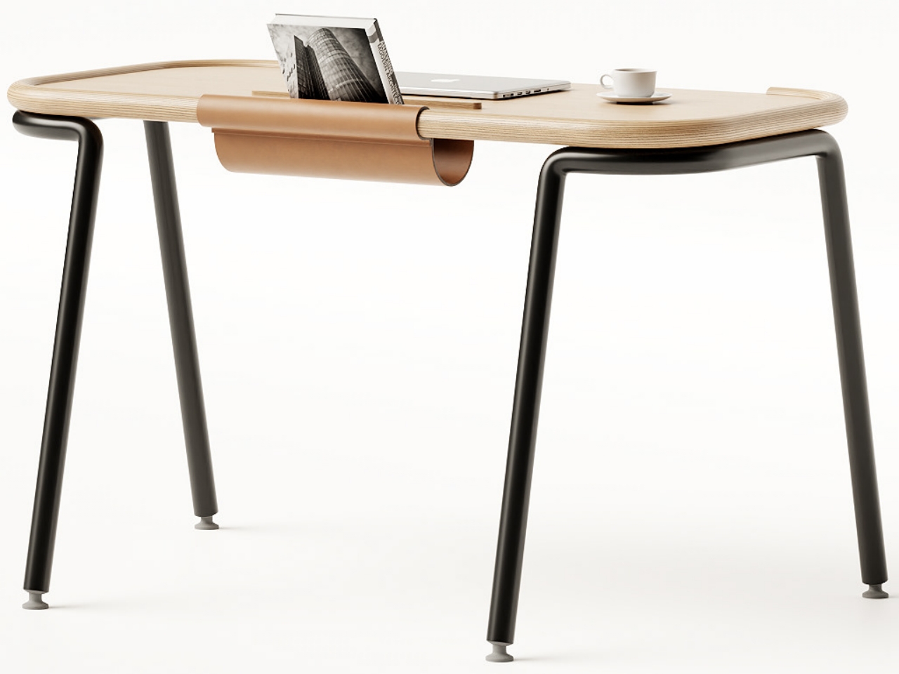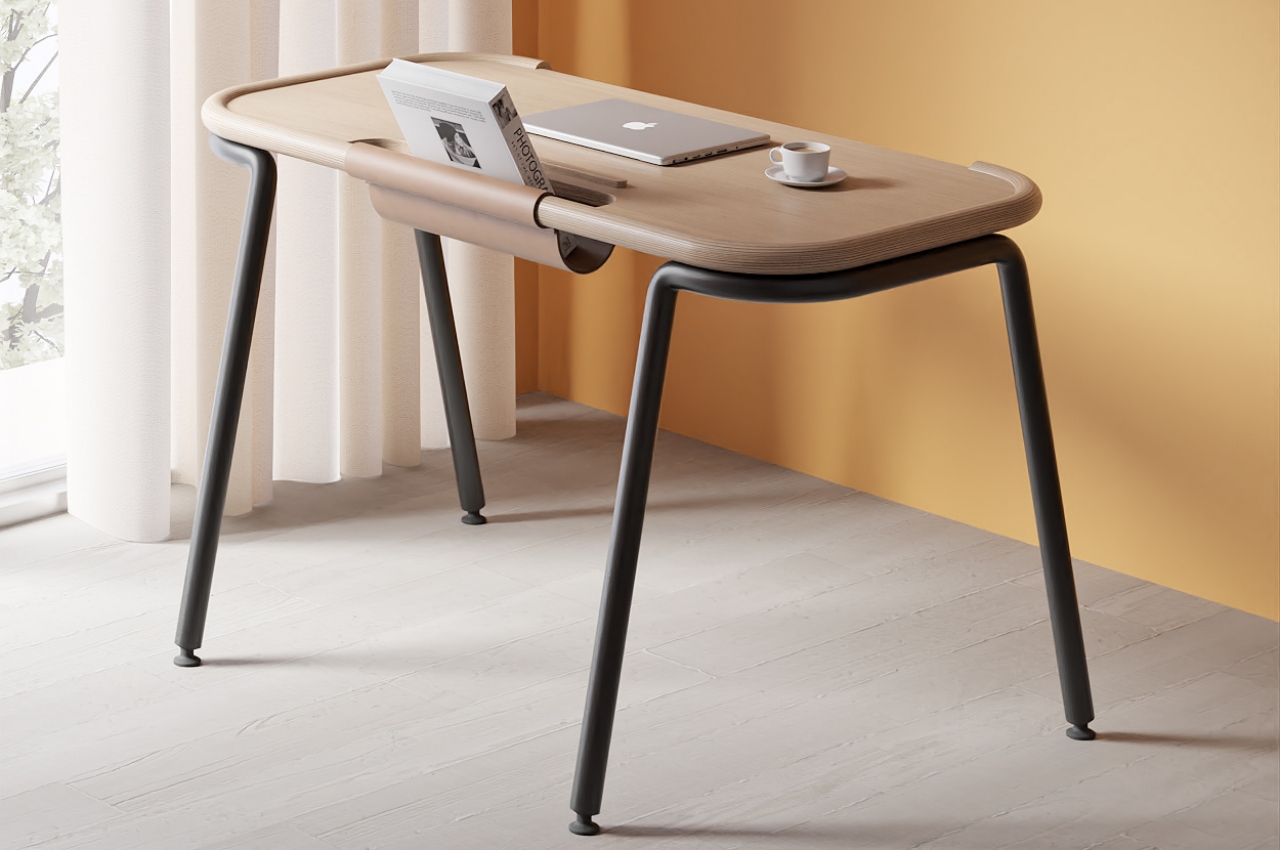
Desks come in a variety of sizes to fit not just available space but also the owner’s habits and preferences. Some like keeping a small table to make room for other pieces of furniture, but most people probably opt for wider and larger surfaces where they can put a lot of things on top. Large desks with many drawers are double-edged swords, though. While they do keep your tools within easy reach, they also invite clutter to pile up until you’re overwhelmed visually and mentally. The Pocket desk concept design errs on the side of simplicity and minimalism, giving you just enough space for what you need at a given time and room for only one book at a time.
Designer: Joao Teixeira
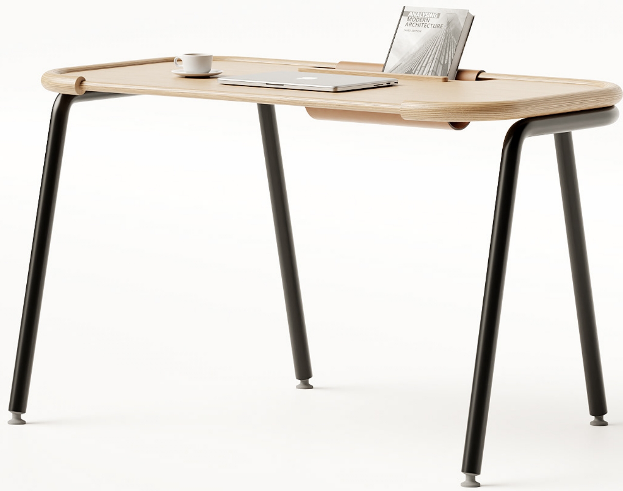
While some feel that limitations and constraints can be suffocating, they can also be ironically liberating in some sense. They make you really consider what’s essential and get rid of excess baggage. When applied to product design and furniture, those constraints force you to Marie Kondo ideas and things, throwing away what isn’t necessary, whether for good or for the time being.
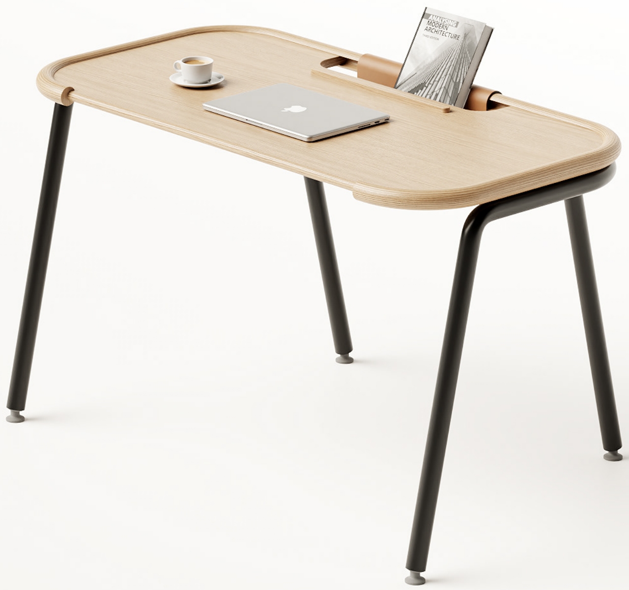
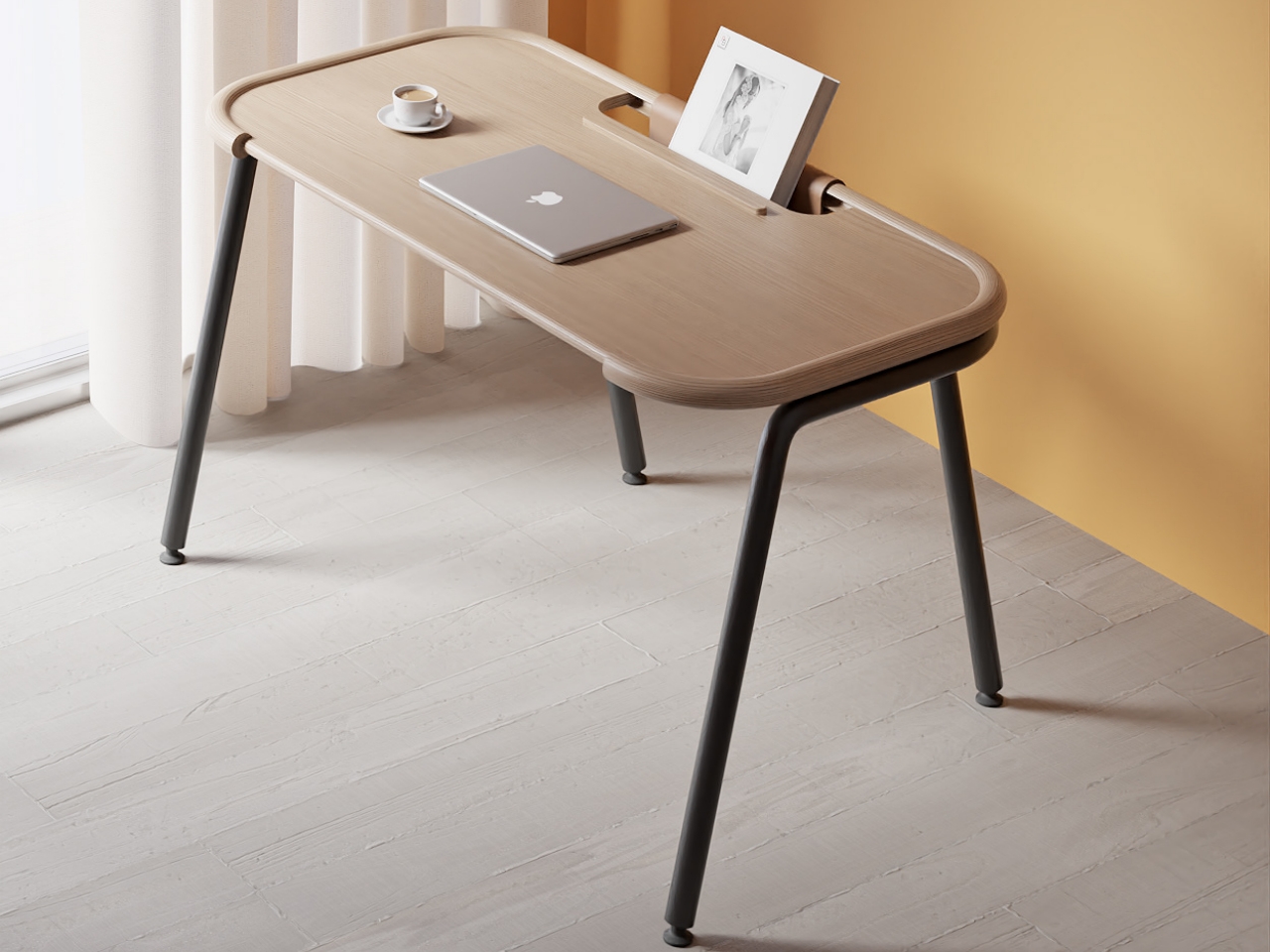
The Pocket desk’s simplicity is exactly like this. There are no drawers or hidden compartments where unnecessary stuff can creep in and pile up. Whether you’re using it as a workstation that you clean up every day or as a more permanent desk, the limited area really pushes you to pare down and only put what you need on top. Despite that simplicity, however, the desk actually has some interesting highlights, both in terms of function as well as visual design.
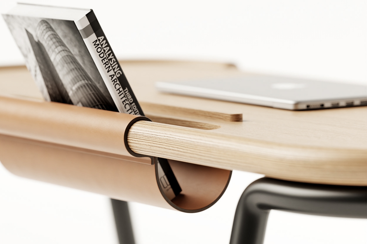
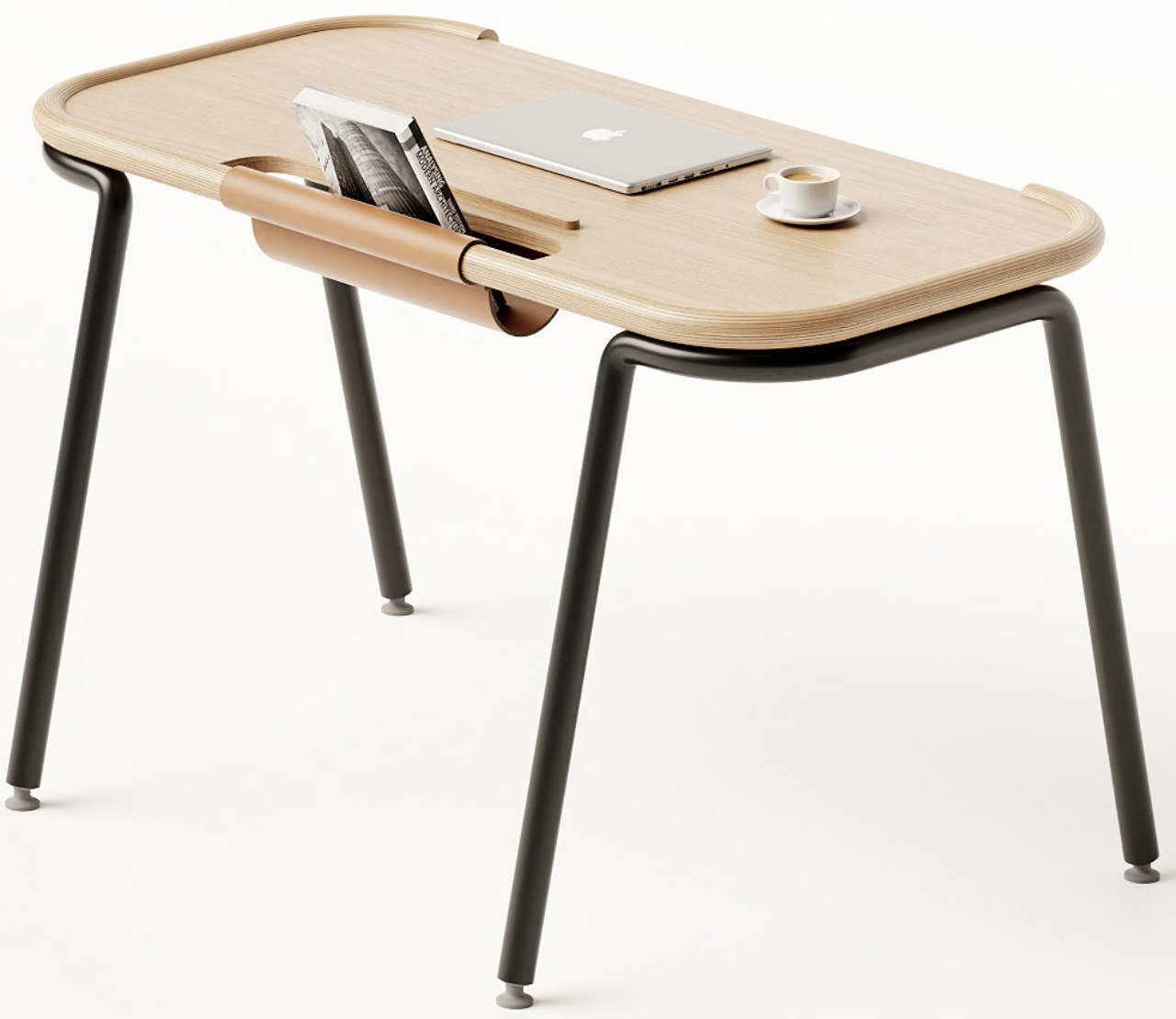
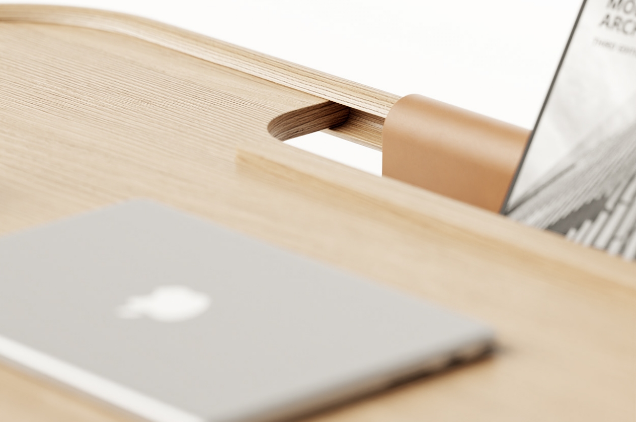
Its name actually comes from the pocket at the back that serves as a bookstand. You won’t be reading from this position, of course, and it acts more as a temporary holding ground for a book that you might be reading currently. There’s little room for more books on top of the desk, so it sends a message of only biting what you can chew when it comes to reading material. It isn’t a simple cutout either and uses a leather sheet to cradle the book inside.
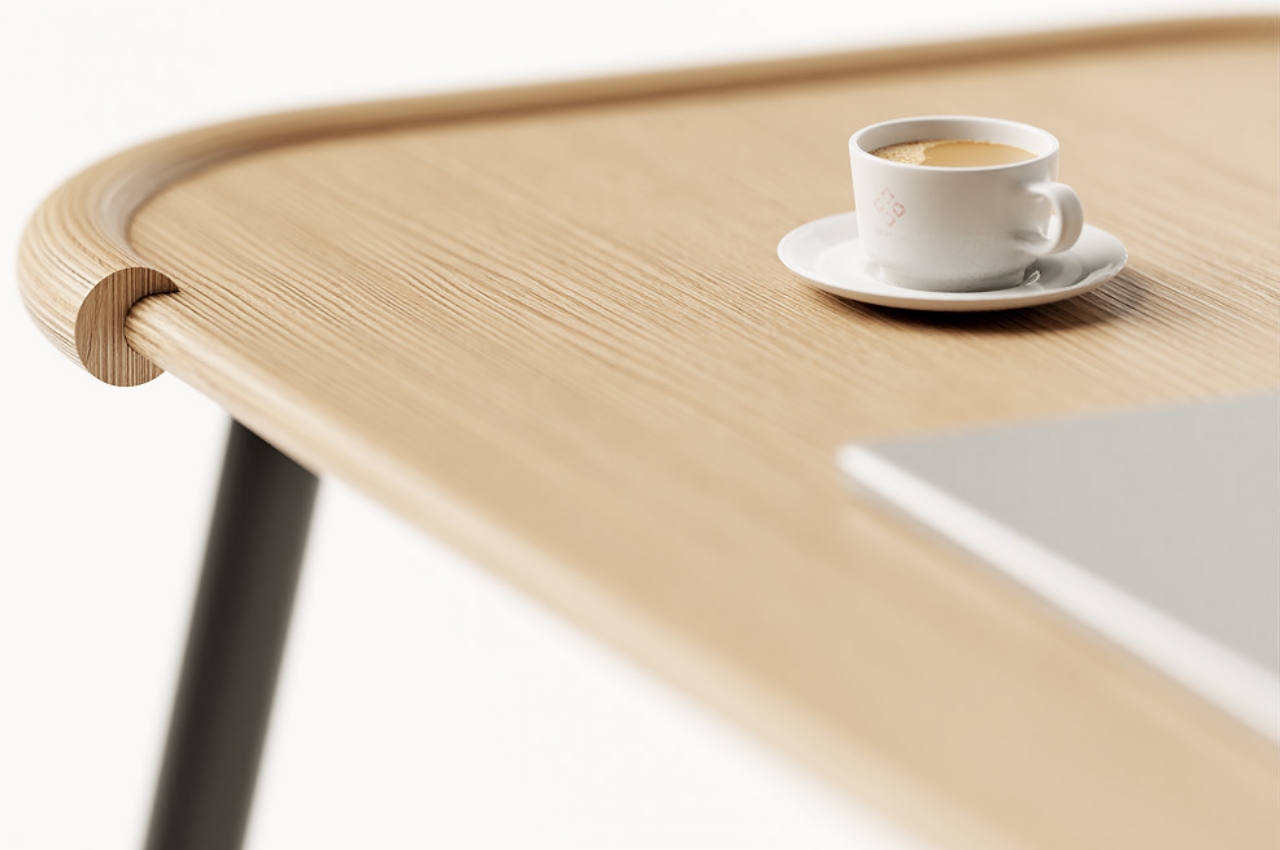
The Pocket desk also seems to have a tube theme going for it, and not just because of the metal legs that hold it up. Instead of having four separate legs, Pocket has two tubes on each side that bend and curve to support the desk. The tabletop joints are also tubular, with the actual top inserted inside. This gives the impression of embracing the tabletop while also keeping its arms open to the person sitting in front of it.
Pocket’s design is supposed to be about valuing details, none of which scream their presence into your face. Subtle visual cues like shapes and contrasting materials create an interesting visual that adds some life to a room. Its simple forms and simple functions make it a good option for space-constrained people, if only because it will make them think about what’s essential and what can be kept away from your desk.
