The Razr seems to have lost its ‘edge’.
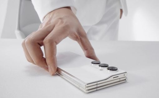
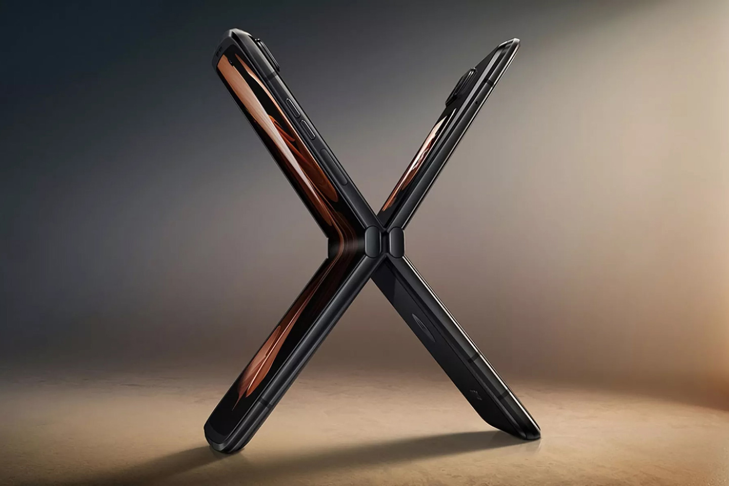
In what couldn’t have been a more shitty time to announce the new Moto Razr, the company decided to do it in the same 24-hour period that Samsung announced their new Galaxy Z Flip4 phone. The worst part? The Moto Razr 2022 sort of looks exactly the same as the Galaxy ZFlip 4, with the vertical folding design, and what really seems like a ‘blunter design’, going entirely against the phone’s one defining character – its razor-sharp design. To add insult to injury, the phone only seems to be available to its Chinese audience, so as much as I’d like to see one on the shelves and get a better look at it, that doesn’t seem to be on the cards.
Designer: Motorola
Although the company’s strategy to only focus on the Chinese market seems odd, it makes sense given two reasons – A. The initial folding Moto Razr had a rocky start with various technical and hardware difficulties, and B. China has consistently recorded the highest number of foldable sales ever since the Royole Flexpai – so I wouldn’t be surprised if this was a business decision.
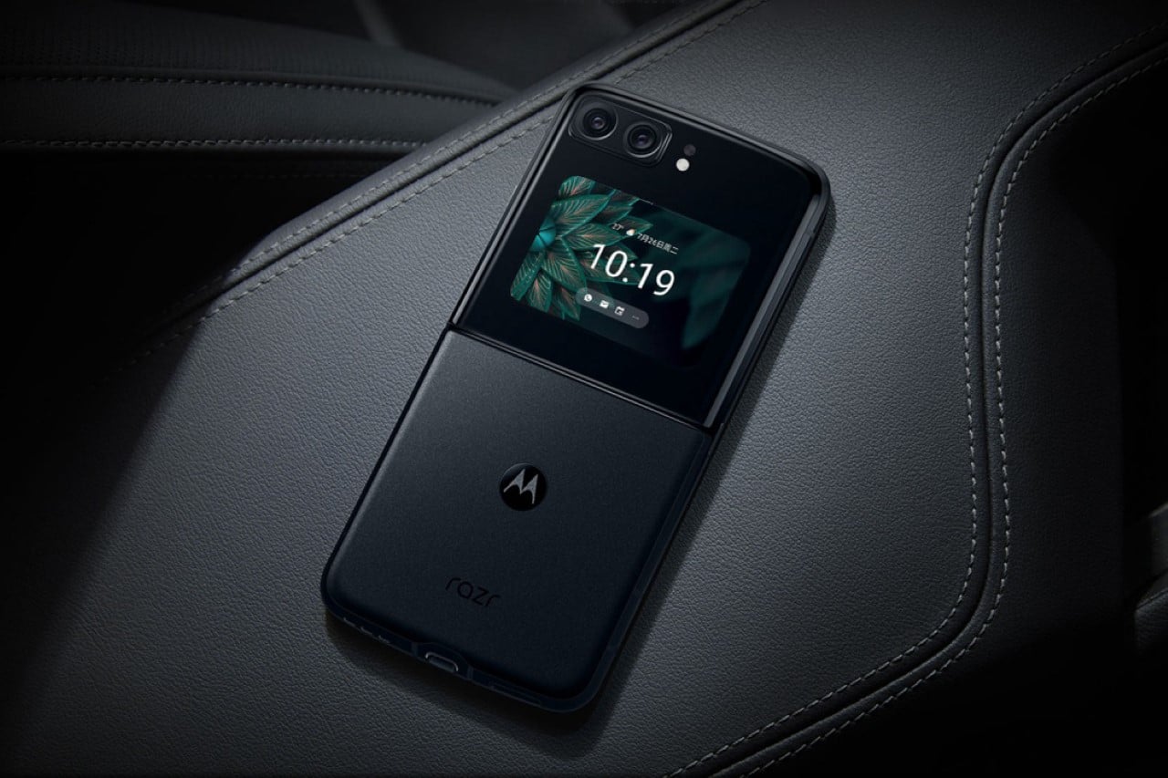
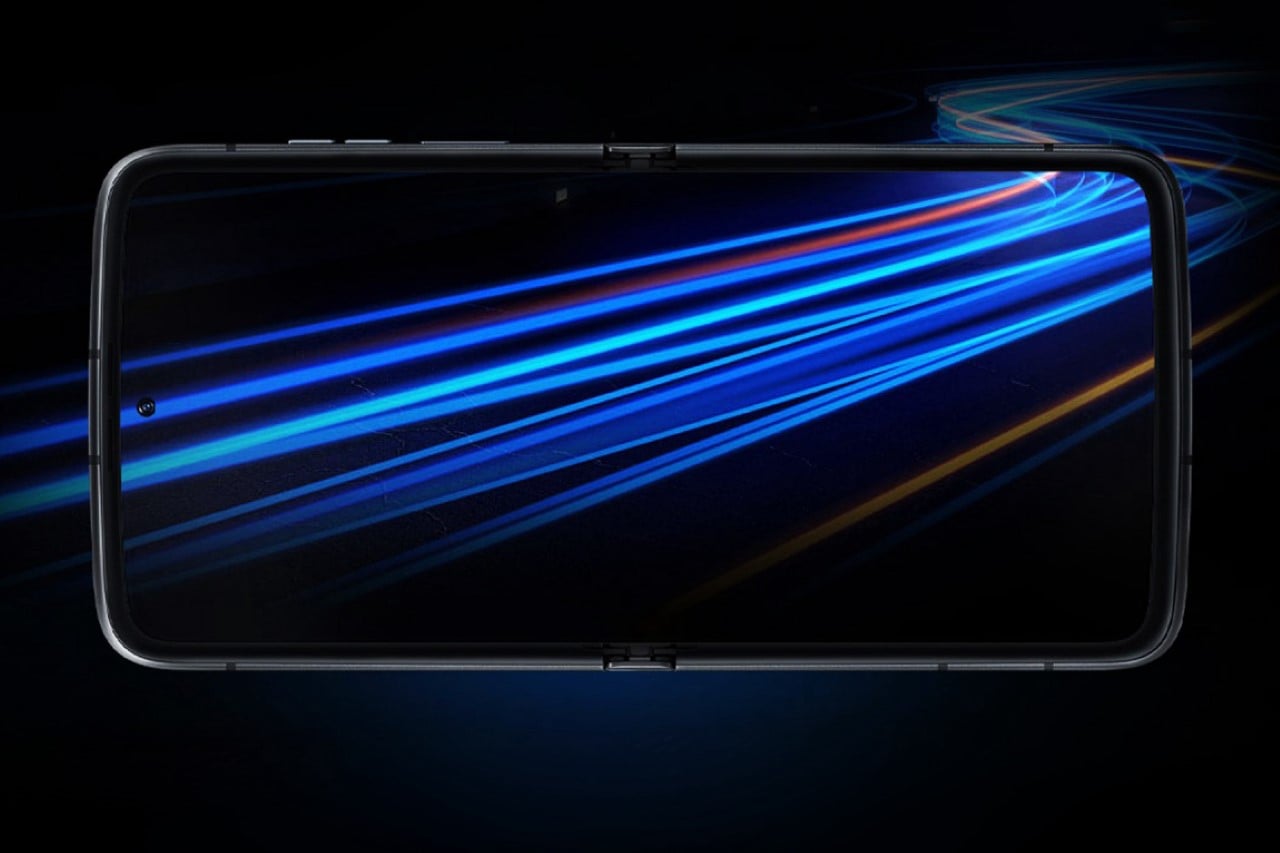
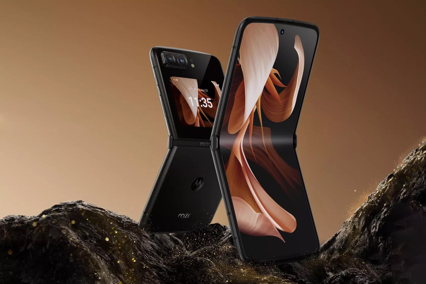
However, just an analysis on the phone itself: Objectively, the Razr 2022 is a pretty great phone. It looks a lot more streamlined and has a larger outer screen and two primary cameras. It also ditches that weird thick chin that the previous phone had, which I appreciate because it allows the folding display to look fuller, but it seems like that chin’s disappearance now makes the phone look thicker in comparison (even though it’s 0.3mm thinner than its 2020 predecessor). Besides, the top of the Razr always had a sharp edge that sat flush against the chin when closed. Without the chin, the top of the phone loses that sharp edge, making it look ‘blunt’. I’m a little confused about how I feel because not only is the Razr phone no longer razor-sharp looking, but it also means the phone looks almost exactly like the Z Flip 4, which also has a larger outer screen, two primary cameras, and a top-to-bottom folding display with a hole-punch camera. In an ideal world where the Z Flip4 didn’t exist, the Razr would look like a pretty remarkable handset, but all factors considered (along with the unshakeable feeling that the new Razr feels less ‘razor-like’), the 2022 Moto Razr just doesn’t seem ‘cutting edge’.
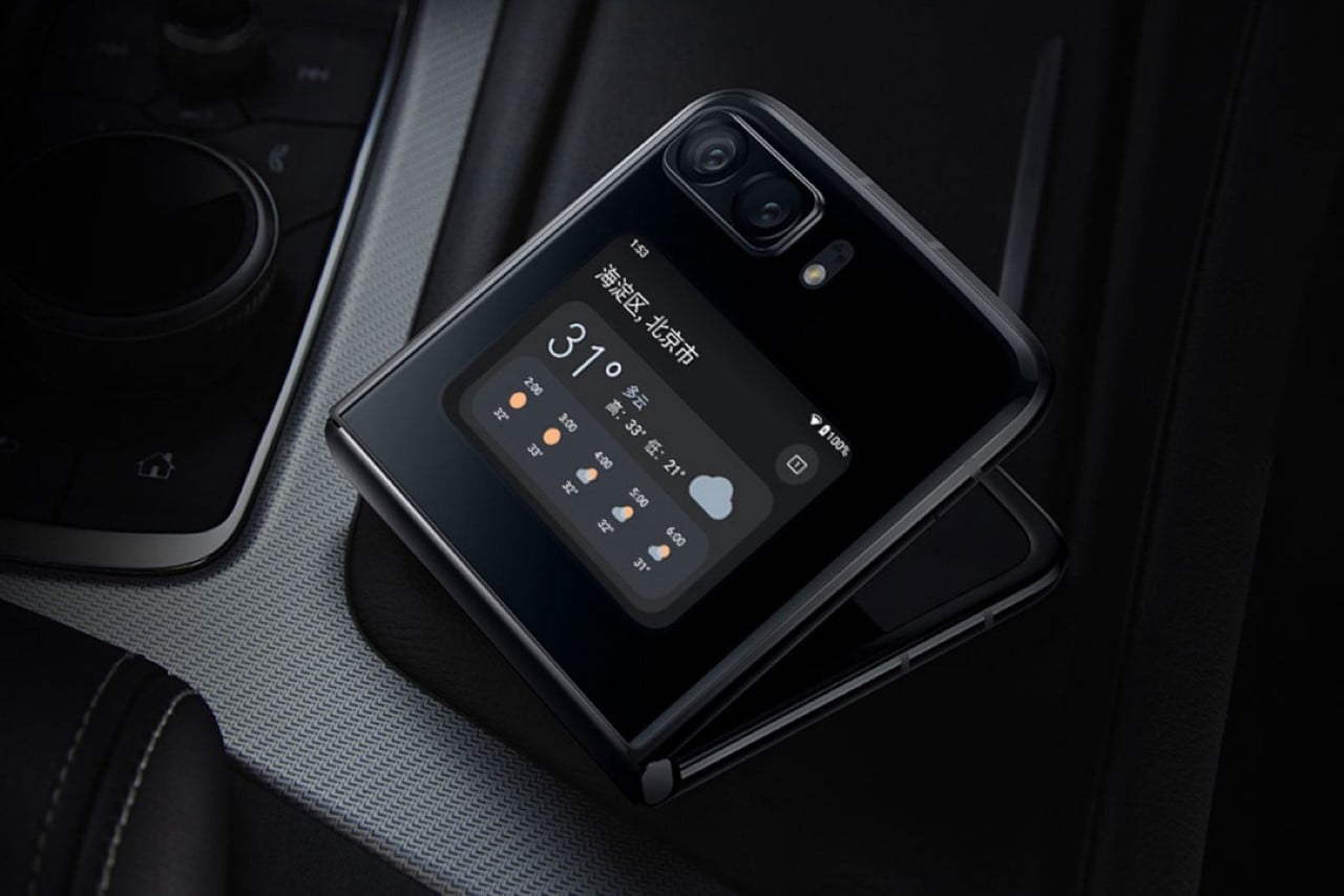
To just get the specifics out of the way, the new 2022 Razr now comes with a 6.7-inch foldable P-OLED FHD+ panel with a 144Hz refresh rate, along with a 2.7-inch P-OLED cover display that works for viewing notifications, accessing unique widgets, and using ad the viewfinder for the two primary cameras. The dual cameras feature a 13-megapixel ultra-wide camera and a 50-megapixel OIS-enabled shooter. There’s a third hole punch camera on the inside, which is equipped with a 32-megapixel sensor.
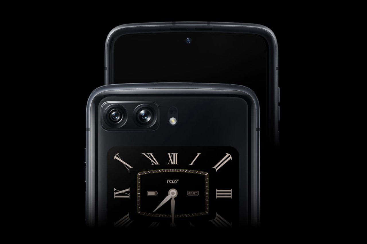
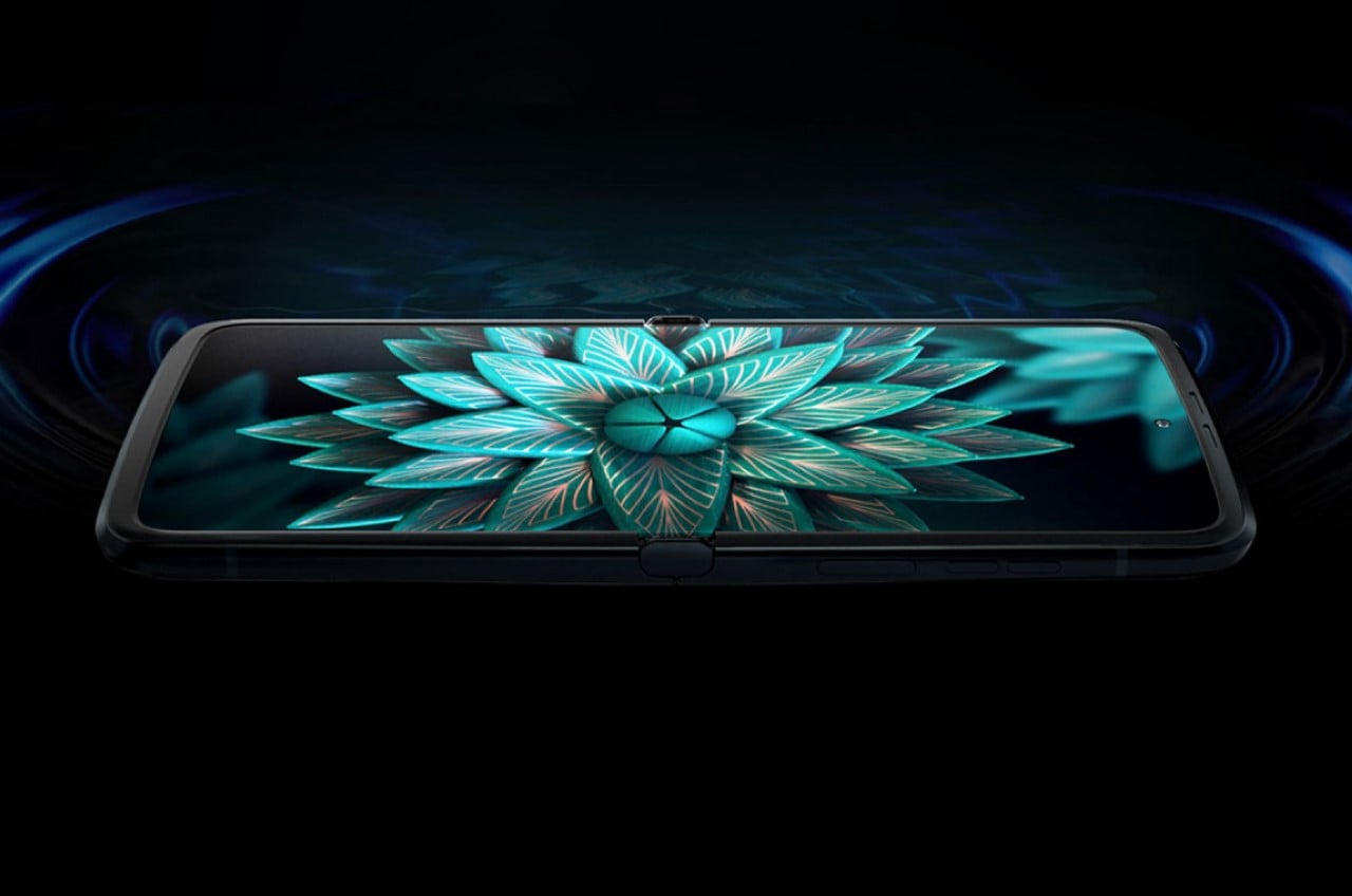
Don’t get me wrong – the Razr 2022 isn’t a bad phone. It’s just not as exciting anymore in visual and overall appeal, also in part because the rest of the world outside China won’t get their hands on it. The phone packs a 3,500mAh battery with support for a 33W fast charger (although I’m not sure if the charger comes with the box). Other features include dual SIM support (which is a big deal in the Asian market), 5G, Wi-Fi 6E, Bluetooth 5.2, NFC, and obviously, a USB-C charging port.
The phone is all set to launch on Monday, the 15th, with a price tag of 5999 Yuan (about $890) for a model with 8GB of RAM and 128GB of storage or 7299 ($1,082) for the higher specced model featuring 12GB RAM and 512GB of memory.
