Our current civilization lives and thrives on information. Although there’s no escaping physical reality, much of this information is now stored and transmitted digitally. And it’s not just the usual culprits like emails, messages, videos, and photos. Even locations and physical objects can sometimes have digital information attached to them, information that we can’t see with just our naked eyes. Augmented or mixed reality is one of the technologies that try to bridge the worlds of physical and digital, but experiencing it in real life isn’t as magical as it may sound or look. Headgear and eyewear designed for XR use have yet to become practical for everyday use, and this concept design tries to find a compromise between form and function for smart glasses that won’t make you look like a Borg.
Designer: Philipp Pisarevskiy
There have been various attempts at designing AR glasses that can be worn by normal people, and Google Glass may have been the most popular attempt. Its popularity, however, comes not just from the brand but also from how it failed. While the second-gen Glass still exists for some enterprise customers, the consumer version’s chances for success have pretty much died by now. And it’s probably for the best, considering the first Google Glass’ design was rather uninspiring and its functionality severely limited.
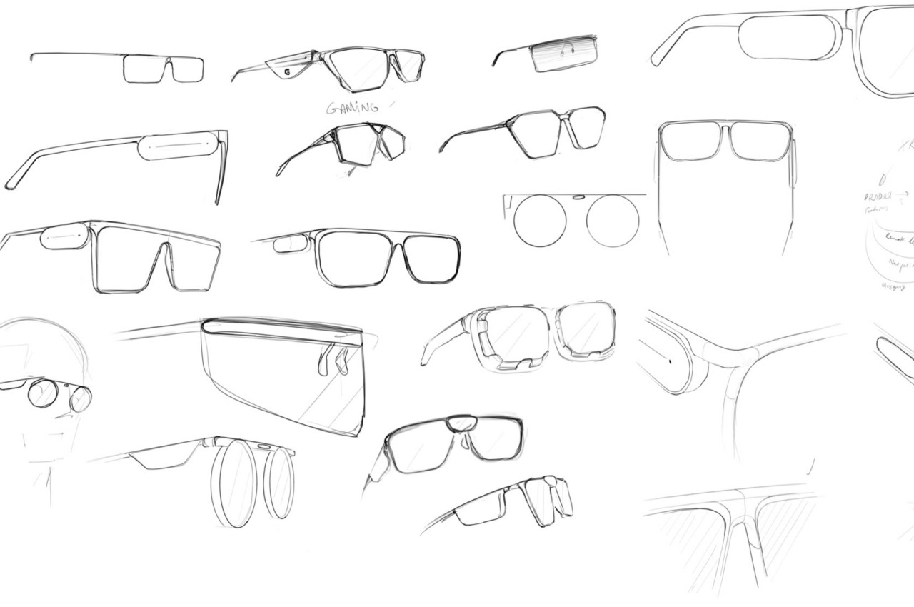
There have been many attempts since then to come up with the perfect design for AR-powered smart glasses. Some look like overgrown shades, while others were more promising as traditional-looking eyewear, albeit with thick frames and arms. The latter, however, is still limited because comfort and aesthetic might become compromised as you try to cram more electronics into its body.
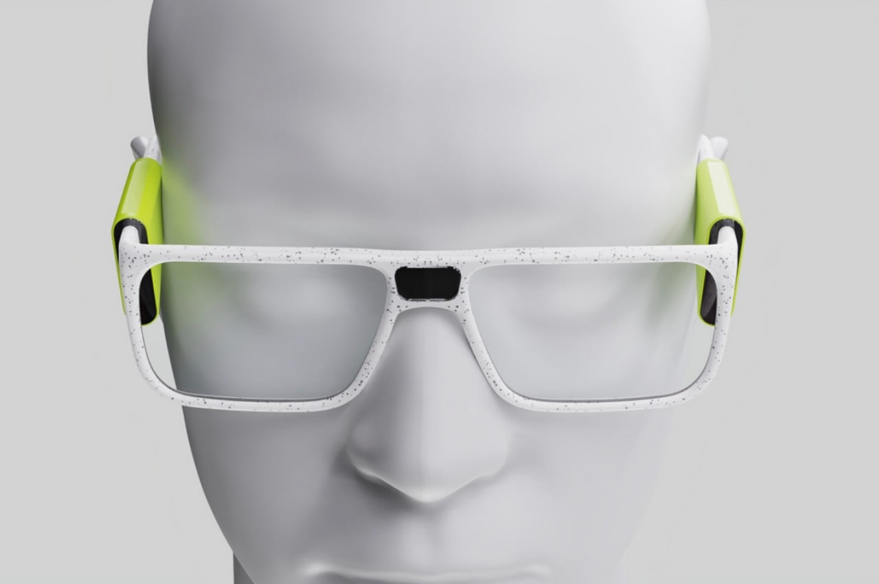
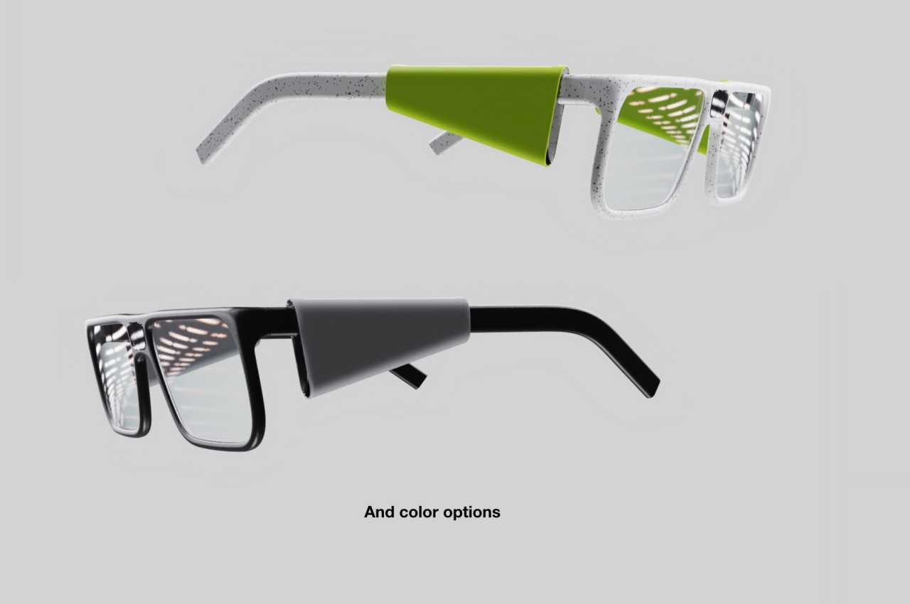
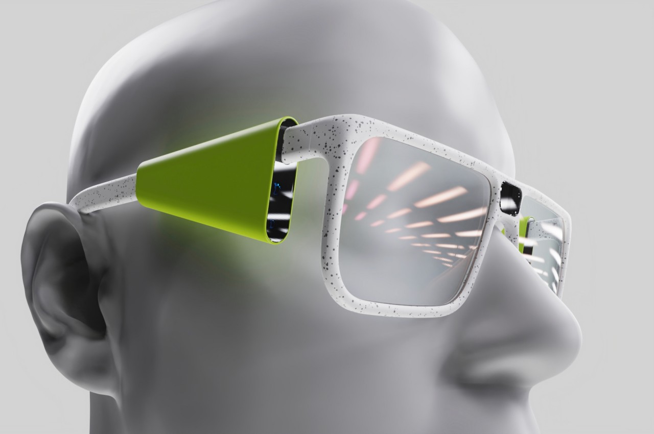
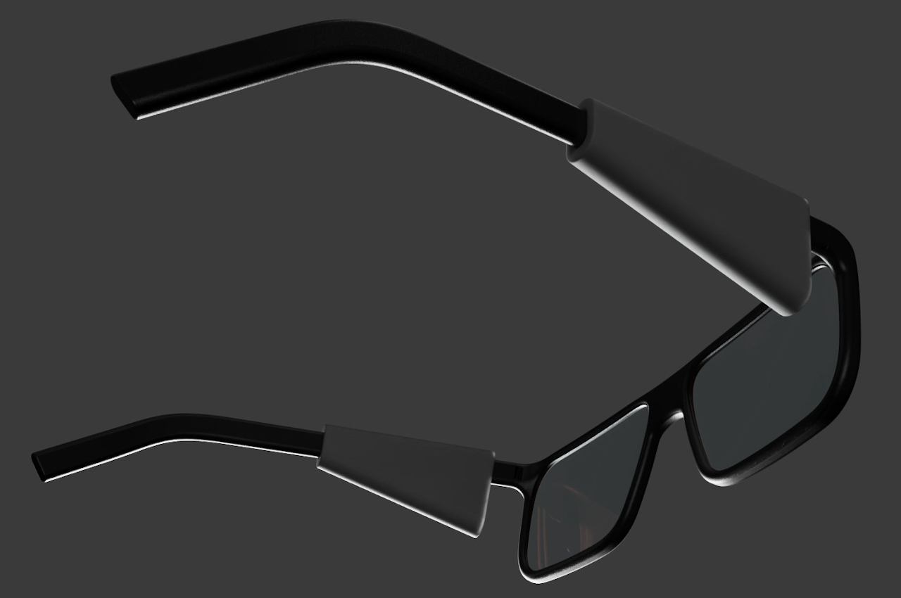
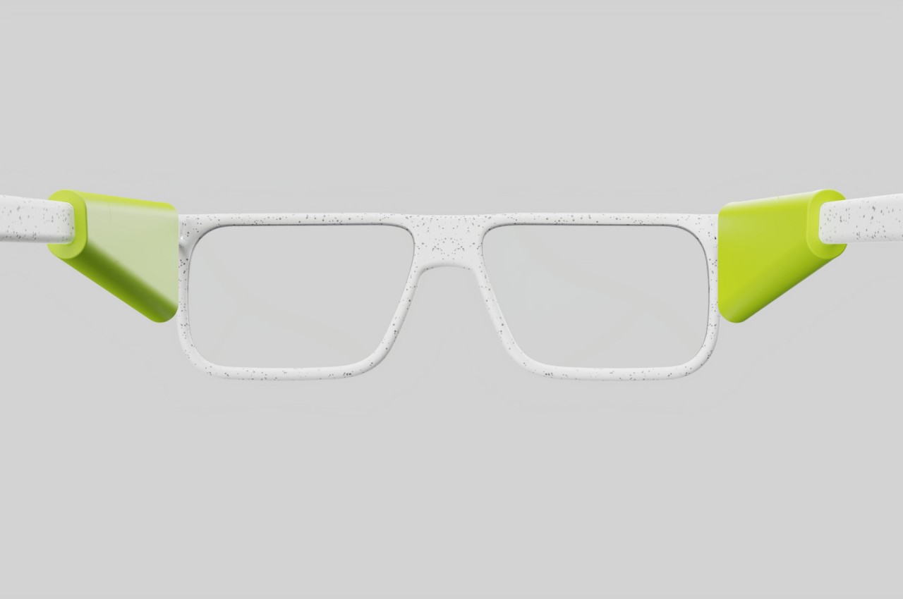
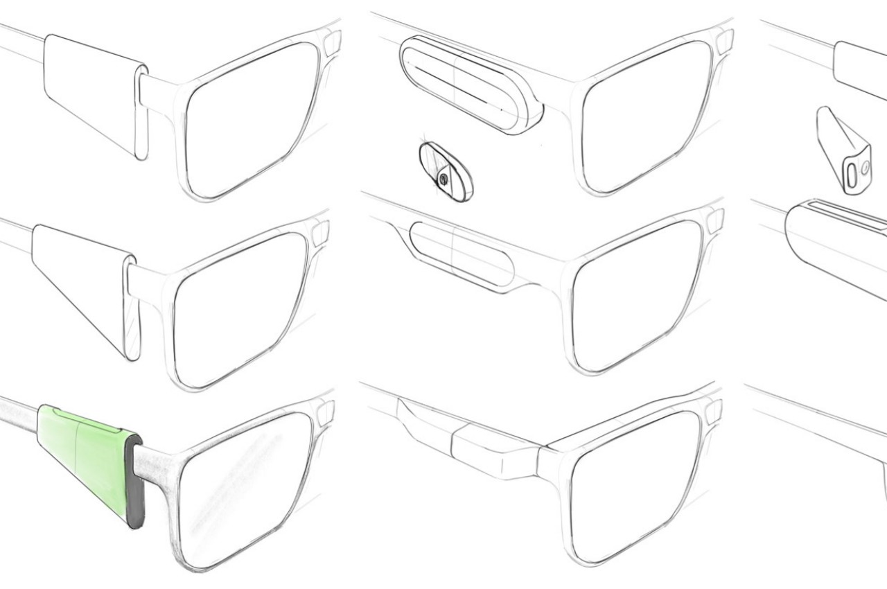
The One-Week AR glasses try to solve that problem by moving all electronics, lenses, and projectors to modules on each side of the glasses close to a wearer’s temples. Yes, they do look like big plastic clips hanging off your glasses’ arms or temples, but their shape also follows what would have been the form of regular eyewear with thick frames. Despite the unconventional appearance, this design actually brings some advantages over designs like the Focals North, especially in terms of flexibility.
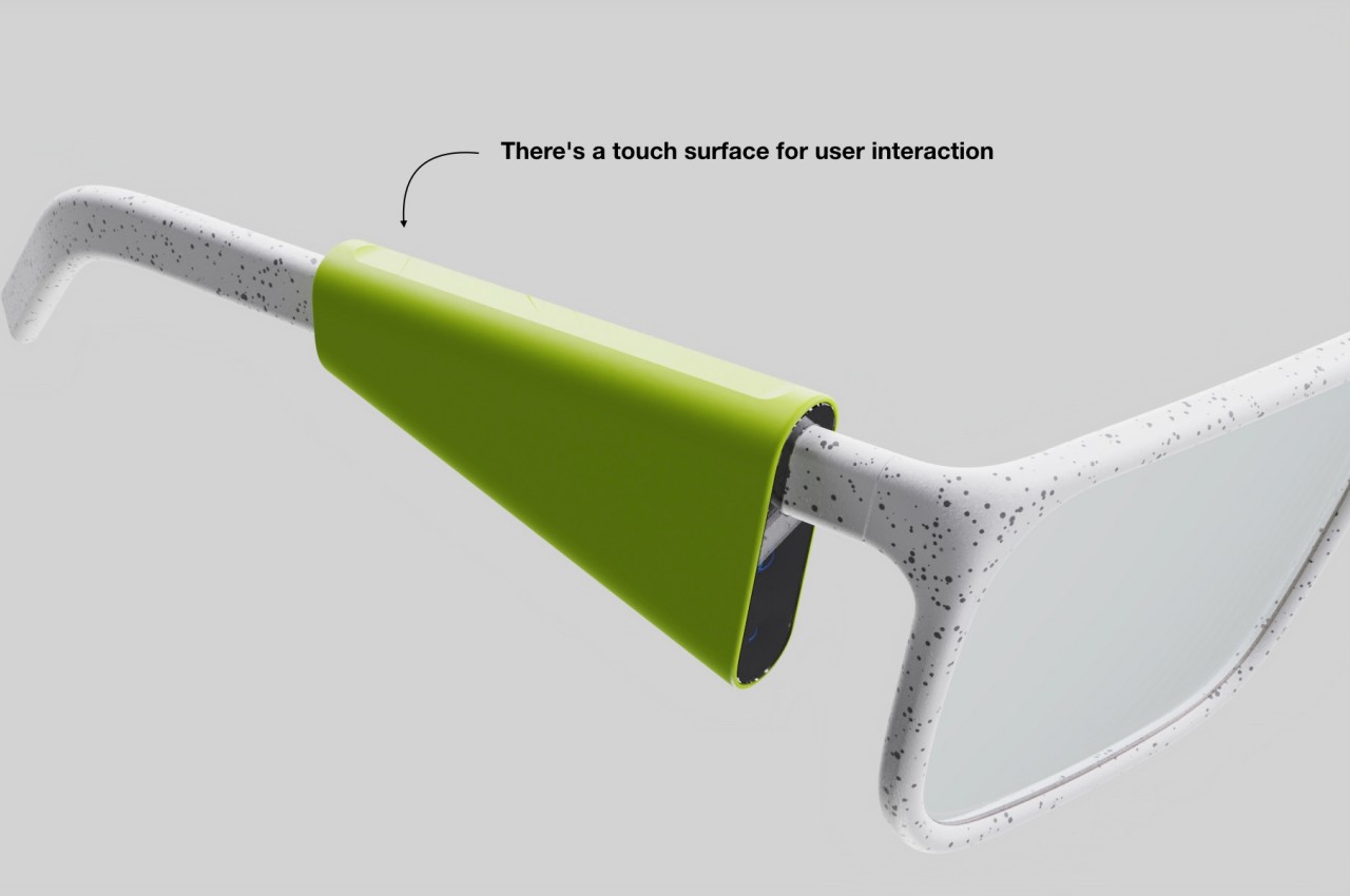
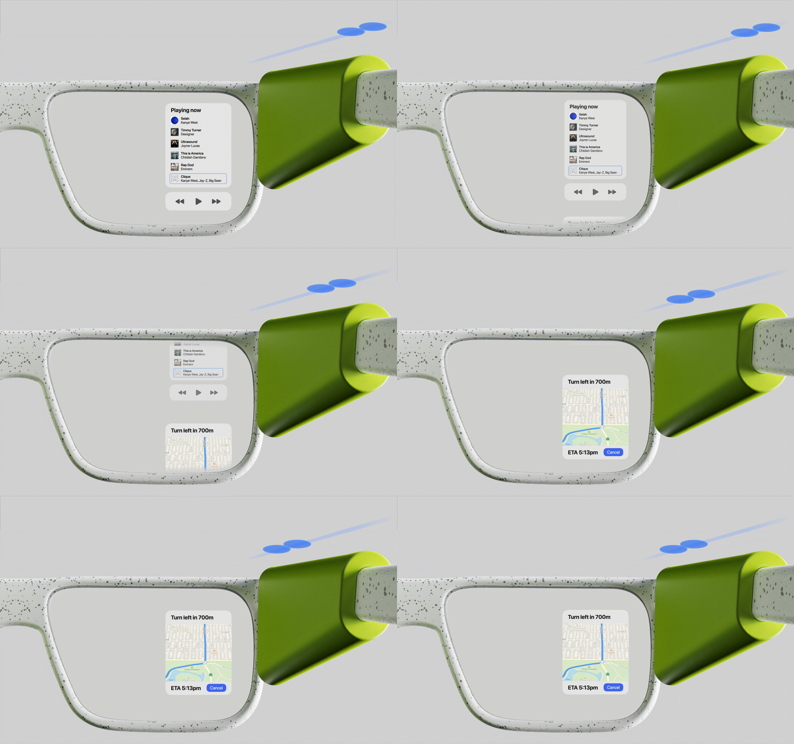
For one, you can have two displays, one on each side, if you can sync the displays to work together. Alternatively, you can split the electronics between the two sides, leaving the left or the right as the sole projector and controller. The top edge of the module has a long strip that can be used for touch gestures like tapping, sliding, or even pinching. The modules can have a wireless charging coil so that the glasses themselves can be charged without a cable.
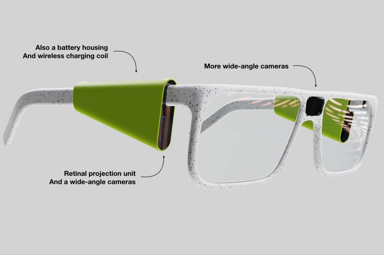
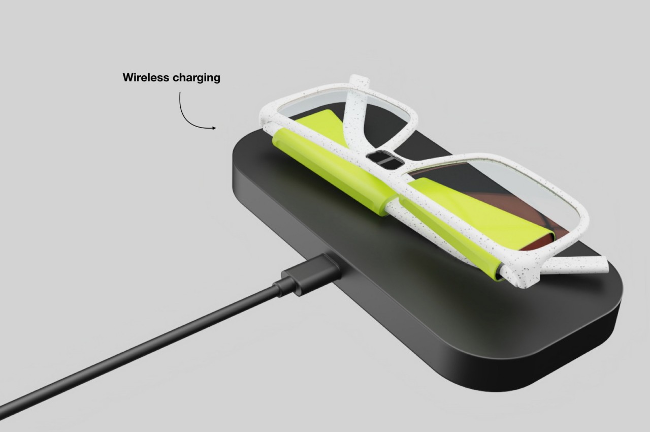
Although it’s not explicitly stated in the design, it seems that it’s possible for the One-Week AR Glasses to be modular, mixing and matching parts and designs to taste. It might need to have extensive use of wireless technologies or at least have conduits inside the frame of the glasses, but it would definitely be doable from a technology standpoint. Such a design could open the market of smart eyewear to more people, particularly those who view glasses both as functional tools as well as fashion accessories.
