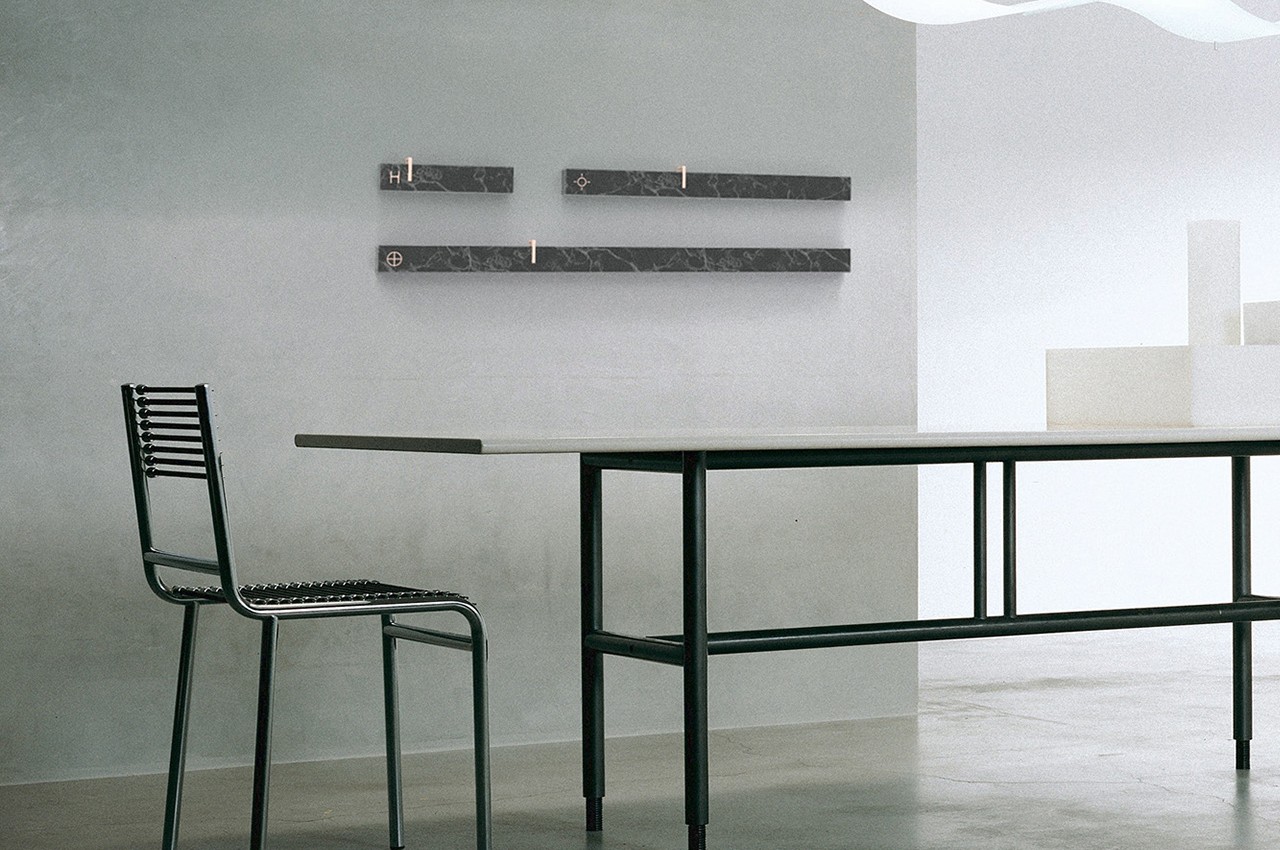
In our minds, we all know that time is linear. Once gone, you can never go back even just a second in the past, nor can you jump a second to the future. At the same time, however, we also have this concept of time as going in circles, with repeating cycles of 24-hour days, 30-day months, and 12-month years. Many clocks, including digital ones that try to emulate analog timepieces, represent time in a circle that goes round and round every day. It may seem negligible, but it can actually affect the way we approach our time and our schedules, which is the kind of mentality that line linear wall clock is trying to fix.
Designer: Luke Avenas
It’s almost too easy to take for granted how shapes and designs can actually affect the way we think about things. Although the concept of time is linear, we still see it as a never-ending cycle of day and night represented by a circle with hands that travel around its face. This makes us aware of certain rituals that need to happen on a daily basis, from eating to sleeping to going to work or school, but it is also somewhat limiting because it confines your “vision” to only 12 hours at a time, even when the day has 24 hours.
While we view days as a cycle of hours, we actually see our schedules more as a list of hours, days, and even months. The discrepancy between our paradigms and our tools can be jarring and inefficient. At the very least, it forces us to jump between paradigms every time we switch between a clock, a calendar, a to-do app, and the like. A digital clock may seem like it minimizes that shifting, but it may actually make it worse because it only shows the time as an isolated point rather than as part of a bigger whole.
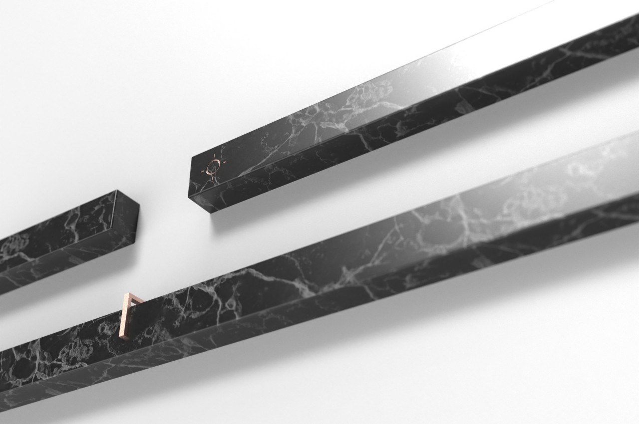
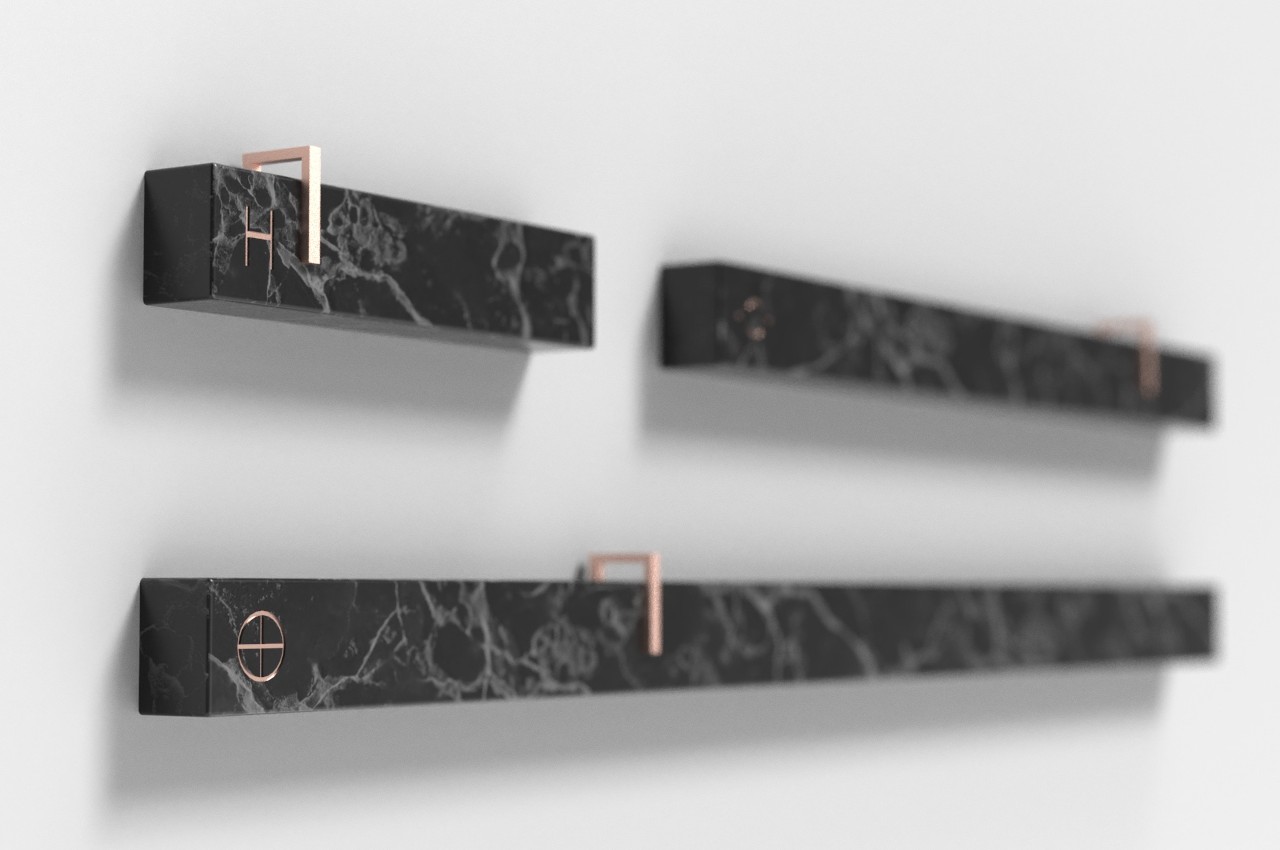
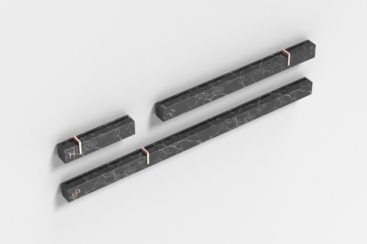
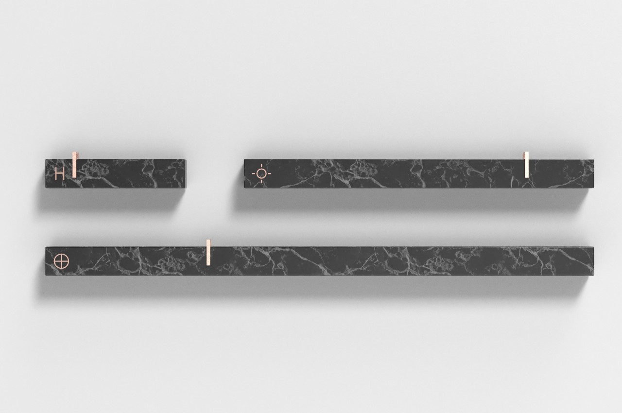
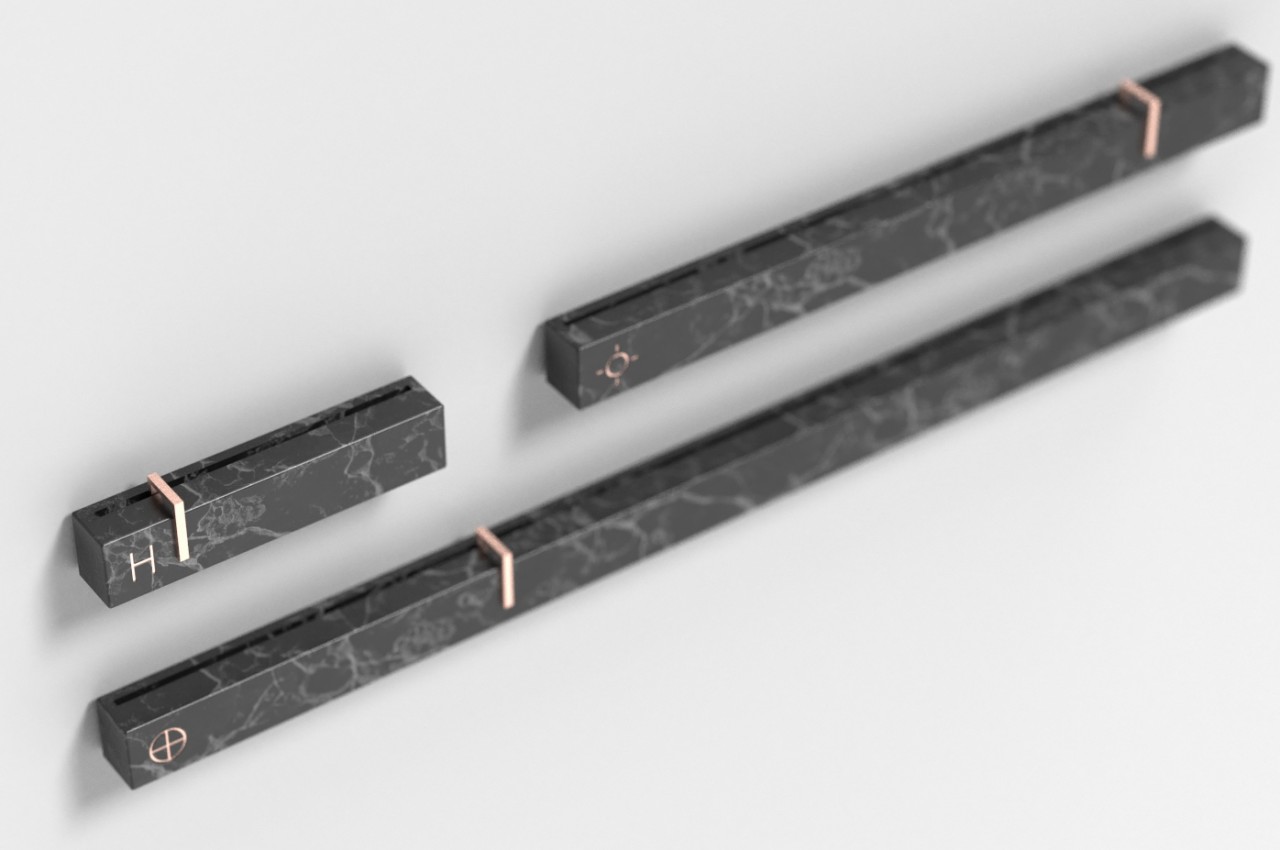
This Linear Clock concept tries to address that in an elegant and unconventional way by representing time for what it is. It has three bars representing the hours of a day, the days of a month, and the months of a year, synchronizing with how we actually view and use time, especially when thinking about schedules and appointments. Because it isn’t limited by space, the clock isn’t limited to showing just a portion of a day each time.
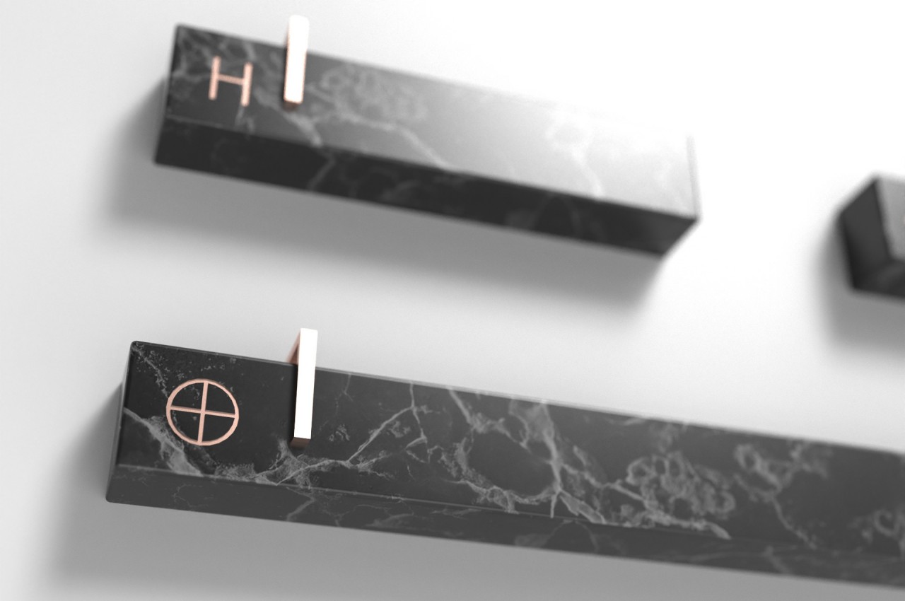
The clock is also simple yet beautiful, with a material that reminds one of black marble. It uses gold markers and accents to contrast with the dark surface of the bars. The markers move across the length of the bars to indicate the hour, day, and month, moving back to their starting position when the first stretch is over. Admittedly, there are no clear markings on which position corresponds to which figure, a detail that could perhaps be added in future iterations of the concept.
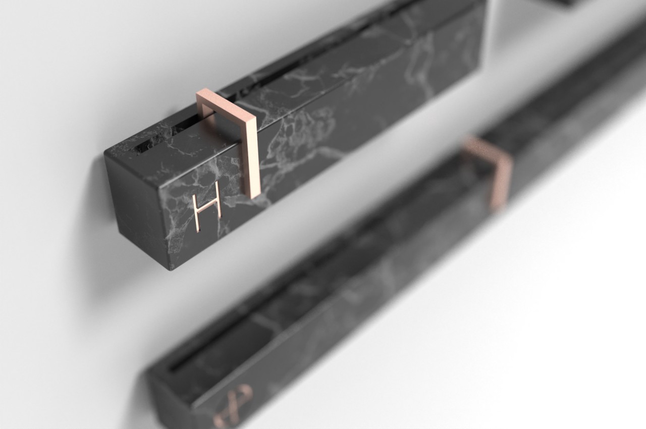
The Linear Clock does take up more space than even the most extravagant wall analog wall clock, but it also serves as a beautiful accent to any room anyway. It stands like a silent witness to the passage of time, making us become more acutely aware of how little time we have left and that, despite the repeating cycle of days, you can’t repeat time that’s already passed.
