What truly makes or breaks a home at the end of the day is the furniture that’s placed in it. The right kind of furniture design can create the essence and soul of a home. And I do feel it’s essential that the soul of our home is a reflection of our own soul. Hence picking furniture pieces that bring out the best in our homes, while authentically representing our personality is a must. You need to pick designs that are fun, sophisticated, and functional. They add an extra spark to your home, without compromising on utility in the least. From a side table with legs and arms to a coffin-inspired office chair – these intriguing furniture designs are what your modern home needs!
1. The Bookgroove

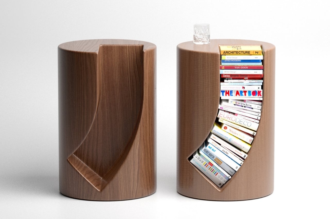
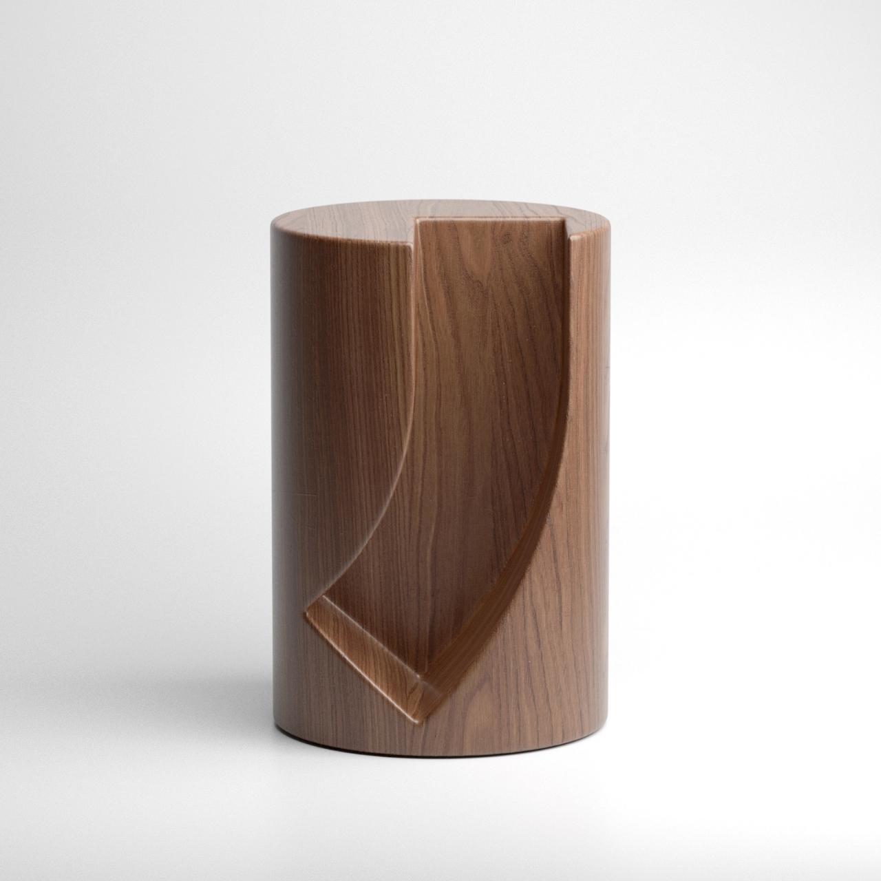
We’re seeing a lot of product concepts for tables, shelves, and sideboards that can house books so designers need to create something that will stand out. And one such design is Bookgroove. The Bookgroove is a bookrack and table in one that has a pretty unique shape.
Why is it noteworthy?
The table itself is circular at first glance but there’s an almost J-shaped carving on one side that can fit several books. It’s not the most usual way to store books as they have to follow the shape of the built-in shelf on the side table
What we like
- You can place a cup of coffee or glass of wine on the top part
- It’s a fun way to store your favorite books
What we dislike
- The books that will be at the bottom of the curve may get damaged over time because of its positioning
- It’s also probably difficult to get some of the books when you want to read them
2. Sharing Joy
Rather aptly titled ‘Sharing Joy’, this award-winning chair comes with a side table for humans to place their books and cups of tea/coffee on, and a crawl space for cats to casually lounge in (complete with a suspended toy for them to play with).
Why is it noteworthy?
What I personally love about Sharing Joy is that it subscribes to a broader vision of what lounging is and who can ‘lounge’. Designed for humans and cats to cozy up in, the chair comes with a hollow, oblong backrest that’s perfectly sized for an adult cat (or a tiny dog) to crawl into and laze around in. Moreover, the idea of having the human and pet lounging together against each other sounds like absolute perfection. 10/10 will give you the happiness hormones.
What we like
- The chair sports a minimalist aesthetic that fits in most contemporary homes
What we dislike
- No complaints!
3. The Praying Mantis side table
At first glance, the Praying Mantis side table looks like just a simple, circular piece of furniture. But the name itself indicates that there’s something a bit different from this concept.
Why is it noteworthy?
You get a circular surface on top but when you look at the legs, that’s where it becomes a bit more unique. The legs actually look like arms folded in prayer, hence the name. The insect it’s named after doesn’t exactly look like the side table’s legs but the idea is there.
What we like
There are two legs and a praying arm so the latter maybe provides balance to the entire table
What we dislike
You wouldn’t be able to put a lot on the Praying Mantis side table as it just has the surface to place things on
4. Plint
Italian design studio Pastina created Plint, a collection of urban furniture for Punto Design. Pastina describes Plint as “more than just a street bench”, and I wholeheartedly agree.
Why is it noteworthy?
The colorful and quirky pieces of this collection are a far cry from the dreary brown benches, we often see scattered around cities. Plint on the other hand plays with diverse materials, geometrics, and visual perceptions, highlighting the interesting contrasts between them. This makes Plint anything but boring!
What we like
- The base is modular, hence allowing each piece to be used individually, or to be combined with other pieces to create compositions of various lengths
What we dislike
- No complaints!
5. The Paper Warrior Series
What do Samurai warriors and tables have in common? Not quite a lot, I’d imagine… but for Mingdu Design, the two shared a potential visual overlap, resulting in the Paper Warrior series of side tables and coffee tables.
Why is it noteworthy?
The tables, styled in longer pill-shaped variants as well as tall round side-tables, come with a distinct red fabric wrapped around their body. Rather than using the exact same kind of paper as the Samurais (which was made traditionally by specialized Japanese artisans), Mingdu Design opted for a similar but more readily available Tyvek paper by DuPont.
What we like
- The iron has a distinct criss-cross pattern running around the middle, which the Tyvek clad conveniently exposes
What we dislike
- No complaints!
6. The Orbit Coffee Table
Designed by Deniz Aktay, whose prolific designs have enigmatically taken over the online design world, the Orbit coffee table is distinguished by its multicolored and interloping legs.
Why is it noteworthy?
Aktay drew inspiration for the table legs from the orbits you find in outer space. According to NASA, “An orbit is a regular, repeating path that one object in space takes around another one. Now compare the coffee table to the images we’ve seen in our school textbooks of planets orbiting the sun – pretty similar, no?
What we like
- The tubes are interestingly intertwined, creating an intriguing visual mesh, which is further enhanced by giving each of them a different color
What we dislike
- It’s still a concept!
7. Coffin Office Chair
Are you someone who absolutely despises your dead-end corporate job, well then, we may have found the chair for you! Shaped like a coffin, this wooden chair recently took the internet by storm. A Twitter user shared it on September 7th, and everyone who’s downright fed up with their jobs completely resonated with it.
Why is it noteworthy?
The conceptual coffin chair perfectly represents all the dreaded emotions employees feel throughout the entirety of their workday. It reflects the feeling of doom one experiences, as they have to sit through another pointless meeting that could have been an email.
What we like
- Inspired by Rene Magritte’s painting titled The Balcony (1950)
- Perfectly captures the feeling of having a dead-end job
What we dislike
- It’s a concept!
- There’s no cozy cushioning to get comfy in
8. The Groove Concept Table
The Groove concept for a curved table is pretty interesting. You get two levels for this furniture with the bottom part being the flat, hard, sturdy plane but the top part being the curvy section as it uses a fabric material. The designer calculated the depth that the fabric can reach and up to what weight you can place on it without it tearing or falling over. It also uses a wide shape rather than a circular one as you can see the changes in the fabric when you put light or heavy objects on it.
Why is it noteworthy?
The second space of the table is the more stable one and is made from an iron plate. So basically you get two options when placing an object and the contrast between the “flexible-shaped fabric and hard steel plate” is pretty interesting. Obviously, the design for this kind of table is more aesthetic than functional.
What we like
- A unique furniture design
- Features a crease-resistant fabric
What we dislike
- More aesthetic than functional
9. The Play Table
Presenting a modern dimension to the work table, Strol x cloudandco –studios brainchild of designers Yeo Junyoung and Yeongkyu Yoo respectively – have designed a ping pong table that can also facilitate work from home.
Why is it noteworthy?
Rightfully called the Play Table, it is categorically designed for a home than a recreational space. To ensure it finds a rightful place at home where stylish and contemporary tables rule the roost, the ping pong table does a multipurpose gimmick in a modern design outfit. Kicking back the tradition of a single-purpose table, the Play Table gears up for a game of tennis and in an instant transforms into a work table complete with wireless charging and storage for your stationery and supplies.
What we like
- Functions as a recreational and a functional furniture design
- The table legs are made from aluminum with steel castors that make it effortless to move the table
What we dislike
- No complaints!
10. Skrolla
A shining example of an ergonomic yet aesthetic chair is Skrolla, a beautiful wooden chair whose curves are more than just for show.
Why is it noteworthy?
Chairs with curved surfaces are nothing new, but you’d often find those forms in seats made of plastic or metal. These materials are easier to bend than wood, of course, but they also have less impact when it comes to portraying natural beauty. That novelty serves to augment Skrolla’s beauty, its smooth wooden surface and smooth curved form creating a visually appealing appearance that will sit well in almost any room. Plus, those curves were carefully designed to offer the best comfort for anyone sitting on this magnificent piece of furniture.
What we like
- Joined and curved using a novel patented process
What we dislike
- No complaints!