![]()
Google’s first-ever smartwatch is about to be officially announced in a few days, but the Pixel Watch has, of course, already been leaked to death at this point. Google itself has shown off the smartwatch’s appearance here and there, but it hasn’t completely revealed its design from all sides and angles. Fortunately, we can look to unofficial information and sources for those details, allowing us to form a complete picture of the Pixel Watch. Unless Google makes a shocking U-turn, we might finally have everything there is to know about the Pixel Watch, at least from a design perspective, thanks to this super early unboxing of the device. But while the smartwatch’s somewhat unique design does pique our interest, it also raises a few questions about its usability and longevity.
Designer: Google
![]()
![]()
After years of speculation and wishful thinking, Google finally confirmed back in May that it was indeed planning to launch its first smartwatch under its own Pixel brand. It also gave a preview of that smartwatch’s design, which was admittedly like no other smartwatch on the market. There are still a few specific details missing, but the unique aesthetic of the Pixel Watch has been cemented in people’s consciousness by now. Apparently, someone on Reddit got their hands on one this early, and they generously shared images of what the wearable device would look like.
![]()
![]()
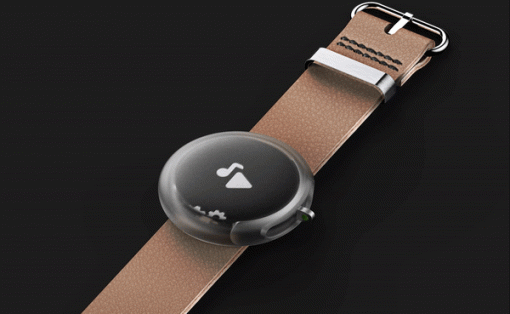
Unlike any other smartwatch or traditional watch so far, the Pixel Watch’s design can be likened more to a smooth and glossy pebble than a timepiece. It has a nearly domed top glass and an equally curved bottom, which would most likely make it wobble on top of any surface unless the bands are attached. It’s almost like a cross between an Apple Watch, which has a similarly curved display, and the typical round bodies of Wear OS smartwatches.
![]()
The design is admittedly novel and attractive, giving the Pixel Watch a unique visual identity that will help it stand out from the rest of the smartwatch market. It barely has any bezel, at least not that we can see, but it might just be a visual trick. There are already a few misgivings about how the display’s real bezels are underneath that domed glass, meaning that the actual active portion of the screen is quite smaller than the watch itself, leaving a sizable border around the edges.
![]()
Many smartwatches do have very visible and sometimes large bezels anyway, so that shouldn’t matter in theory. There are, however, some people that consider this design almost deceptive and definitely wasteful since you don’t have full access to the entire surface of the watch. Whether that “hidden” bezel has any practical function, we’ll have to wait and see.
![]()
![]()
The Pixel Watch has a seamless design where the body blends smoothly into the straps. This beautiful aesthetic, however, is only made possible by using a proprietary strap connector, not unlike what Apple does with the Apple Watch. Not only does this mean that you’ll be unable to use standard watch straps, it also means you’ll always be at the mercy of the few manufacturers that will make compatible straps. Once these companies, including Google, stop making such straps, you’ll be out of luck. The Pixel Watch is set to debut on October 6th at 10 AM ET.
![]()
![]()
![]()
![]()


