I’ve somehow become semi-obsessed with finding the right kind of side table for my living room and my bedroom. There are a lot of existing ones out there that seem functional but don’t really add much to the aesthetic I’m going for. I’ve written a lot about the really interesting ones that we see but most of them are just concepts at this point so I won’t be able to add any of them to my apartment anytime soon. I’m adding this new one to my list.
Designer: Deniz Aktay
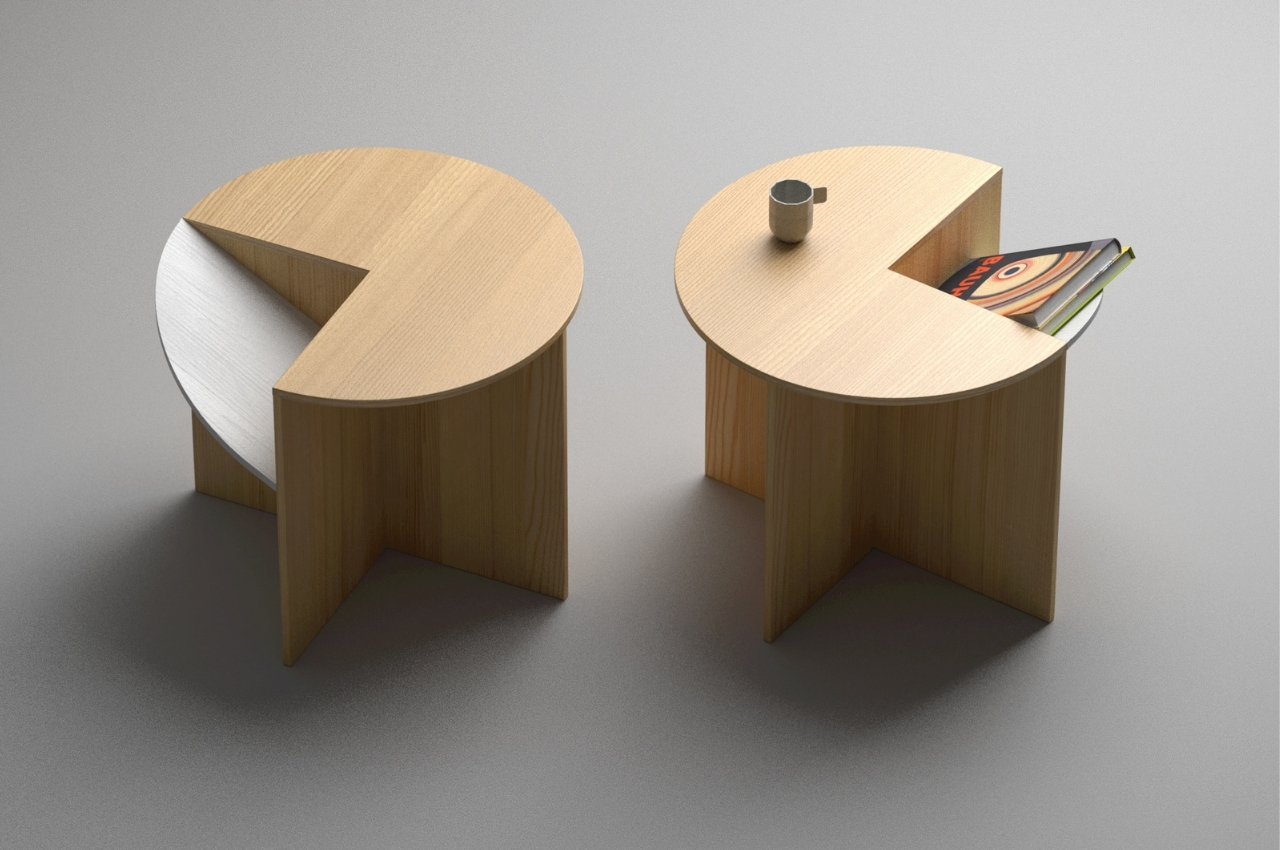
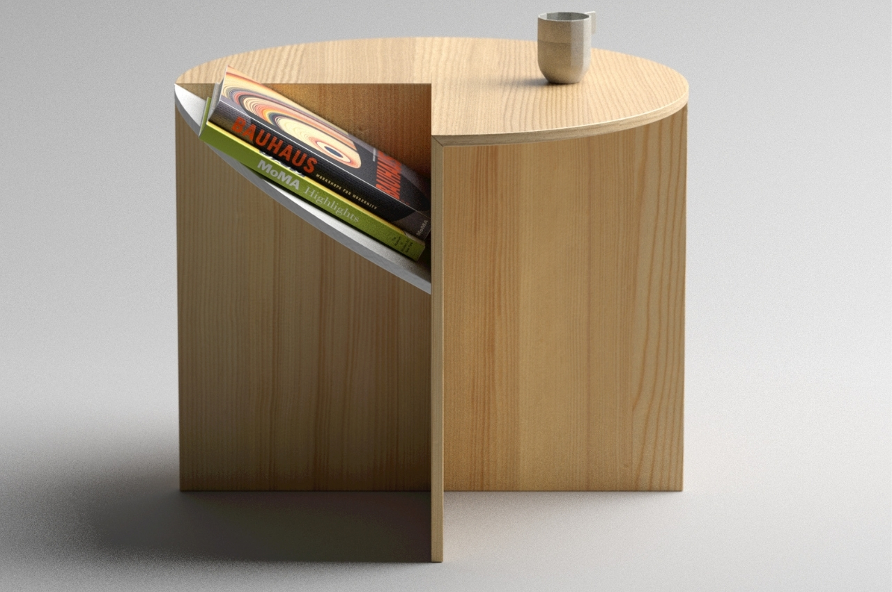
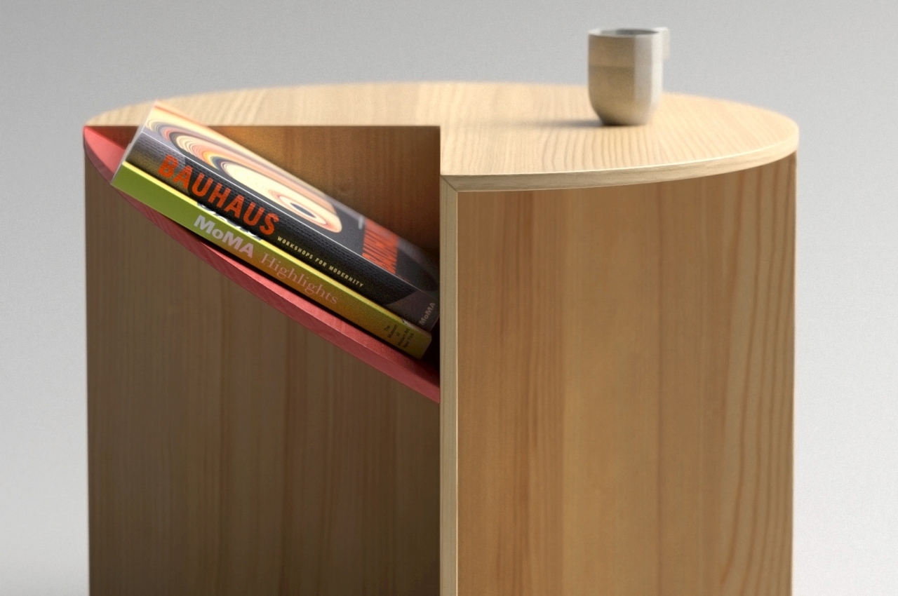
Tipping is another concept for a side table that caught my attention because of its unique but also functional design. If you look at it from just one side, it’s a typical circular side table with “legs”. But when you turn it around, you’ll notice that one pie of the circle is actually “cut” and tipping over onto the side. This becomes a space to put your books or notebooks or documents and they are slanted so you can easily see the spines (for the books at least).
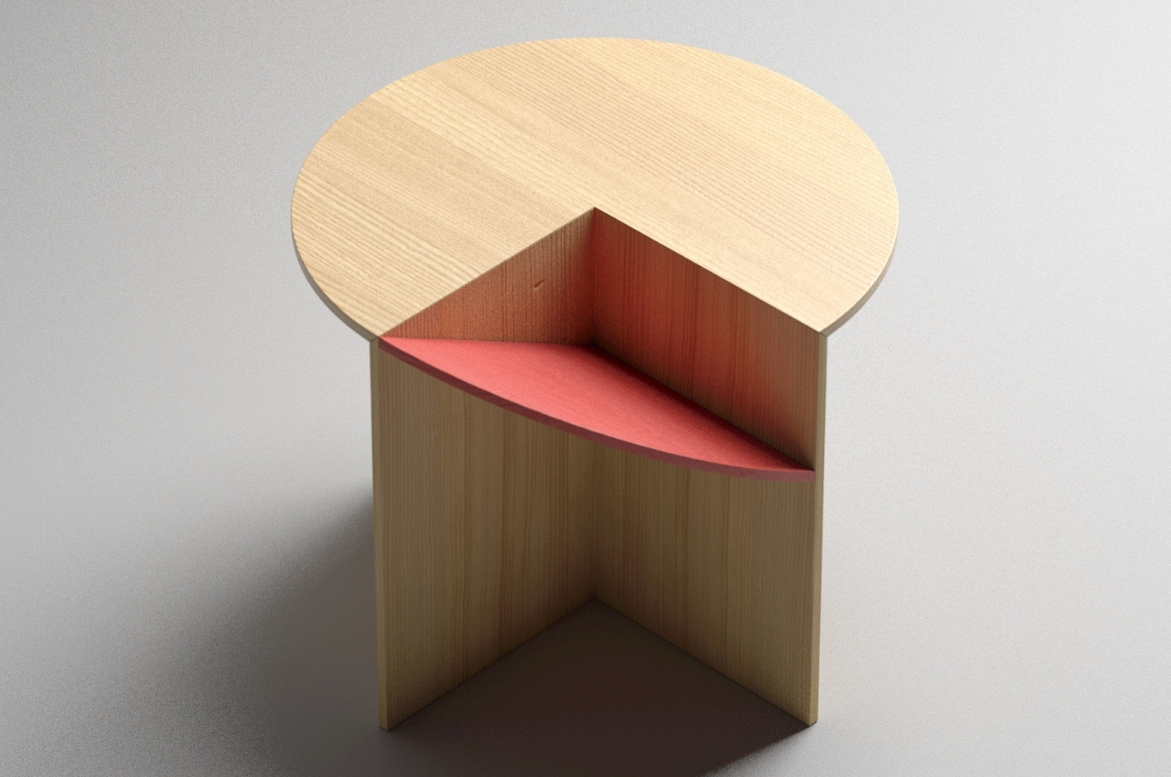
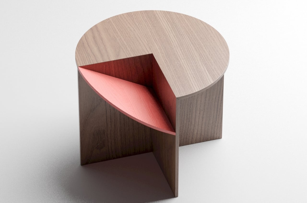
The change made to the typical side table is small but makes the “special feature” pretty interesting and useful. By just tipping one quadrant of the circular top, you get this extra storage area aside from the surface. It’s not much of a space saver since you don’t really get extra space per se, but it adds some texture so to speak to what would have been just a standard side table. If you’re looking for something that’s more of a space saver, you can look for other designs as there are several out there.
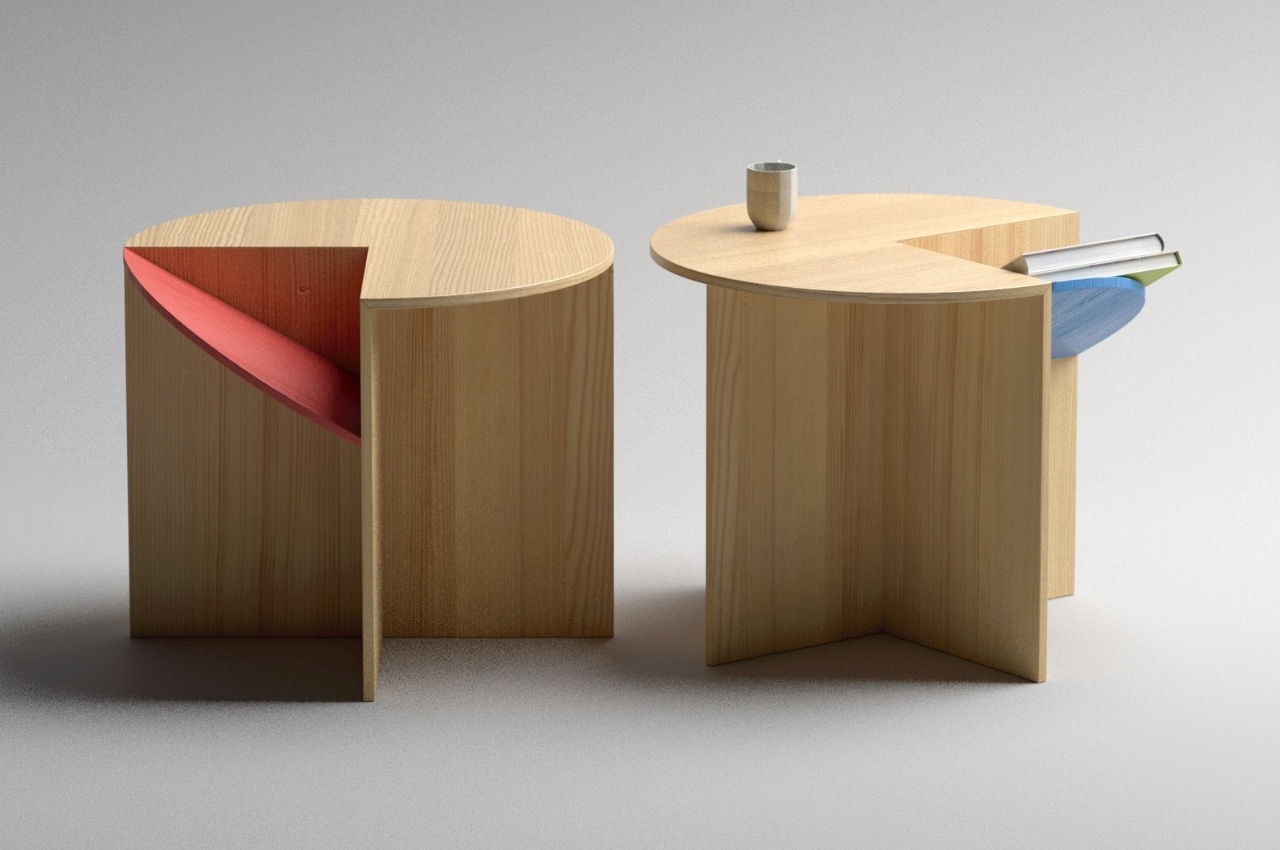
But if what you’re looking for is something more for display and for extra storage with a flair in your living room or in your bedroom, Tipping is an interesting concept design. But then again I won’t be able to actually have one so the search for an actual side table with a unique design is on.
