Gamepads or game controllers have evolved over the decades to accommodate more controls as well as apply new lessons in ergonomics. That said, their core design hasn’t exactly changed that much. It’s still a horizontal piece of plastic held in both hands with buttons and whatnot on each side. That leaves the design a bit open for experimentation, with some more successful than others when it comes to hitting the sweet spot of power and comfort. There are also a few unusual designs that deviate from the norm, like this game controller concept that tries to apply Dyson’s distinct design language, whether it actually works or not.
Designer: Shivendu Verma
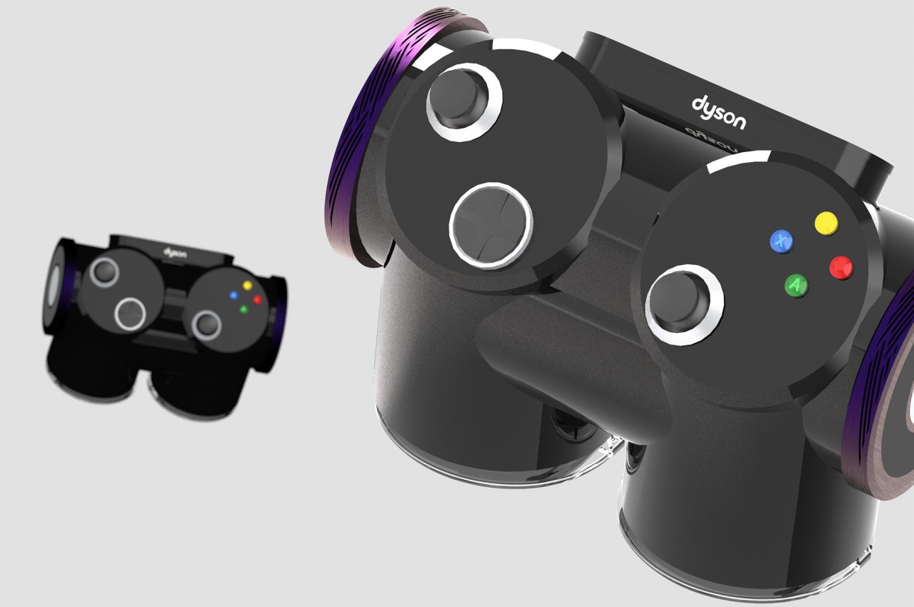
Dyson is a brand best known for appliances revolving around spinning fans, whether it’s for sucking up dirt or blowing your hair dry. More than just the kind of appliances it makes, however, it is known for the design style that its modern products embrace. These products are marked by their elegant industrial design and a penchant for using plenty of cylinders in their forms.
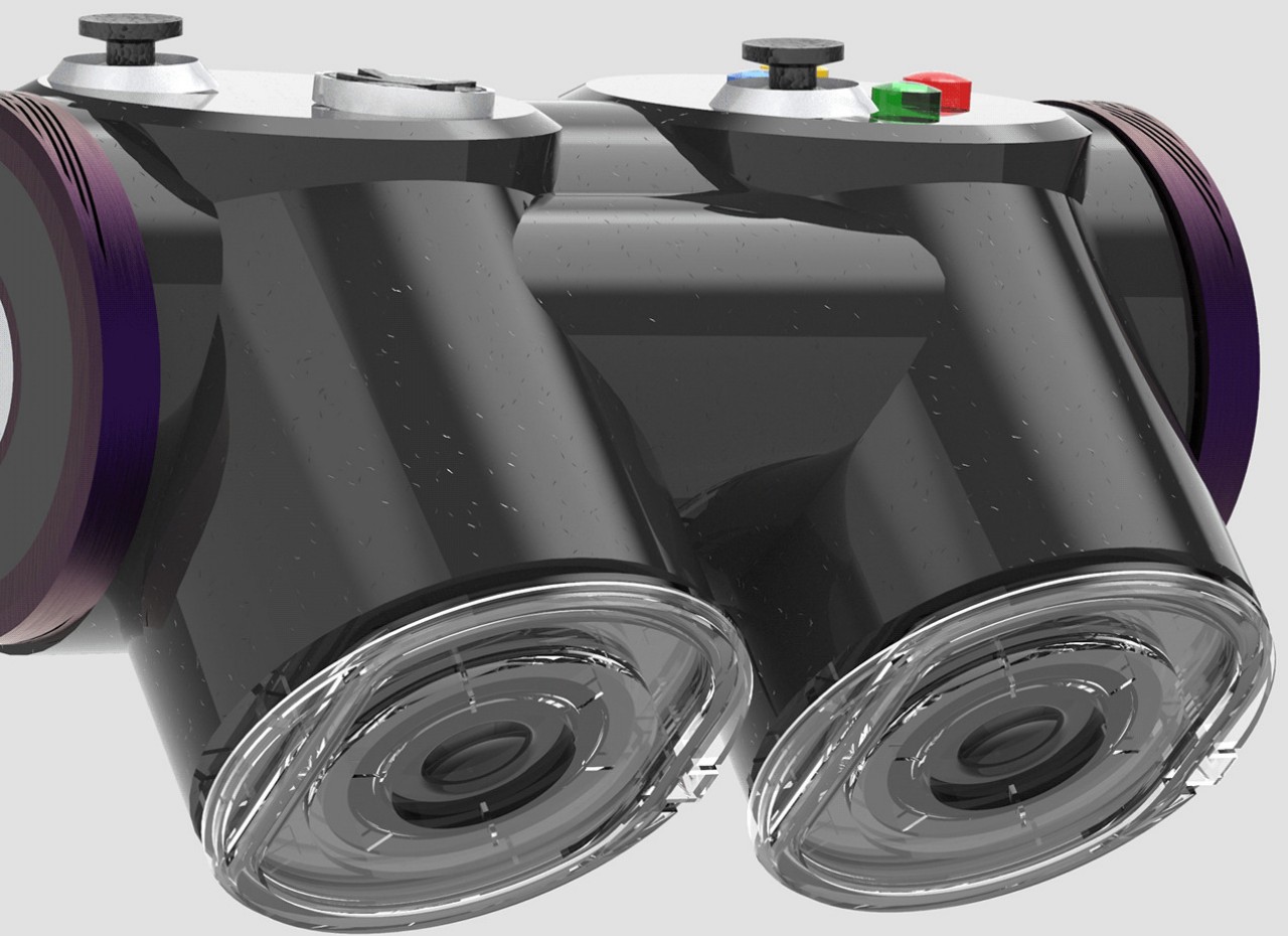
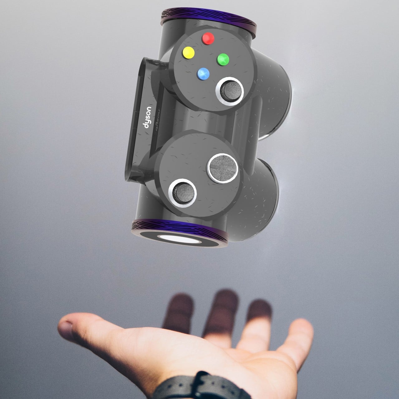
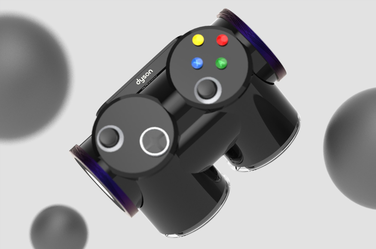
That’s exactly what this gamepad design concept looks like, even if it adheres to that design language in a rather odd way. The overall shape of the controller is formed from the intersection of three cylinders, almost as if you chopped a Dyson vacuum’s tube into three pieces and glued them together. It admittedly looks like it would be at home in Dyson’s catalogue, especially with its shiny glass surface and accents that lie on the blue to purple range of hues. It might, however, not be the most usable gamepad design if it were to be sold in the market.
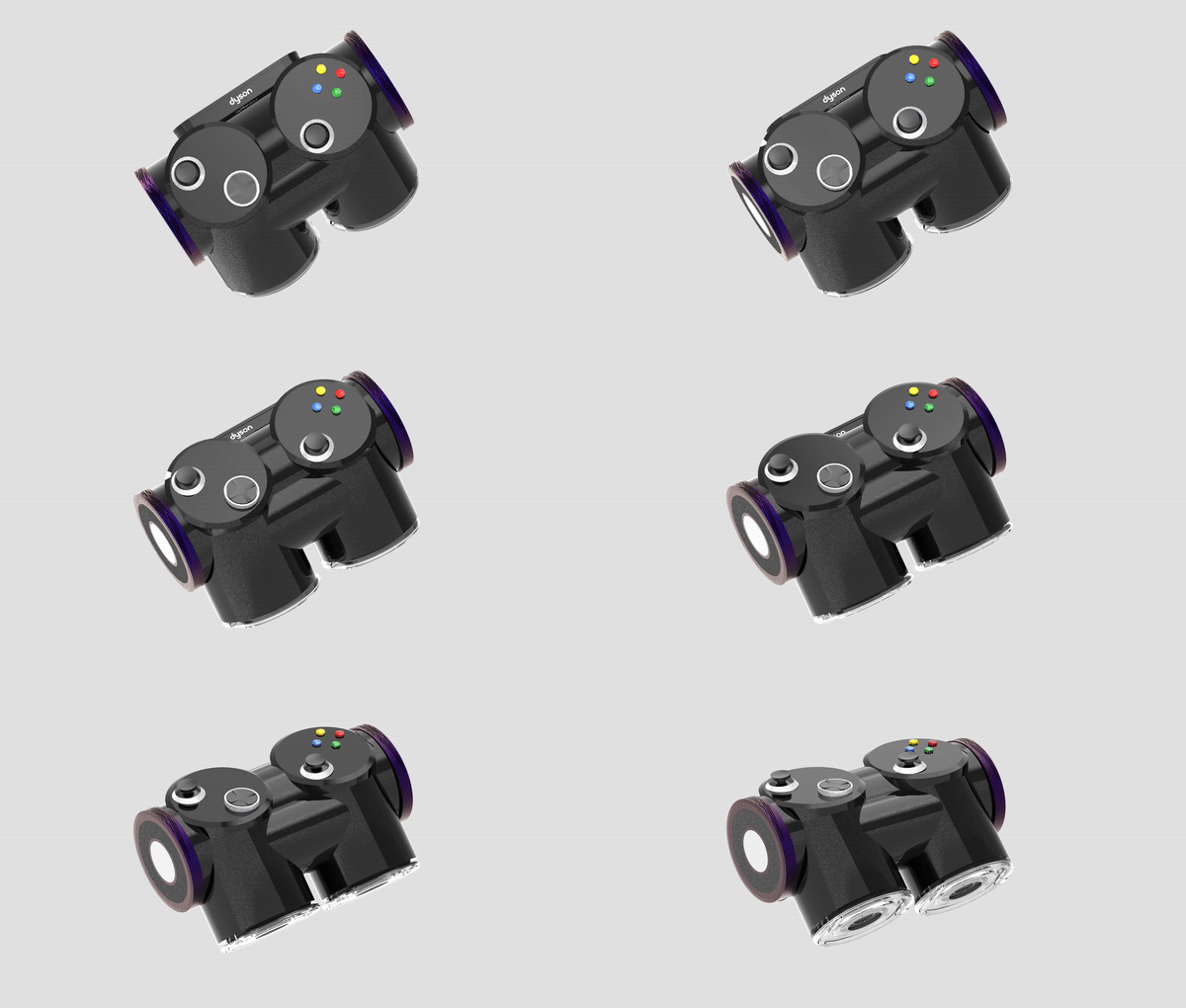
Instead of “wings,” the two cylinders on each side act as grips, but they might not be the most comfortable nor the most stable, especially considering the slippery glass material of this design. The extruded parts of the horizontal cylinder that join the parts together could also get in the way of reaching the controls that might it be far too high. There are also no visible shoulder or trigger buttons that have become standard by now.
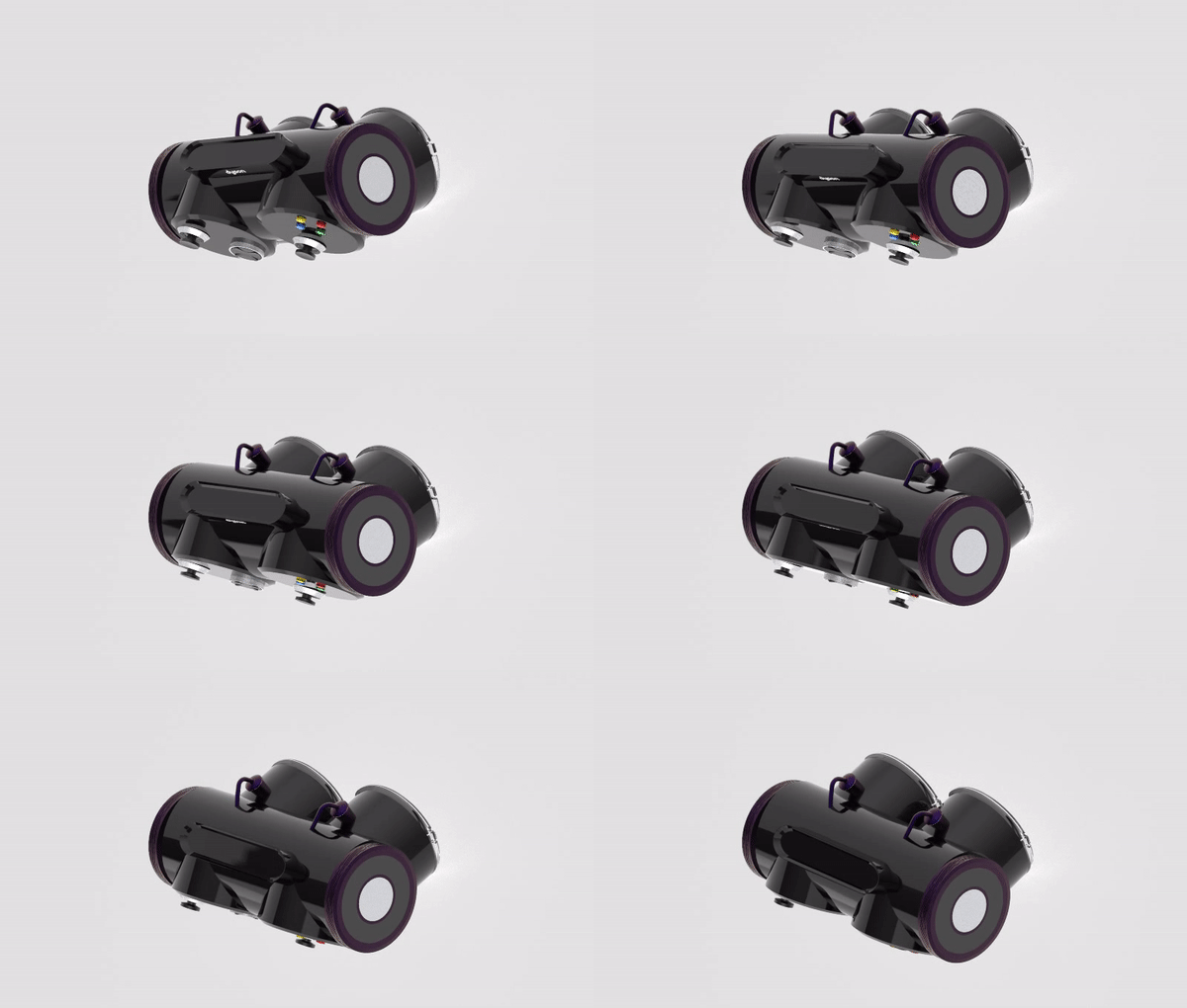
Still, it’s an admittedly interesting design, at least visually speaking. It does, however, drive home the fact that products like these aren’t supposed to just look good. In fact, older game controllers might look hideous by today’s standards and are unsurprisingly less comfortable to use as well. Even today’s gamepads, though, still have a lot of room for improvement, and hopefully, designers won’t quit challenging the status quo to come up with something that is both usable and attractive even to a non-gamer.
