Almost everyone has a smartphone these days, and each of these devices has some form of a to-do list app or another. That said, not everyone uses these apps to keep track of things they need to get done, and some don’t even have such a list of tasks at all. There are, however, many proponents of keeping even the simplest of task lists, not just for the sake of writing down those to-dos. There is evidence of a subtle yet effective psychological benefit to checking off boxes or striking out tasks, something that doesn’t translate cleanly to their digital counterparts. That’s the kind of mind trick that this simplistic-looking device uses, offering a distraction-free way of getting addicted to getting your to-dos done.
Designers: Go Eunseo, janchi
There is definitely something satisfying in the physical act of marking a task as completed. Sure, you can tap on your phone’s screen to do the same, but it requires almost no effort to make that action really meaningful. Perhaps it is the physical activity paired with the sense of accomplishment that gives us that dose of dopamine, which means that it might not require pen and paper to pull that same trick off in other forms.
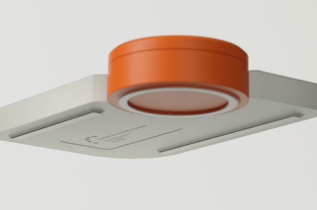
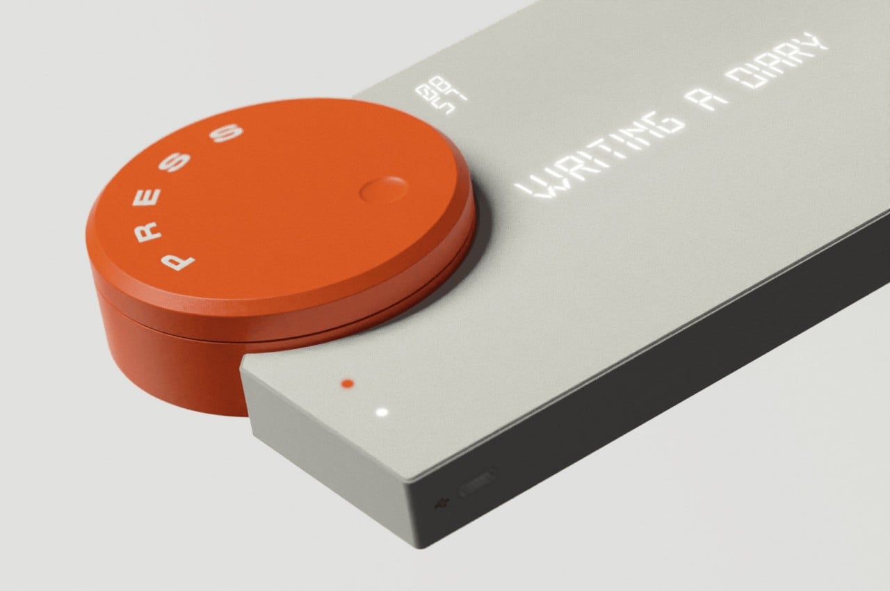
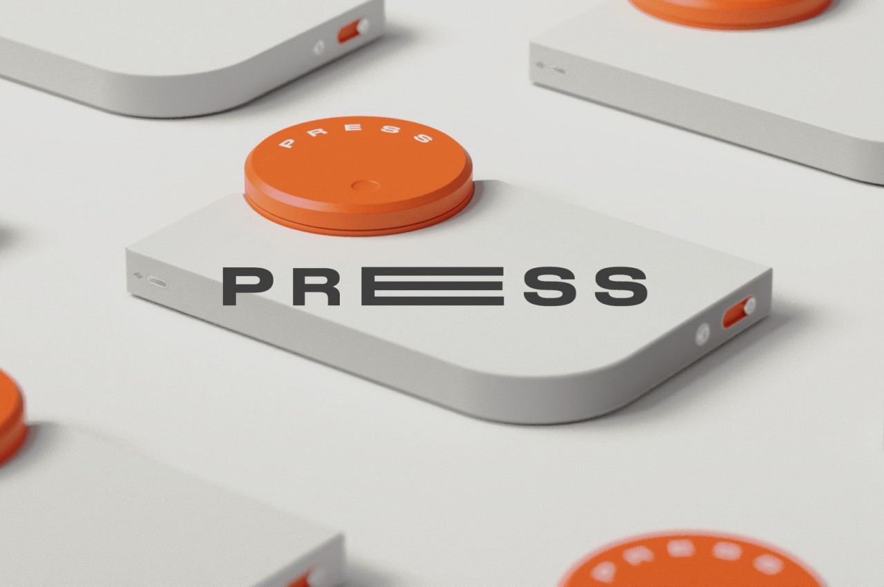
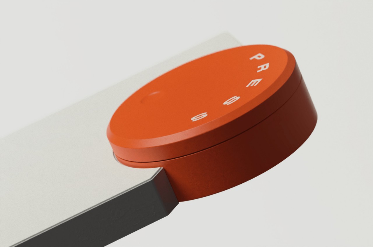
PRESS is a concept for a device that brings a bit of that phenomenon in a new way that bridges the physical and digital worlds. It has a minimalist design that leaves no room for guesswork on what it does, especially with a big orange button that simply says “Press” on it. Of course, its actual implementation might not be so simplistic, and the theories behind it are quite profound as well.
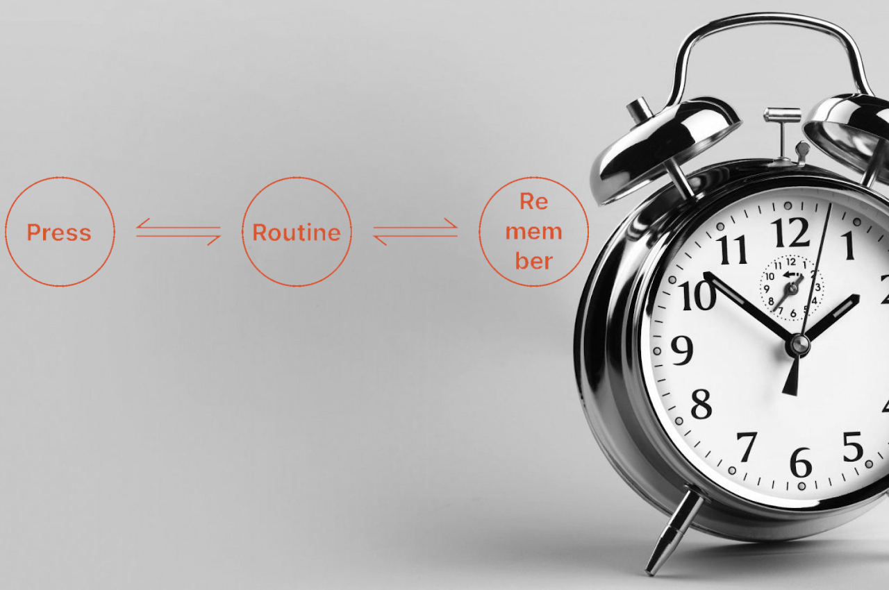
In a nutshell, this device shows a single line of text displayed in an almost retro LCD-like font. There is a small part above the text for a 2×2 matrix of numbers representing the time in 24-hour format. All these displays are “hidden” beneath the surface so that the gadget looks completely clean when there is nothing to show.
The idea is for PRESS to show a single task at a time and the time when it needs to be done. Ideally, it could be a recurring task that happens at the same time daily, like writing or reading at night. When the time for doing the task nears, it will display that data. And when the task is done, you simply press on the orange button to mark it as completed, almost like those buzzers that contestants smash on TV game shows.
It is a pair of triggers and actions that can help develop a habit over time. The design does leave plenty of room for possible features, like automatically syncing data with a phone or computer. Those, however, can just be icing on the cake since PRESS really focuses on delivering that little bit of euphoria whenever you complete a task and press that big, orange button.
