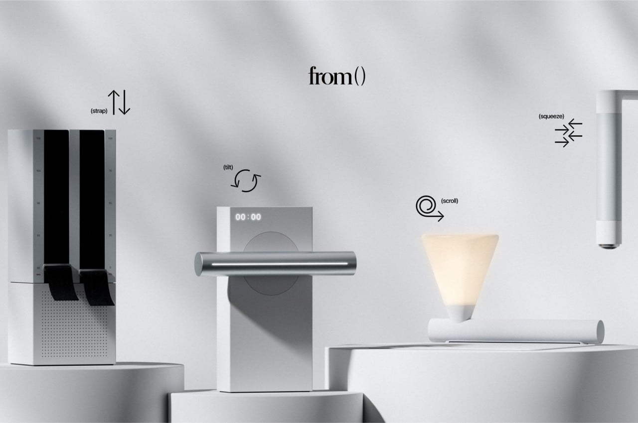
Technology is meant to make human lives easier, but there might be such a thing as being too much. When it comes to operating products and devices, we seem to be moving towards ultimate convenience at the expense of experiences that can give us delight and make us feel human. In the near future, most of us might resort to just issuing commands to the air and waiting for a disembodied voice to respond. Of course, these can empower many people who might not have complete access to parts of their bodies, but it is hardly the only way we can control such things. This design concept tries to offer an alternative that puts the focus not just on physical controls but also on the intuition and familiarity of using certain things in a certain way.
Designers: Mingwan Bae, Adrian Min
To some extent, the driving force behind the development of touch screens and voice controls is the desire for simplicity, removing confusing buttons and knobs in favor of more direct and sometimes literal interactions. At the same time, however, these simpler controls bring their own complexity, like the confusion arising from human speech and lingo. It also makes the presumption that simple operation means removing all physical interfaces. That isn’t always true, however, judging by how simple it is to pour water from a pitcher just by titling it or pulling a strap to adjust its length.
The from() design philosophy uses these very same familiar interfaces and applies them to unrelated products and devices. Those straps, for example, are used as a way to adjust the frequency and the volume of a minimalist radio. The radio’s simple and all-white box design puts the visual focus on these black straps that you use to control it in lieu of a typical slider or set of buttons.
A dimmable lamp, on the other hand, uses a scroll of paper or cloth as a metaphor for its controls. Unrolling the scroll takes it from its off state to its fully lit state, with various levels of intensity in between, depending on how much you have unrolled the material. A bit less intuitive is the timer, which uses the analogy of tiling a container to pour its contents, which, in this case, is time.
And there’s a water purifier nozzle that you can squeeze just like a wet towel to get water from it. Admittedly, this might be taking that “intuitiveness” to the extreme at the cost of making you work hard to get a drink of clean water. While the from() concept design does bring back some of the joys in tactile experiences, it also demonstrates how difficult it is to balance such elements, especially when considering the accessibility of the design for people with less-than-capable hands.