While I’m a certified coffee addict and cannot function well without a cup of caffeine, I’m not really that particular with where it comes from. Whether I get it from the coffee shop across the street or I make it on my own, all I care is that it wakes me up. How the coffeemaker or the espresso machine looks is not really a big deal for me but of course, there are a lot of good-looking and well-designed machines out there. If I could have one in my kitchen that’s pretty and can give me my coffee for the day, then that’s a bonus.
Designer: Odo Fioravanti for Moak
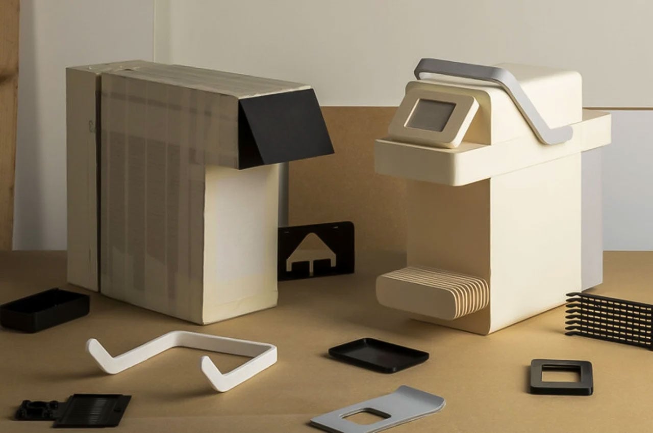
Espresso machine manufacturer Moak commissioned the Italian industrial designer to create a machine that are modernist and minimalist and is actually brutalist in its final render. The CJ (Coffee Jockey) is made up of various geometric shapes that are put together into something simple and beautiful that produces something beautiful as well for caffeine-addicted users. The soft, pastel color shown in the renders adds to the simple but classy look of the espresso machine.
The design shows off a pretty big water tank at the bag that’s easy to remove and fill in. So you can actually put two coffee cups in front and get two sizable espresso shots out of one process. The machine has three main parts that can be assembled and disassembled easily by slatting in the various shapes. It also seems to be easy to clean because of this, which is sometimes my main issue with a lot of the espresso and coffee machines I’ve tried out over the years.
The commissioned design for the machine is for an upcoming new line from Moak which will show off a new coffee blend and capsule system. The renders don’t show where the system comes in since it’s probably still in the early stages and is considered “proprietary”. The clean lines and shapes that we see from the CJ should hopefully translate well once we see the final product when it will be announced and sold commercially.