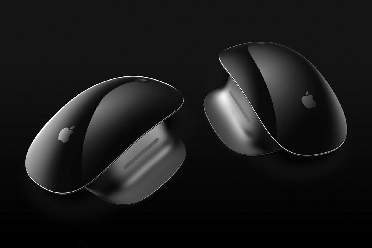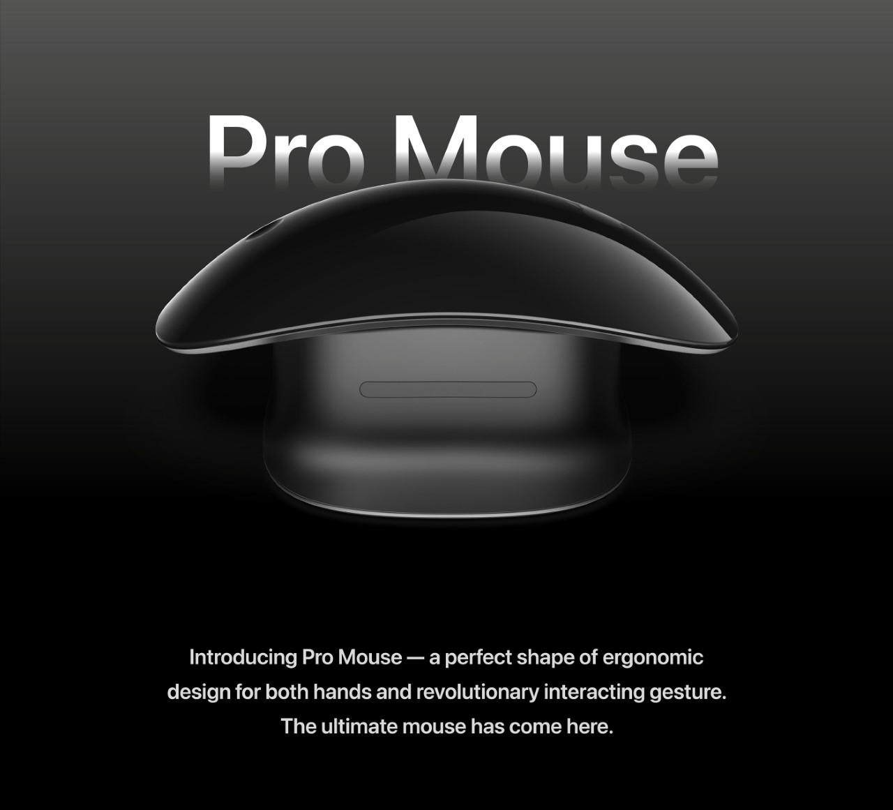
With an ambidextrous design, upgraded laser tracking, a dedicated middle-scroll button (for CAD users), and a repositioned charging port, the Magic Mouse Pro is the wireless mouse we wish Apple would just make already.
The Magic Mouse may just be Apple’s oldest, most unchanged product ever. Launched in 2009 and refreshed in 2015, the Magic Mouse has seen mass acceptance (and resentment) in the 13+ years that it’s existed. The problems we’ve had with it haven’t changed in that time – it’s too sleek to actually be ergonomic, it doesn’t have a middle scroll button (which gamers and designers/engineers need), and its charging port is located in arguably the worst place ever. However, we designers have a hard time accepting the things we can’t change, and it’s our natural tendency to change the things we can’t accept… so behold the Magic Mouse Pro, a concept from the mind of Taiwanese designer Vincent Lin. With a premium all-black exterior, ergonomic form, and better hardware, the Magic Mouse Pro brings a few significant upgrades to the mouse experience, making it a much more compelling purchase compared to its 2015 sibling.
Designer: Vincent Lin

To begin with, the Magic Mouse Pro has a design that prioritizes ergonomics over ‘slimness’. For the most part, your mouse never leaves your desk. Hardly anyone packs their Magic Mouse up in their backpack and carries it home after a day’s work, so why does the mouse even have to be slim? Vincent’s redesign retains the mouse’s overall flavor while giving it an anodized aluminum platform that’s made for better gripping. There’s now a thumb-rest that makes using the mouse much more comfortable over longer periods, and a small rubber grip built right into it so that you don’t always feel the slippery metal against your skin.
The Magic Mouse Pro’s most radical feature is its ability to easily alternate between being left or right-handed. The biggest drawback with ergonomic mice is that they’re seldom ambidextrous. The Magic Mouse Pro’s swiveling upper surface lets you easily flip it around to suit your needs, giving it a significant edge not just over the existing Magic Mouse, but over every ergonomic mouse too!
Let’s also state the obvious. A more strategically located Lightning port makes charging the Magic Mouse Pro much easier, correcting a universal wrong from 8 years ago. Sure, the position of the lightning port changes based on whether you’re using it in right or left-handed mode, but I’d argue that’s much better than having a charging port located on the underside of a mouse.
A single dimple on the mouse also now indicates the Magic Mouse Pro’s ‘middle scroll’ button, which proves useful in web browsers, design software, and CAD/engineering programs. Yet another major oversight fixed with a simple design detail.
Finally, the ‘Pro’ moniker is justified with the inclusion of better hardware, including a Pro Laser Eye that offers better tracking and accuracy with lower latency, and a first-ever Taptic Engine in a mouse to offer better haptic feedback while navigating your software. It’s a feature that Apple’s Magic Trackpad has had for a while, but remains ignored in the mouse itself, given its lack of upgrades in quite a few years.
Sadly, the Magic Mouse Pro and its radical features remain entirely conceptual for now, although for people looking to transform their existing Magic Mice, this easy-to-install ‘ergonomic accessory’ should absolutely do the trick!