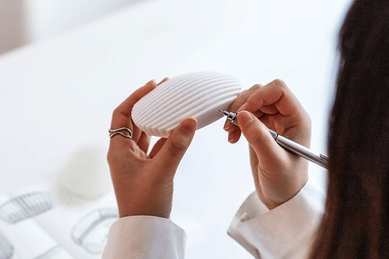
Composed of multiple slats of carved acrylic stacked together, the Dune mouse is incredibly eye-catching… but is it ergonomic?
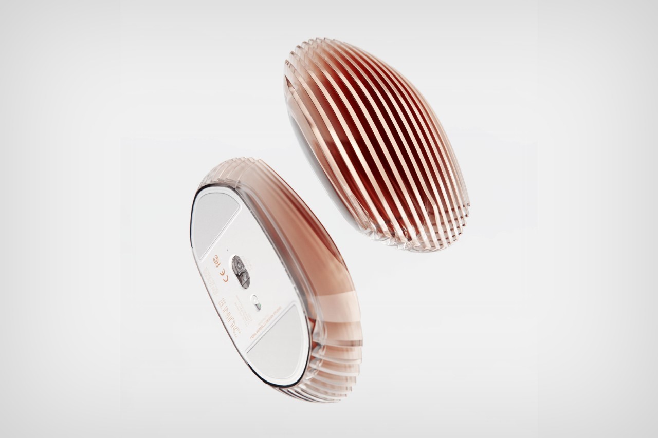
Designed by the Fabio Verdelli | Design Studio, the Dune wireless mouse takes its inspiration from the dunes that form on the sands of majestic deserts. Wind pushes the sand into ripples that stretch for miles, creating perfectly spaced lines that make the sand look like water. The Dune mouse mimics that too, with a set of laser-cut acrylic sheets connected together but spaced apart, creating the Gestalt of continuity that makes it look like a wireless mouse.
Designer: Fabio Verdelli | Design Studio
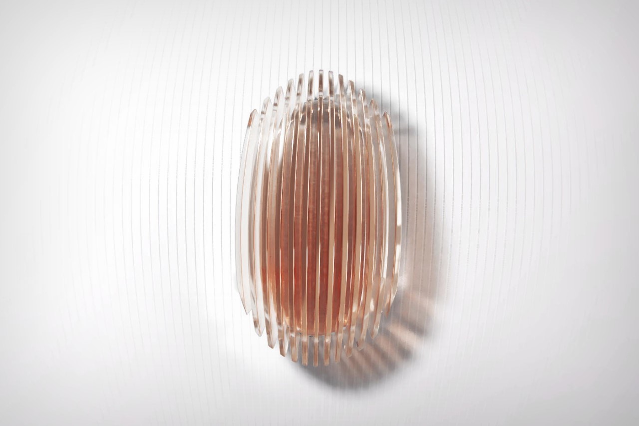
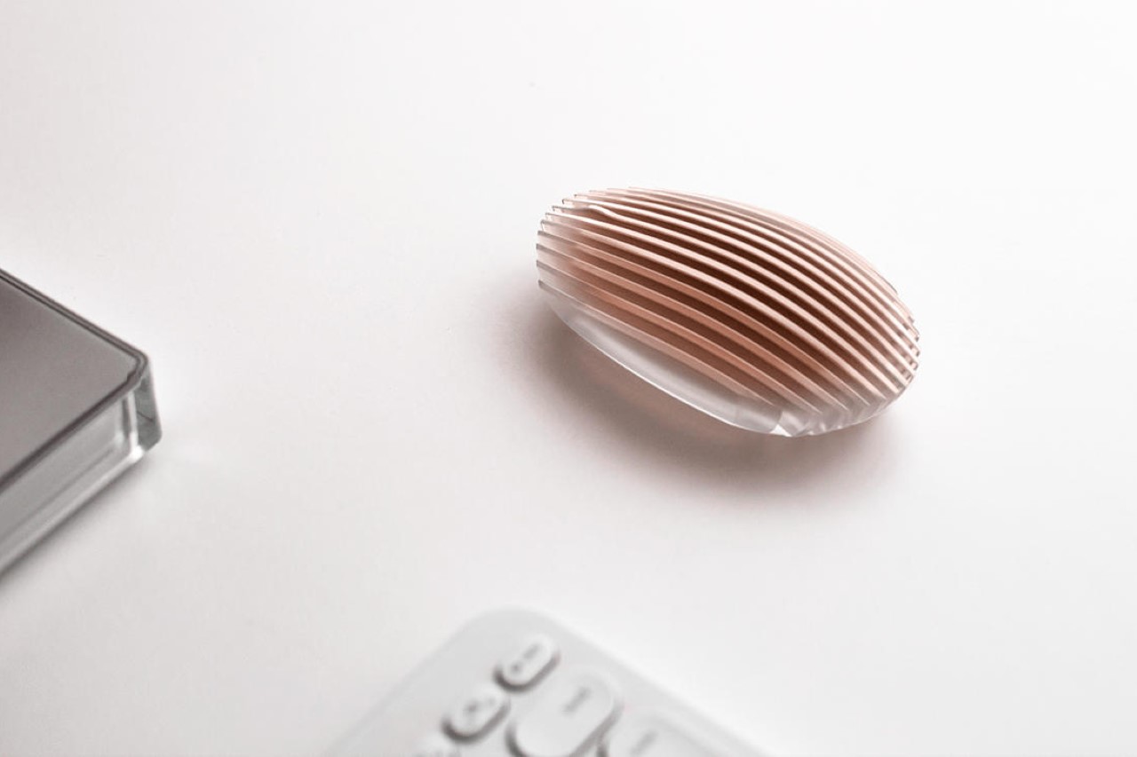
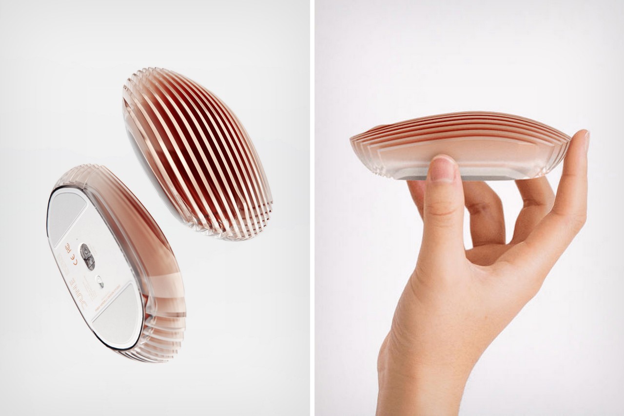
With an aesthetic that feels bordering on jewelry, the Dune mouse rejects convention with its luxurious design. The mouse is fairly monolithic, and doesn’t feature buttons or scroll wheels. Instead, it relies on touch-sensitive functionality, allowing you to both tap or scroll on the mouse’s slatted surface. There is, however, the gentlest bump where you’d expect a scroll wheel. This area intuitively has your finger scrolling on it, with the touch feature translating that into scrolls.
Visually, the Dune looks absolutely stunning. It’s designed to create visual drama with its frosted acrylic strips that are just ever so gently tinted with rose gold. The upper part of the mouse is fairly opaque, but it begins showing translucency at the edges and the base, creating an almost gemstone or perfume bottle-like effect.
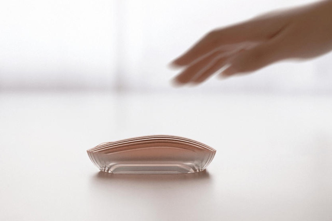

Is the Dune as ergonomic as a more conventionally-designed ergonomic mouse? Well, instinctively, it feels like it isn’t, but then again, it’s possible that our hands could grow to love that slatted texture instead of being repulsed by it. The overall form still has curves in the right places, although the edges on the sides seem a little sharp, sort of like the way the Magic Mouse has cliffs around the edges.
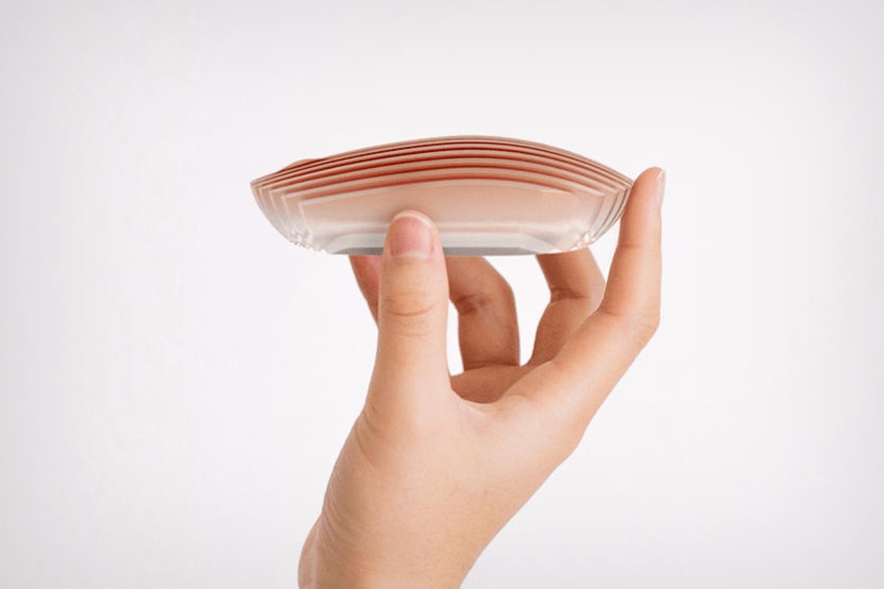
There’s no soft surface on the mouse, which leads one to believe that prolonged use will have you struggling. There’s also no feedback in terms of clickable buttons or actual physical scroll wheels. One could easily make the point that the Magic Mouse doesn’t have those too (at least the clicking function isn’t as intuitive as actual left and right clickers), but the Magic Mouse makes up for it with a flat surface that you can perform gestures on – the Dune has no such functionality.
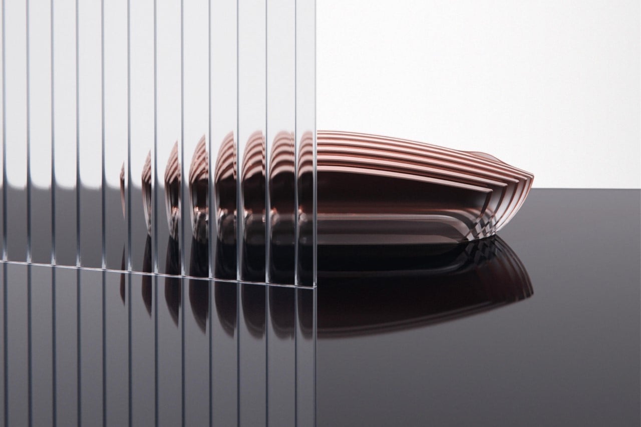
Where the Dune wireless mouse really shines is in its aesthetic department… however, everything else about the mouse feels like a bit of a drawback. The mouse doesn’t look too light, which means it requires a little more effort to move it around. It doesn’t feature soft grips or proper ergonomic surfaces, which puts it behind your average $20 ergonomic Logitech mouse. It doesn’t have buttons or scroll wheels too, nor does it have macro keys, or support for gestures, making it difficult to recommend to a graphic designer, gamer, or someone who needs a highly-functional precision machine. Most importantly, its transparent design makes it look fragile, and while most mice don’t really go through rough abusive use, there’s a tendency to think that this mouse is prone to cracking, snapping, or shattering – which isn’t a good look.
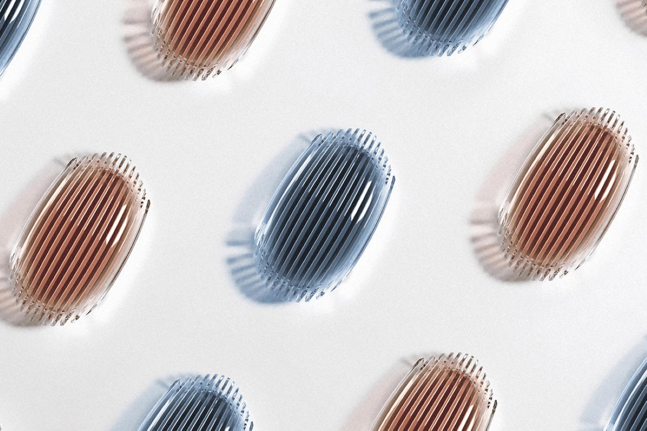
The mouse, however, is a wonderful vanity device. The kind that could easily sit on the executive’s desk, becoming almost one with the decor around it. It has a jewel/trophy-like quality that really allows it to stand out, and combined with that bronze-gold or blue colorway (shown above), the Dune really has the potential to completely uplift your desktop’s allure. For extra effect, pair it with lofree’s transparent mechanical keyboard!
