Smartphones and computers have created ways for us to become more efficient at the things we do, and paper has probably never before been more popular, perhaps as a reaction to the former. Despite these developments, keeping on top of our tasks has never been more complicated, torn between these two conflicting and contradictory worlds. The physicality of pen and paper has a certain appeal and “stickiness” but lacks reliability and flexibility. Apps, on the other hand, offer plenty of customization and speed at the sacrifice of a more personal and tactile experience. There are many attempts to bring these two worlds together, and this device concept tries to add a bit of that direct physical engagement while still keeping your to-do list completely in the digital realm.
Designer: Chester Chen
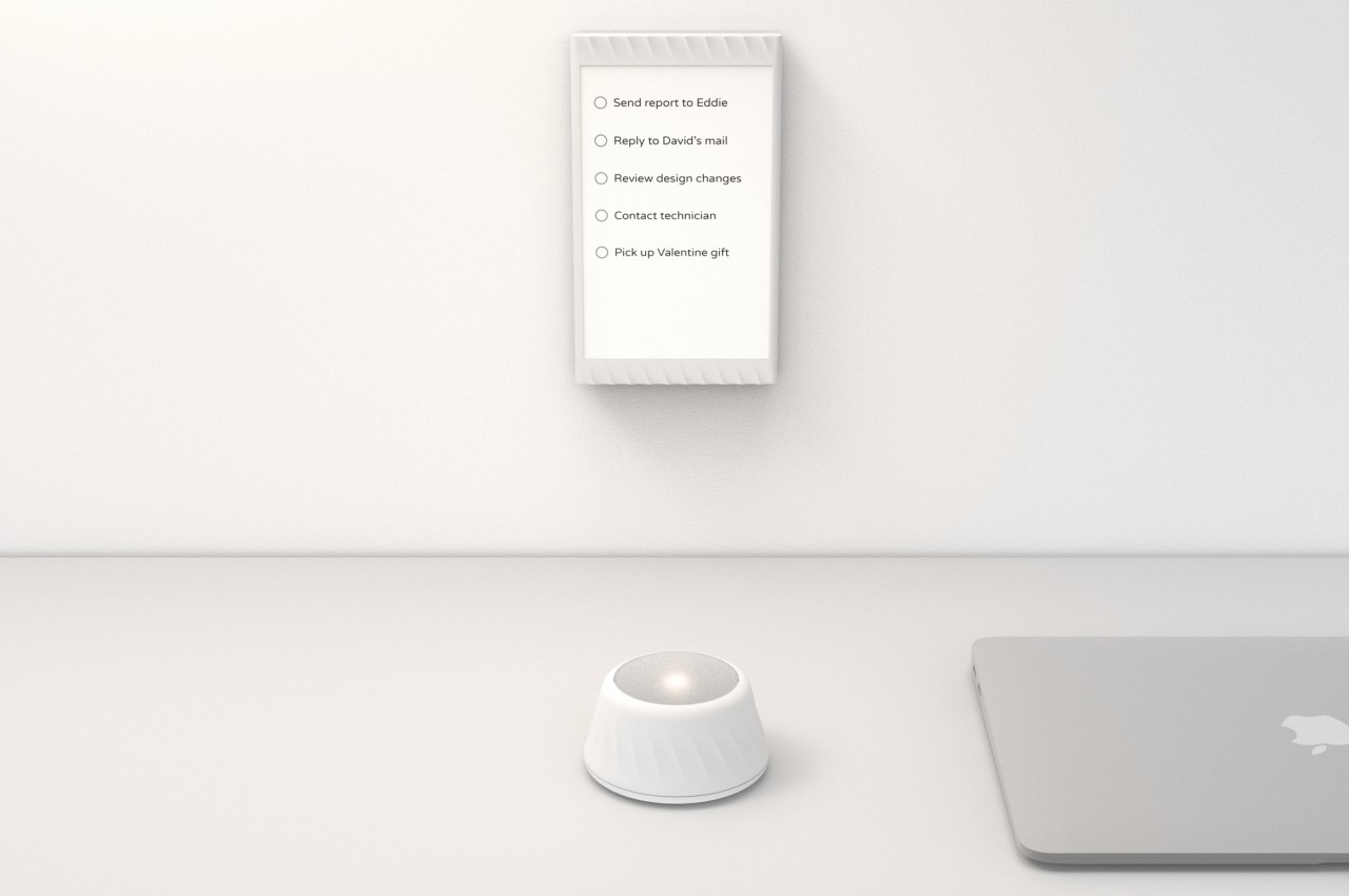
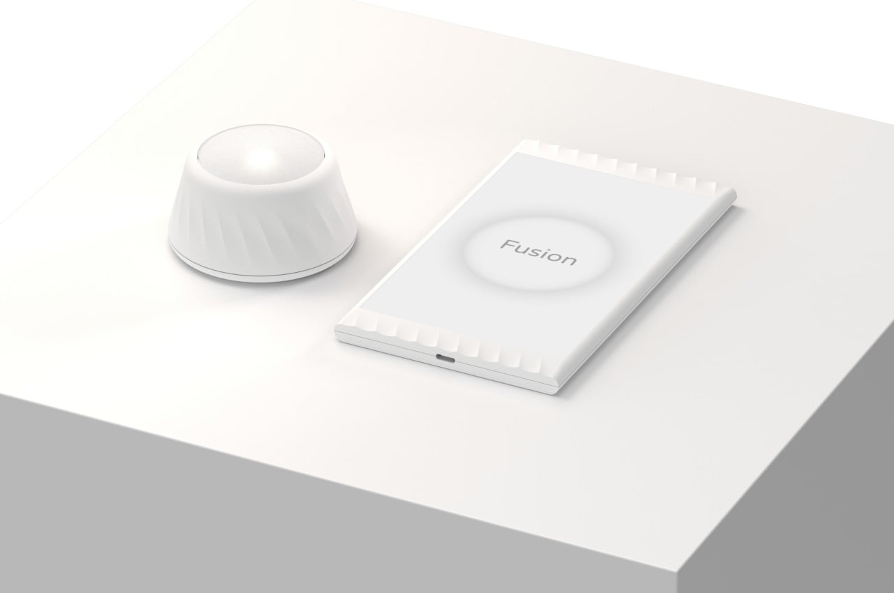
To-do apps are a dime a dozen these days, and they exist on phones, computers, and everything in between. This allows people to make rapid changes that sync between devices, increasing their efficiency and productivity. Tapping or clicking on checkboxes, however, doesn’t exactly have the same satisfying feedback as checking it off from a list, and you might find yourself driving on autopilot, mindlessly tapping things even unintentionally. Fusion is a combination of hardware and software that tries to bring that active participation to your electronic to-do list without going back into pen-and-paper territory.
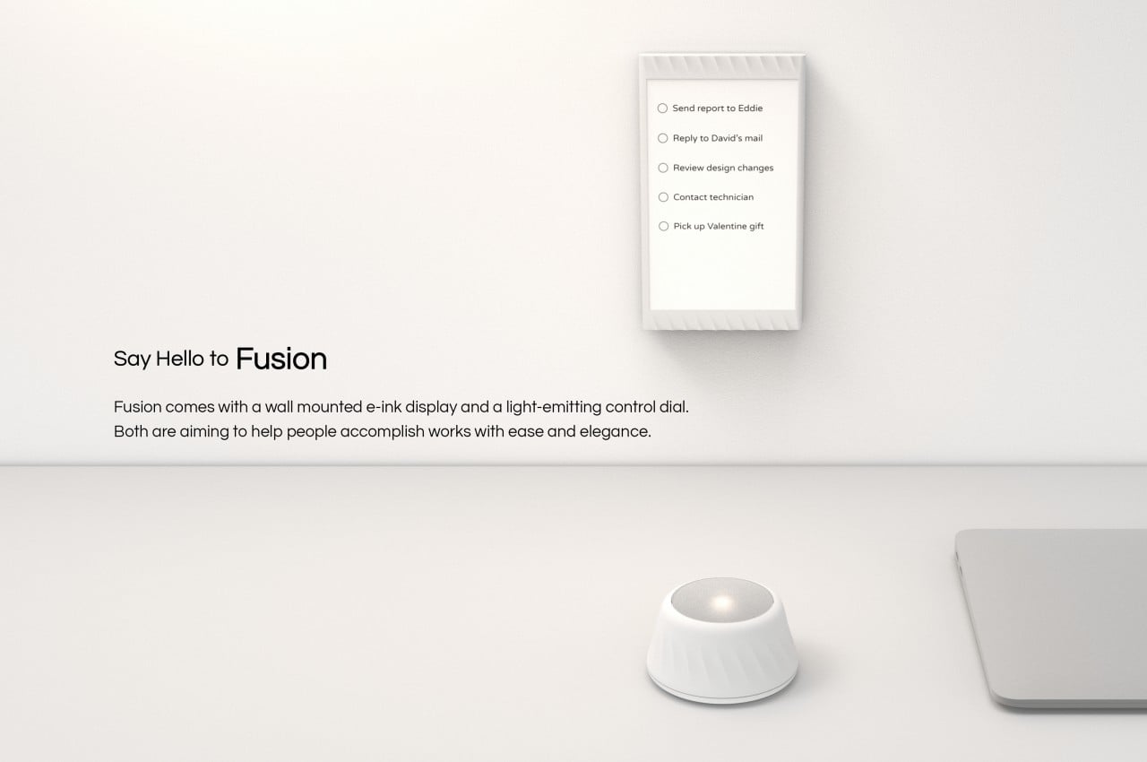
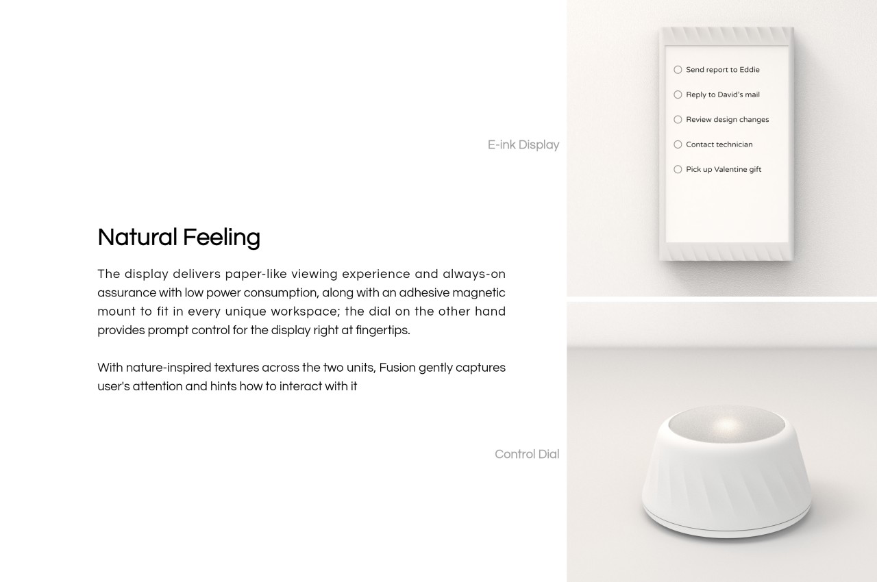
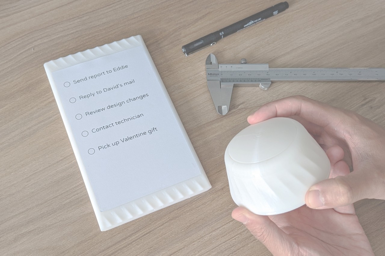
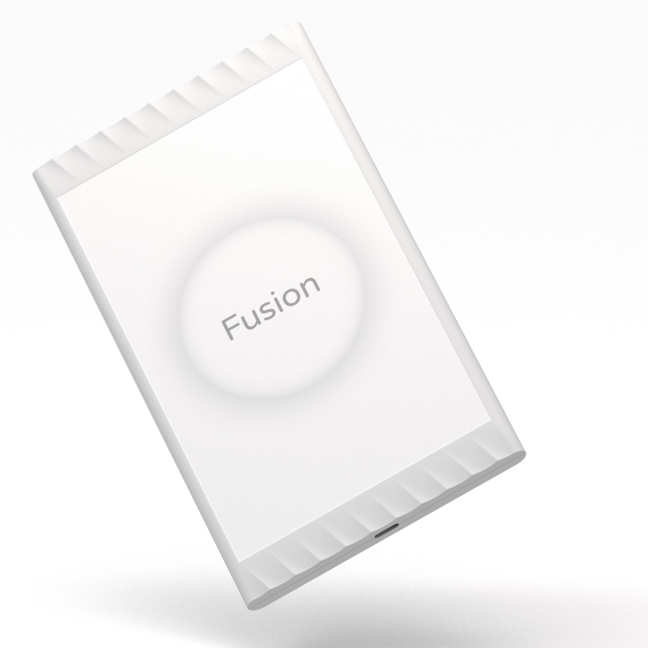
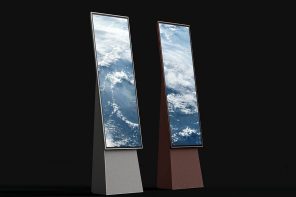
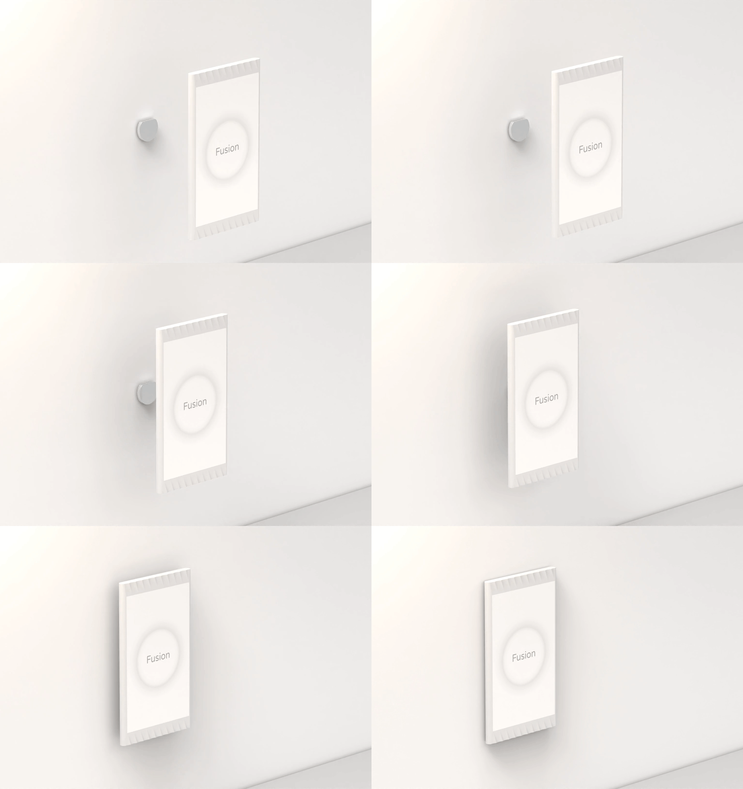
The concept is divided into two parts, with the first being the simpler and more straightforward half. This is an E-Ink display the size of a large, wide phone that displays your task list. This can be magnetically attached to a wall mount so that you can have an eye-level view of what’s on your plate. The e-Paper technology means that the screen won’t consume much power even while it’s on, making it more power-efficient and environment-friendly.
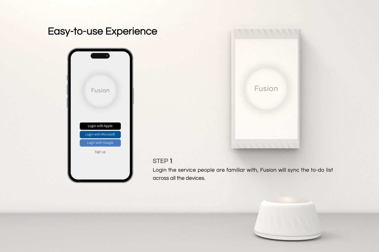
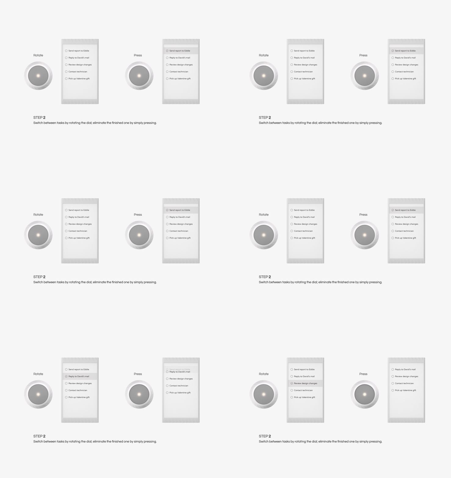
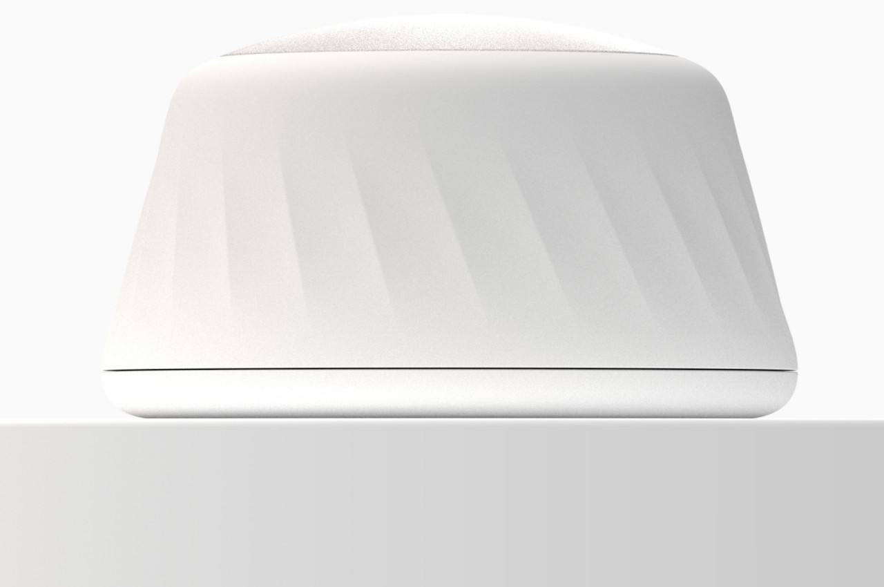
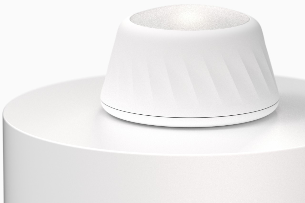
Such a device isn’t that uncommon these days, but what really sets Fusion apart is the dial that comes with it. The tall dome-shaped device gives users a physical method of scrolling through the list, making the action more memorable and special. To mark a task as done, you press the top like a big button, and you get rewarded with a colorful light effect that changes the color, pattern, and intensity every time you “check off” an item. Not only does this visual cue serve as a reward, it also becomes a motivation to see what combination you will get next time.
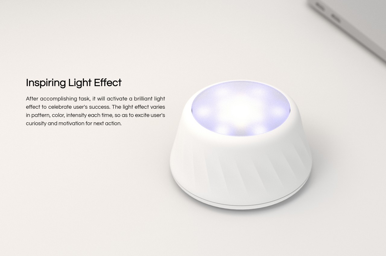
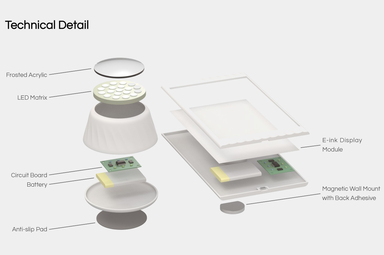
Admittedly, such a system can be easily implemented using apps or computer software, but the addition of a physical, analog component creates a different and improved experience over simply clicking on virtual boxes. It gives our minds a physical action to associate with the behavior, making it more memorable and even a bit addictive. It’s a simple and almost trivial change that produces a significant impact, just like what good designs are supposed to do.
