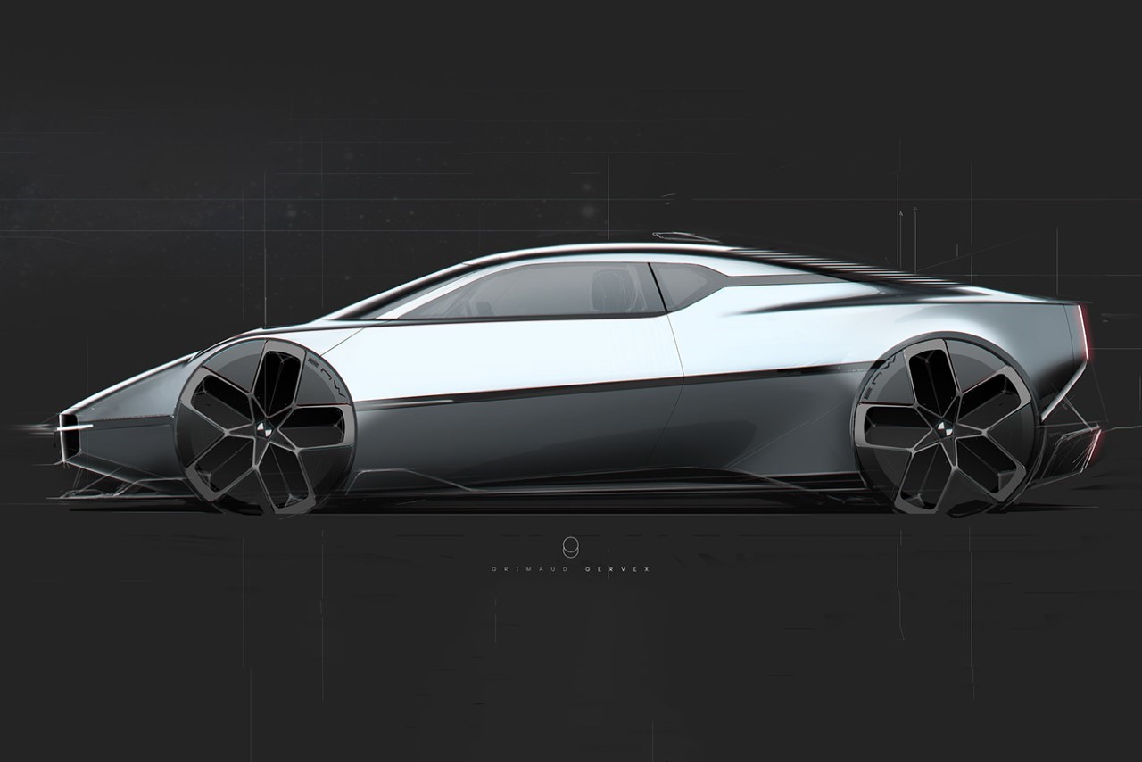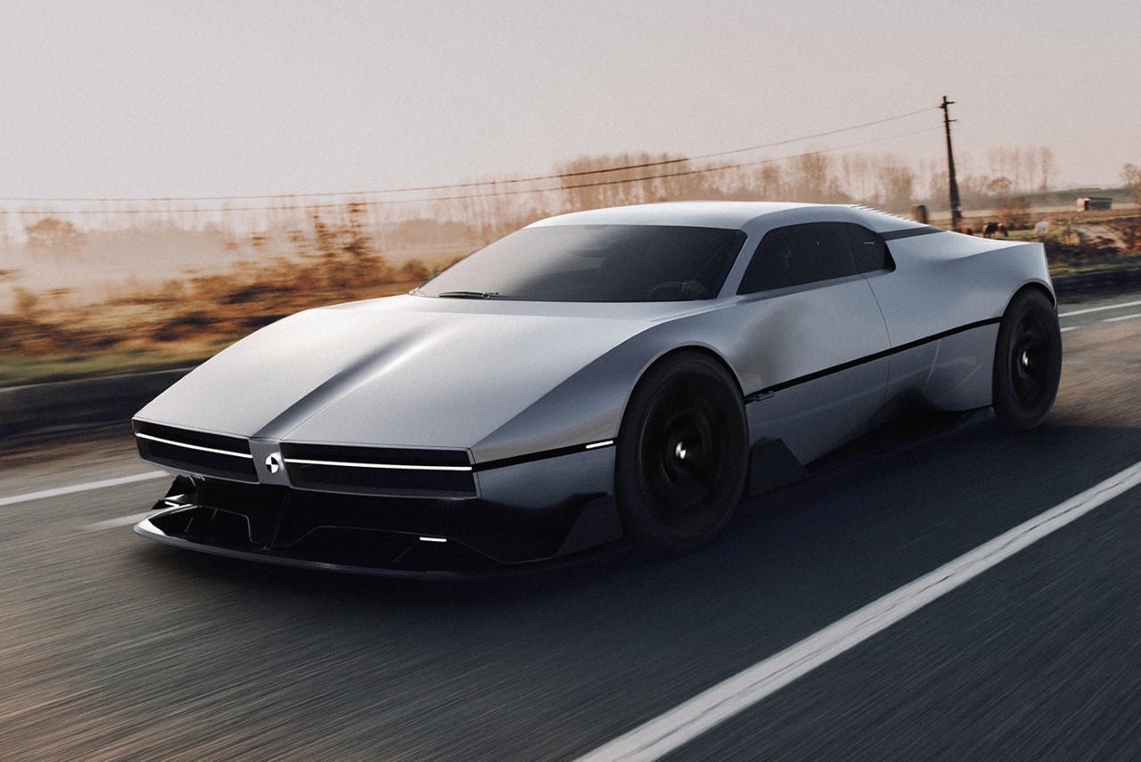
Touted as one of the rarest models BMW has ever built, the M1 is the German marque’s sole supercar dating back to the 70s. It hasn’t been recreated since, and BMW pretty much never made a supercar again (whether the i8 classifies as one remains a big debate), but designer Grimaud Gervex decided to give the good ol’ M1 a contemporary facelift. Following the M1’s template but consciously opting for sharper lines, tighter curves, and an overall meaner aesthetic, the redesigned BMW M1 looks right out of a sci-fi graphic novel, with an overall futuristic flavor that’s still somehow innately BMW.
Designer: Grimaud Gervex
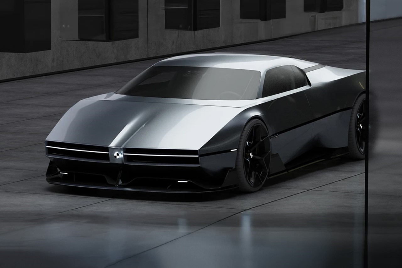
The car’s silhouette and especially its front are unmistakably inspired by the M1’s wedge-shaped design and slick, cutting-edge front. Unlike its predecessor, however, the M1 redesign doesn’t have pop-up headlights but instead relies on two LED strips on the front that serve as headlights, along with a minimalist, glowing BMW logo. Très futuristic.
Yet another detail to go missing, or rather to evolve into something else, is BMW’s signature kidney grilles. While one can only assume that this M1 redesign concept is electric, Grimaud decided to merge the grilles right into the air intakes around the headlights. They’re still there, but in a way that feels more visually present than the significantly tinier grilles on the original M1.
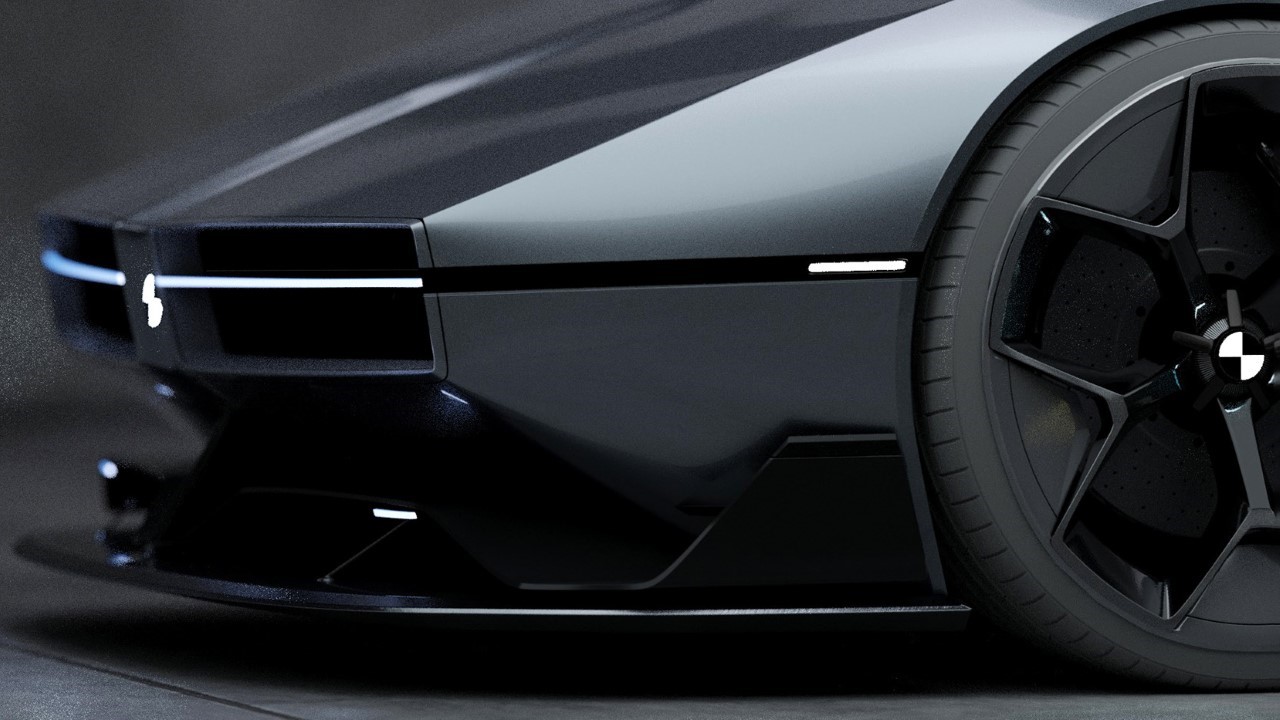
The LED-strip headlights are complemented by a similar-looking set of indicators right in front of the wheels.
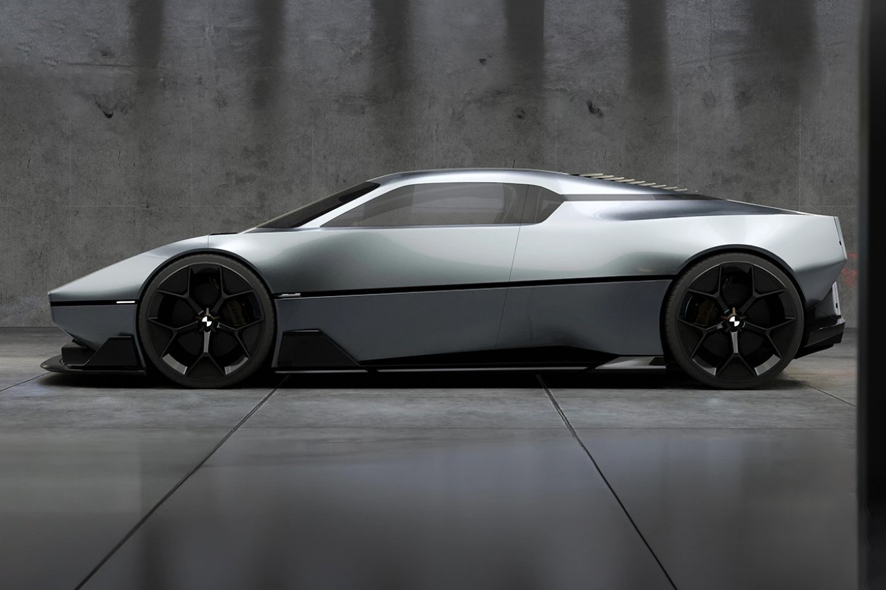
The rest of the redesigned M1 cleverly balances traditional details with creative futurism. The renewed design comes with the same black line cutting right through the side of the car, giving it a sense of speed and forward-moving dynamism, and there’s some similarity in the quarter-window’s design too. The rear windscreen also houses the same slatted grille as the original M1… however the entire rear feels like a complete visual overhaul, with a piercingly slim taillight that runs around the edge of the rectangular backside of the car. While the original had two BMW logos above each taillight, the redesign instead has the embossed initials BMW on the metal plate.
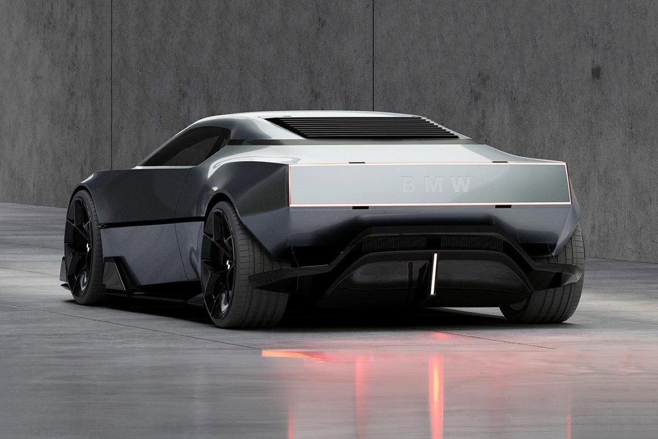
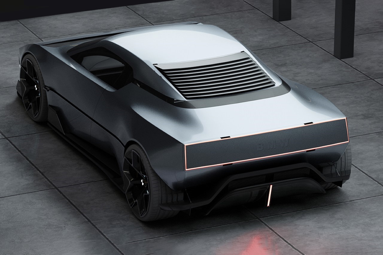
What really makes the new M1 feel futuristic is its design and surface treatment. You’ve got a lighter, tighter form factor with razor-sharp edges and extremely thin parting lines between panels, resulting in a seamlessness that looks nothing like production cars from decades ago. The body kit gives the M1 a more low-hanging personality with a much lower ground clearance as compared to the original M1. I don’t know how to feel about that metallic paint job because, between the DeLorean, Cybertruck, IONIQ concepts, and a few other modern cars, it feels a little overdone. Maybe a white with blue accents instead?
