If you’re looking for a stunning little cabin in the woods to get away to and simply relax, then you’ve reached the right place. Cabins are by far the best type of vacation I’ve come across. They’re a peaceful and tranquil option to abandon your urban life and woes, and simply unwind in nature. If you’re wondering where to head for your next cabin retreat, then you can refer to this collection of beautiful and super cozy cabins that we’ve gathered. They’re the perfect safe haven nestled in the midst of nature, providing you a break from your everyday hectic life. From an off-grid cabin in the Italian mountains that doubles up as a yoga retreat to an all-black cabin in the woods that support a slow-paced life – these mesmerizing and surreal cabins are the ultimate retreat, you’ve been searching for. Plan your next vacation in one of them!
1. The Forest House
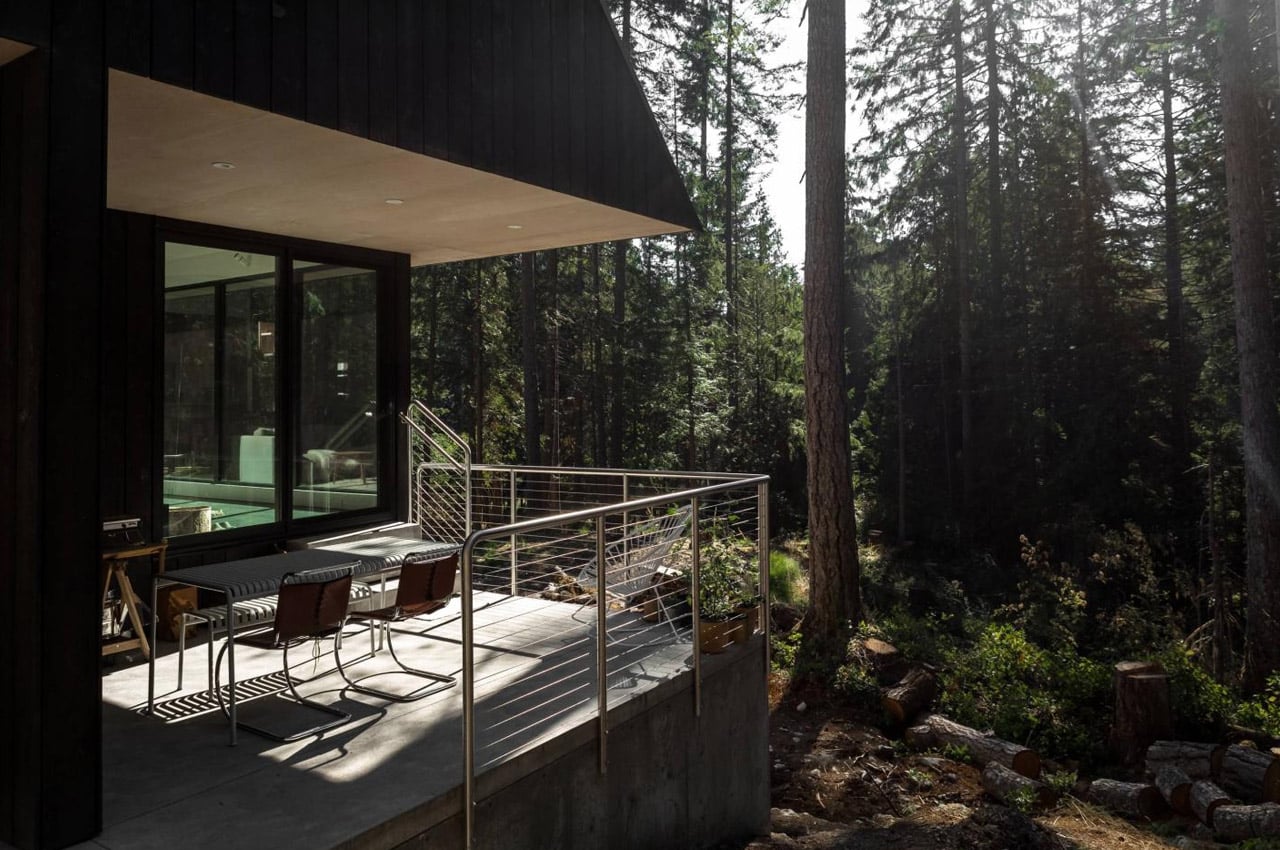
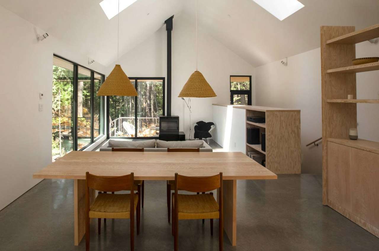
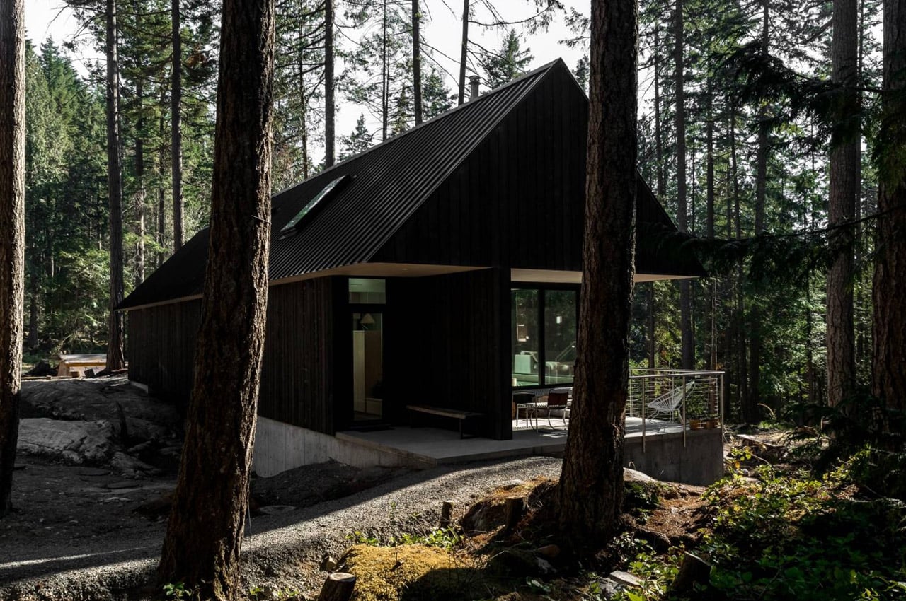
Called the Forest House, this beautiful cabin in Bowen Island, British Colombia is designed by SM Studio. It is heavily inspired by SM Studio’s philosophy of building low-energy and sustainable homes – and they have achieved it by creating a bridge-like structure that connects the home foundations. The result is a design that does not impact the surroundings negatively while allowing the user to enjoy the serenity, peacefully.
Why is it noteworthy?
Designed by the Vancouver-based SM Studio, the Forest House is surrounded by Douglas firs, and elevated above the rocky landscape. To reduce the impact of the home on the forest floor, SM Studio designed it like a bridge connecting two massive outcrops, leaving the space below quite clear, and minimizing the need to create a foundation on the rocks.
What we like
- Built while maintaining a serene relationship with the landscape around it
- Supports a more slow-paced life
- Causes minimum disturbance to the site
What we dislike
- The home can accommodate only 3 people, hence it can be considered a small space for certain families
2. Cabin Anna
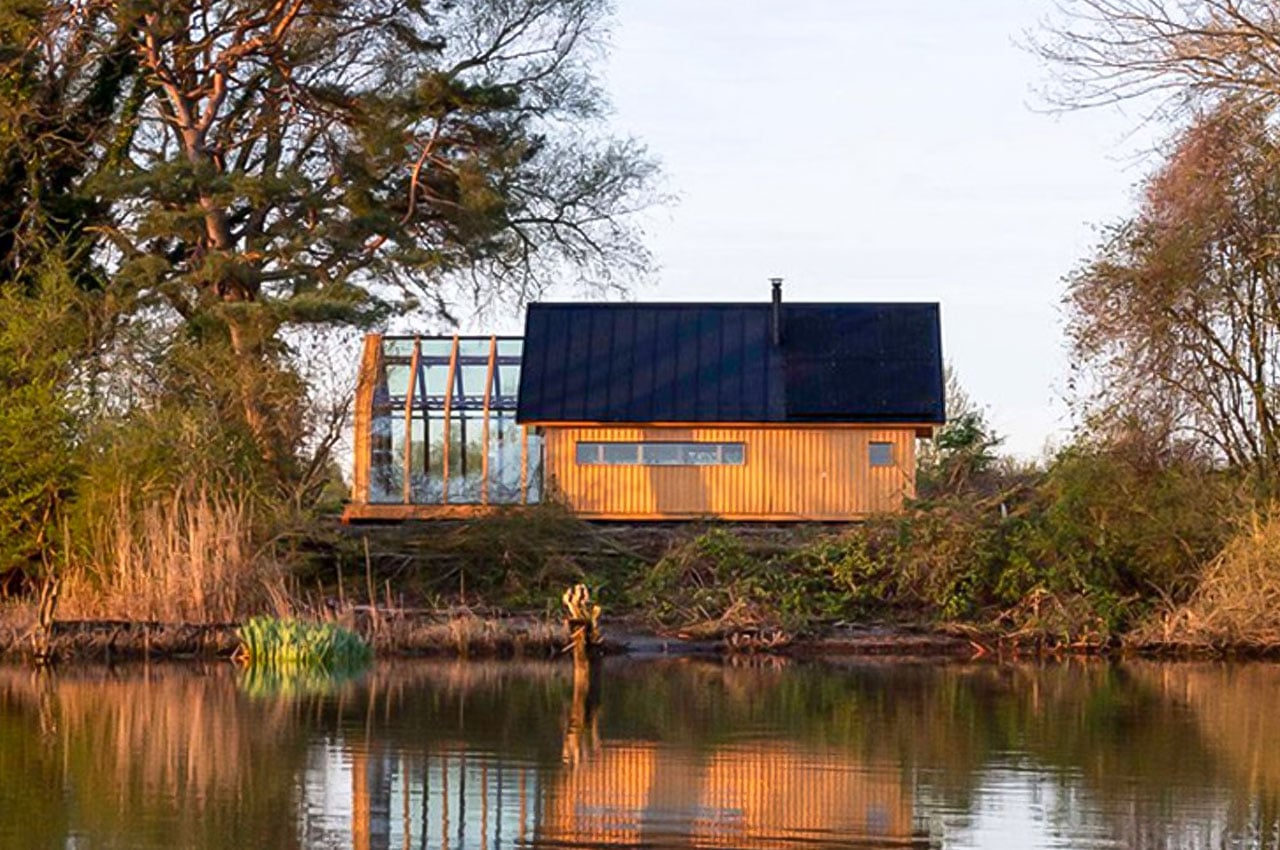
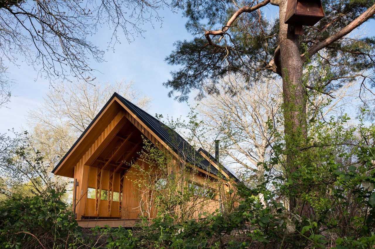
Located in the De Biesbosch National Park in the Netherlands is a modular cabin called the Cabin Anna. Designed by architectural designer Caspar Schols, this cabin is the latest iteration of the flatpack Cabin Anna, which created waves in 2016. Schols had built it as a prototype garden room for his mother, in their home in Eindhoven.
Why is it noteworthy?
The latest cabin in the De Biesbosch National Park is designed to be utilized as a small compact home. It features a ground floor, mezzanine sleeping areas, a kitchen, a bathroom, and an outdoor shower. “In wintertime, Anna’s insulated wooden shell keeps the warmth inside like a thick winter coat. In spring or autumn, the glass keeps the rain outside or lets the sun in to warm up the space,” said the architect.
What we like
- All the sliders have been designed to be manually operated, to allow the residents to feel a sense of closeness with the surrounding environment
What we dislike
- They don’t offer an electronic opening version of Anna
3. The Iwi Cabin
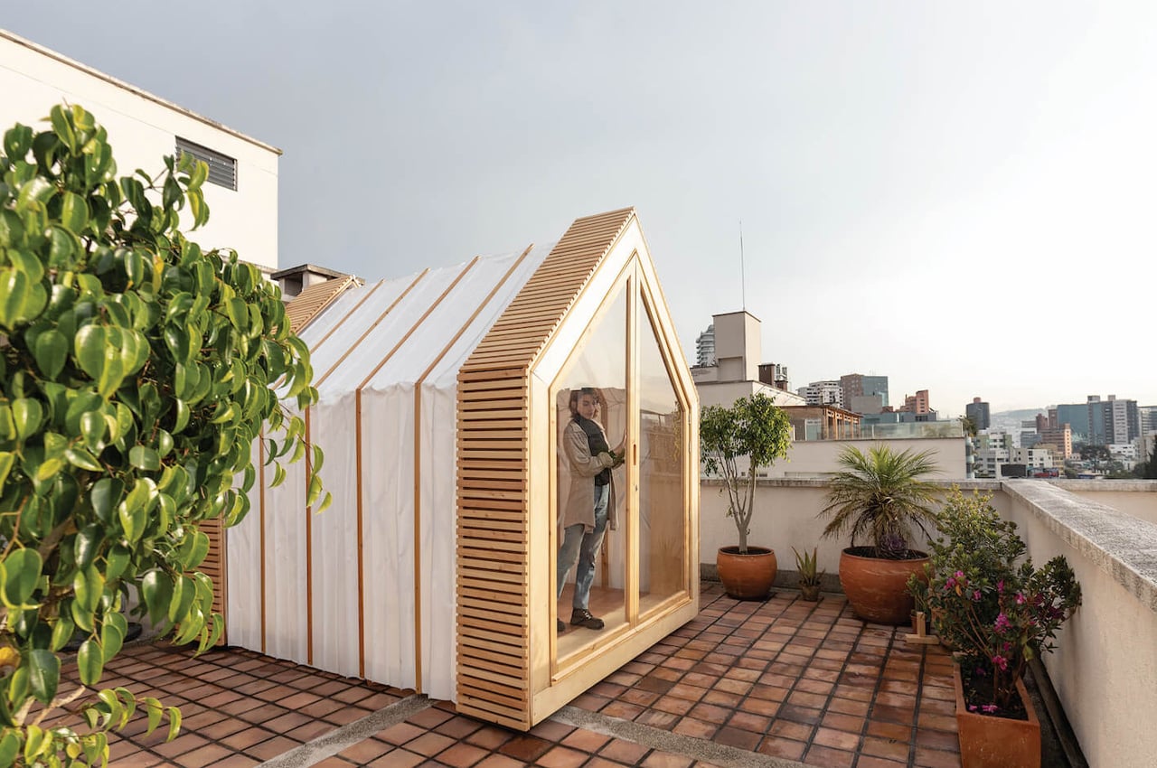

Designed to be an accordion-shaped shed, the Iwi Cabin is an innovative space-maximizing design that can be compressed and expanded. It provides city dwellers with a nifty solution to expand space in urban apartments and living spaces.
Why is it noteworthy?
When the Iwi Cabin is fully expanded, it unfolds and occupies almost 91 square feet, and when it is folded and compressed, it occupies only 26 square feet. The Iwi Cabin is super easy to operate since owners can push and pull the shed, owing to the wheel system that allows it to be swiftly and efficiently handled and stored away.
What we like
- The exterior of the cabin is resistant to wind, rain, and sunshine
- The interiors have been outfitted with cork and sheep’s wool to keep the residents warm during cold weather
What we dislike
- There being only one door/window, it is the only source of ventilation in the cabin
4. Kjerringholmen


This is the Hvaler archipelago, a true island paradise in Norway where you will find the ‘Kjerringholmen’ cabin. With just 63 square meters in size, the plan/design of the cabin still showcases plenty of space to give a very spacious and airy effect.
Why is it noteworthy?
Kjerringholmen is proof “that large houses don’t necessarily mean more quality of life. In just 63 square meters, with smart planning, it still has plenty of usable space,” said the studio. Occupying 63 square meters, the cabin is supported by steel pillars and surrounded by a dusky rocky landscape.
What we like
- Blends perfectly with the natural landscape
- Designed extremely efficiently to support a smart way of living
What we dislike
- Birds may not notice the home and could crash into it since it merges so perfectly with its surroundings
5. Cabins in Farouche Tremblant
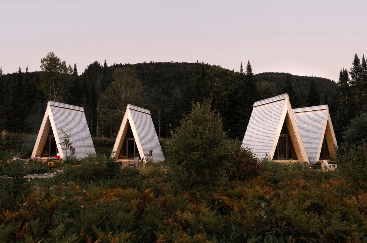
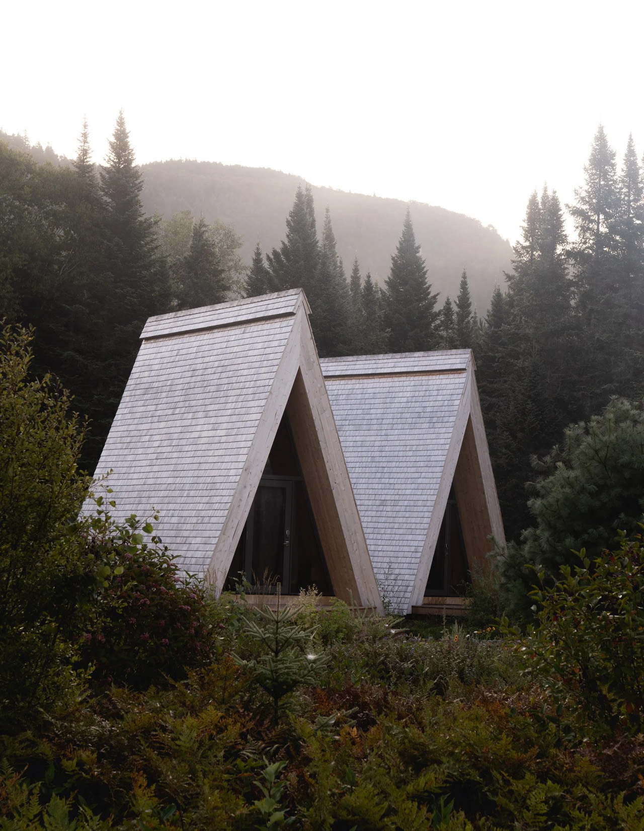
Nestled within the Devil River’s Valley, with the Mont-Tremblant National Park in the backdrop is a series of A-frame buildings in the ‘Farouche Tremblant’ agrotourism site that includes a cafe, farm, and four rental micro-cabins. “The cabins, though minimal, are designed for visitors to comfortably experience the changing beauty of the site throughout all four seasons,” said Atelier l’Abri founding partner Nicolas Lapierre “The structures’ organization and proximity really bring in a more social and communal experience which is great.”
Why is it noteworthy?
Designed by the Canadian architecture studio Atelier l’Abri, the buildings are meant to “recede in the landscape”. The studio designed that function as a basecamp for visitors who want to visit Devil’s River and valley.
What we like
- Amped with outdoor decking and a glazed gable end which allows the visitors to enjoy stunning views of the surrounding natural landscape
What we dislike
- The aesthetics of the cabins are a bit old-school
6. “3 Scenes of Homes”
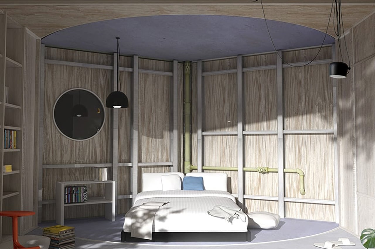
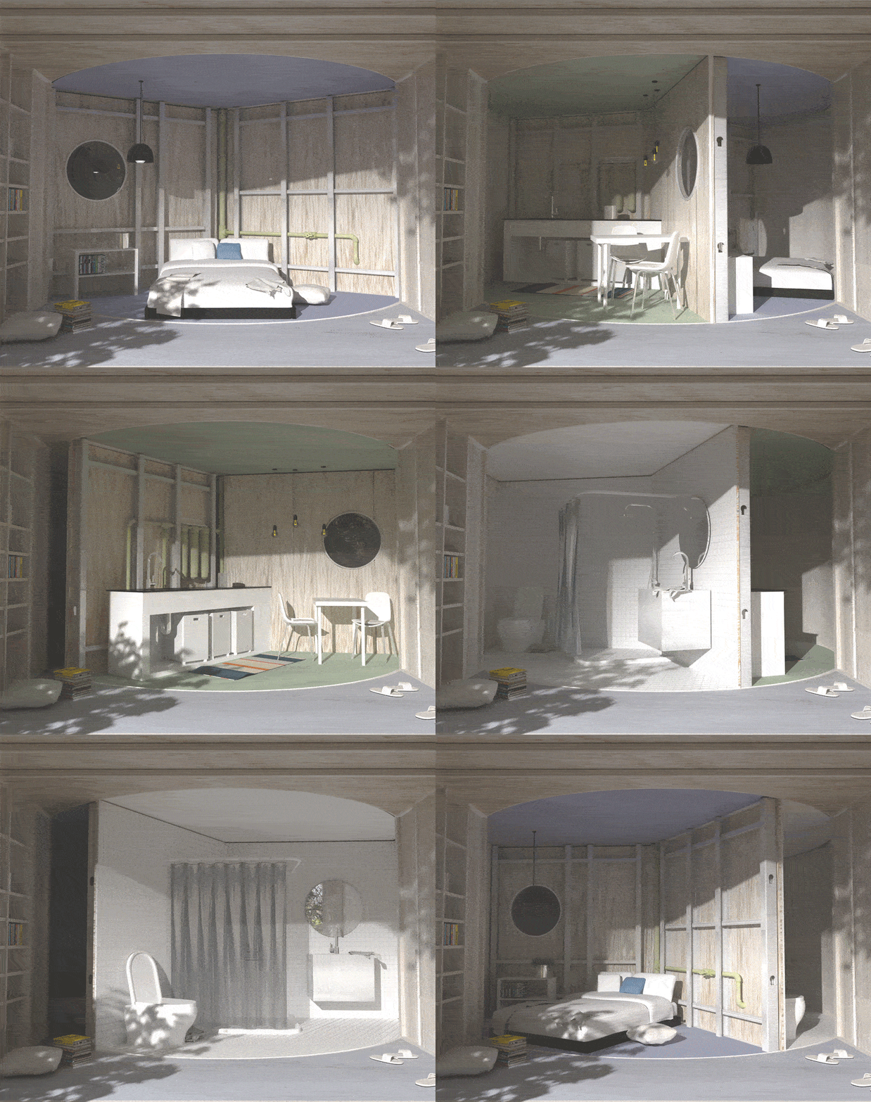
The ‘3 Scenes of Homes’ is a conceptual design by Studio Supra-Simplicities that was created as a proposal for Buildner’s 2023 MicroHome Competition Edition. The micro-cabin is placed on a rapidly rotating display, allowing it to swiftly switch between three varied rooms or scenes of living.
Why is it noteworthy?
The micro cabin seamlessly integrates three spaces – for sleeping, dining, and washing. It rotates swiftly, utilizing the theatrical function of a stage, to bring the bedroom, dining area, and washroom into the limelight turn by turn. The structure, in turn, occupies a minimum footprint, eliminating the need for unnecessary circulation spaces, and providing the space with a flexible style of living.
What we like
- It covers only a small amount of space on the site
- Recycles rainwater for daily usage via its rooftop harvesting system
What we dislike
- It’s not the best and most functional living situation realistically speaking
7. Bathhouse
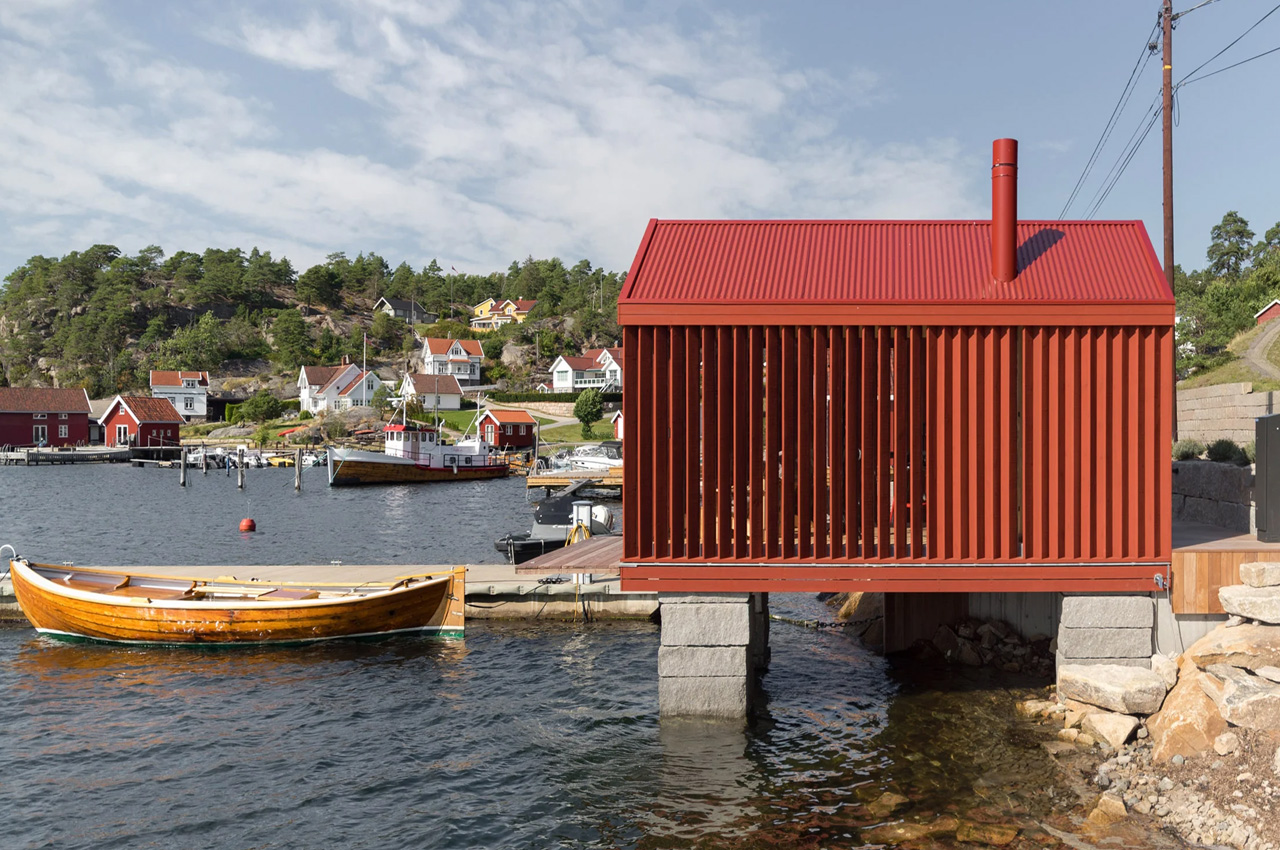
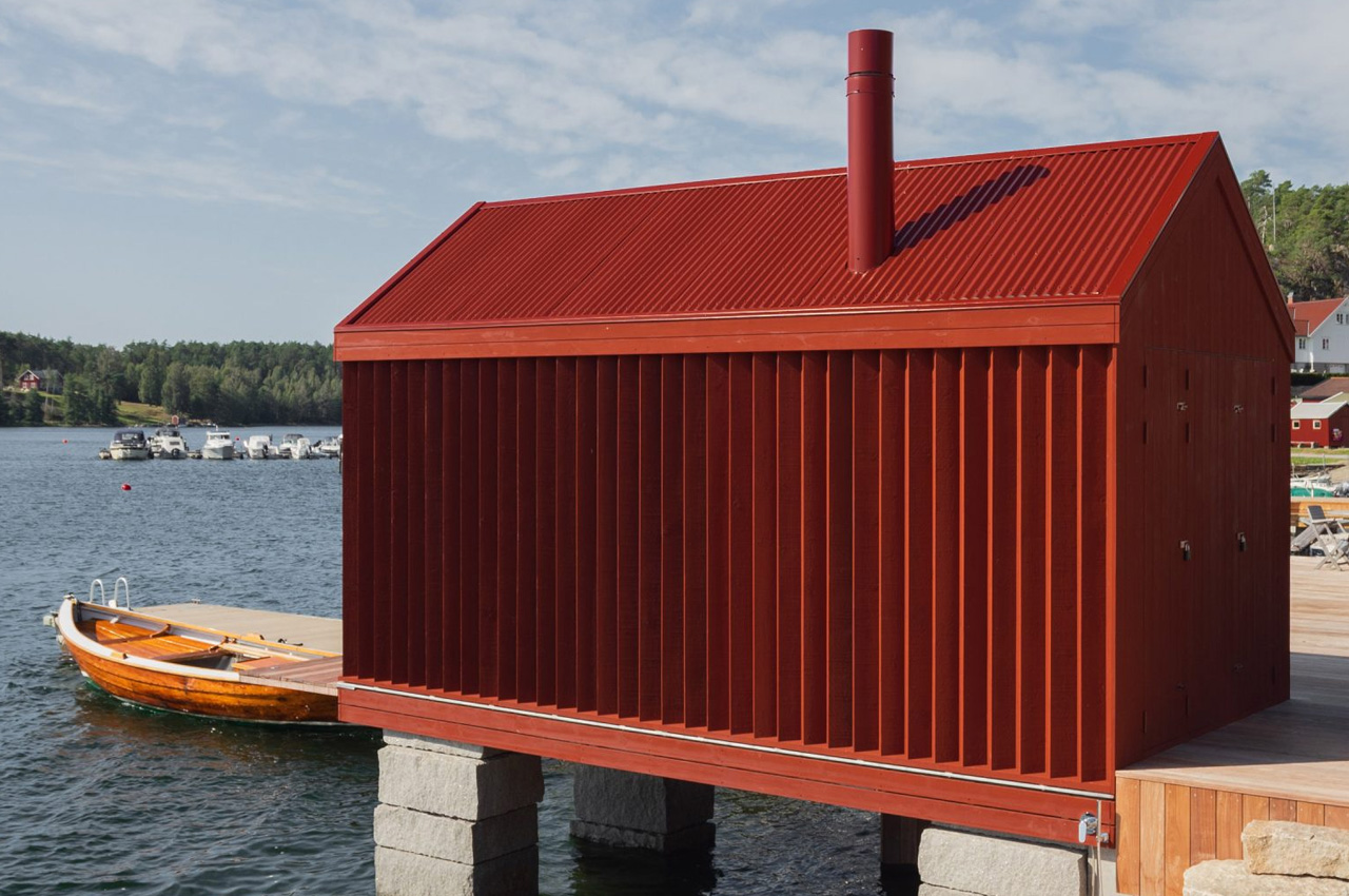
Norwegian architecture studio Handegård Arkitektur designed Bathhouse, a bright red cabin on the seafront in Hankøsundet, Østfold. Inspired by the traditional Norwegian boathouse aesthetics, the cabin uses the red color exterior as an homage to the same. The cabin sits right at the waterfront and is elevated using stacks of granite. This design gives it an almost fairytale appeal, with the little red cabin looking like it’s almost floating in the air.
Why is it noteworthy?
The cabin was built for a client who lives near the coast and aims to be a ‘modern reinterpretation’ of traditional Norwegian boathouses. The studio used contemporary materials and techniques to create this lively-looking cabin since the client wanted a space that was both modern and traditional.
What we like
- The cabin’s red-painted finish, tin roof, and thick granite stacks in the water give the impression of a traditional boathouse quite accurately
- The cabin’s living area is covered by a second layer of timber planks, angled at 45 degrees, which aim to create a sense of privacy
What we dislike
- The open panels in the living room may cause discomfort for those who would rather have an option in arranging the angle and the privacy of their windows
8. A House
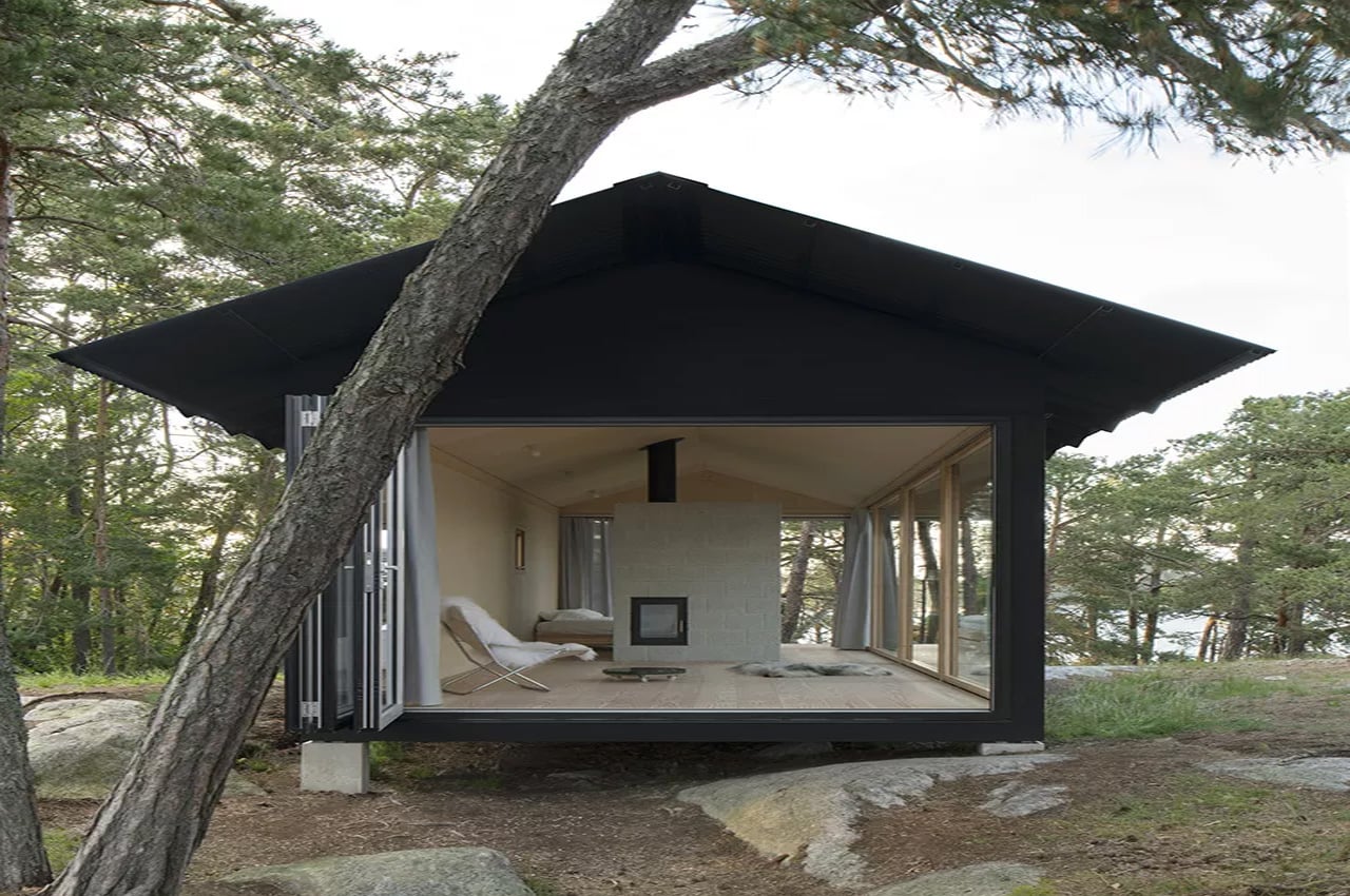
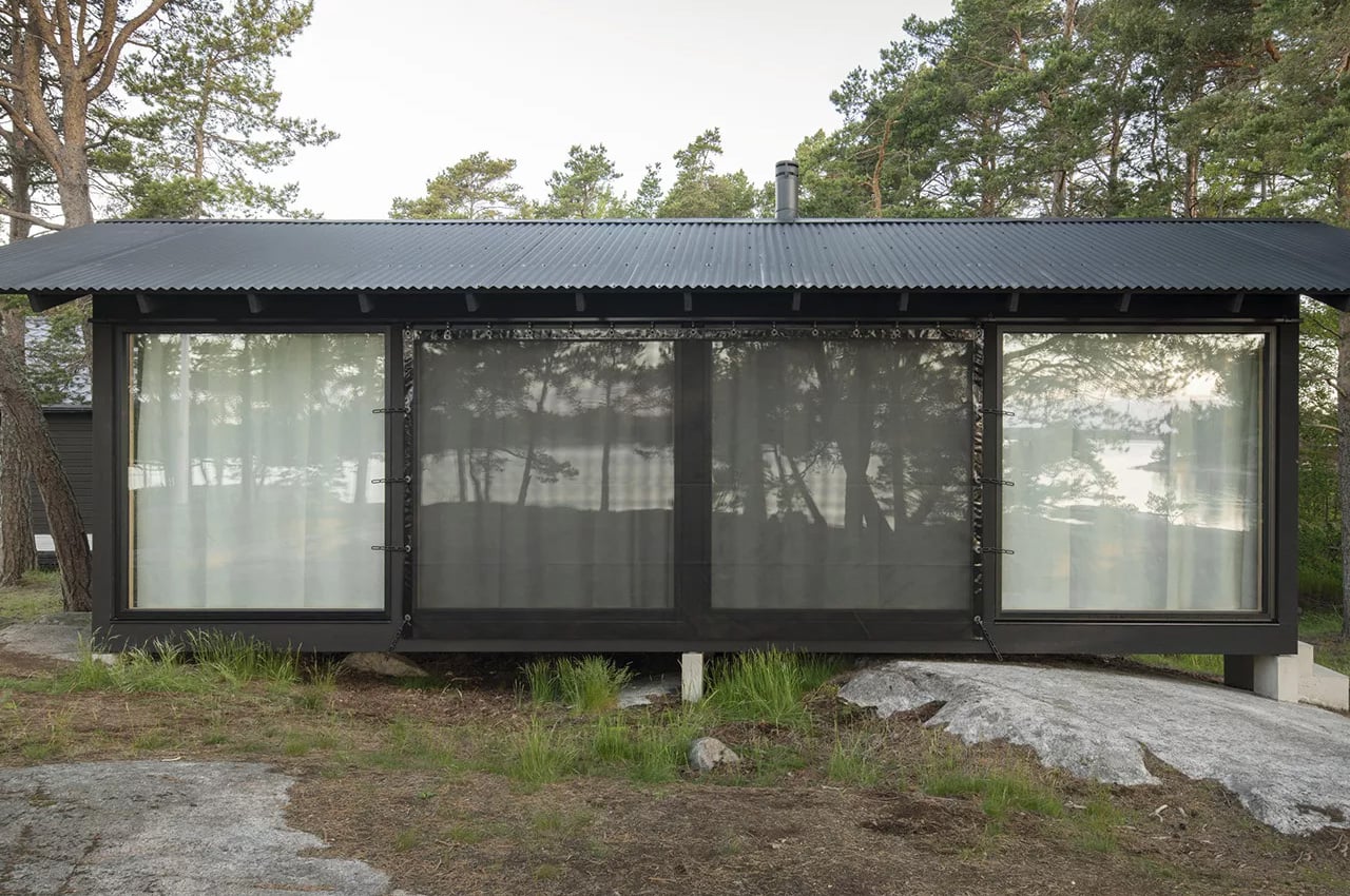
Nestled in the beautiful wooded region of Lilla Kilskäret, an island of the Swedish archipelago near Stockholm is a minimalist Nordic cabin called ‘A House’. Designed by emerging Studio Nāv, the idyllic cabin was designed for a young couple as a cozy summer home to escape to during the warm season.
Why is it noteworthy?
‘A House’ beautifully captures minimalist Nordic architecture, and its picturesque surroundings help to create a space that is truly calming and peaceful. However, despite its pristine and awe-spiring location, building the home wasn’t simple child’s play. The site and local building regulations were quite challenging, and hence the home needed to occupy a tiny footprint, and perfectly blend in with its surroundings. In a quest to do so, the interiors of the home were made to be open, free-flowing, and extremely flexible.
What we like
- The interiors are marked by a single open room, encapsulated in shrouds of glass, allowing the home to harmoniously merge with its surrounding landscape, and creating the sensation of being at one with it
What we dislike
- The home may not be private enough with its 3 walls being made of glass
9. The Buck Mountain Cabin
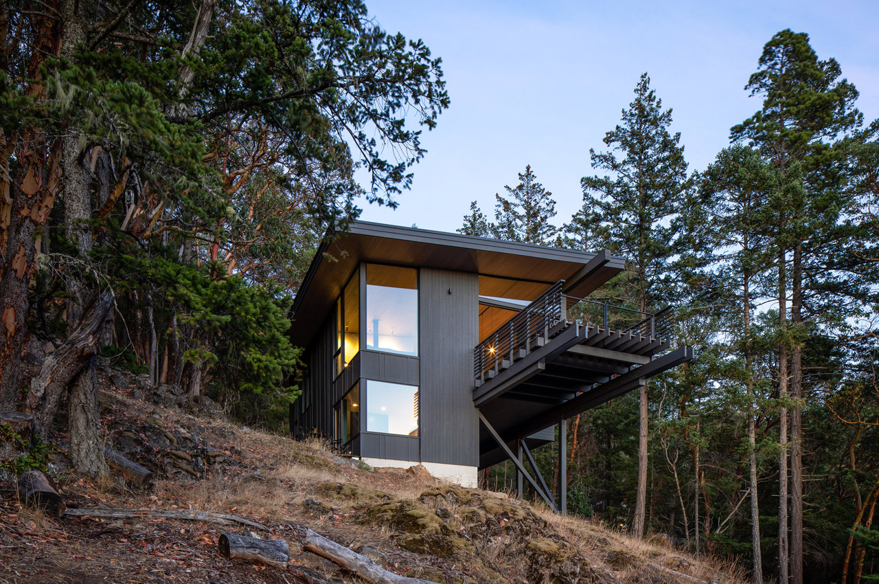
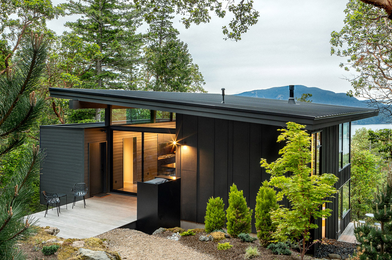
Situated on Orcas Island, which is part of an archipelago called San Juan islands, is the Buck Mountain Cabin. The beautiful cedar-clad cabin was built by embracing the original site and its conditions, and by ensuring that minimal disturbance was caused to it. A steep grade and a narrow clearing created by a rock outcropping were a few of the challenges faced by the architects, but they encouraged the clients to focus on these features as they are unique to San Juan.
Why is it noteworthy?
The grassy basalt-rock outcroppings set within a Douglas fir and Pacific madrone forest were used to enhance and elevate the cabin. The east side of the 1527 square feet cabin is anchored to an outcrop, while the west side interestingly cantilevers over the entire site, almost 22 feet above the ground, and provides beautiful views of the surrounding landscape. The large trees around the site weren’t torn down which also ensured that the site was minimally disturbed. The addition of cantilevers and point-load wooden columns with small footings helped this cause as well.
What we like
- Large protective overhangs and south-facing clearstory windows allow sunlight to generously stream in, especially during winter
- A stunning patio floats over the site and can be accessed via a glass door
- Ensures minimal disturbance is caused to the original site
What we dislike
- The designers avoided precious or complicated materials and systems, taking away from the luxury element the interiors could have
10. The Hermitage Cabin
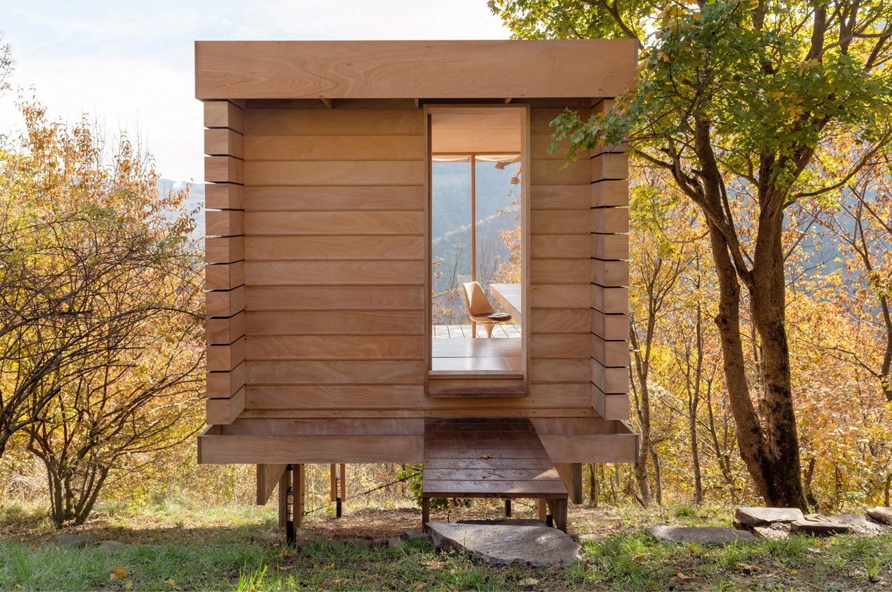

Positioned on the edge of a hill, surrounded by the Apennine Mountains, and overlooking the Trebbia Valley near Genoa, is a minimal off-grid cabin called the Hermitage Cabin. This beautiful wooden cabin was built for “contemplation and introspection”, and occupies only 12 square meters. It can function as a secluded little home or even a cozy yoga retreat!
Why is it noteworthy?
Italian architecture studio Llabb drew inspiration from Scandinavian cabins and Japanese teahouses while designing the Hermitage. The cabin is raised on four wooden and steel supports, which stand on a base of sandstone beds. It features an intriguing modular form created from Okoume marine plywood in Llabb’s carpentry workshop!
What we like
- Inspired by Scandinavian cabins and Japanese teahouses
- Creates a minimal impact on the land
- Doubles up as a yoga retreat
What we dislike
- Can be considered a small space for a yoga retreat

