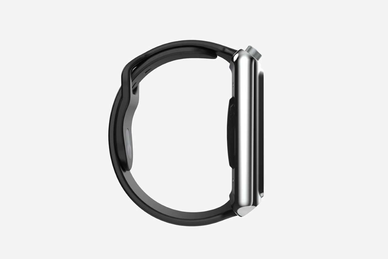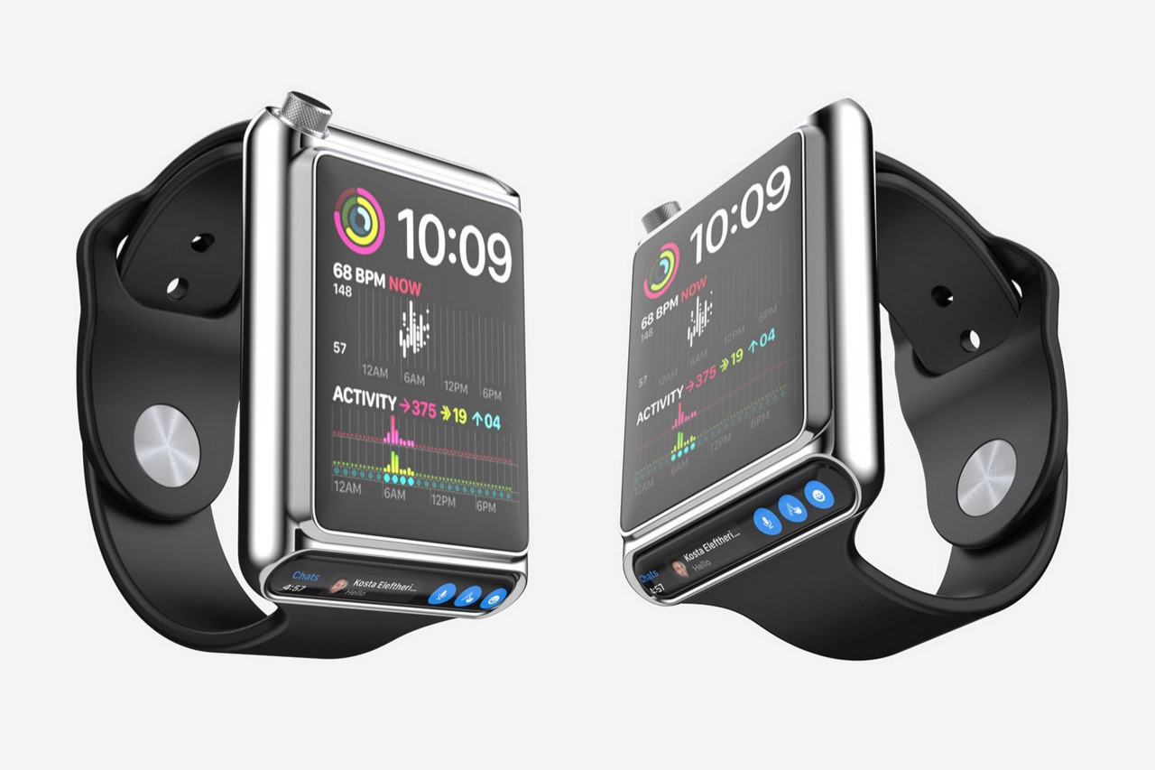
As multiple rumors of an Apple iPhone with no buttons, a HomePod with a larger screen, and an Apple XR headset hit the surface, let’s look at this odd little Apple Watch concept that ditches the large always-on display for something a little different. This unique Watch concept from the mind of Tien Hung comes with two displays instead of one, using a secondary ticker-tape-inspired screen right below the primary one to show you notifications. The watch also shifts the crown to the top left corner, creating a template that definitely feels different in a way that I’m still trying to wrap my head around.
Designer: Tien Hung
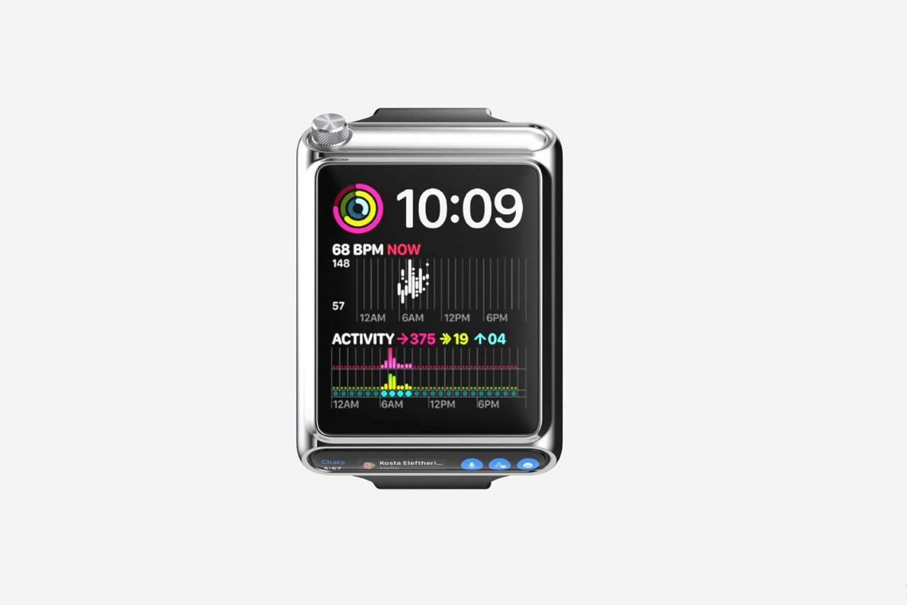
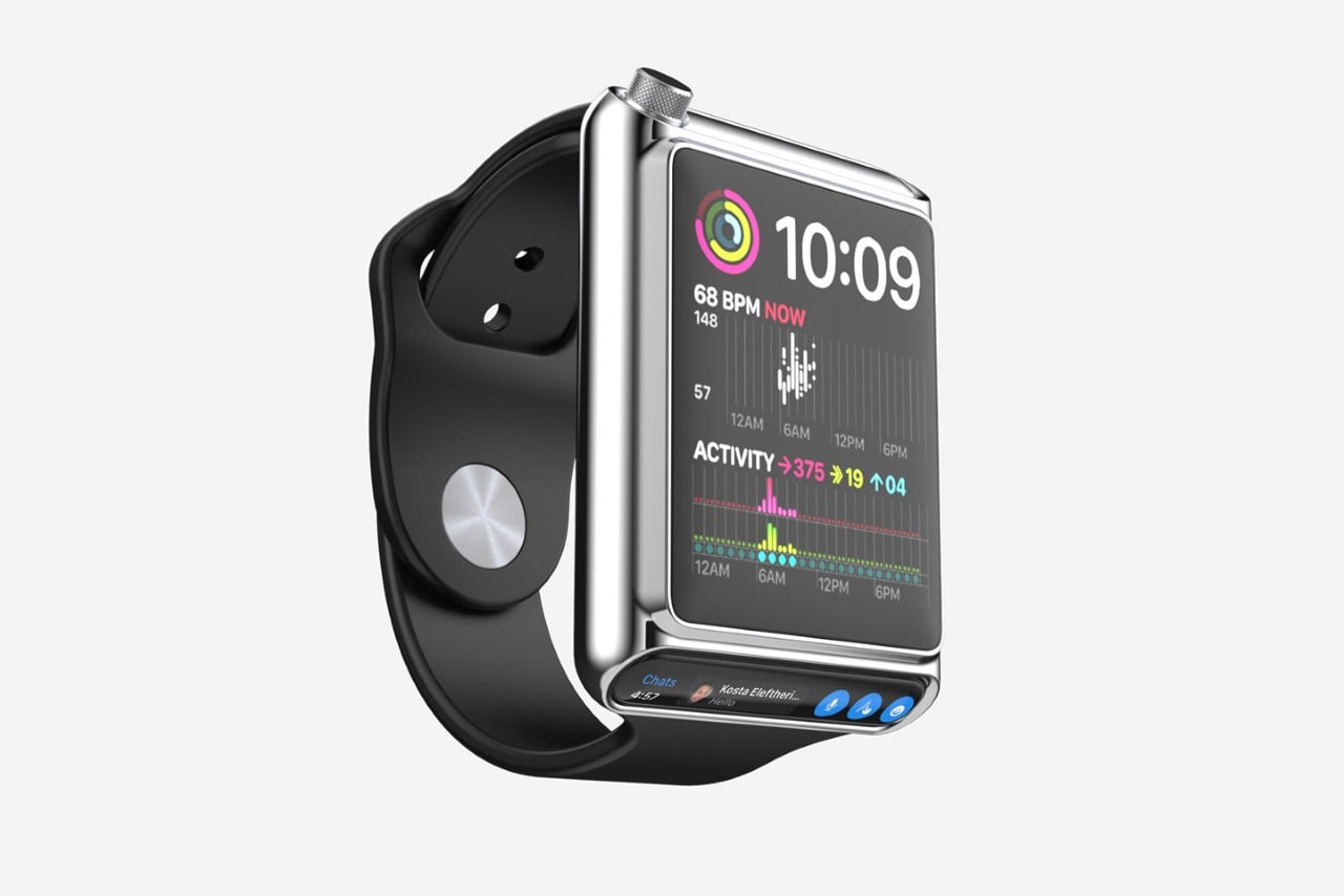
Just like the MacBook with its TouchBar, this Watch concept has its own TouchBar of sorts, designed as a dedicated notification and quick-action center. The secondary display sits underneath the first one, at an angle that naturally points towards the wearer’s eye so that you can get your notification at a glance without needing to tilt your Watch over to activate the display.
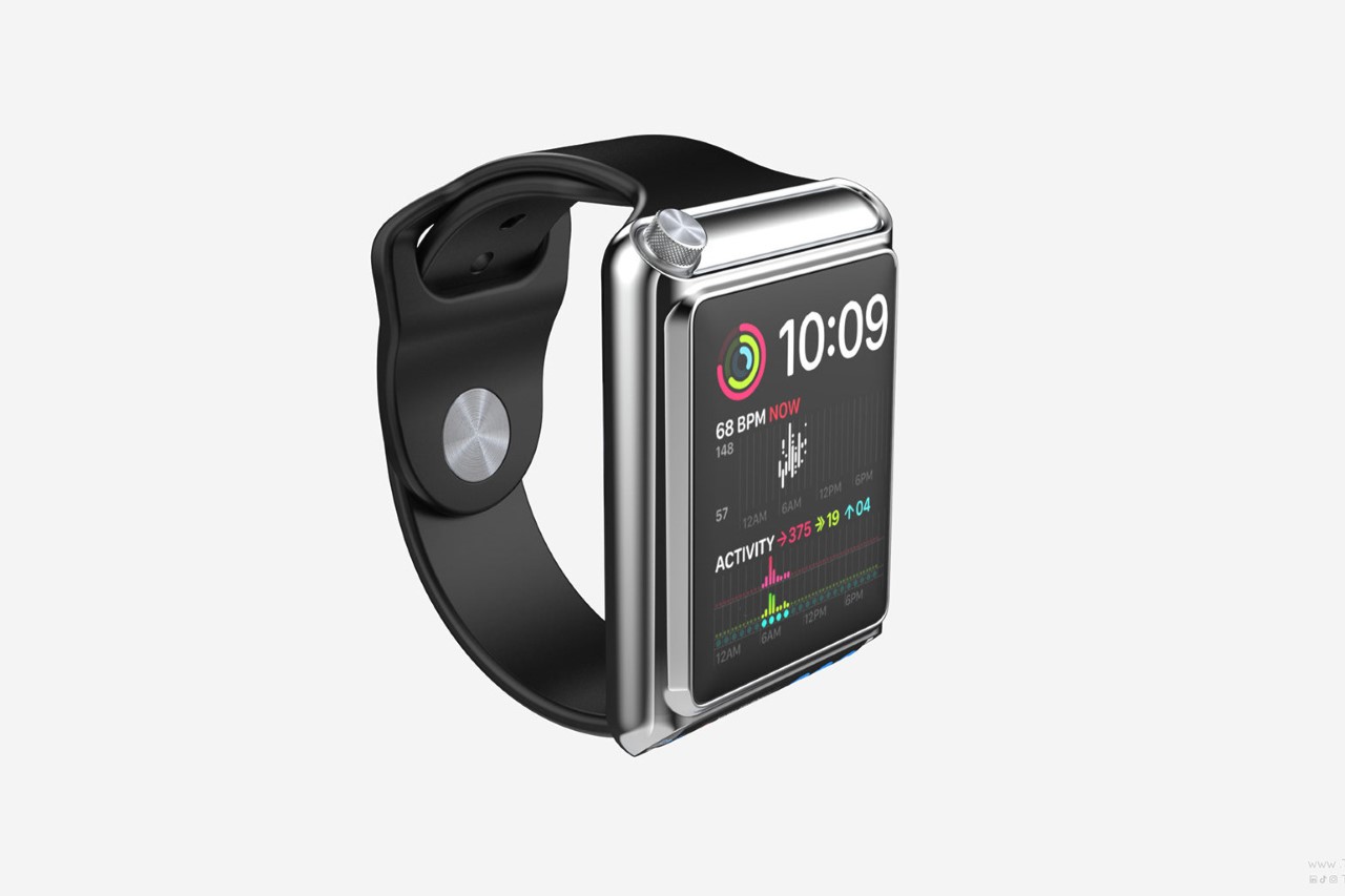
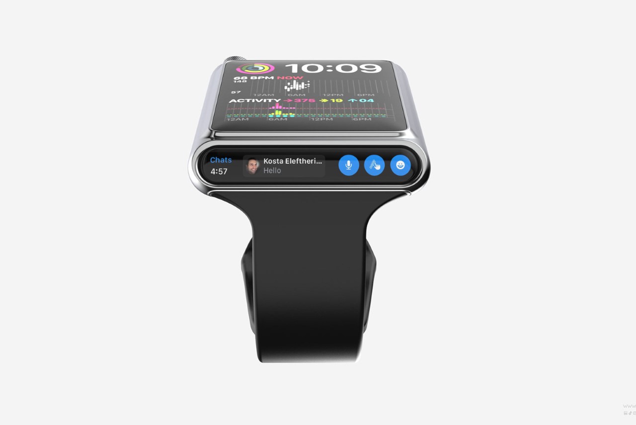
This new kind of Dynamic Island gives the Apple Watch a distinctly different aesthetic. It allows the watch to, for once, multitask by letting you respond to messages on one screen while you track your activity on the other. The Watch’s body perhaps receives its biggest set of changes, while the strap stays the same. The dual-screen design sees a complete shift in the watch’s overall visual DNA. The home button goes the way of the dinosaur, while the crown shifts from the 3 o’clock position to the top-left corner, becoming a little hard to access. I’d prefer a top right, if anything.
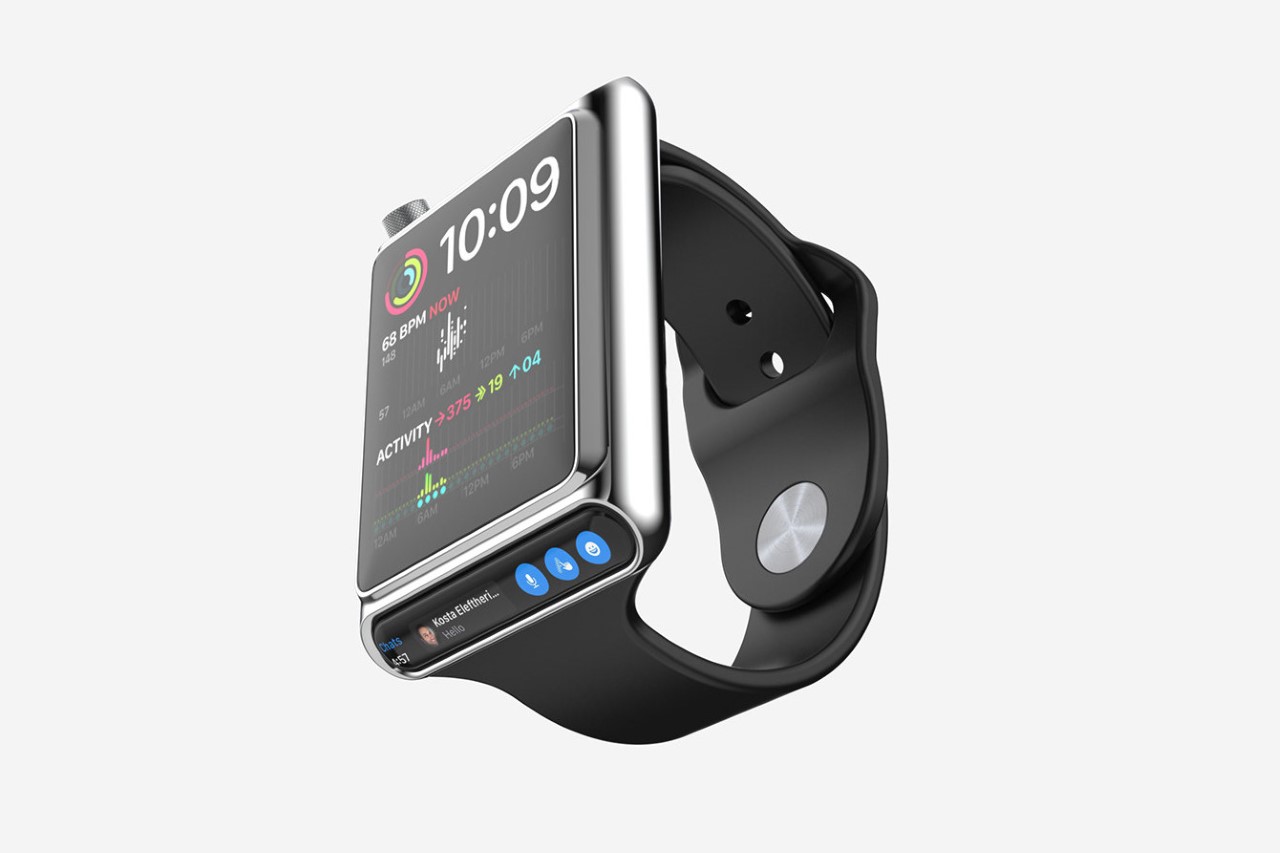
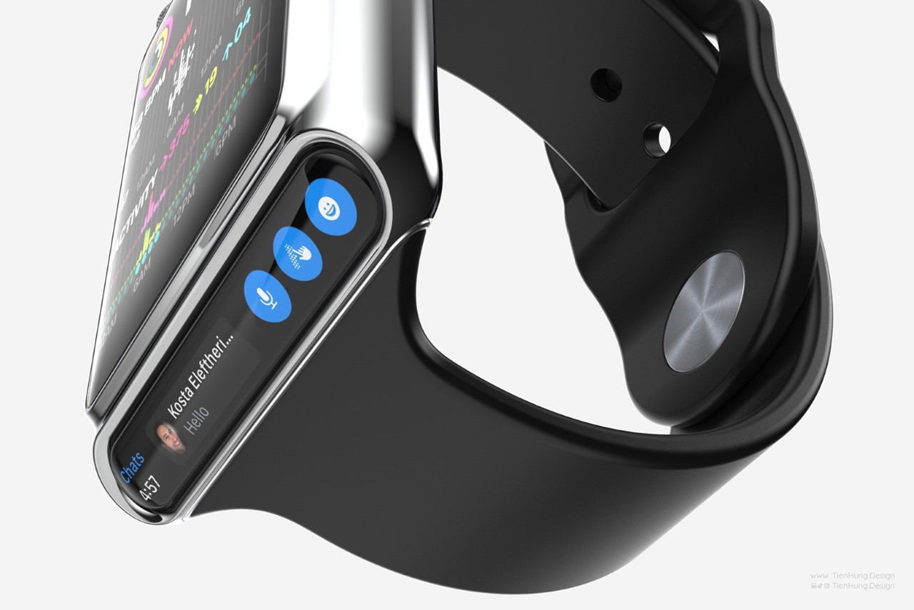
This novel concept is far from ever being a reality, given that the Apple Watch is less of a multitasking device and more of a health wearable. Apple’s announcement of the Watch Ultra last year has only further cemented the idea that the Watch isn’t an extension of your phone anymore… it’s a potentially life-saving device that monitors your health 24×7, letting you know the second it senses something wrong. Apple’s been working on a non-invasive blood glucose monitoring system that may come to the Watch this year, although realistically it seems like that feature is still a year or two away. If you asked me what the watch was missing, however, a secondary screen wouldn’t be anywhere on the list. I’d much rather have a camera on the watch that lets you FaceTime directly from your wrist!
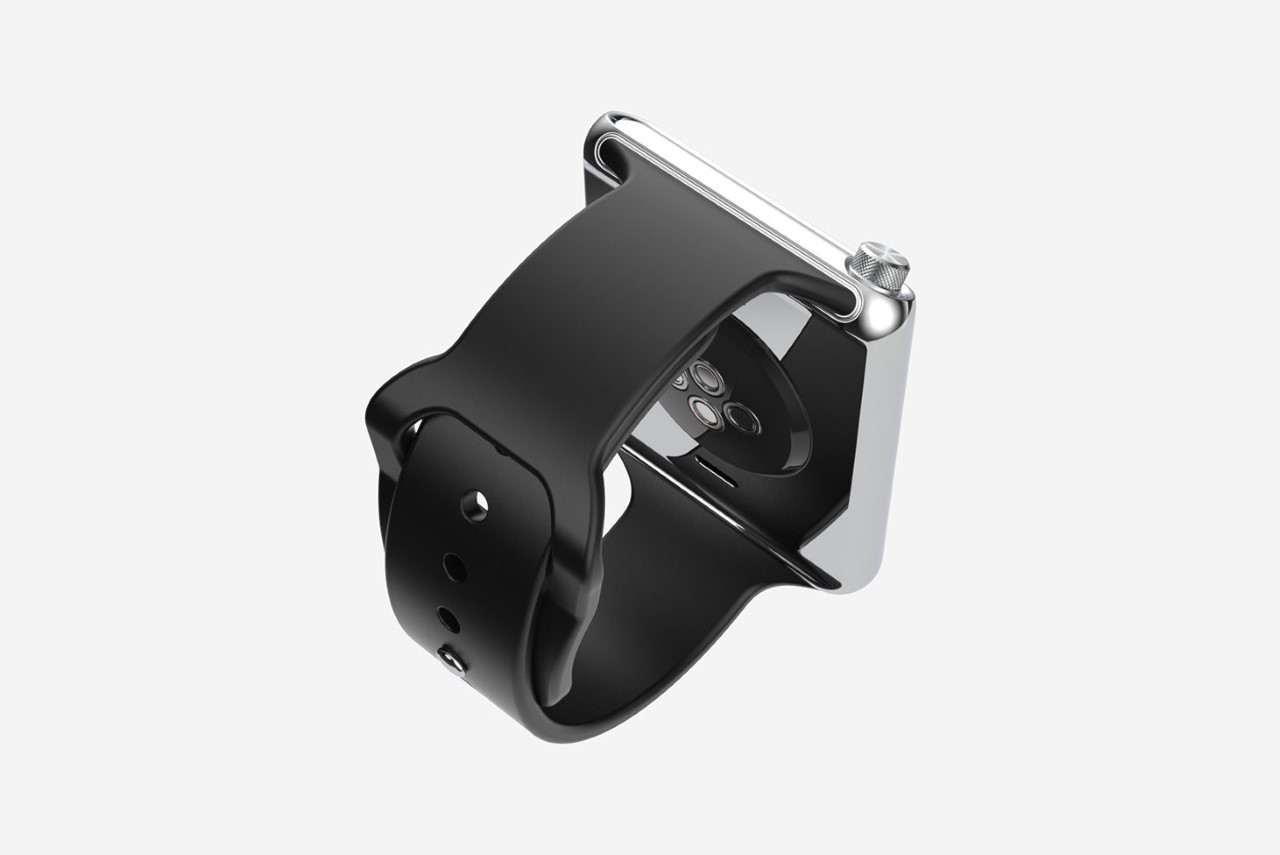
The sensors on the bottom of the Watch stay the same too.
