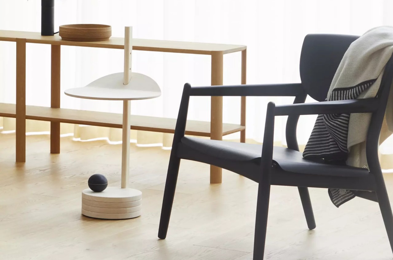
Furniture has long ceased being simply functional products that take up space in homes or offices. Given their very visible roles, they have also become decorative pieces that add to a space’s ambiance. This is especially true for chairs, sofas, and large tables like coffee tables, but even smaller items like side tables can have an impact on the overall appeal of the room. Some of these side tables use elaborate designs, unusual forms, or even showy colors, but those are not the only ways to grab people’s attention. There are times when simplicity works better, and this particular design uses extremely simple shapes and constructions to the point that the side table looks almost magical as if its top was simply hovering above the ground.
Designer: Jonas Herman Pedersen
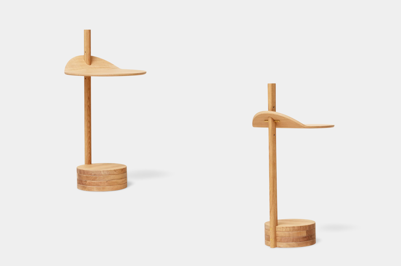
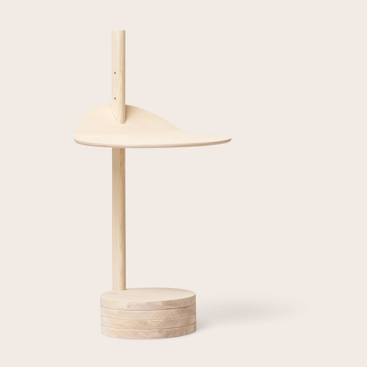
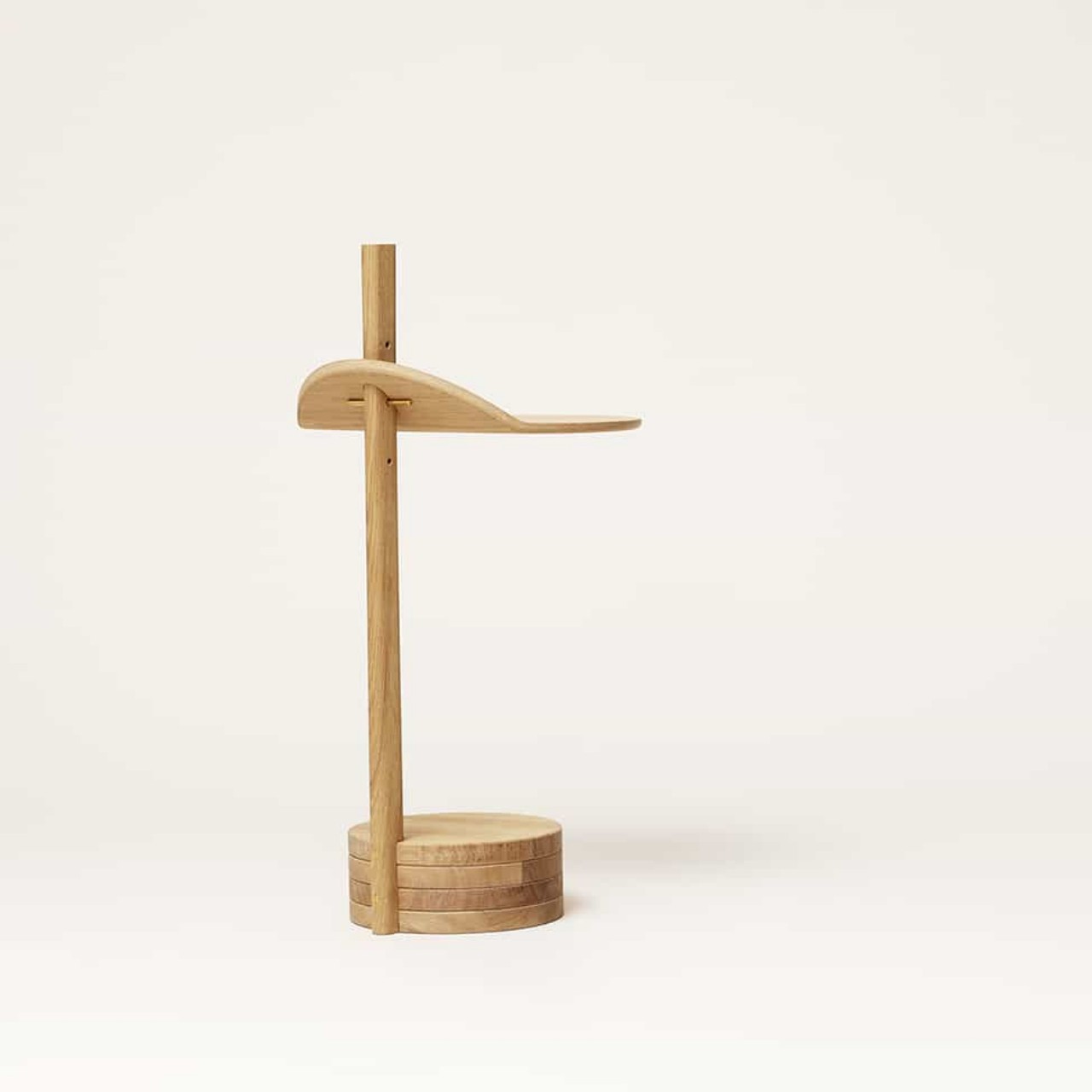
Tables need to be steady and stable to be able to hold things, and that’s normally accomplished by having four or at least two even legs raising the tabletop up. Even for a table with a single “pillar,” that support is often located in the middle at the table’s center of gravity to help keep it from toppling on one side. The Stilk Side Table, however, throws convention out of the window, resulting in a design that seemingly challenges common sense when constructing tables.
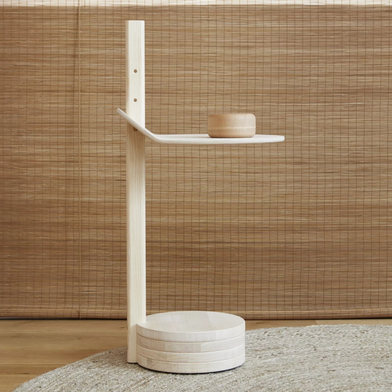
Completely made out of wood, Stilk’s top rests on a thin monolith that stands not at the center but off to one side. Of course, balance is achieved through the counterweight, which is a pile of four thick wooden discs joined to the base of the monolith, also on a single side only.
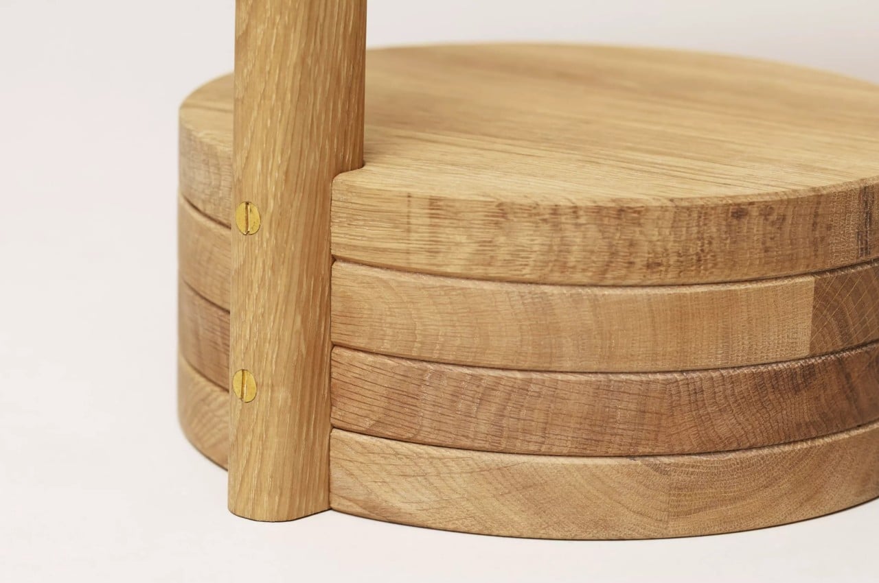
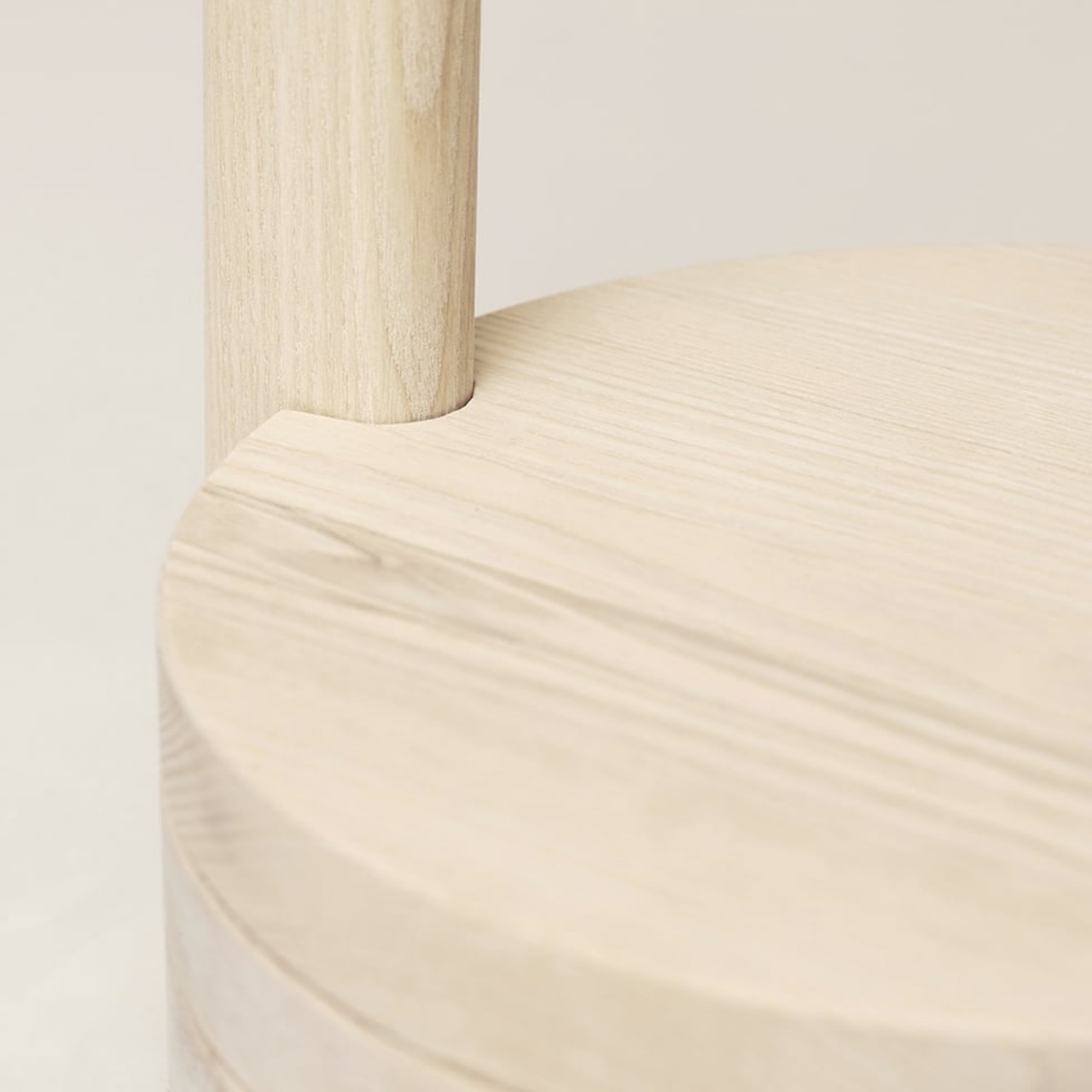
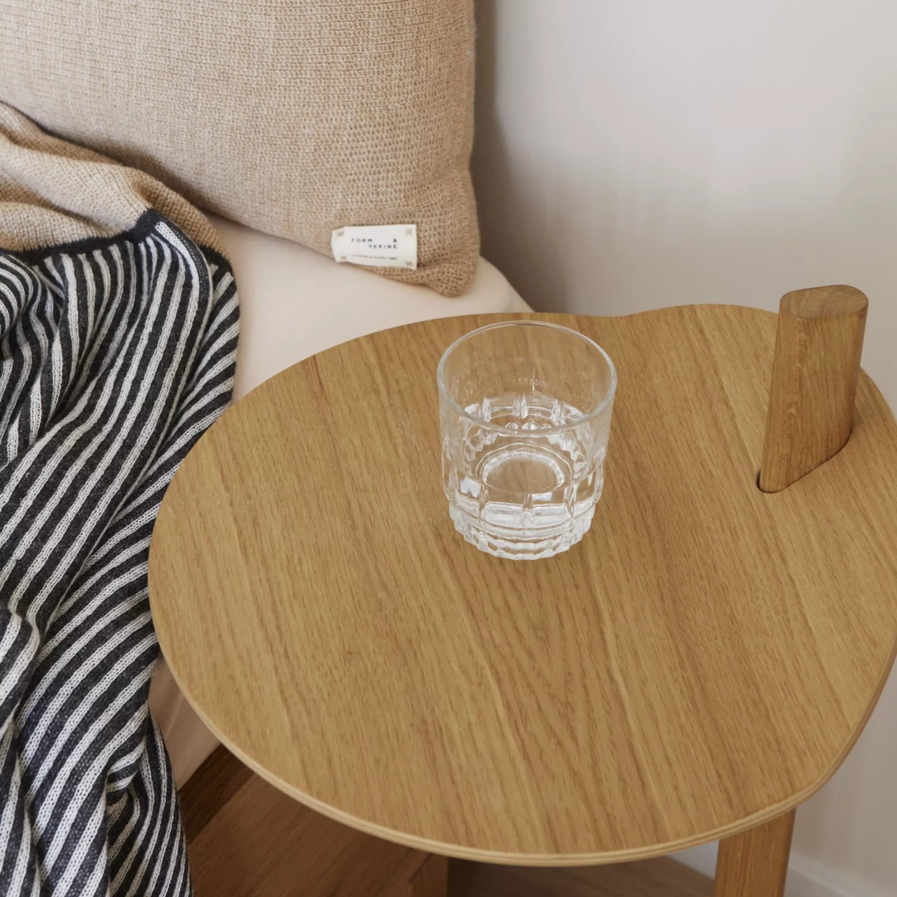
The top itself isn’t a flat circle but has the edge attached to the stem folded up a bit. This makes the tabletop look like it’s hovering with nothing supporting it while also acting as a sort of locking mechanism when something heavy is placed on the table. Despite its simple design, Stilk actually has a secret function where the owner can adjust the table’s height by simply removing a small wooden rod and positioning the top on one of three available heights.
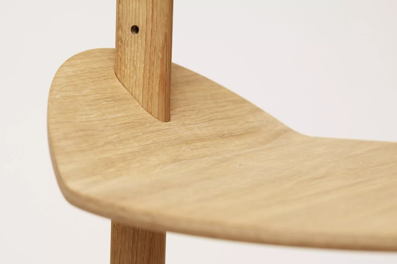
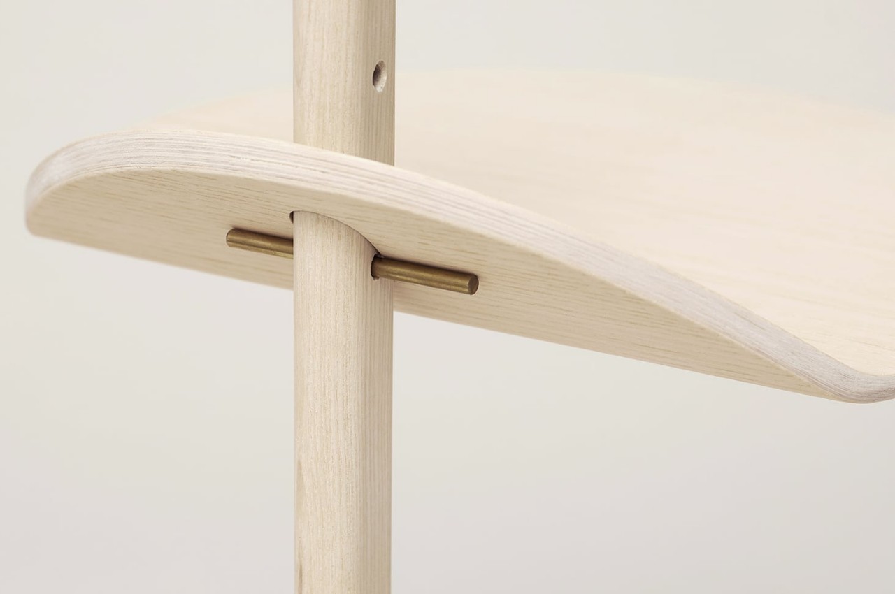
Stilk is an unconventional side table design that admittedly would make some people nervous about placing fragile objects on it. In a sense, its appearance creates an illusion of lightness and instability that definitely catches people’s attention without actually going beyond simple shapes and finishes. It’s an effective example of how challenging the status quo can lead to interesting and effective designs while still keeping things simple, minimalist, and beautiful.
