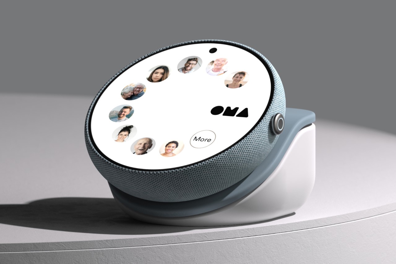
Controversial hot-take: Smart Displays suck. Companies don’t know what they’re doing with them, and their approach feels a lot like they’ve got a solution in search of a problem. No company has successfully flip-flopped on the smart home display issue as much as Google. They acquired Nest, designed a Nest Hub Display, forgot about it a year later, killed the Nexus tablet, forgot about tablets altogether for almost a decade, and then designed the Pixel Tablet as a strange crossover between a tablet and a smart home display. Everyone who’s reviewed it says the same thing – nothing makes sense. Designer Chris Barnes, however, has a better idea… and it borrows directly from an unlikely source of inspiration – the Apple Watch.
Designer: Chris Barnes
Every year, Tim Cook takes the stage at Apple’s main keynote, talking about how the Apple Watch helped save the lives of hundreds if not thousands of people. The watch made a successful impression as a health device, helping detect unusual heartbeats, body temperature, breathing, or even detecting if someone’s fallen. Perpetually strapped to your wrist, the Apple Watch is the perfect ‘guardian angel’ designed within the Cupertino company’s product ecosystem. Google doesn’t have that (yet), but this unique smart home display by Barnes proves to be exactly that. It combines the functionality of the Apple Watch with the large size and usability of a smart home display. Meet the Google OMA concept, an ideal gadget for the elderly or technologically un-savvy to use within their homes.
The Google OMA is an intuitively designed, smart alternative to your average landline and provides an important connectivity experience for elderly people, allowing them to stay in touch with their families. While the Apple Watch does something somewhat similar (allowing you to monitor stats of the elderly wearers for safety’s sake), the Google OMA easily allows both parties to video-call each other whenever possible, providing a video-based communication bridge that’s in line with current technological capabilities.
In essence, the Google OMA is a smart display that’s designed keeping the elderly in mind. Its large screen makes visual elements easy to read and tap, and the circular profile means you’re never holding the Google OMA the wrong way. No matter how you hold it, the circular display orients itself to stay vertical. The Google OMA comes with a curved body that sits on a charging base, and can be un-docked and held in both hands sort of like a cup, allowing elderly people to easily hold their device in a manner that suits them well.
The Google OMA works as a smart personal display rather than just a smart home display, doing the job of a landline, a phone, or an Apple Watch. It sits on a countertop and can be used to play games like sudoku, log in your mood, or contact people using a rotary phone-inspired contact list that just feels familiar. The OMA device can be held in your hand while video chatting, or to your ear for a conventional audio-only experience. It’s designed for people who aren’t used to a lot of new technologies, coming with simple features and functions… and yes, a dedicated home menu also lets you access smart home features, allowing it to do the job of a smart home display too.
What the Google OMA has that the Pixel Tablet doesn’t is clarity of the problem it’s looking to solve. The OMA helps elderly people stay connected with their families, guardians, and friends in an easy, intuitive, and meaningful way. Unlike smart home displays that end up just being glorified screens for album art or the weather, the OMA has a sense of purpose, thanks to a well-defined design brief. Moreover, it allows non-tech consumers to benefit from technology, bringing more people into Google’s ecosystem… and that’s only a good thing.