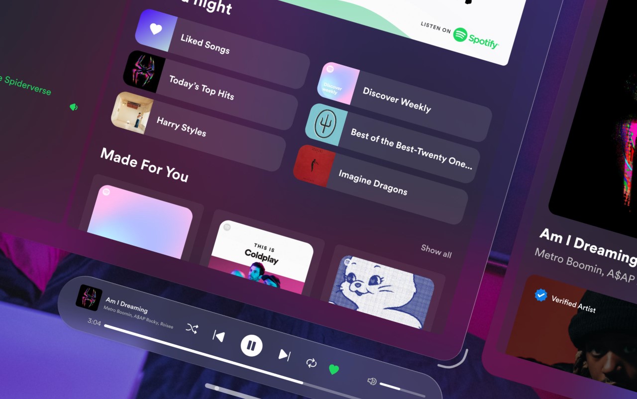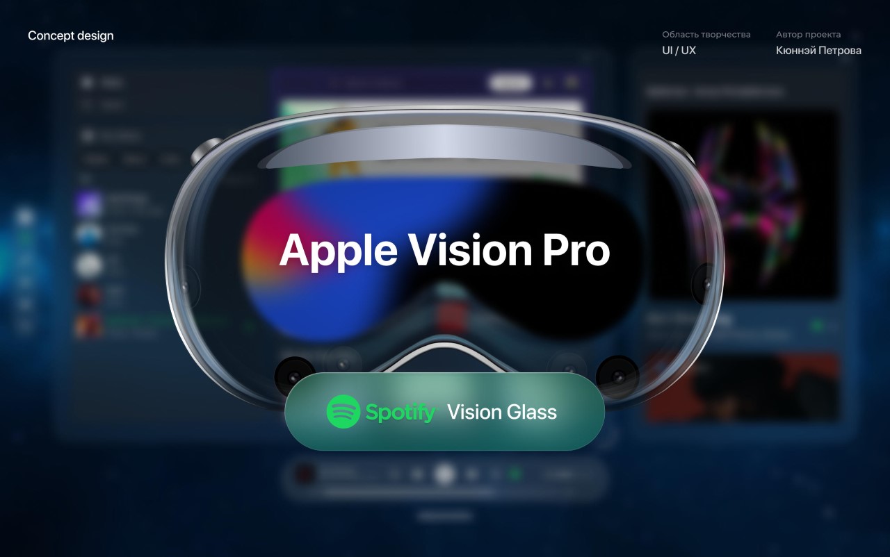
While the highly-anticipated headset is still a ways away, a designer has created a conceptual Spotify interface for the Apple Vision Pro and it looks absolutely stunning. With three panels filling your entire periphery, Kyuna Petrova’s Spotify UI lets you browse music, view album art, set your queue, see artist info, and play/pause/seek music all at once. The interface also features the signature blurred glass background that changes hues with your environment, creating an immersive app experience that feels incredibly real and within your palm’s reach!
Designer: Kyuna Petrova
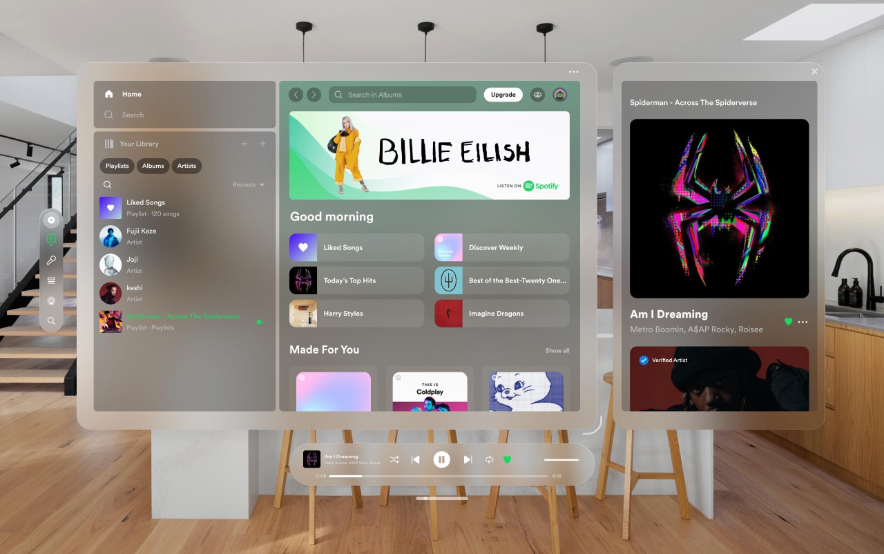
Petrova’s Spotify UI for spatial computing is quite different from Spotify’s own desktop computing interface. The larger display in virtual reality offers much more visual real estate for digital assets. The entire UI can be split into four blurred glass canvases – one taskbar on the left, one control bar at the bottom, a main canvas for browsing music, and another for displaying the album art of the active song along with the artist bio. This is an extension of Spotify’s desktop app/website but with just more meat in the sauce. The result breaks the boundaries of the traditional rectangular display, creating something much more immersive.
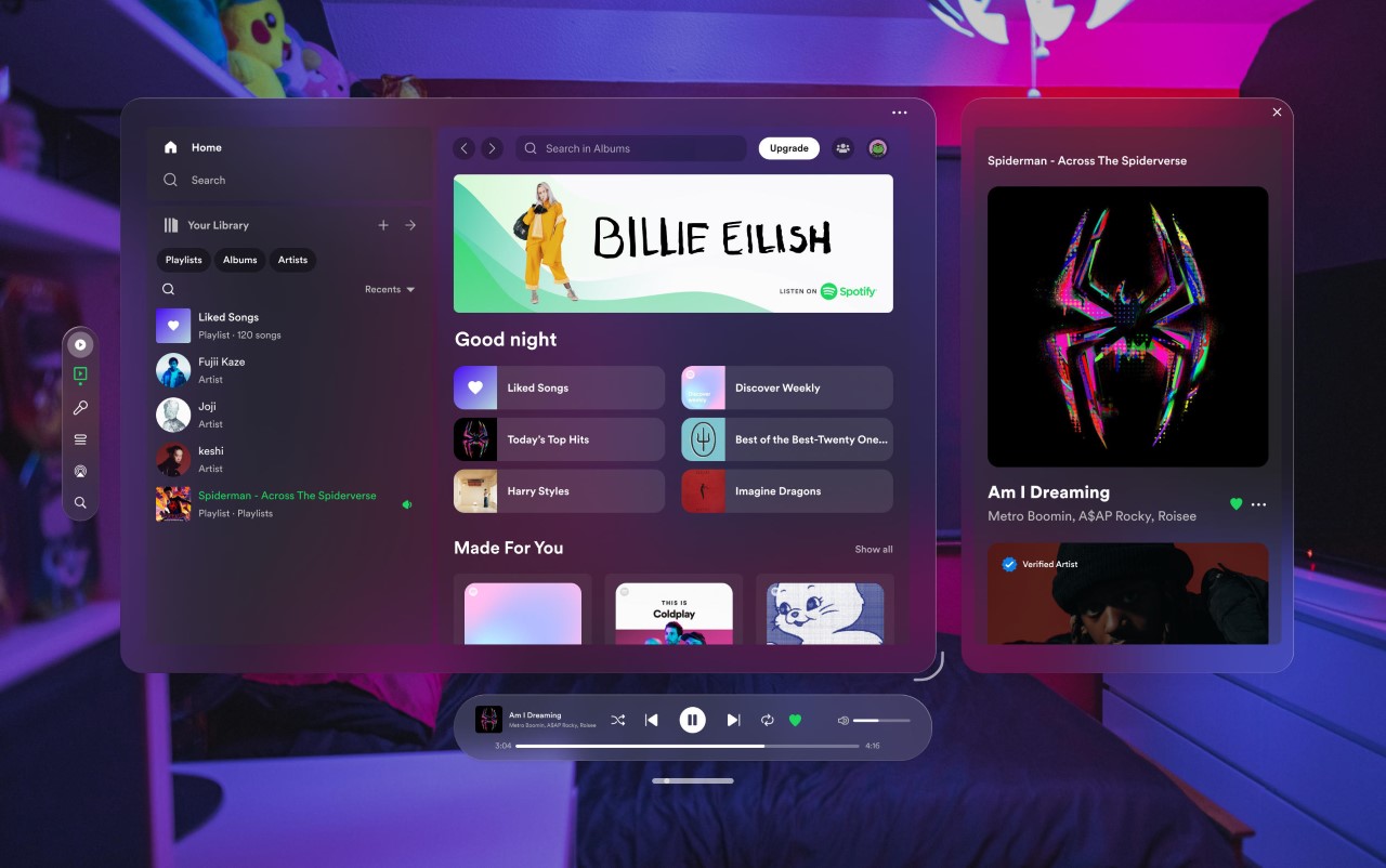
While the interface doesn’t have a ‘dark mode’, the blurred glass instinctively shifts hues depending on your environment. In a well-lit space, the UI stays light, but in a darker area, it transforms into a dark UI that’s high on contrast and just glorious to look at. It’s a shame Petrova didn’t show what the app looks like when resized, but I imagine the album art and playback control bar take center stage. I’d also love to see immersive visualizations that fill your environment with psychedelic dynamic art as the music plays too. After all, why would I want to stare at a living room when I could look at responsive motion graphics that dance to my music?!
