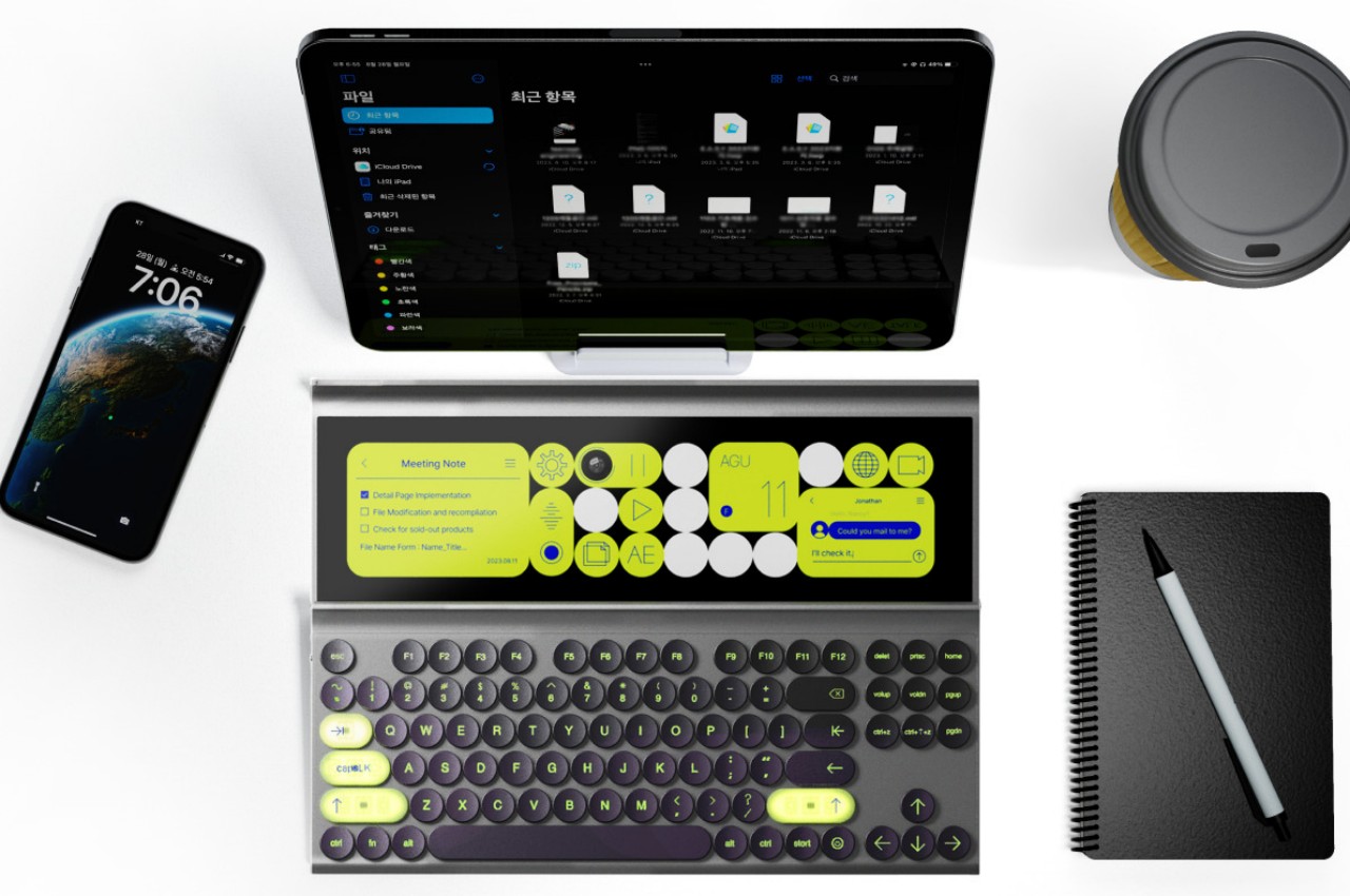
Tablets today have become so powerful that they could almost replace laptops for much of our needs, which is the narrative that even Apple is making with its iPad Pro line. That said, some people still find such devices a bit limiting, particularly in the area of multitasking. When you’re at your desk in the office or at home, you might have access to a powerful keyboard with plenty of extra keys for shortcuts to functions. But tablets are supposed to free you from your desks and let you work wherever you want or can, and you can’t bring those desktop keyboards with you. If only you could extend your portable keyboard’s functionality without extending its size. That’s the kind of paradigm shift that this concept design is trying to offer by also shifting the keyboard’s form to reveal a hidden touch screen beneath.
Designers: Subin Kim, Taeyang Kim, Su Hyun Bae, Doyoung Kim, Gyeongmi Kim, Yujeong Shin, Seungmin Hong
Rendered on KeyShot: Click Here to Download Your Free Trial Now!
Keyboards with small interactive displays are no longer an alien concept thanks to the Touch Bar on the Apple MacBook Pro. Although that did add some customizable flexibility to the equation, it was pretty limited because of its size. It was, after all, meant to take the place of the row of function keys rather than being an independent interface of its own. Despite that additional power it offers, the Touch Bar has been retired and the idea never made it outside of laptop keyboards, at least until now.
SCROOM is a concept for a portable keyboard that, at first glance, simply looks like a wireless mechanical keyboard with pretty lights. The real magic, however, happens when you slide down the keyboard or slide up its bottom half, revealing a display that’s almost the same size as the keyboard. It’s not just a simple screen, though, and it might not even function as a typical screen. Instead, it’s a touch screen that’s filled with large-sized buttons, sliders, and other controls that can help you multitask on a tablet that has pretty limited space for multitasking.
This screen is pretty much an extension of the keyboard, except with user interfaces that are specifically designed for certain functions. There’s a large block that shows the date, pretty much like the calendar app icon on a tablet, while some have virtual buttons for media playback. There’s even a to-do list so that you don’t have to switch back and forth between apps just to check your tasks and check them off. The UI is customizable, as are the colors, and the choice of colors also affects the hue that shines underneath the keys.
SCROOM is definitely an intriguing concept and one that is possible to implement. The biggest concern, however, will be the sliding mechanism, which is always a risk, especially for devices that get carried around a lot. There’s also the matter of support for different operating systems, but that might not be as difficult to solve compared to hardware and engineering concerns.