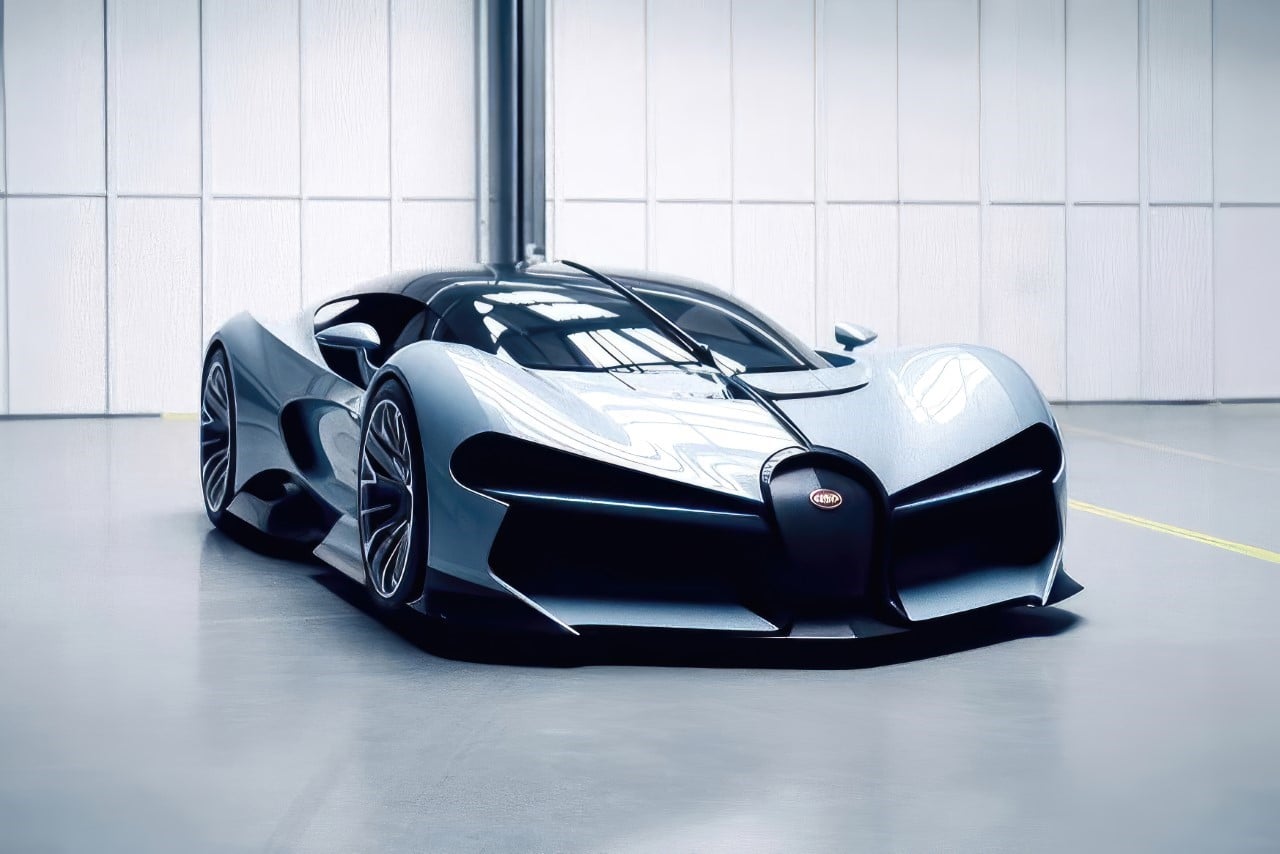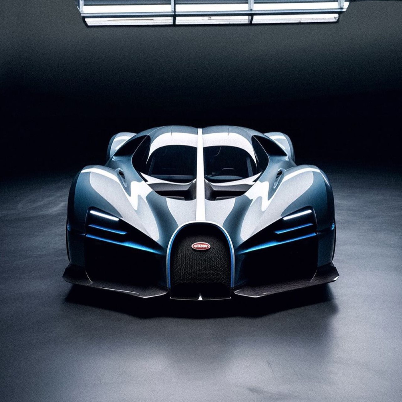
In just about a year since AI technology’s gone mainstream, it’s gotten shockingly good. The amount of realism they’re capable of is mesmerizing, especially with tools like Midjourney doing an incredible job at creating even minute details. Gone are the days when AI botched up faces, fingers, and other aspects of the human body or even the real world. It’s reached a level where to an untrained eye, we’re way past that uncanny valley. In fact, if I hadn’t mentioned it in the title, it’s entirely conceivable that some people would think the image above (or even the ones below) were concept renders either by Bugatti or by a transportation design enthusiast. They are, however, an exploration of Bugatti’s aesthetic using Midjourney and Photoshop’s AI tools. The results help us understand and appreciate two things – not only do they remind us of how spectacular AI is at understanding design cues, these images are also a reinforcement of Bugatti’s own design language, showing how the company’s cars are all a part of the same visual DNA. Let’s dive into that DNA a bit further…
Designer: Cole Kessel (Via Midjourney)

The AI still has a tendency to mess up certain elements like logos, which is why it’s possible that these were edited to put the actual Bugatti logo in place. That aside, they almost look like they were created by the French marque’s automotive design division. Look at them long enough and you see hints of the Centodieci, Divo, La Voiture Noire, and even the Bolide.
Bugatti’s visual language pretty much was defined after the Veyron was first announced. Designed by Jozef Kabaň, the Veyron eventually become the starting point off of which the company’s entire fleet was based, as following cars emulated the same elements of Veyron’s design. The silhouette became a common element as did things like a softer front profile around the front fenders. Bugatti cars always had a horseshoe-shaped grill on the front and this further went on to becoming a strong element in future cars, as did the C-cut window which can’t really be seen in the front view, but is highly recognizable once observed from the side.
With newer models, as carbon fiber outer shells became more of the norm, the cars started experimenting with more aggressive designs that eschewed the Veyron’s otherwise ‘bubbly’ aesthetic. The headlights began evolving too, with the Divo first breaking apart from the Veyron and Chiron’s headlight aesthetic. Finally we began seeing headlights like the one in the Bolide, which the AI image above mimics rather well, with its X-shaped pattern hinting at the car’s extreme capabilities.
All these AI explorations play rather well within the parameters of the ‘constraints’ set by Bugatti’s design team. You’ve got hyper-aggressive forms like the one below, but relatively smoother ones like the image above. All the cars opt for a classy bubble cockpit with a line cutting through quite similar to the Bolide concept. The AI also does a great job of sticking to Bugatti’s brand colors of black and shades of blue, interspersed with small carbon fiber trims in between. It’s remarkable that despite how hyper-realistic they are, none of these cars are real… but they still feel unapologetically like they were designed by the French luxury supercar brand. Which carmaking brand do you want to see AI take over next??