With an event scheduled for October 30th, Apple has some seriously ‘scary’ Halloween plans for your wallet! We’re expecting new MacBooks, refreshed iMacs, and maybe an upgrade to the iPad line-up given that Apple announced a budget USB-C version of their Pencil. That being said, clearly Apple has something in mind that goes beyond the simple chip update and performance boost. We may be looking at the Cupertino giant consolidating around a few design directions, like USB-C supremacy, a rally-cry around Spatial Computing, and perhaps a few neat tricks borrowed from Apple’s iOS platform.
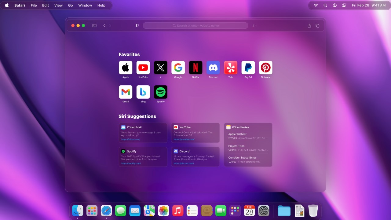
Put together by Concept Central, this video highlights the future of MacBooks, but more importantly, the future of macOS in general. Concept Central’s rather enticing video brings a few dazzling tricks to Apple’s flagship laptop, from widgets in the dock bar, to a frosted transparent Safari browser that is a hat-tip to the Vision Pro, and perhaps my favorite little feature – a Dynamic Island-style animated interface around the MacBook notch!
Designer: Concept Central
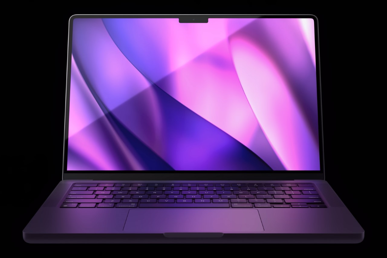
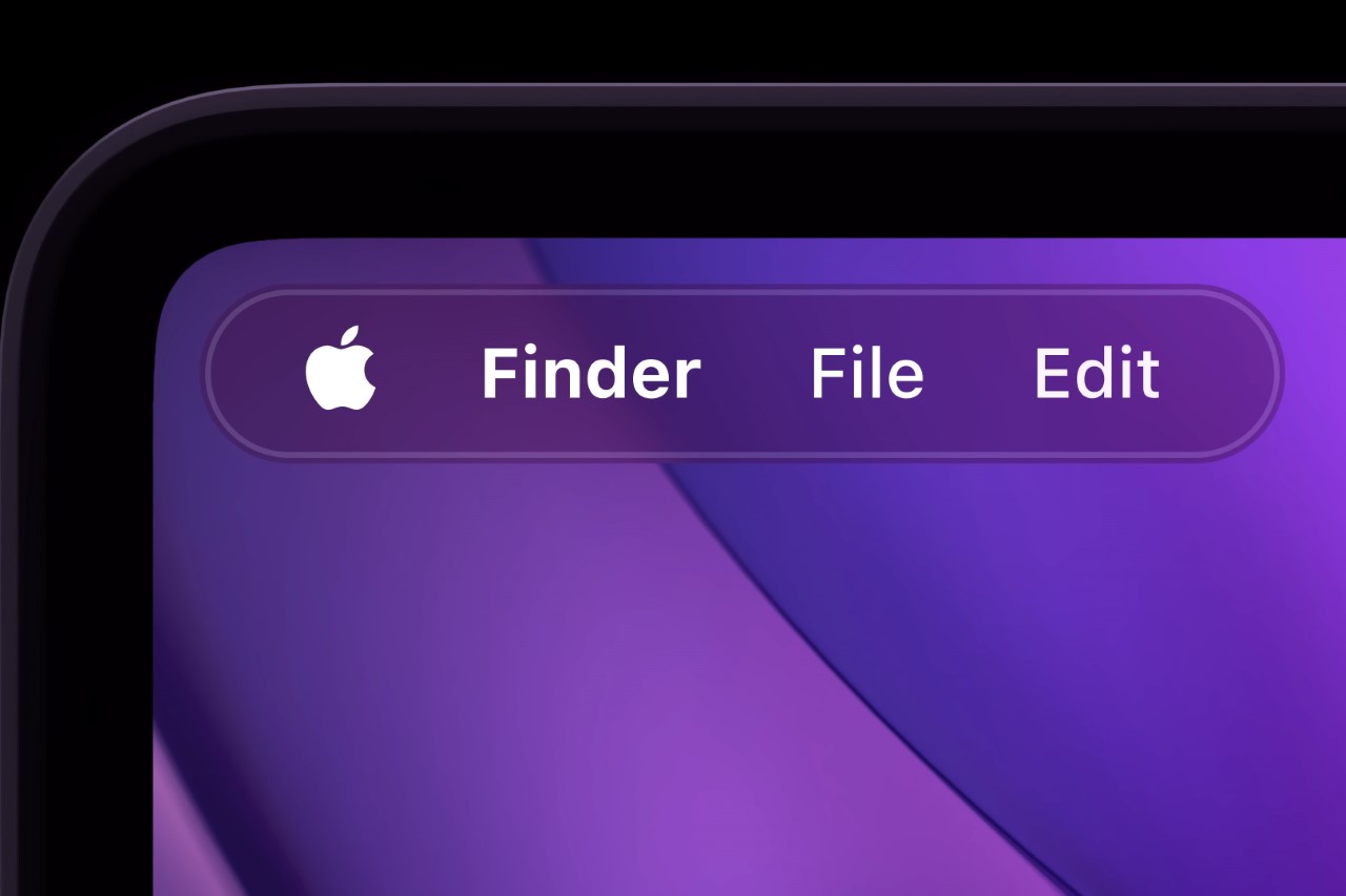
Titled the ‘Future of macOS’, the video makes some extremely sensible suggestions that feel less like wild conceptual ideas and more like practical solutions to make macOS better. For starters, the Finder gets its first big refresh in AGES, with a widget-style design that allows the toolbar to exist in two halves on the left and the right, rather than being a linear bar that travels all across your screen. This frees up more real estate, while also preventing the bar from interfering with that objectively ugly MacBook notch.
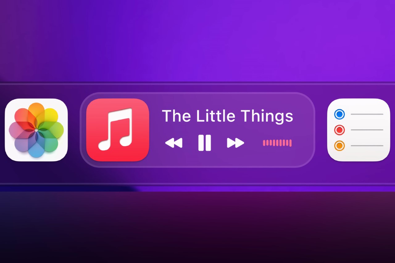
I’ve always wanted macOS and iPadOS to really streamline and Concept Central’s video does just that. The dock finally gets its own widgets based on active apps/software, allowing you to toggle media playback (among other things) without switching programs. Like Apple’s mobile operating systems, the dock now also supports the creation of folders, giving that tiny stretch of linear real estate much more space and value. You don’t need to ‘ration’ your dock or go wild by chucking all your useful apps in a never-ending ticker-tape of functionality. Similar apps get clubbed together into Folders that maximize and minimize to let you access apps only when you need them.
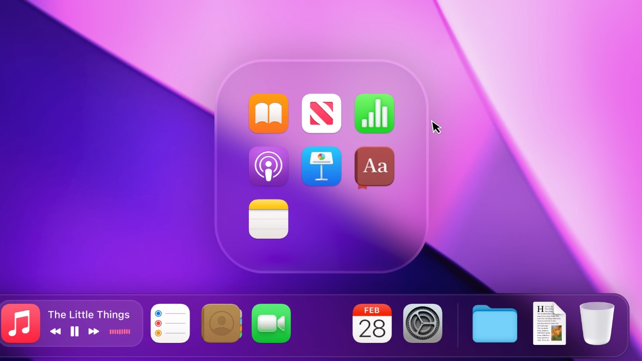
Apple’s pivot to Spatial Computing also heavily informs its macOS design directions. A lot of the UI elements get that frosted glass finish, from the folder background to the Finder, and even Safari itself, which looks deliciously minimal in this new, slick avatar!
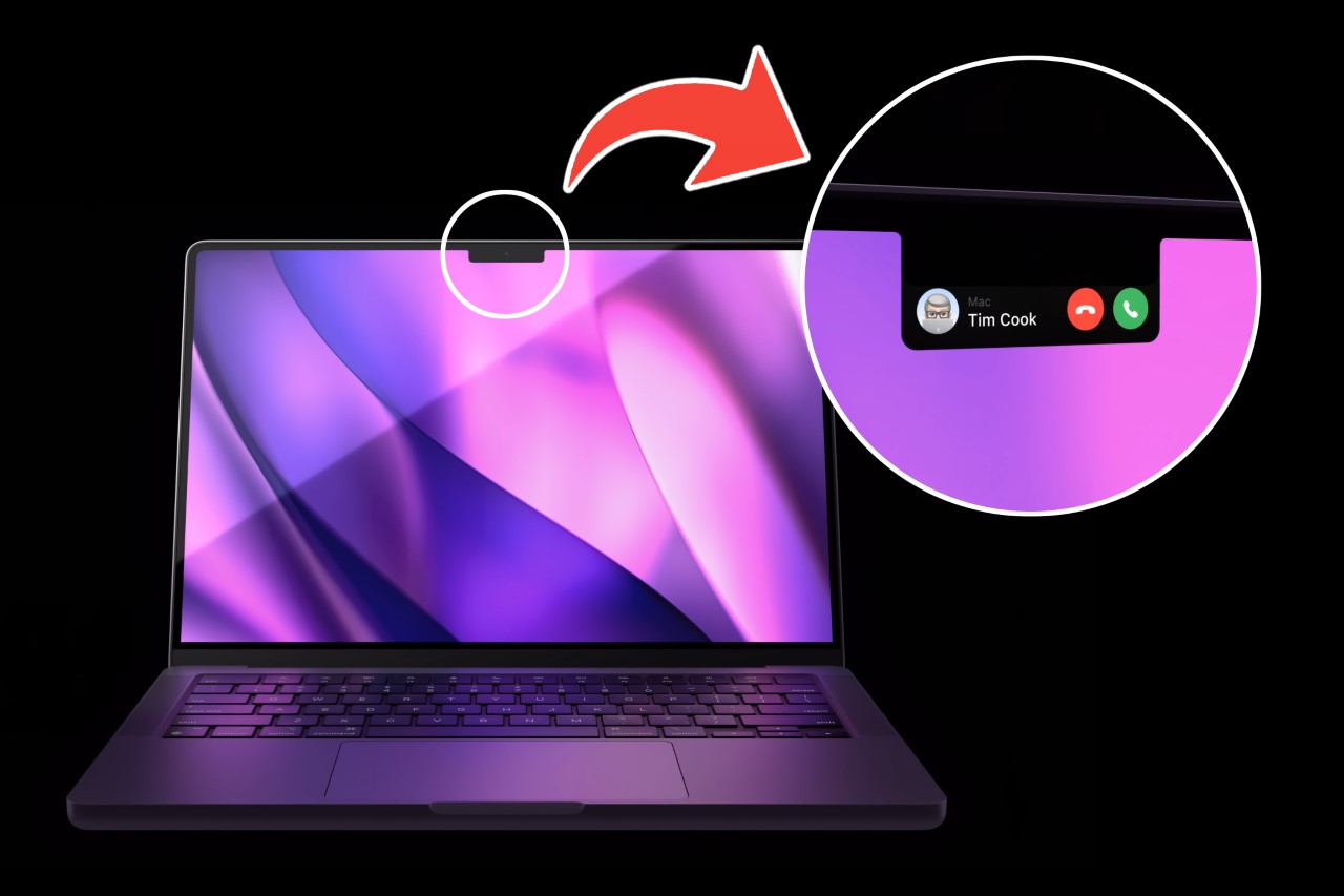
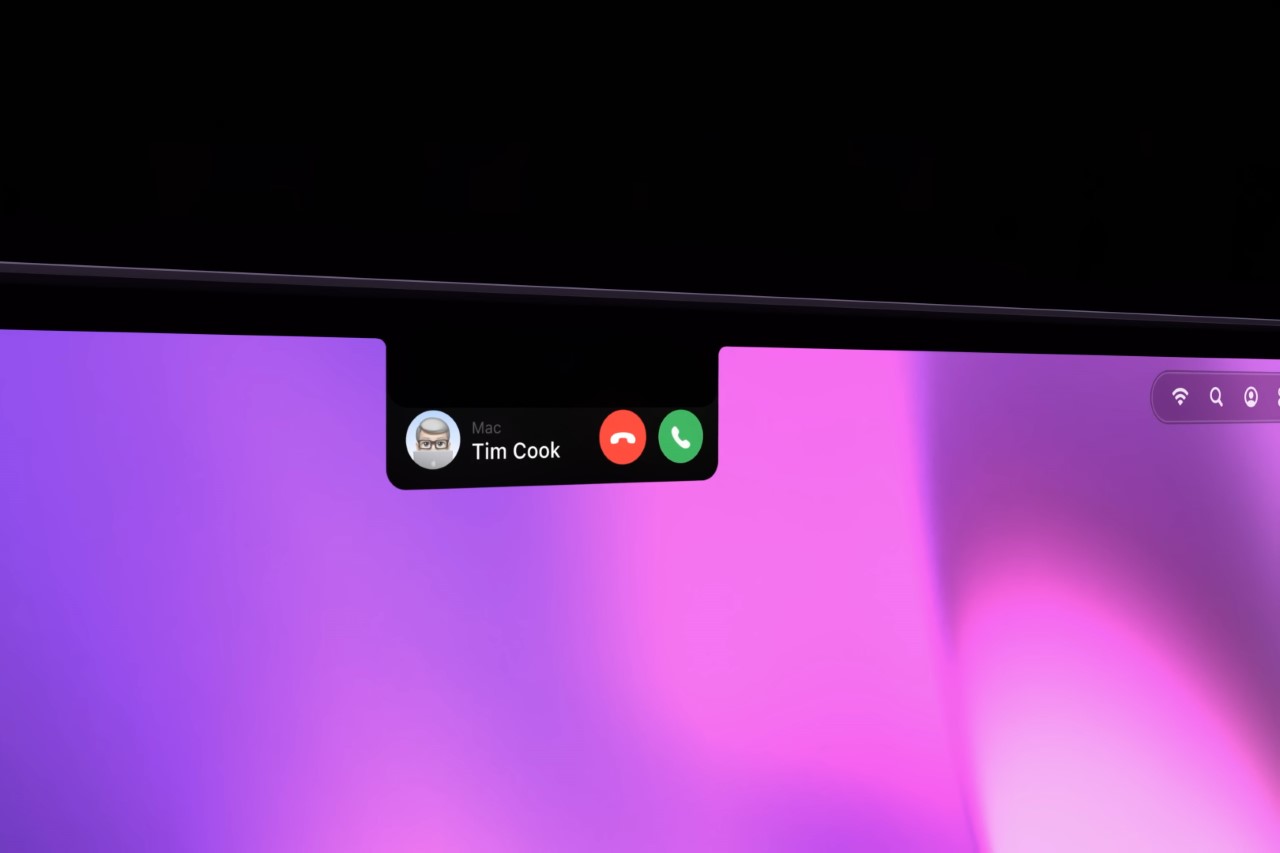
The icing on the cake, however, remains the MacBook’s new Dynamic Island. In the interest of absolute accuracy, it isn’t really an island as much as it’s a delta, given that it’s surrounded by a screen on 3 of its 4 sides. To account for that, Concept Central renames it ‘Live Actions’ instead. Quite like the Dynamic Island seen on its smaller sibling, the iPhone, the MacBook’s Live Actions turns that notch into a functional detail. Notifications on the Mac now manifest around the notch, causing it to expand in different directions based on the nature of the notification.

At least for now, Concept Central’s displayed native app notifications within the Live Actions zone, from FaceTime calls to AirDrop notifications, volume controls, and even charging statuses of various Apple gadgets. It’s a fun detail that really allows the MacBook’s notch to go from an eyesore that’s perfectly in your line of sight, to a dynamic element that serves a purpose apart from being a bunch of wide-angle cameras, sensors, and microphones.
We’re just days away from Apple’s final event of the year. Multiple analysts say that the MacBook will almost certainly get its refresh to the highly anticipated M3 chip. The M3 reveal will also most probably be accompanied by new iMacs and maybe a refresh to the Mac Mini.


