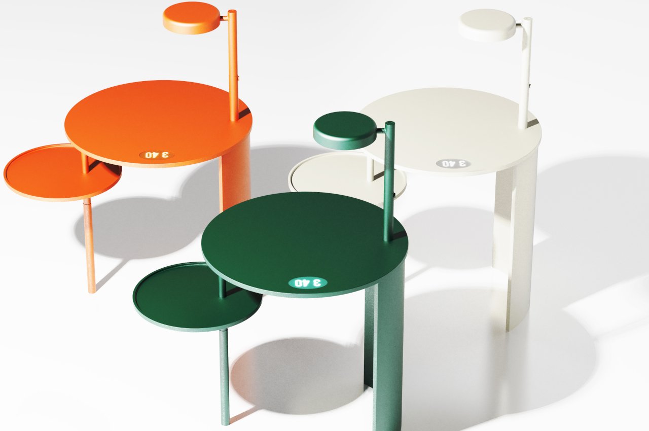
A lot of people feel that there aren’t enough hours in a day without realizing how much time they might be spending or even wasting on unimportant activities. Keeping track of how you spend your time is often one of the first pieces of advice that productivity gurus give because they often reveal how much free time we actually have if we schedule our actions wisely. There is no shortage of time-tracking and logging apps today, but these digital tools are sometimes easily dismissed or ignored because they’re too convenient. This rather unusual table, however, makes the passage of time a bit more visible and tangible, allowing people to have a more personal relationship with the time they invest in work, projects, and other activities.
Designer: Yunseo Jung
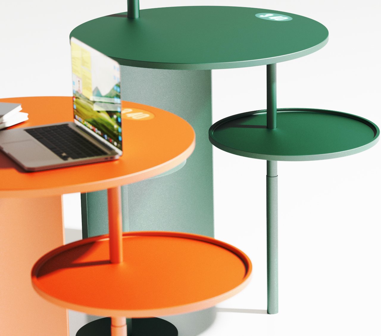
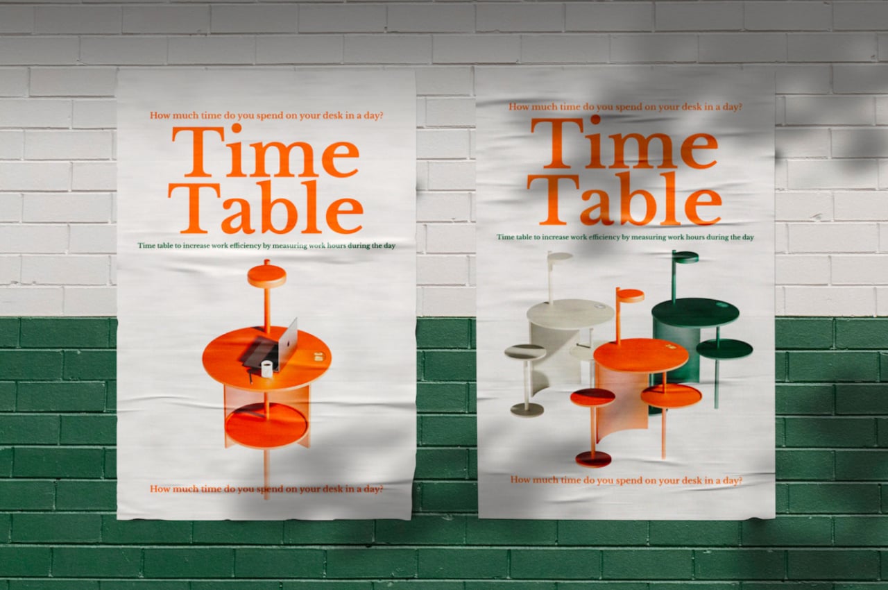
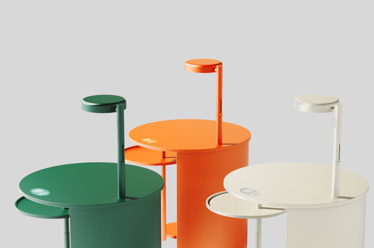
Right off the bat, the Time Table already strikes an interesting visual. Unlike the majority of desks and tables, it’s made almost completely out of circles, from the tabletop to the built-in lamp to the rods that make for its legs and structure. One side of the table shows that leg, but the other side has an arc that functions like a privacy shield. There is also a matching circular tool to complete the set, though such a design isn’t actually novel to this kind of furniture.
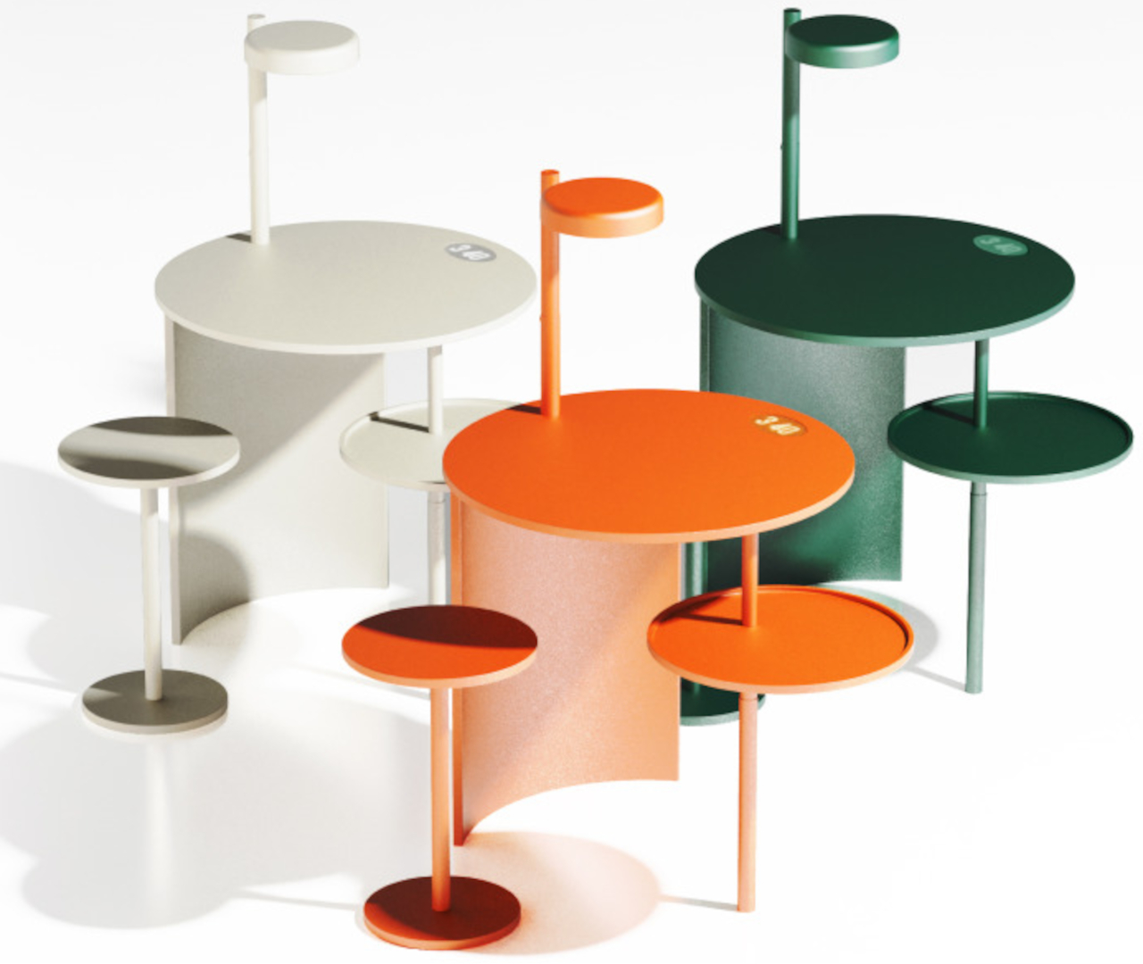
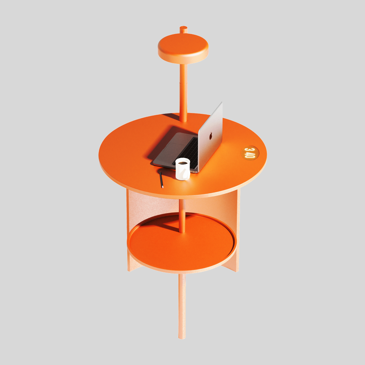
While a circular table isn’t exactly rare, the attached “sub table” is. It’s a smaller circular tray affixed to the exposed leg of the table, but that’s not what makes it unique. This sub-table actually moves up and down, changing its elevation as time passes before returning to its base state at the lowest point. Think of it as a time, like a reverse hourglass, that slowly demonstrates the movement of time in a very visual manner.
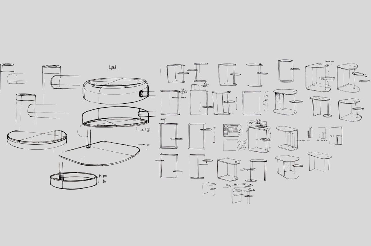
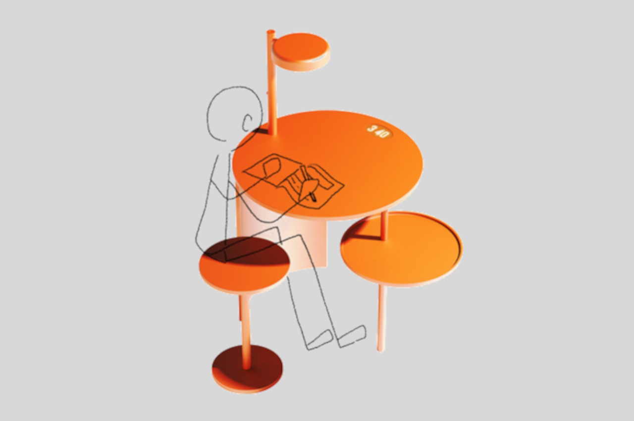
The basic idea of the Time Table is to let the person sitting in front of it measure, log, and be aware of how much time they’re spending there. You might place some tools related to your work there or anything else that you’ll be able to notice in the corner of your eye. It offers a visual and tangible experience in counting down time without being monotonous like watching seconds tick by. Admittedly, it might also be a bit distracting, which could also be the point of instilling awareness of your time.
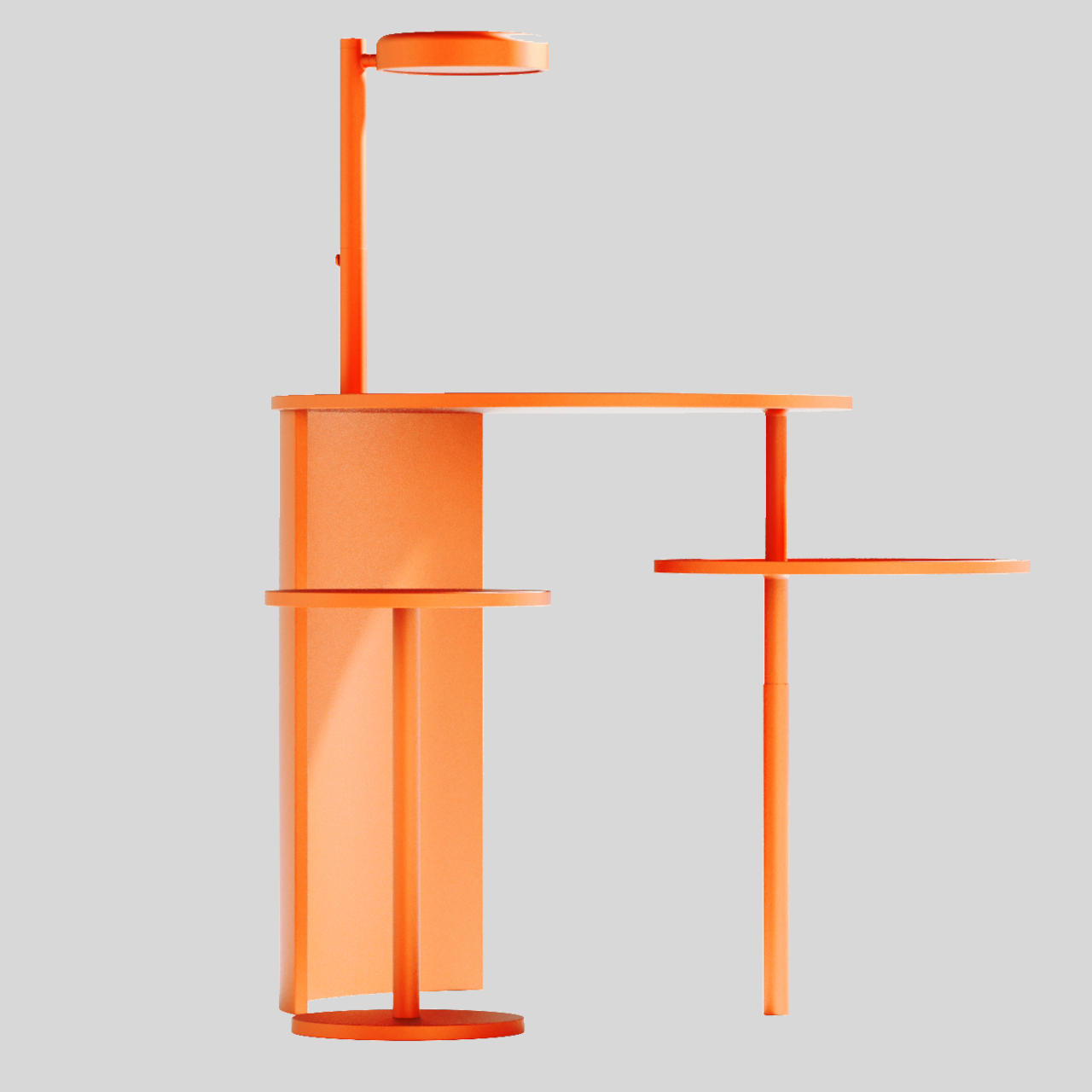
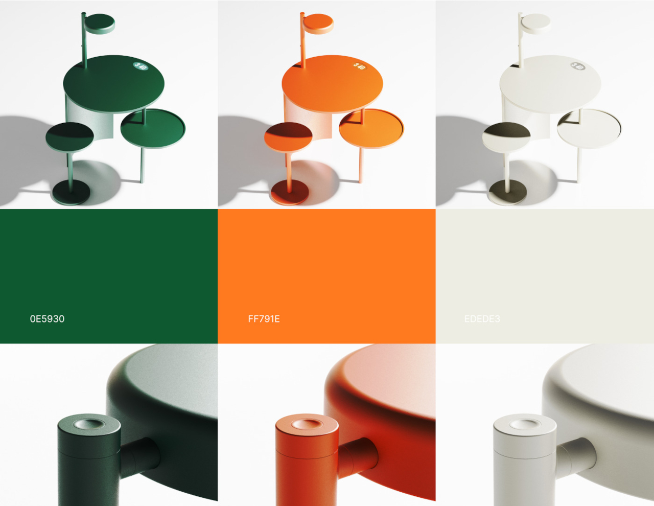
Novel as the concept might be, there are also a few issues with the Time Table’s design. The position of the elements, for example, might not be ergonomic or comfortable, with the lamp at a fixed spot and the privacy shield at the side potentially blocking leg movement. Given its design, there seems to also be little room for changing the height of the table, which could be too low or too high for some people. The moving sub-table as a time tracker is definitely an interesting idea, but it could probably be implemented in a different way that doesn’t negatively affect the rest of the table’s functionality.
