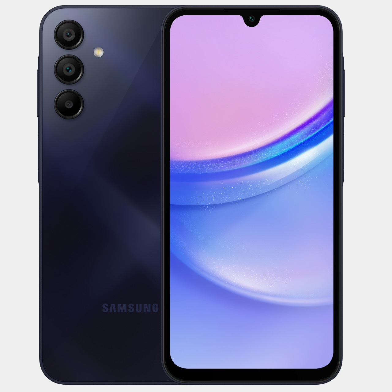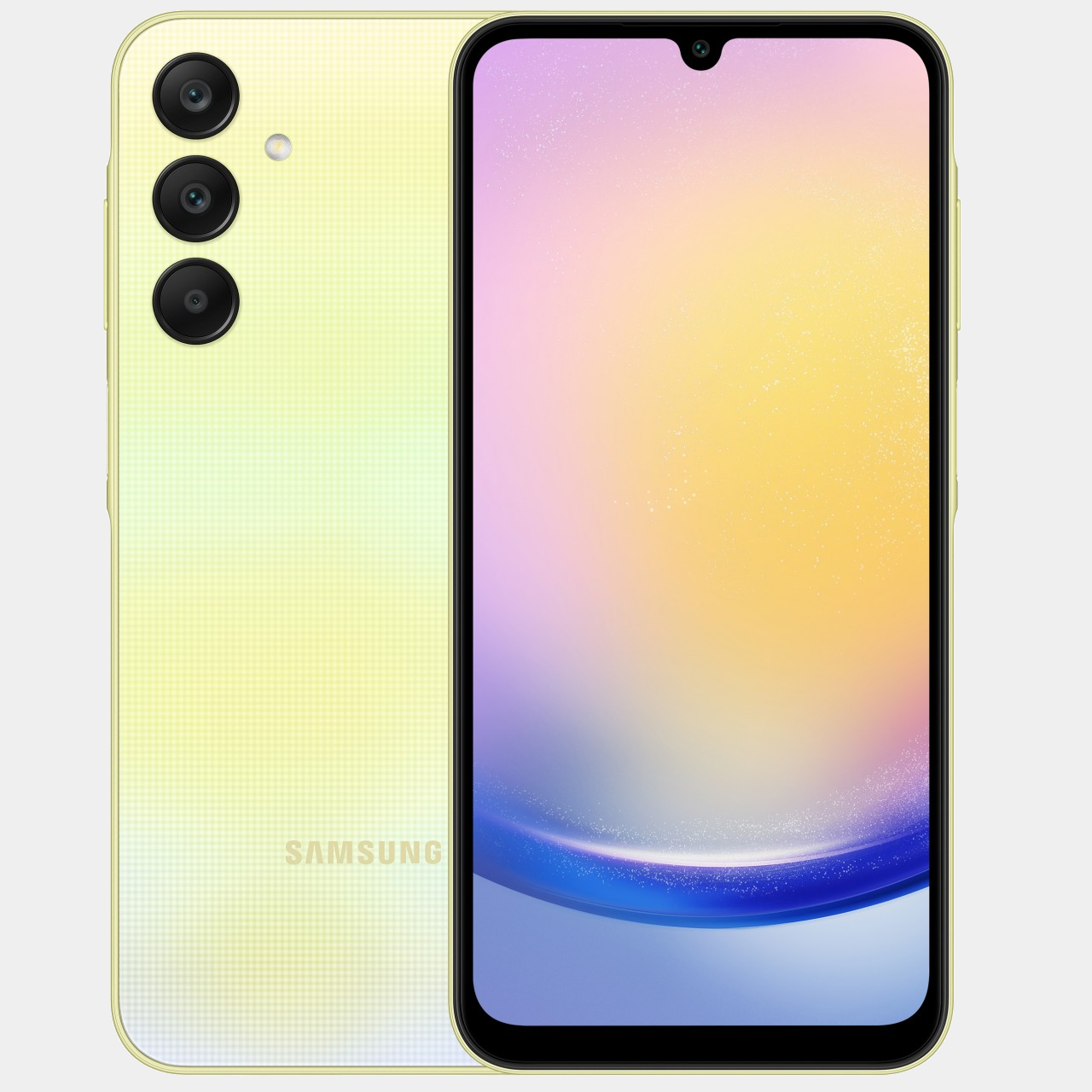
Compared to its rather rowdy past, Samsung has been changing its phone designs less frequently these days. This allows the brand to cement its image, especially when those designs remain unique to it. The absence of a large camera bump, for example, has become a signature element in Samsung’s flagship Galaxy S phones, espousing a level of minimalism not found in other brands. It’s also becoming a standard even in its mid-range Galaxy A family, almost turning into Samsung’s design DNA. That’s not to say it no longer experiments with different designs, as demonstrated by its latest mid-range models that bear what might be the strangest design detail to have come across a Samsung phone in recent years.
Designer: Samsung
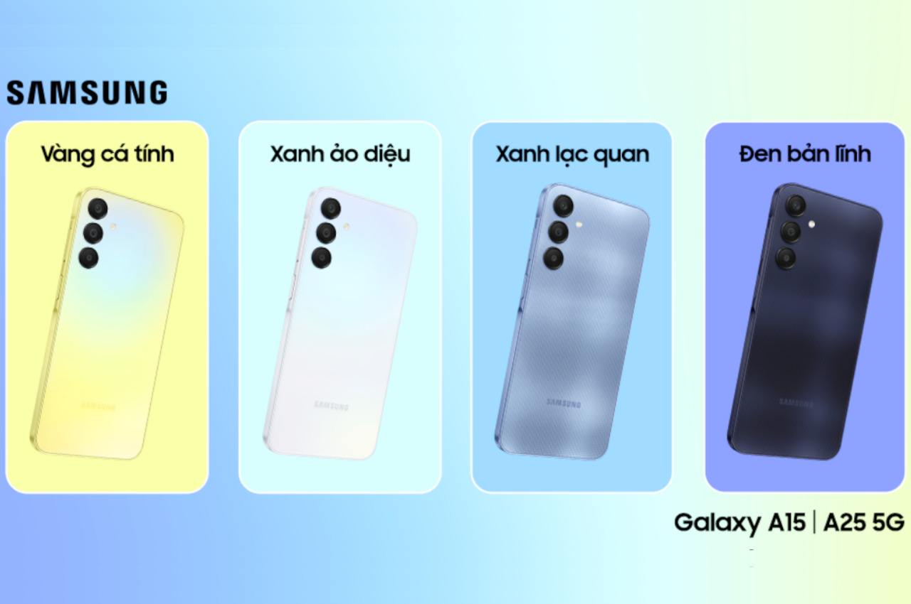
At first glance, the new Galaxy A15 and A25 look quite plain, almost like the smaller versions of the Samsung Galaxy S flagship. In fact, given what we know so far about next year’s upcoming Galaxy S24, you could almost say they prefigure Samsung’s next big thing. The Galaxy A15 and A25 feature very flat edges on all sides, at least except where the volume and power buttons are.
In most smartphones, the volume and power buttons are the only pieces that protrude from the side of an otherwise flat or featureless edge. It’s a necessary style to allow the fingers to immediately locate and press the buttons even without seeing them. Samsung, however, seems to have gotten the idea to raise not the buttons themselves but the area surrounding the buttons. It calls it “Key Island,” and it seems to be inspired by the common camera island or camera bump design on most smartphones.
The area flanking and in between these two buttons are raised almost to the same height as the buttons themselves. The sides of this mound gently curve upward while the island itself has a curved surface that contrasts with the flat edges of the rest of the phone. It’s not immediately clear, but it seems that the volume and power buttons still rise a little bit higher than the island, making it a two-step elevation also like some smartphone camera bumps.

While it adds a bit of visual uniqueness to the Galaxy A15 and A25, it is still puzzling why Samsung decided to go with this Key Island design in the first place. To some extent, it defeats the purpose of tactile physical buttons since it will be harder for fingers to sense where the correct buttons or areas actually are. The extruded portion might also snag more than simple buttons, not to mention taking up more space and becoming incompatible with cases that would have otherwise fit these two phones. Thankfully, these are mid-tier products and Samsung can afford to play around with what might become unpopular designs. Hopefully, this isn’t a foreshadowing of what the Galaxy S24 will have in a few months.
