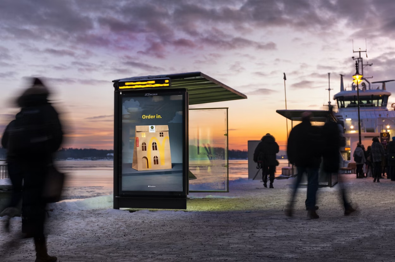
Most restaurants would probably have campaigns encouraging you to go and visit their establishment and have a meal inside. But probably for fast food places, they would not like people to linger at their store and take up space. In Norway, McDonald’s customers usually eat their meals at the store or in their cars. So the fast-food chain started a campaign to encourage people to eat their favorite McDonald’s meals in the comfort of their own homes.
Designer: Julie Wilkinson from Makerie Studio
![]()
For this campaign that has a very simple tagline “Order in.”, they used something that’s very familiar to those who are ordering food to go: the takeout (or takeaway) bag. The outdoor camapaign features the omnipresent brown bag but hand-cut to show the traditional apartment buildings found in Norway with square and arched windows plus an arched doorway. They wanted to make sure that there was a balance between the iconic look of the bag and an instantly recognizable building.
![]()
The hand-cut image was then captured on camera by photographer Catharina Caprino for the campaign and there were no digital touch-ups for this. Everything was done in-camera, including the window light turned on in one of the windows. The minimalist design of the imagery that will be used for the campaign adds to the pretty simple message that they want to convey. The paper bag is already pretty simple so they just needed a couple of elements to complete it.
![]()
McDonald’s ad agency in Norway, Nord DDB Oslo, will be populating the country’s major cities with this imagery with the aforementioned tagline. They will be doing it in a pretty appropriate season which is winter. It will be too cold to go out or even eat in the car so they want customers to enjoy their ordered meals in the comfort of their heated homes.


