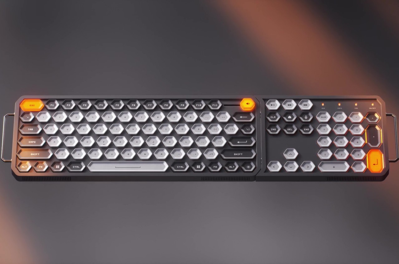
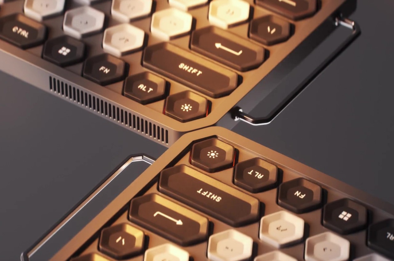
There has been a great deal of effort and attention put on keyboards these past years, whether for actual products or for ideas that embody the hopes and wishes of both users and designers. From split-type ergonomic keyboards to keyboards with all sorts of knobs and touch screens, these designs are all made in an attempt to make people’s lives easier and to cater to their needs. Of course, not everyone’s needs are the same, so features on one keyboard might not work for different audiences. This keyboard design concept is already interesting because of its modularity, but it becomes even more eye-catching thanks to an unusual choice in the shape of its keys and controls.
Designers: Travis Ragsdale, Elijah Vary


The basic design of keyboards is almost set in stone, at least for the combination of letters and numbers that make up the essentials for keyboards of any size. The layouts might differ from region to region or from laptop to laptop, but there are more or less 80 keys even on the smallest configurations. Beyond that is almost fair game, with some preferring a numeric keypad to the side, while others probably wish for a different set of controls.
The K-Bird Spec Project is a concept design for a modular keyboard that tries to address that need by providing a different side module for different applications. You can have the typical numpad for fast numeric input or you can have a set of sliders and dials for quickly controlling or editing audio. You can even have a small drawing area with a groove to place a stylus. Or you can have no modules at all and be left with admittedly odd-looking handles protruding from the side.
The base shape of the keyboard theoretically allows for modules to be placed on either side, but the modules themselves would have to be designed to be ambidextrous. The default seems to presume the current convention of placing modules on the right side where the numeric keypad would usually be, and you can’t simply put it on the left because of the handle extending from that side.
What makes this design a little different from other modular keyboard concepts is its use of hexagons as the main shape for all the controls, even the sliders and dials on the modular extensions. The keys themselves are indented, which is already unconventional as far as keyboard designs go. It gives the keyboard a more visually interesting appearance, though it’s not clear whether that will have any negative impact on the ergonomics of typing on such a kind of keycap shape.