The accessory market for phones and computers is a wide and varied one, with designs that are all over the place and cover almost the entire range of the spectrum. Some try to offer everything, almost including the kitchen sink, resulting in a cornucopia of features and attachments, while others aim for the bare basics to keep things simple yet elegant. Minimalism continues to dominate the design world, and it has also started to grip the tech industry, particularly when it comes to gadgets and accessories. Minimalist design, though sometimes plain-looking, doesn’t exactly mean “boring,” especially when they take inspiration from some of mankind’s creative achievements to give these products an interesting visual and functional spin.
Belkin BoostCharge Pro 3-in-1 Wireless Charging Stand
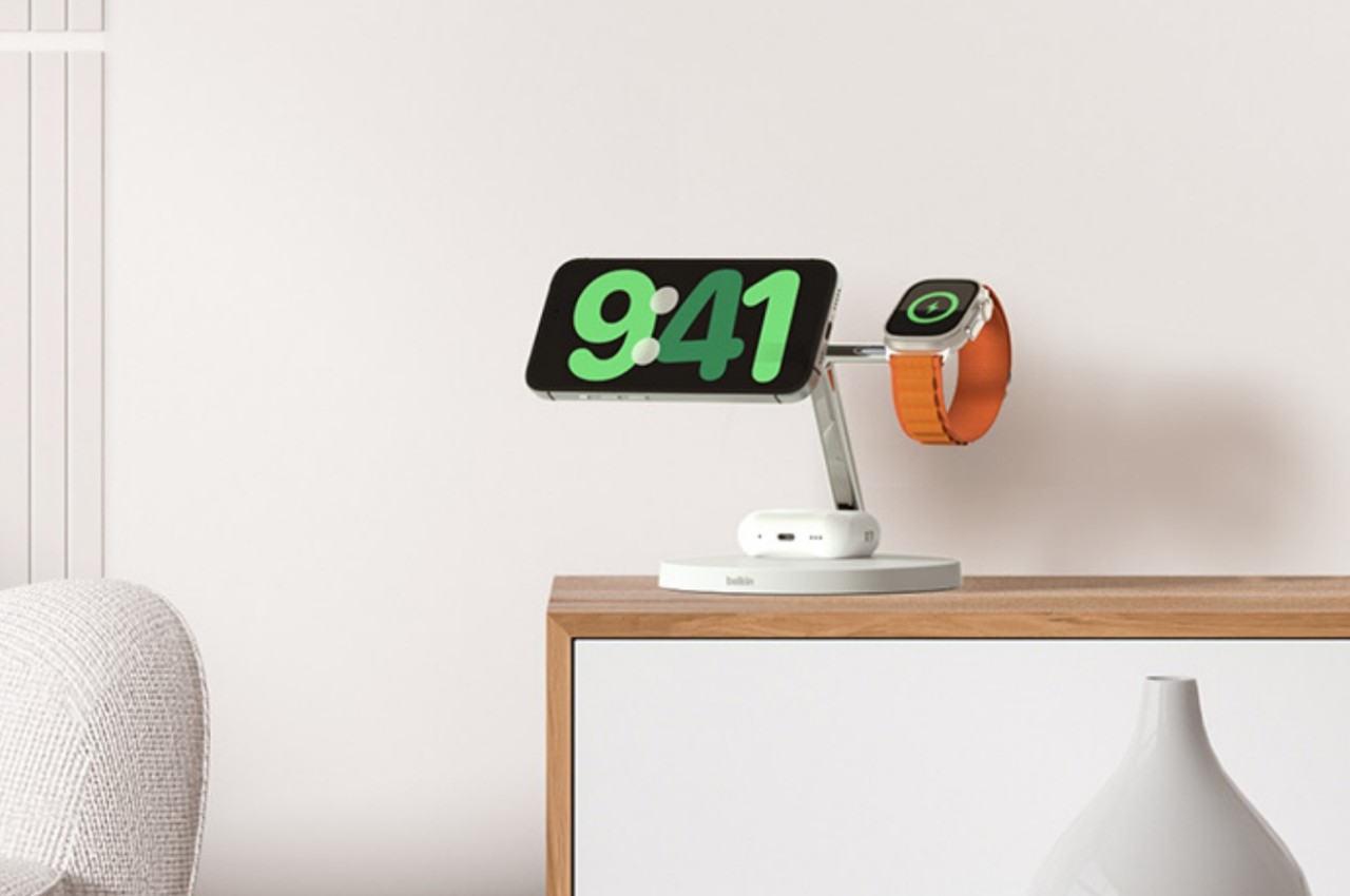
Some say good things come in threes, and iPhone owners tend to own an Apple Watch and AirPods to complete a functional set. Keeping all three charged has become somewhat of a logistics problem, though thankfully it’s less of a mess now that none of them require charging cables all the time. Apple’s MagSafe technology has opened up a new world of designs, free from the tangles of wires, and it has given birth to a variety of charging docks and stations, including some pretty minimalist ones.
Designer: Belkin

The Belkin BoostCharge Pro really takes minimalism almost to an extreme, being nothing more than a metal post that branches in two, standing on a plain round disc. While there are quite a number of 3-in-1 MagSafe chargers that support a similar combination, Belkin’s design emphasizes keeping a tidy appearance, whether there are devices charging on it or not. The base holds the AirPods case, keeping your desk or shelf clean, while both the iPhone and Apple Watch are held up high for easier visibility.
The charger’s clean and minimalist appearance takes its cue from modern architecture, with well-defined lines and shapes and a simple yet functional design. It distills the whole structure down to its essentials, providing support and a place for your gadgets to call home, without overpowering Apple’s already elegant and stylish aesthetic.
MagSafe Origami Grip Stand
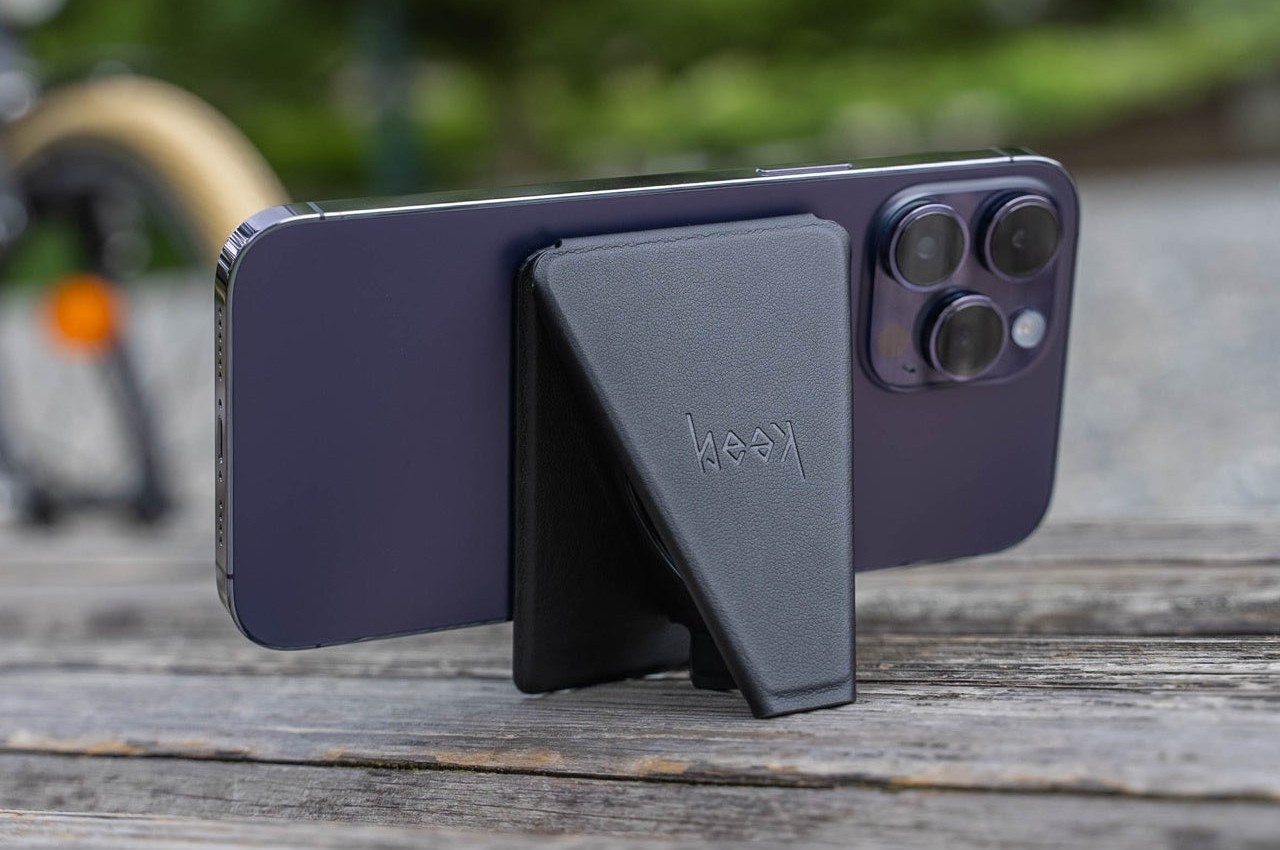
The ancient Japanese art of paper folding has inspired many designs across history, from simple children’s toys to mind-blowing structures even to complex robots. The main pull of origami has always been its ability to change shape from a flat sheet of material like paper to something three-dimensional any moving parts or without removing or adding any part at all. Because of that, something that takes up space can be made to collapse down to almost nothing, like this grip and stand that adds almost no thickness to your iPhone.
Designer: Marcy Arimoto
Click Here to Buy Now: MagSafe Origami Grip Stand ($45)
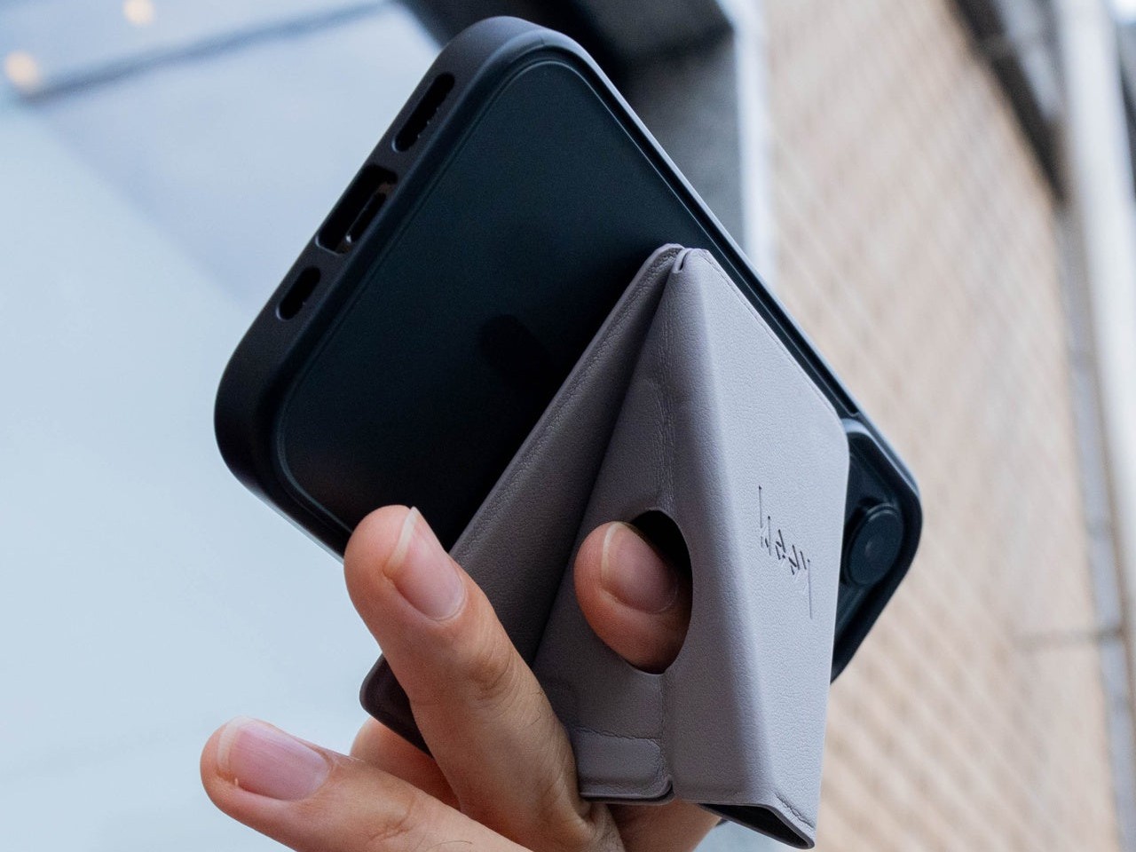
Thanks to its creative origami-inspired design, the MagSafe attachment transforms from a flat pad into a triangular shape that can do more than just prop up your phone on a table. It gives your fingers something stable to latch onto, making it perfect for taking selfies with confidence. It can even stick to metal posts, walls, and surfaces thanks to that strong magnetic power.
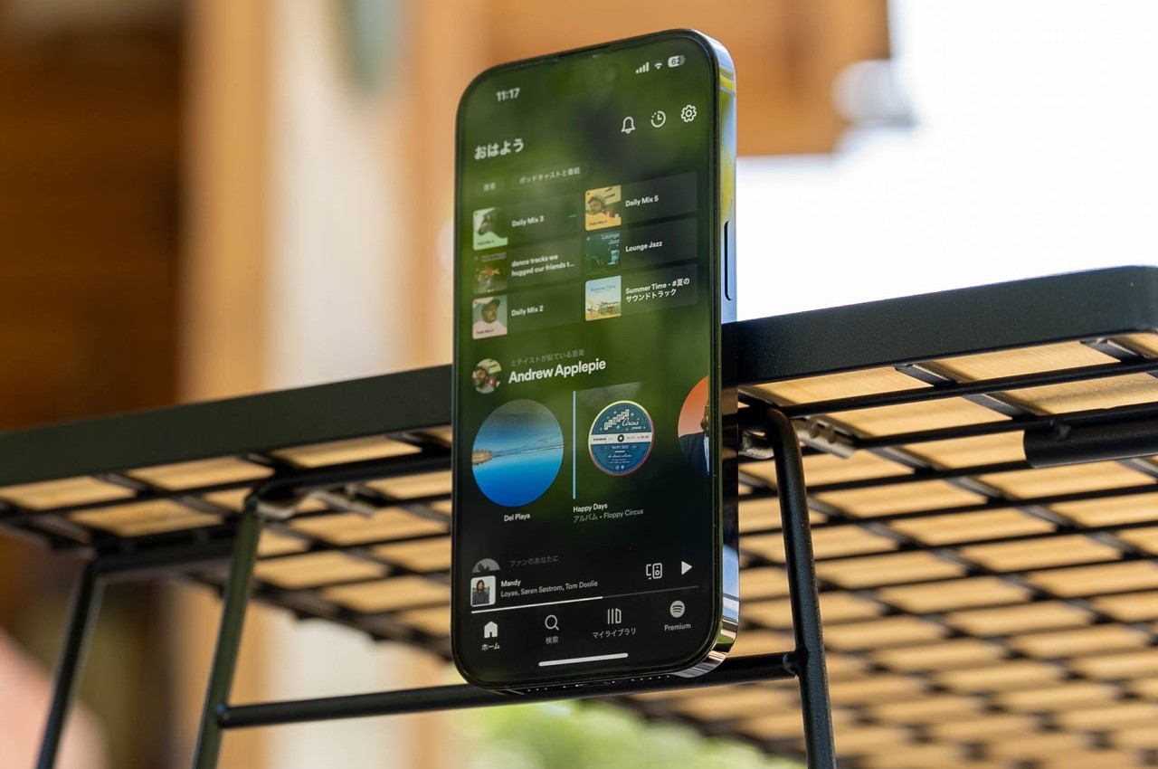

The best thing about its design is that it doesn’t get in the way when you don’t need it. It simply collapses back down to a flat shape that’s no thicker than the iPhone’s own camera bump. Nothing to snag when you slip it into your pocket and nothing to make it wiggle when placed on a table. It’s beautiful, functional, and as simple as it needs to be, nothing more.
Twelve South BookArc Flex Vertical MacBook Stand
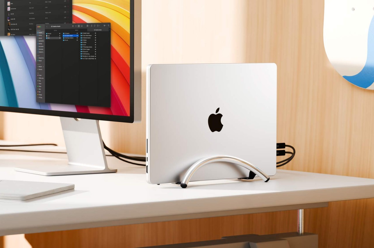
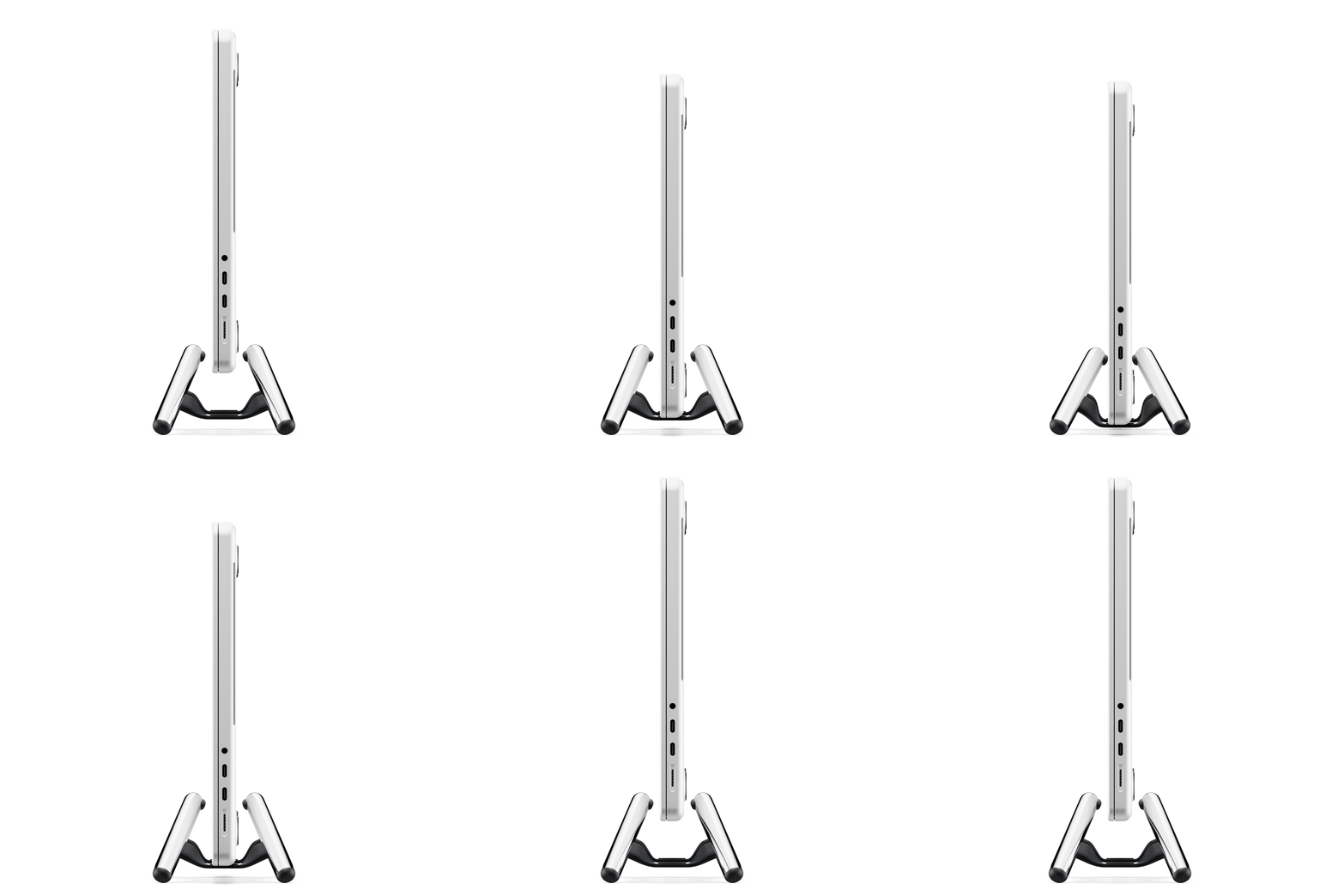
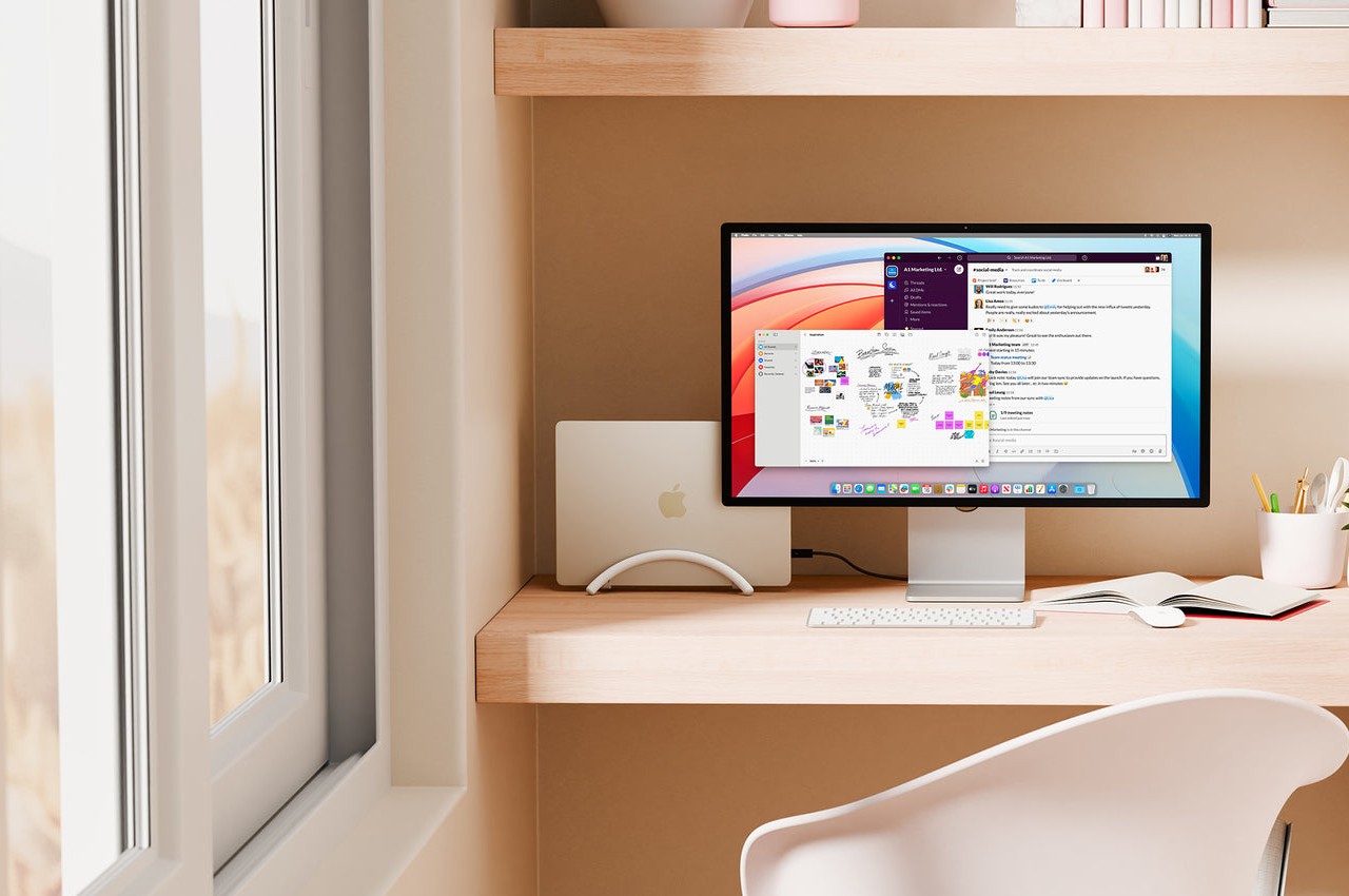
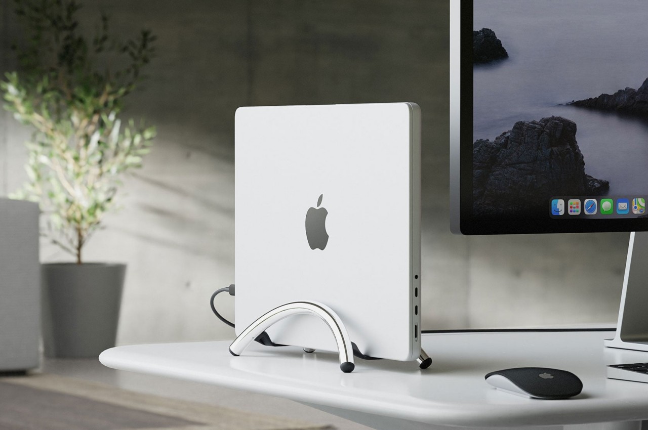
A laptop stand is, more often than not, a horizontal plane meant to hold your laptop while it lies down. Of course, that’s the most common way to use a laptop, but it’s definitely not the only way, especially when you’re using it as a makeshift desktop computer. With the lid always closed and the laptop simply connected to a monitor and other peripherals, having a laptop lying flat or even on a horizontal stand is already a poor use of precious desk space. That’s where a vertical laptop stand comes in hand, and Twelve South just launched what is probably the most minimalist design in that category.
Designer: Twelve South
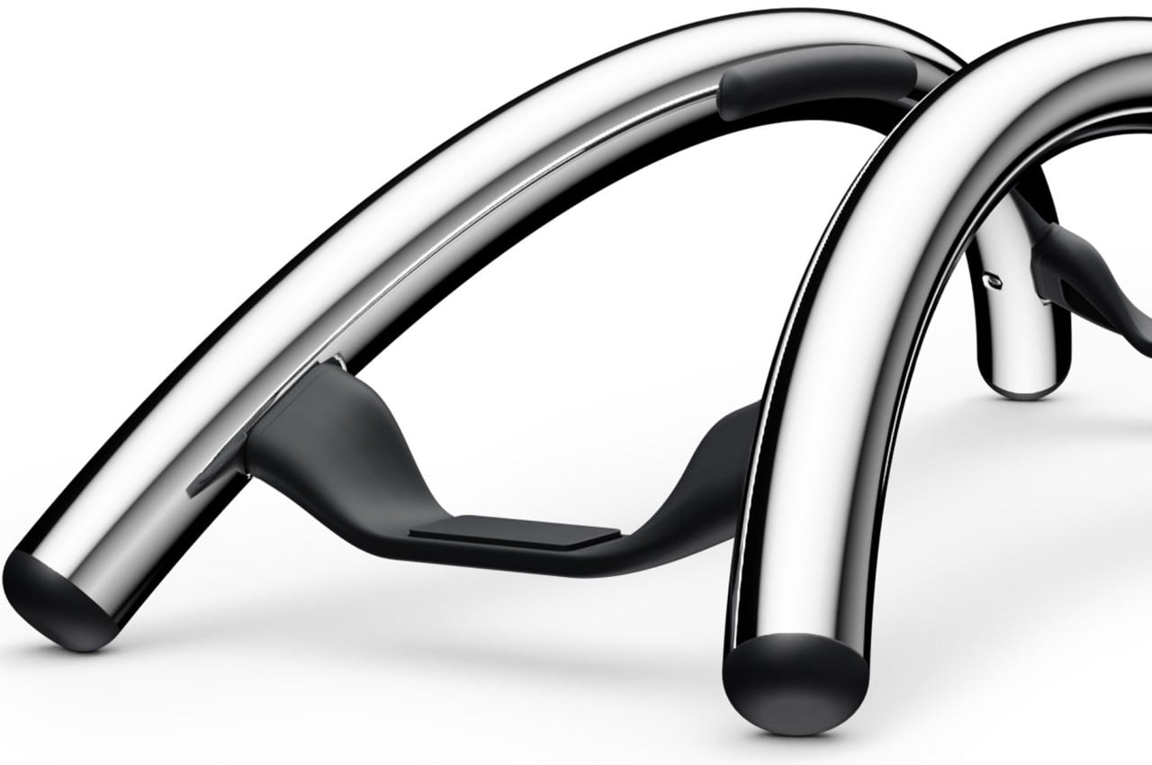
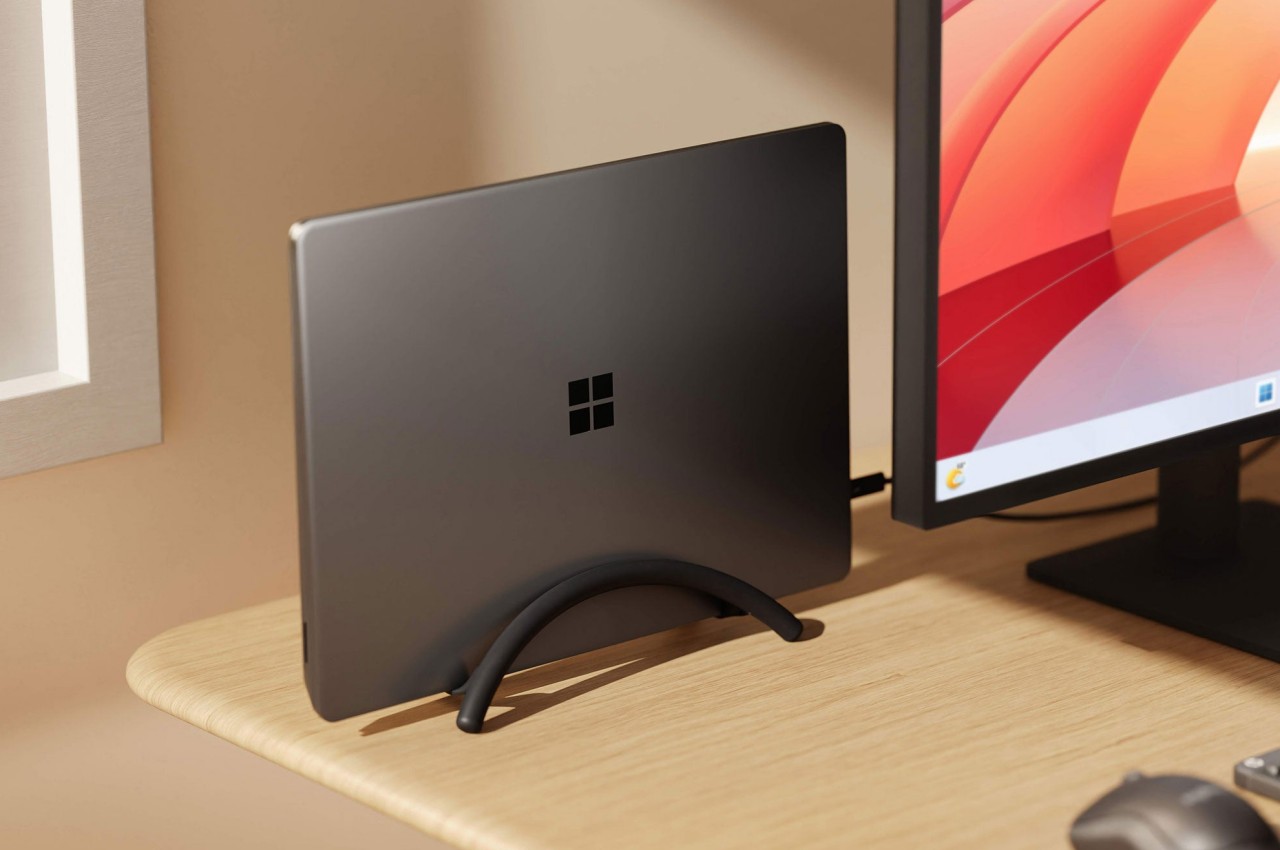
It might look like two simple metal arcs, but that ultra-minimalist design is what makes the BookArc Flex a work of genius. Designed to hold your closed MacBook vertically, it can save you precious desk space when all you really want to do is connect the MacBook to an external screen and some peripherals while it’s running. It keeps all the mess away without sacrificing any functionality, and you can still easily plug in other USB devices because the MacBook is still within reach.
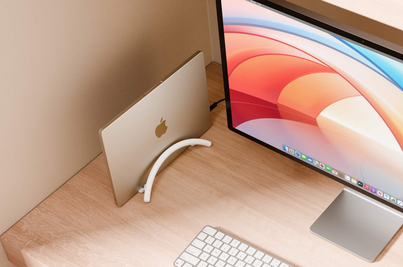
The design is both simple yet elegant, perfectly complementing Apple’s design language with its bent all-metal rods in matte black, matte white, or premium chrome finishes. It is inspired by modern architecture, particularly the Noisette Creek Pedestrian Bridge in Charleston, South Carolina, in more ways than one. While it does owe its form to that bridge, it also takes a few lessons from a bridge’s structure and use of physics, particularly in how the stand uses the MacBook’s own weight to pull in the arcs and secure the laptop. That means that this simple design is also future-proof, supporting any MacBook or even any laptop that’s only an inch thick, making it a beautiful example of how good, simple design can be universal and timeless as well.
