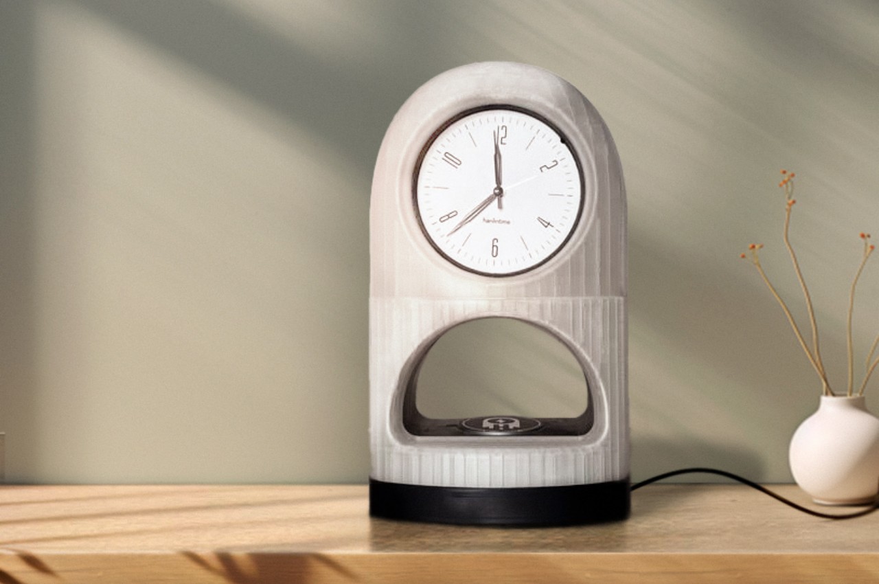
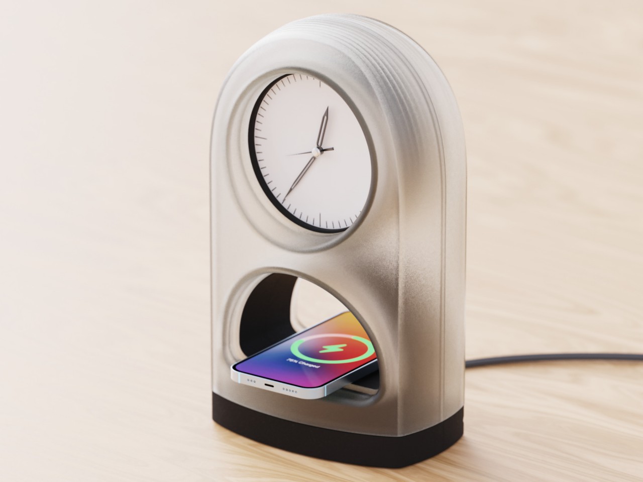
Wireless chargers are all the rage these days, taking on different shapes, sizes, and functions. Some are simple flat beds for your phone and accessories to lie on, while others raise the design a bit higher, literally, with stands that magnetically hold your devices up. The one common trait that these products have is that they mostly lean towards minimalist design trends, which is good for keeping a clean and tidy look but bad for missed opportunities. Minimalist or not, that wireless charger will still take up some space on your desk or shelf, so why not let it serve another purpose, like this rather simple yet elegant desk clock that does more than just charge your phone; it also tells you to take a break and charge yourself as well.
Designer: Nihoy Lahiri
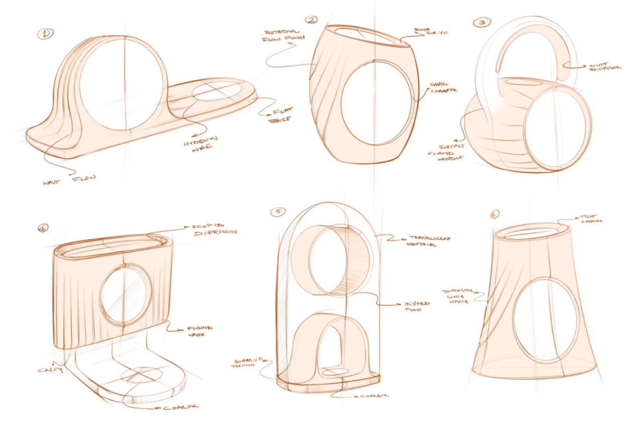
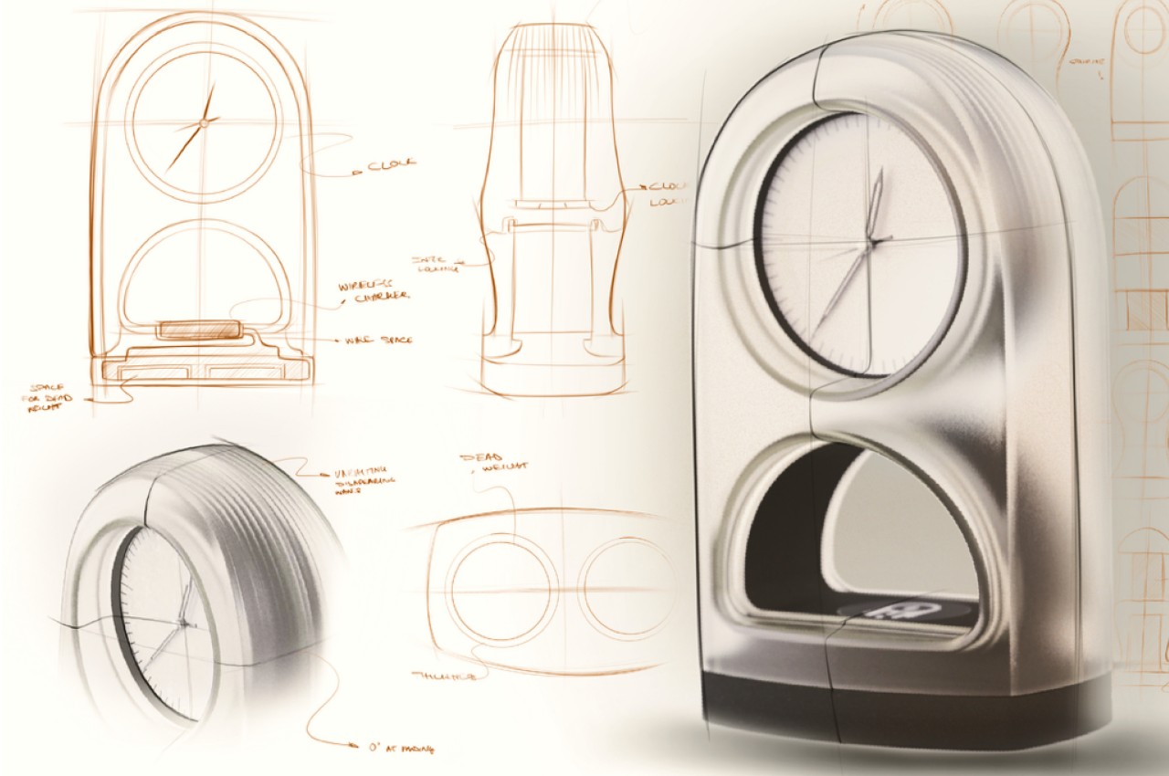
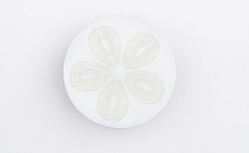
Although they still need to make contact with a flat surface, wireless chargers, especially the magnetic variety, opened up new possibilities for designs. No longer tied down by charging cables, the only limits are creativity, imagination, and, of course, the laws of physics and electronics. Transforming a charging pad into something that has use even when it’s not charging a phone is a smart way of making use of space, which is what Zenith tries to offer with a subtle spiritual purpose behind its design as well.
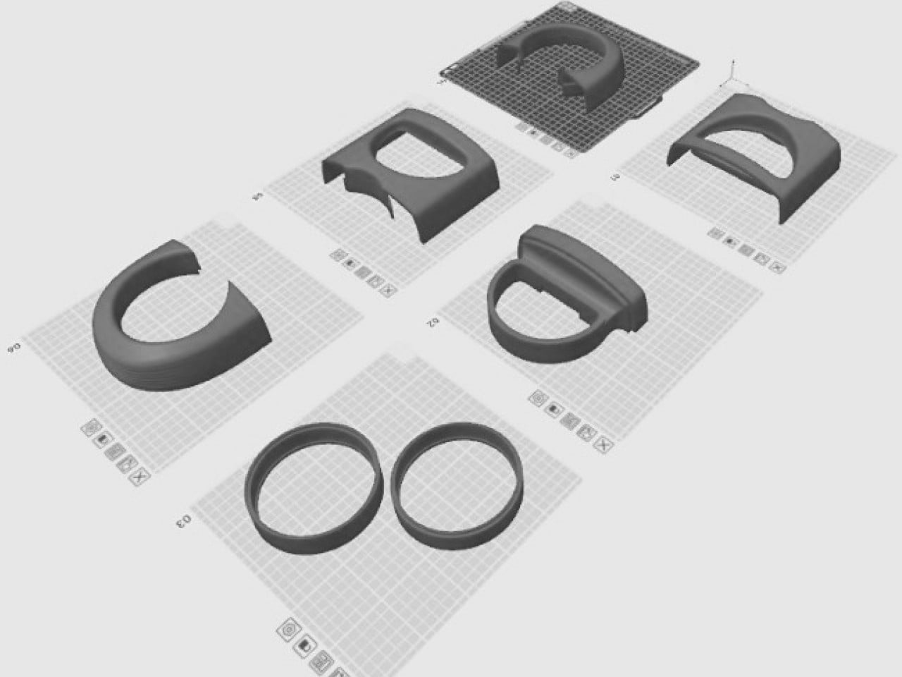
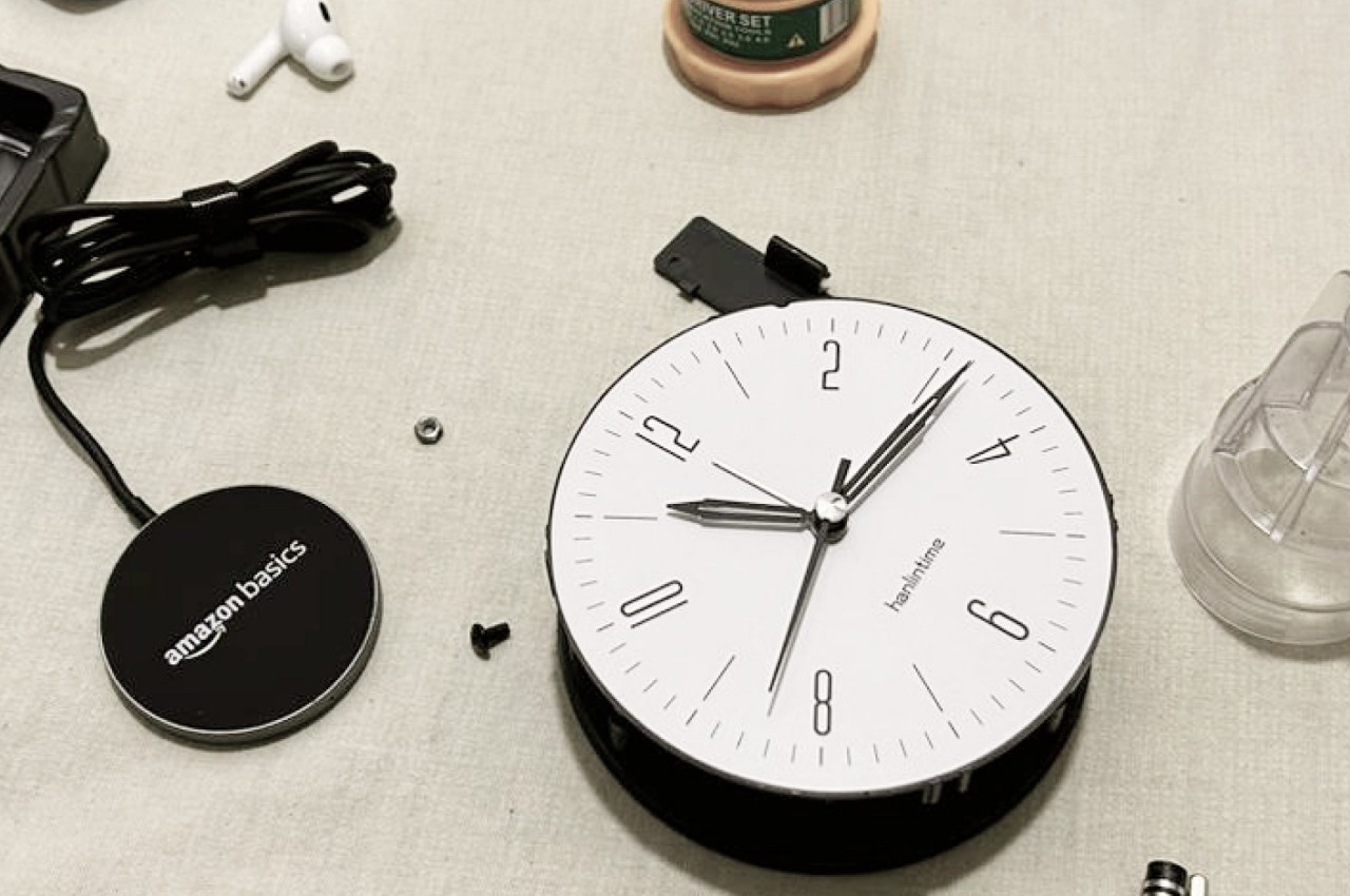

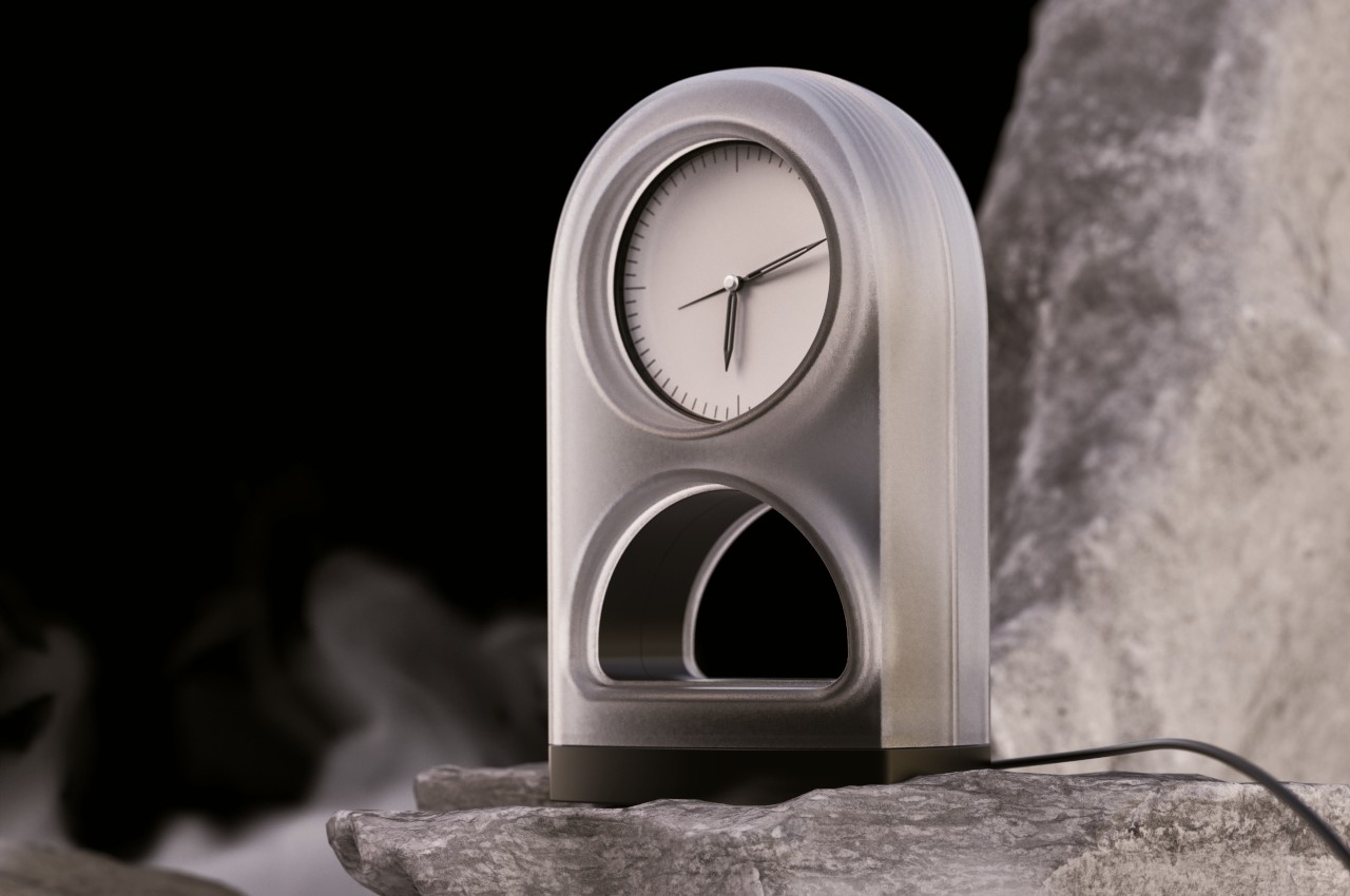
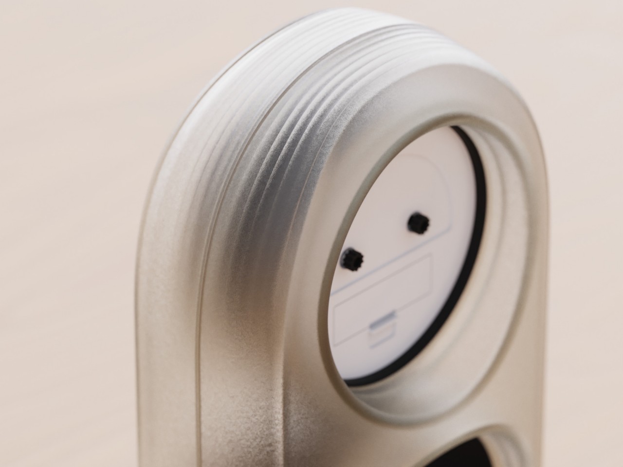
Even without a phone, Zenith already looks like a decorative piece that calls your attention not just to the actual clock but also to its design. The gentle curves of its body convey a more organic and less daunting image compared to something that looks completely angular and mechanical, like what many desk clocks look like. The translucent material makes the entire structure look ephemeral and almost mystical, adding to the spiritual character of the design.

The arch-shaped void at the bottom is where you will let your phone lie while it charges. The empty space is a perfect contrast to the roundness and whiteness of the clock above it. It’s a small version of a Yin Yang composition that further enhances the design’s otherworldly appeal. Zenith’s deeper message, however, goes beyond its aesthetic.
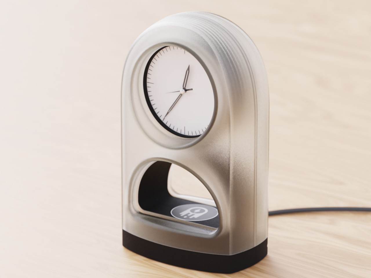
By combining a wireless charger with a timekeeping piece, people will be forced to look at the clock every time they lay down the phone to recharge. It visually nudges their mind to take stock of their own internal battery levels, giving them pause and practicing a little bit of mindfulness. With the clock positioned above the smartphone rather than the other way around, it gives a subtle reminder that time should have a higher importance in our lives than tools. It is the zenith, so to speak, that guides our lives, not the phones that, more often than not, send us on a downward spiral of distractions.
