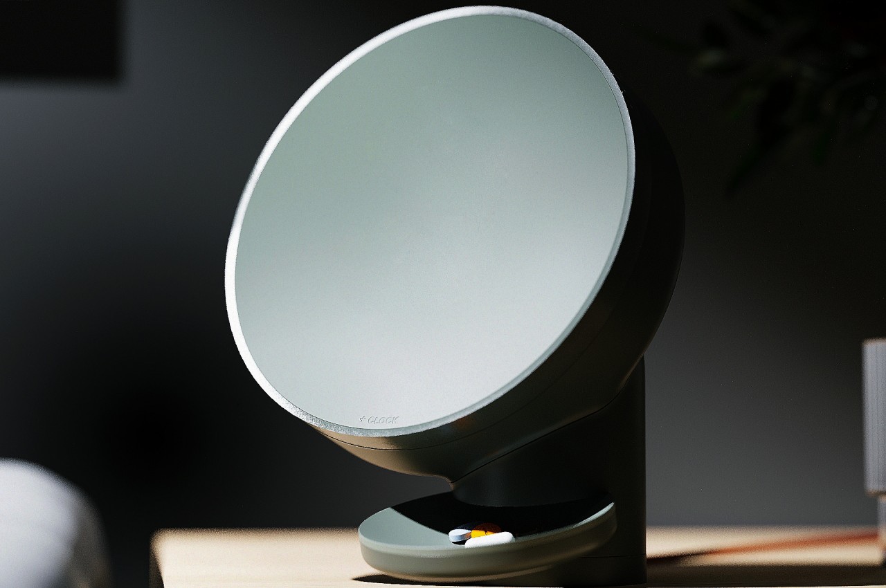
Sooner or later, we will all need to take some pills regularly, whether it’s for medication or even just daily supplements. But unless you live a very disciplined life or have a sharp mind all the time, there will be times that you miss taking the proper dosage at the right time. Pillboxes try to save us time by splitting pills and tablets into their appropriate days, while smartphone apps give us the timely nudges to take them. The distance between these two objects, however, can lead some people to actually forget to drink those pills, especially if they’re stored in a less accessible place to avoid exposure to sunlight. Smart pill dispensers are becoming more common these days, but this twist on that concept proposes a design that is simpler, more aesthetic, and possibly more accessible since it lets you conveniently place the clock exactly where you need to take those pills.
Designer: Chanho Ju
Yes, the design looks like a huge clock, albeit an extremely minimalist one that doesn’t show the conventional numbers around its face. That face is actually an LCD screen that only displays the clock hands as glowing lines, along with the actual number they’re pointing at for a bit of readability. The display does change its contents when it’s time to take those pills, showing the current alarm time and other necessary information.
While it might sound a little underwhelming when it comes to constantly telling the time, its real worth shines when it comes to dispensing medicine. Simply twist the front to detach the clock, revealing 28 compartments for 28 days’ worth of medication. There are four buttons that let you set how many tablets you take per day, anywhere from one to four pieces. There’s also a special compartment for silica gel to make sure the interior of the clock remains dry and prevent pills from spoiling in humidity.
Combining a clock and a pill dispenser isn’t just some random design decision. Unlike a typical pill box, you can place this +CLOCK concept design anywhere it makes sense, whether it’s near the table, a kitchen counter, or a shelf. Its minimalist aesthetic makes it double as a decorative piece so it won’t exactly stick out like a sore thumb, especially since it also minimally tells the time anyway.
More importantly, however, when it does call your attention, you will be in the right place and at the right time to actually receive the pills that drop from the dispenser. There’s no physical gap between the two actions, so you’re less likely to forget to actually take the pills after you’ve automatically turned off the alarm by habit. It’s a simple yet elegant design that addresses the core problem of forgetting to take medication without having to use sophisticated and ultimately more expensive solutions.