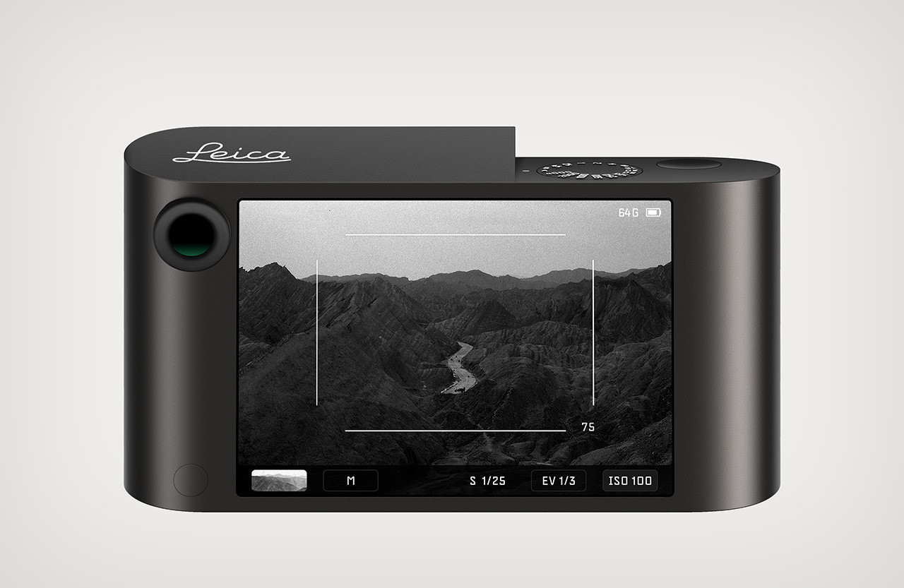
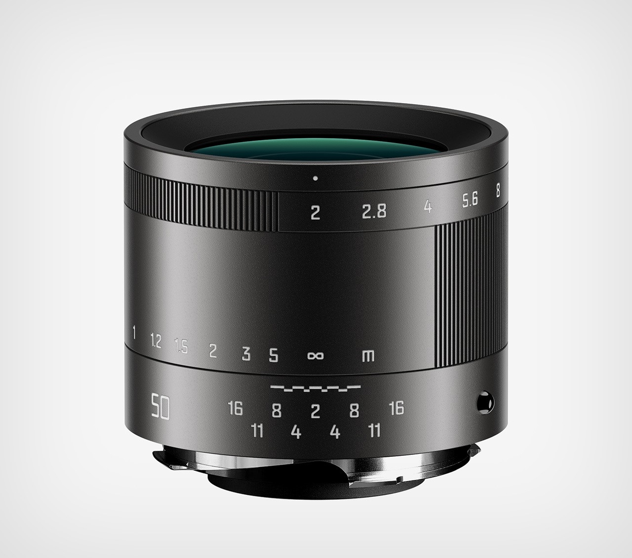
We’re officially in an age of remakes and reboots. Whether it’s movie franchises, music genres, vinyl discs, or even cars like the Lamborghini Countach getting a modern revival, the words ‘Old Is Gold’ seem to hold true for nostalgic classics… Now, Shanghai-based designer Wencheng Zhang is reviving yet another classic from the mid-50s. Perhaps one of the most iconic cameras of its time, the Leica M gets a minimal redesign thanks to Zhang. Crafted from a single block of aluminum, the redesigned camera combines old-world analog charm with a modern aesthetic and cutting-edge features that bring the 1954 classic shooter well into the year 2024.
Designer: Wencheng Zhang
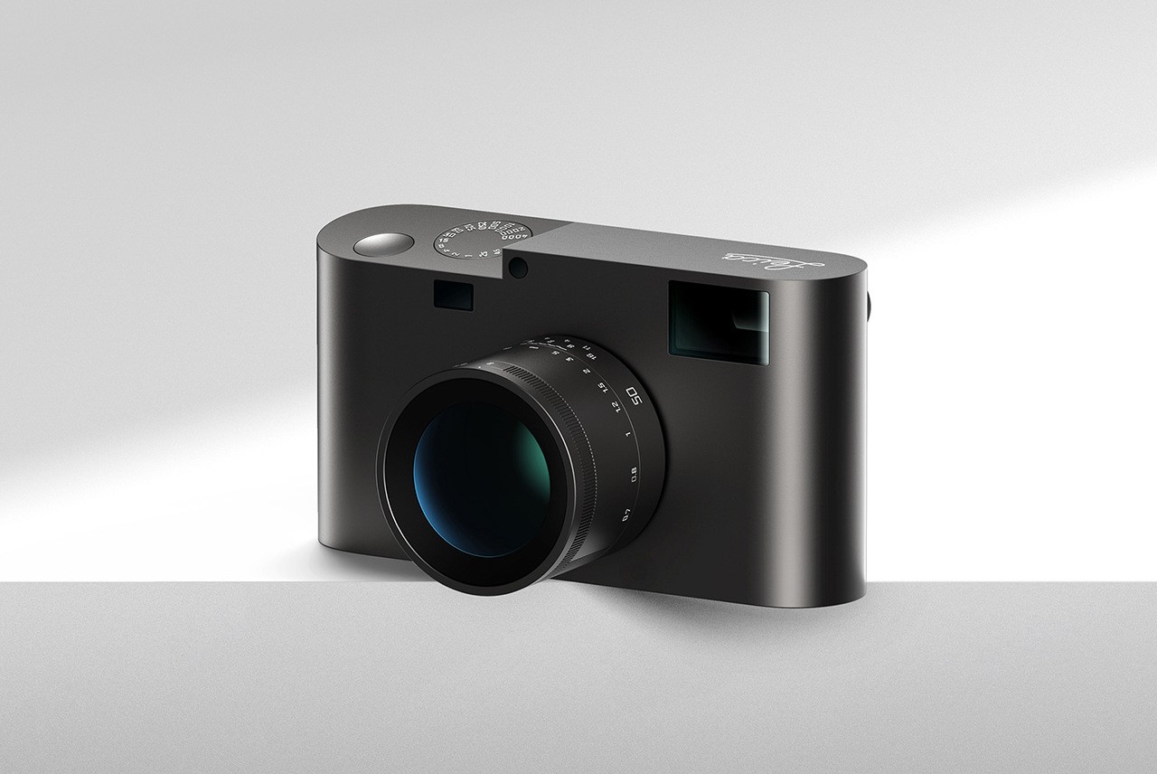
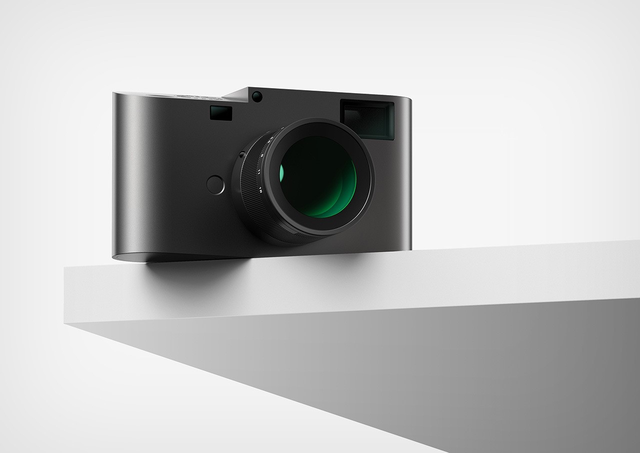
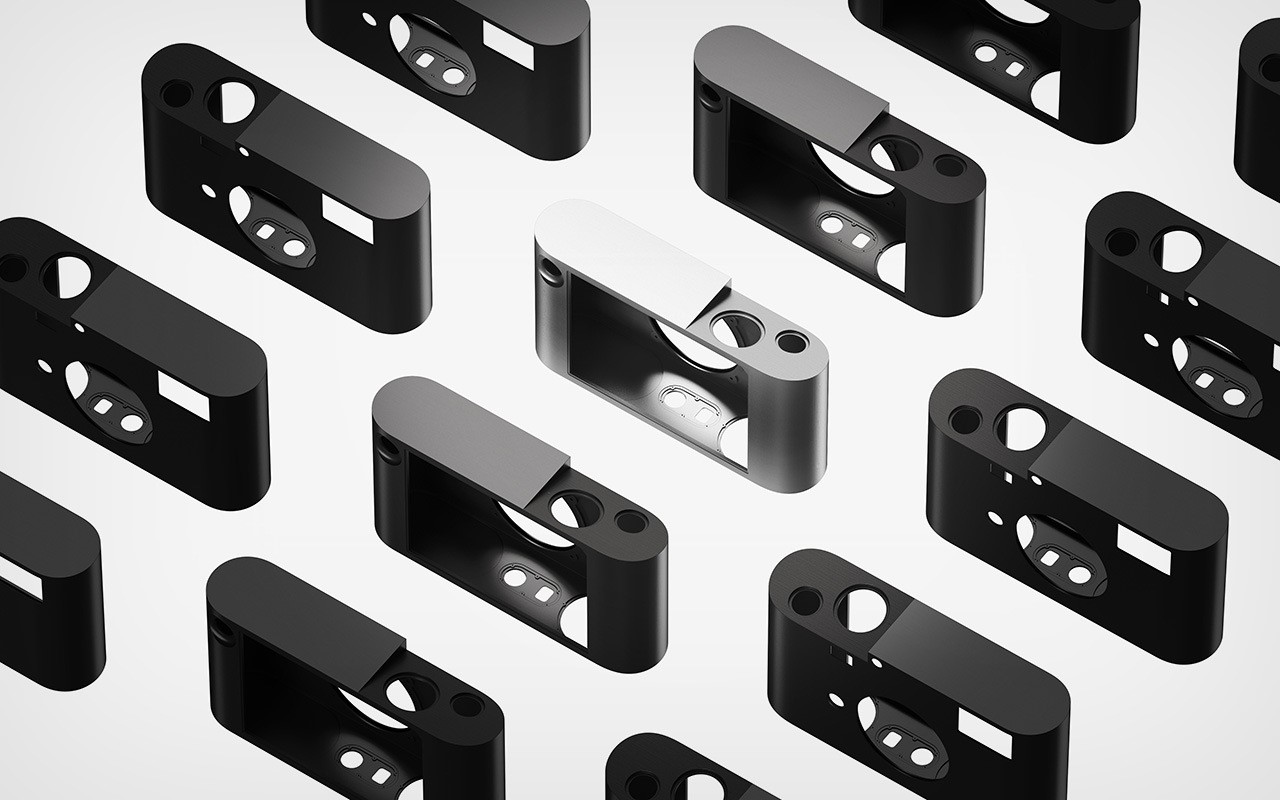
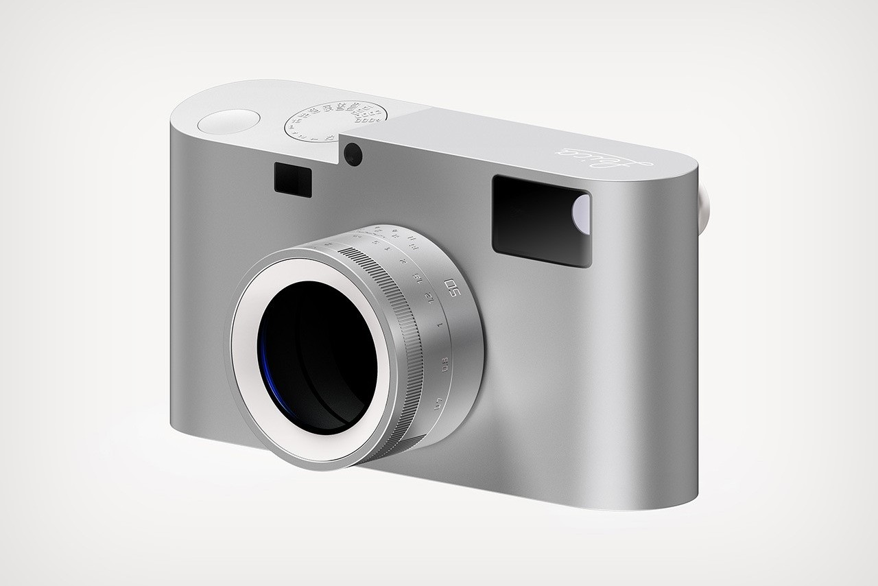
Zhang’s concept reimagines the Leica M for the modern era, stripping away unnecessary elements to create a truly minimalist design. Imagine a camera precisely carved from a single block of aluminum, echoing the unibody confidence of classic Leicas while hinting at the sleek lines of the Leica TL2. Zhang mentions that the inspiration for this form came from none other than Leica’s very first camera, the Ur-Leica Replica.
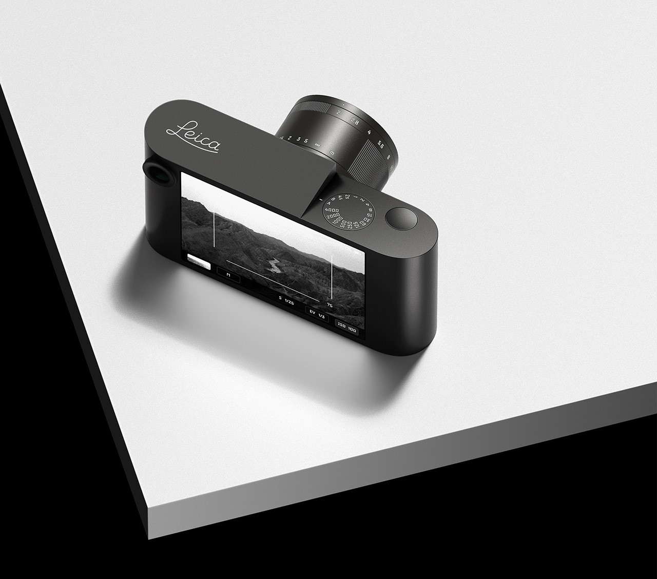
While the classic Leica M layout is instantly recognizable, Zhang incorporates subtle tweaks to enhance ergonomics. A gently angled top plate improves in-hand feel, while the familiar viewfinder and large touchscreen display (borrowed from the M11) remain. However, in the spirit of minimalism, Zhang removes the M11’s three customizable function buttons.
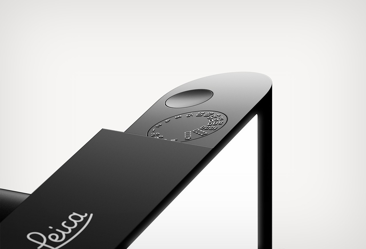
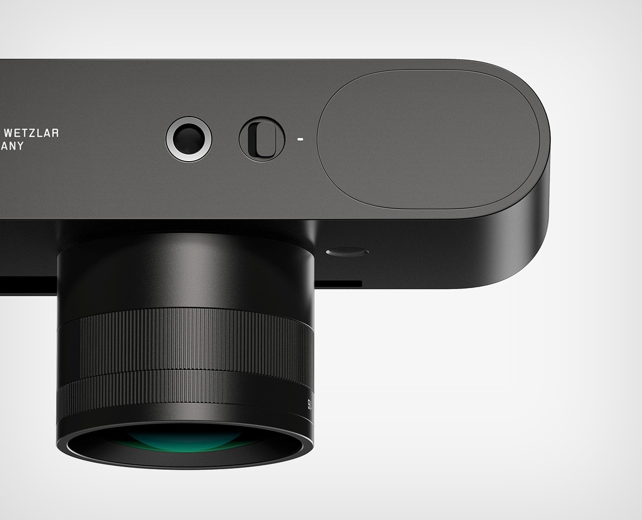
Essential physical controls are consolidated on the top plate, just like a classic Leica. Raised numbers provide a nice textural contrast on the shutter speed dial, which sits perfectly flush with the camera body alongside the shutter button. The overall design prioritizes clean lines and seamless interaction.
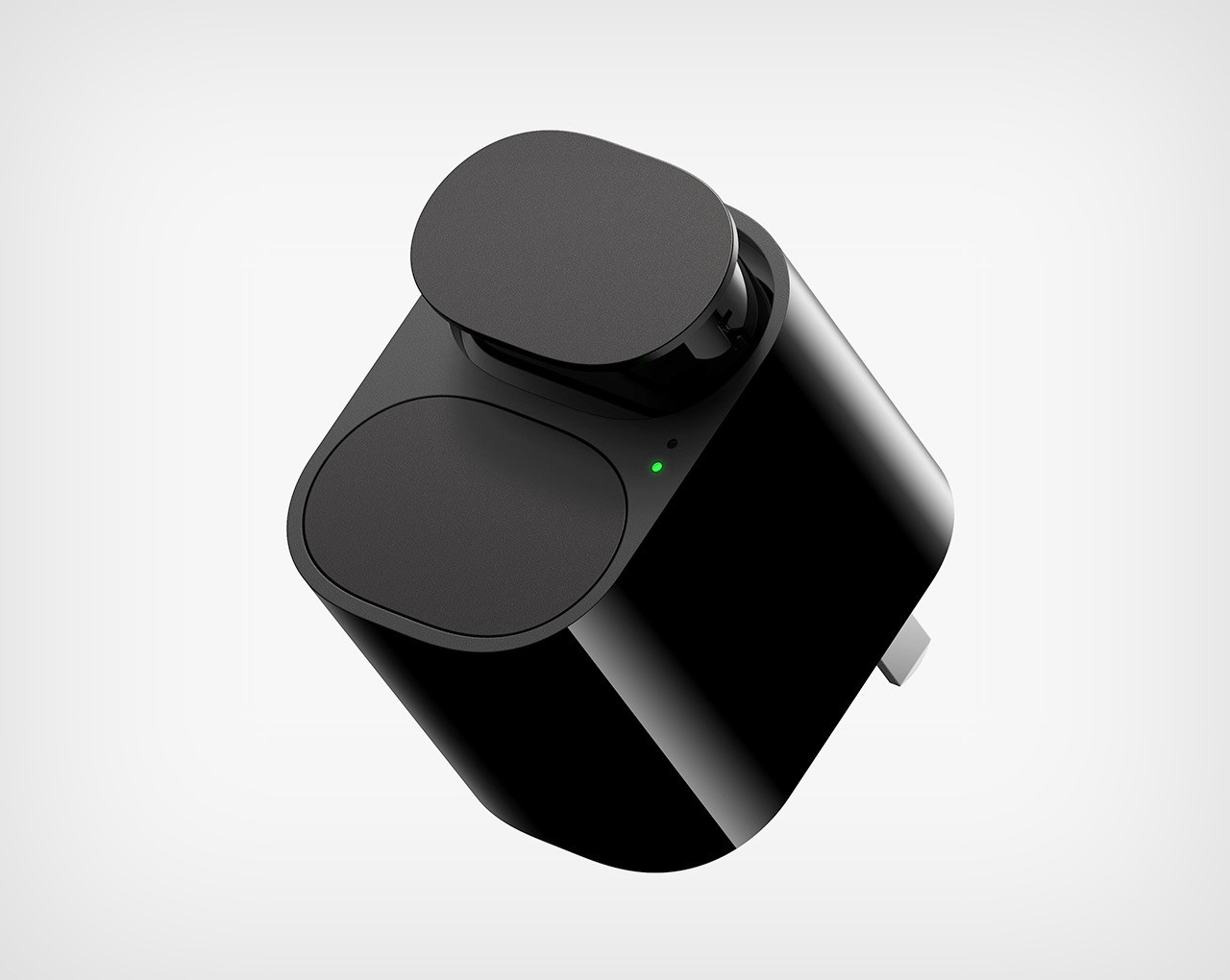
Zhang even extends the minimalist concept to the charger, featuring a compact dual-slot design for convenient battery management on the go.
