With almost everyone owning a smartphone these days, the need for dedicated media players has plummeted significantly. That’s not to say they’ve completely disappeared, especially those types that can be placed and displayed on desks or shelves. The retro design craze has breathed new life into old products like turntables, but these aren’t the only designs from bygone ages that deserve to be rediscovered. Some of these old-school designs come from the digital realm, where some software have achieved near immortality thanks to their distinctive user interfaces. Winamp is one of those iconic faces when it comes to music player applications, and this concept turns that into an actual device that, just like the digital original, can somewhat be configured to suit your needs and moods.
Designer: Eslam Mohamed
![]()
![]()
By modern standards, the original design of the Winamp media player app is clearly outdated, but it remained a darling until recently because of its flexibility. It supported using different skins to personalize the software’s appearance, which naturally led to hundreds of designs, some of which might even make you want to gouge out your eyes. At the very least, Winamp followed a LEGO-like design where you can move parts of the app around or even remove them completely, depending on your needs.
![]()
![]()
![]()
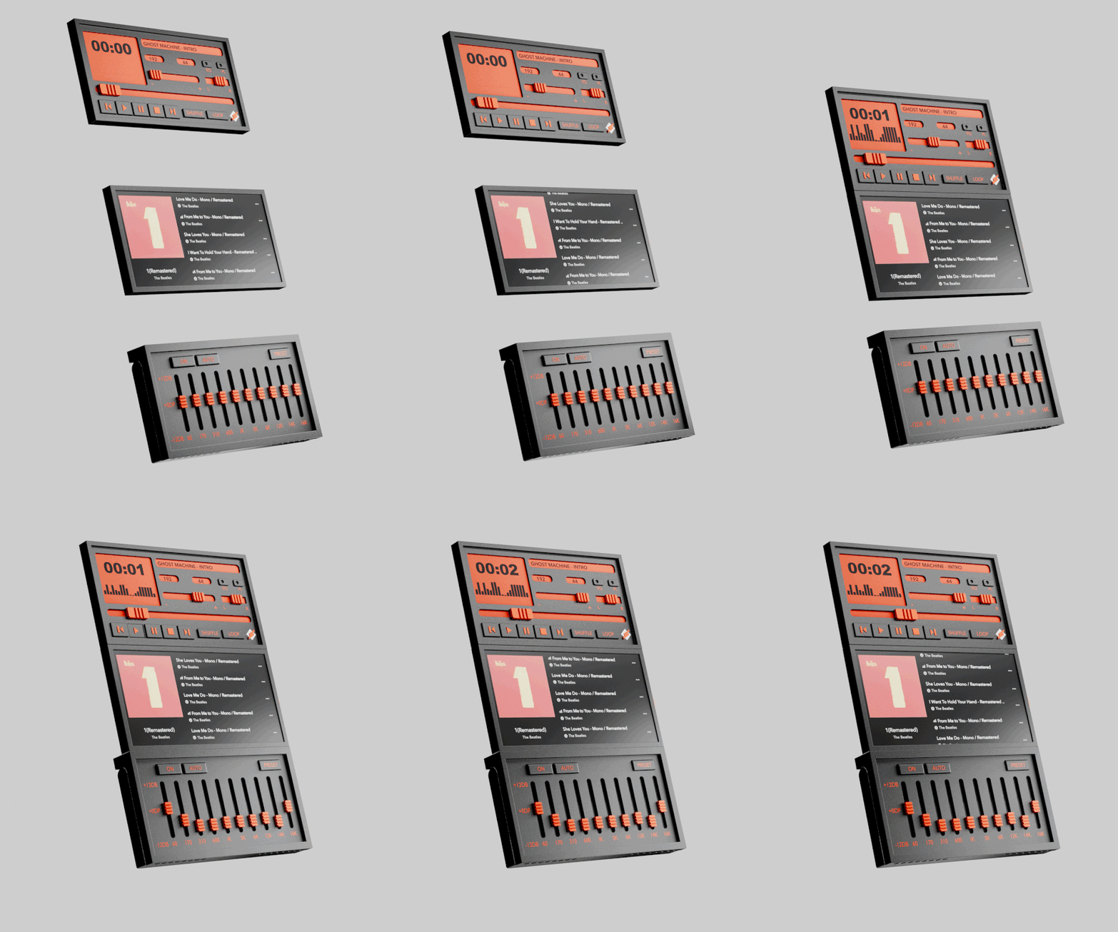
This concept design for a device of the same name follows the latter aspect of Winamp’s design, particularly the ability to move its three main panels around or even leave one out. Like the original Winamp, the media player device has a component for the actual media controls with a single-line display for the current music, one for the equalizer, and another for displaying album art and the playlist. All three can be stacked together for a tall device that is propped up on a desk using the built-in kickstand of the equalizer. Or you can switch them around leaving only two components visible, as long as the equalizer is there to act as the base.
![]()
![]()
You can, for example, only have the media controls and the equalizer if you don’t mind not seeing the list of tracks and the album art. Or if you already have a fixed equalizer setting, you can put either the media player or the album display above it and then snap the other component in front of the equalizer to hide it. You can even show only the media player itself, with the other two hiding behind it. These components connect using strong magnets, so no rewiring is needed to make instant changes to the combination. And at the end of the day or if you want to take the device with you, you can simply collapse all the components in a sandwich and carry it around.
![]()
![]()
What’s interesting about this particular design is that it uses physical controls like sliders and buttons instead of simply employing a touch screen to offer the same interface. It’s like reverse skeuomorphism, where the digital user interface mimics the appearance and behavior of physical controls. Of course, this more physical design means you don’t get to use skins anymore, but it’s a small price to pay for such an intriguing device.
![]()

