The recent years have put gaming under the spotlight, from the hit mobile games like Pokemon GO to innovative consoles like the Nintendo Switch, to the messy adaption of iconic video games into films or TV shows. Of course, this has also given rise to interesting new product designs, especially those riding on the retro trend that’s bringing aesthetics from the past to the present. That said, we can’t always be looking backward trying to relive a so-called “golden age” of design. In order to move forward, we sometimes have to break away from standards and tradition to pave the way for the future. That may sometimes result in unusual designs that may or may not work as intended. This futuristic-looking game controller, for example, aims to simplify the user experience and give the product a more aesthetic flair, but it also raises questions about the usability of the redesign.
Designers: Sami Azfar, Salekin Piash
The basic design of game controllers has changed little over the decades. Yes, they vary depending on the platform or generation, but the existence of buttons, directional pads (D-pads), joysticks, and triggers has always been a standard. For now, it’s the only way you can express a multitude of actions with a limited number of controls, but it’s hardly the most effective or convenient. Unfortunately, we will have to stick with such conventions for the foreseeable future, but that doesn’t mean we can change how they are implemented.
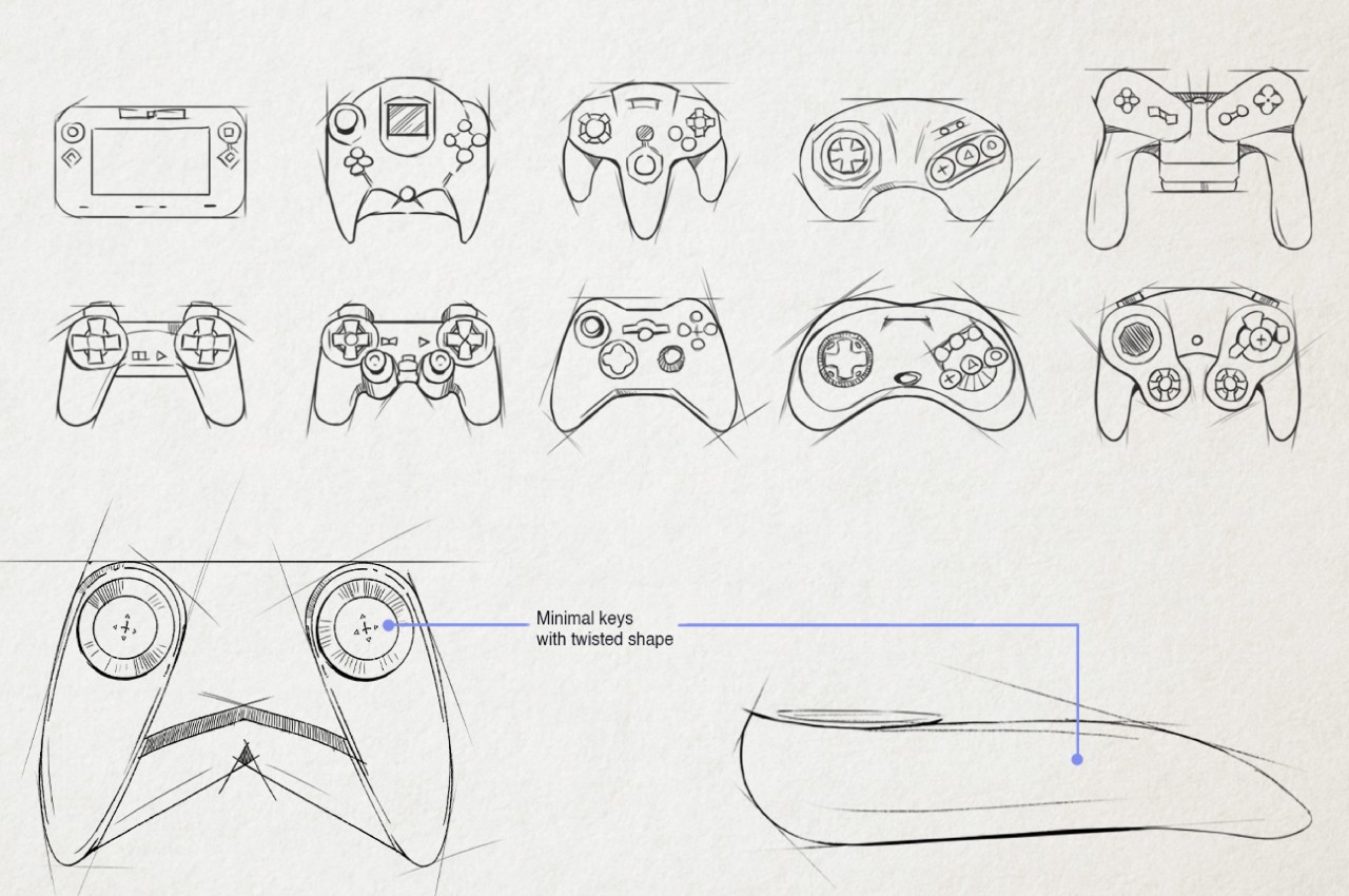
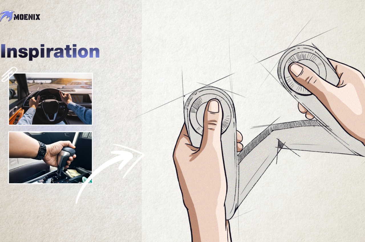
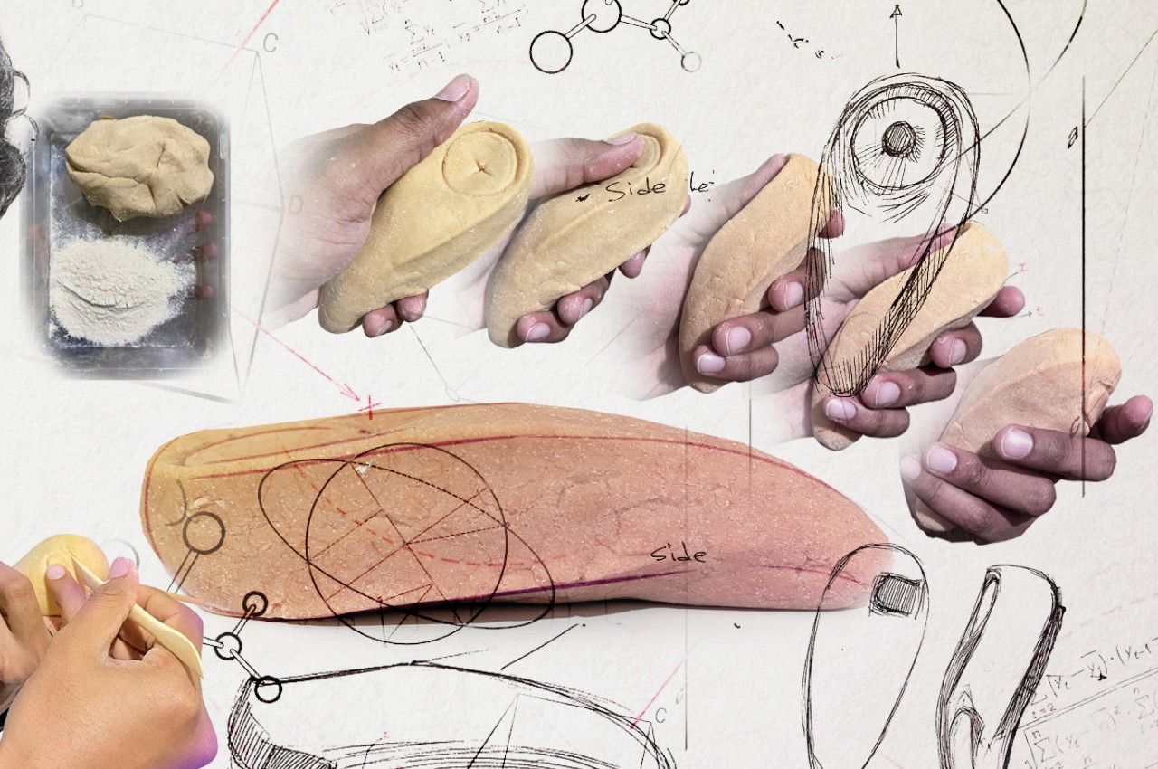
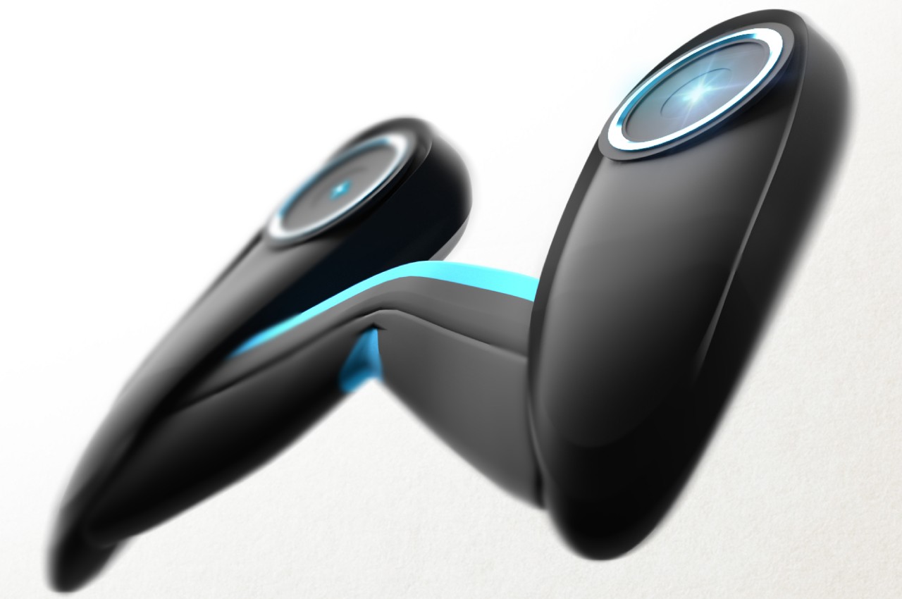
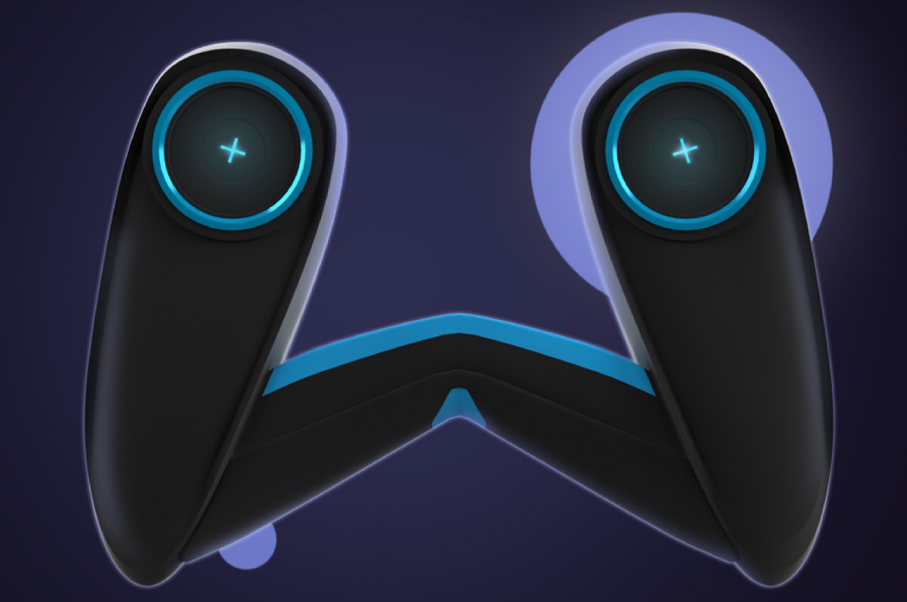
Moenix is a design concept that tries to simplify the form of the controller, thereby allowing it to take on a completely different aesthetic. It specifically takes inspiration from the design of steering wheels and gearshift which are examples of simple yet powerful user interfaces. Unsurprisingly, the Moenix takes on a shape that’s not unlike the steering wheel of a vehicle but utilizes more organic shapes to give it a less mechanical appearance.
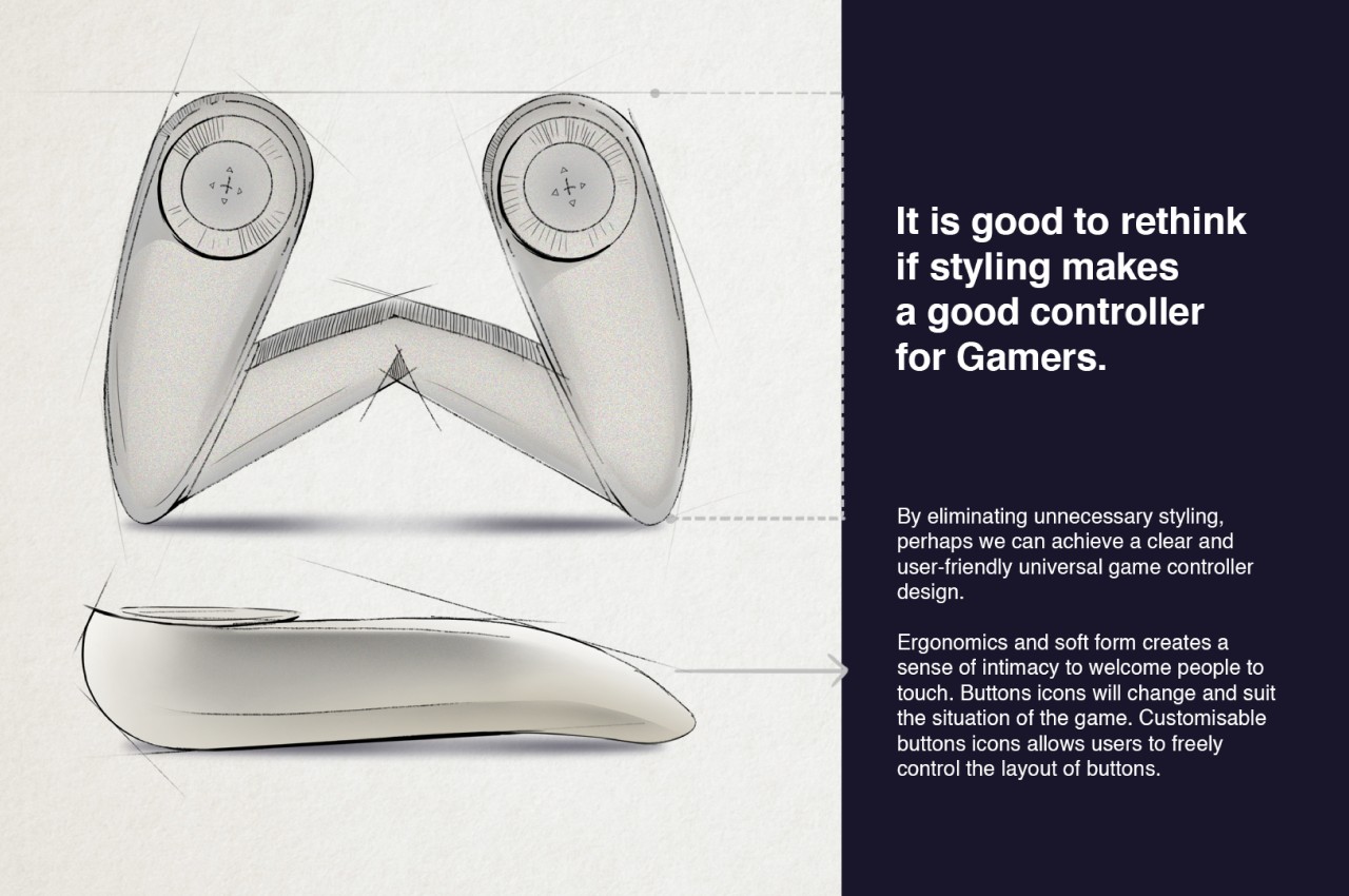
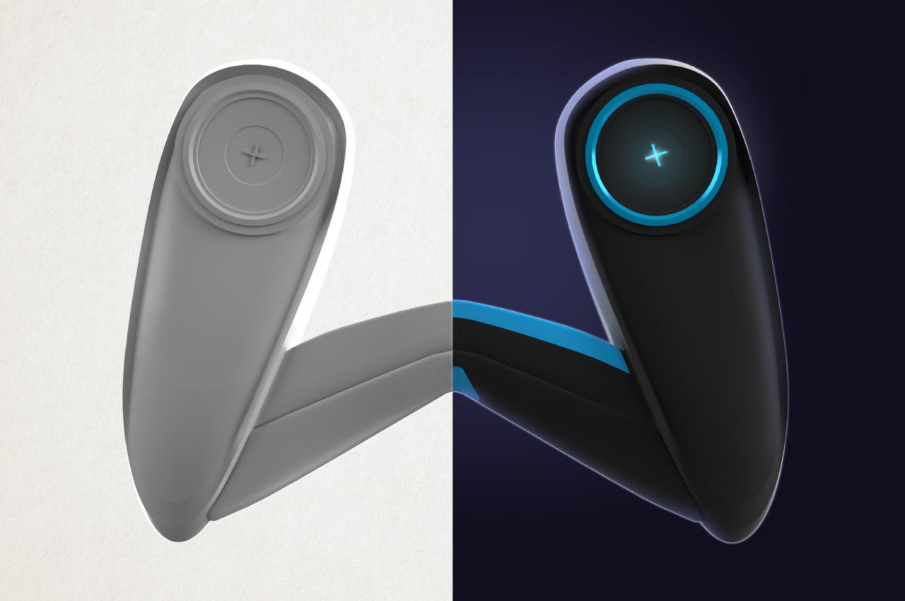
The most striking aspect of the controller’s design, however, is the lack of any visible interfaces. There are only two explicitly mentioned in the design, and both come under your thumb. These are touch-sensitive buttons whose actions can change depending on the game being played. One could act as a trigger in a shooter or as the gas pedal in a racing game, while the other can be mapped to movement or camera controls. Given the shape of the controller, it wouldn’t be surprising if it had motion controls so that you can turn your character or your car just by turning the controller itself.

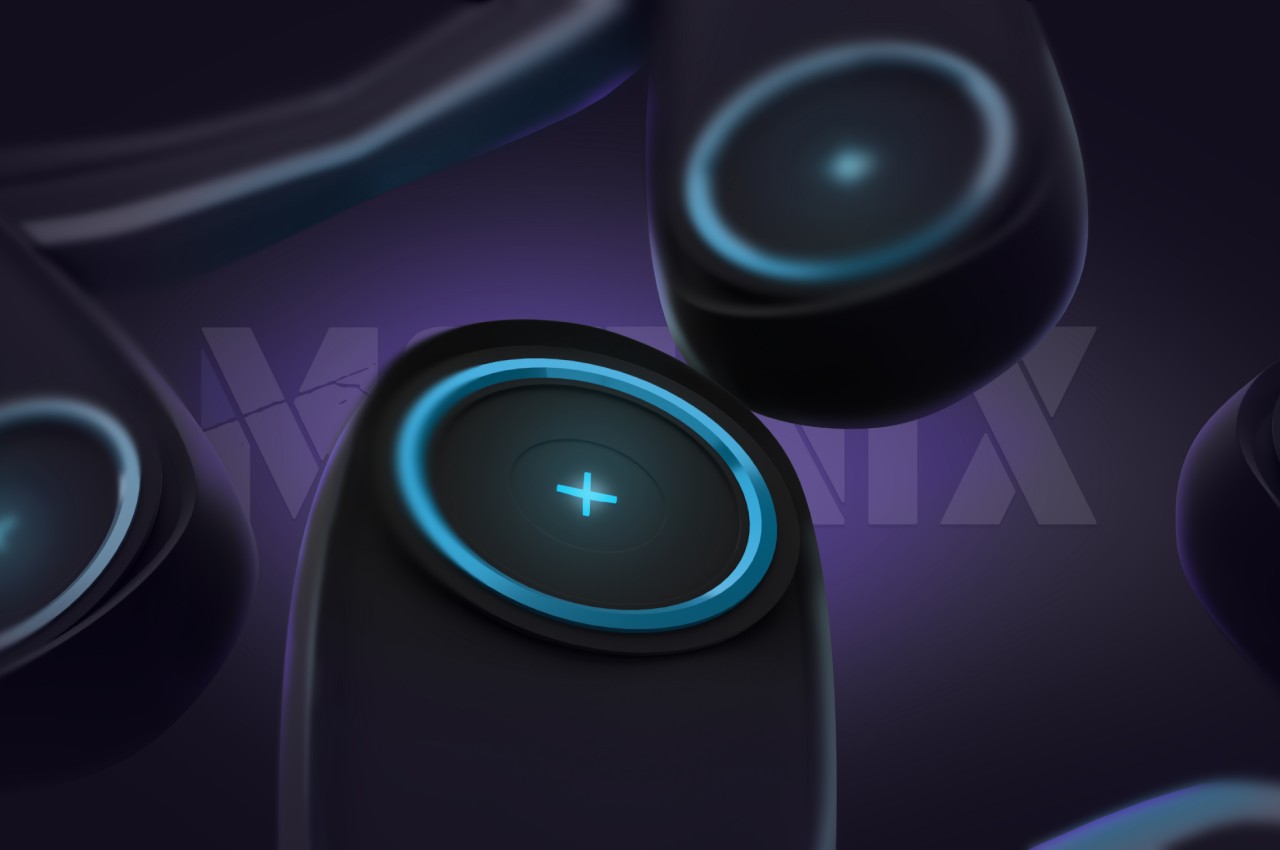

This concept allows the game controller to take on a simpler and more approachable design, but it seems to come at the price of actually providing enough controls to the player. The dynamic buttons can be changed, but unless it can provide more than 2 or four actions, it will definitely be insufficient for most modern games. Alternatively, it might be possible to include buttons behind each handle, providing the same amount of expressiveness but in a more ergonomic position.
