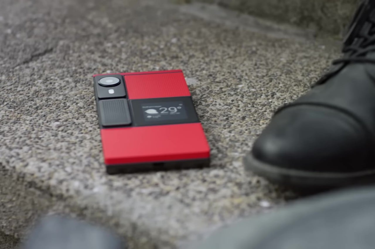
Smartphones today seem to look very similar, varying only in the shape of the camera bump and the color of their backs. Sometimes, the materials might be different, too, but the same large-sized “candy bar” form factor has become the standard for all the smartphones currently in the market. There was a time, however, when companies were a bit more daring, experimenting with phone designs and features in an attempt to stand out from the crowd. That did lead to some rather eccentric and sometimes even ridiculous designs that make us question the sanity of the minds behind them. But there are times when those odd designs of the past actually have important relevance today. Here are five such phone design oddities that we wished existed or still exist, and some alternatives in case you may have been smitten by their quirky appearance.
Designer: NewDeal Design for Google/Motorola
Undying Handset: Project Ara
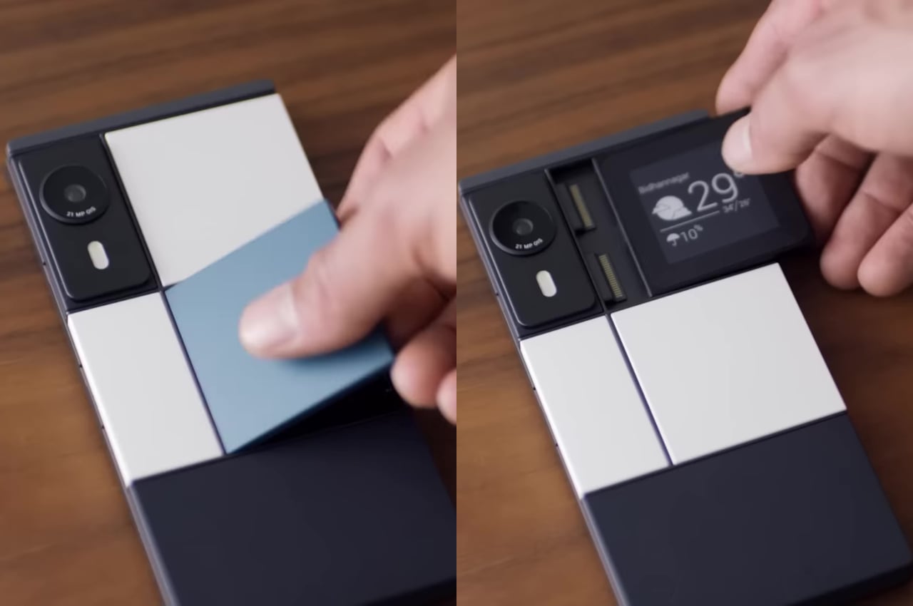
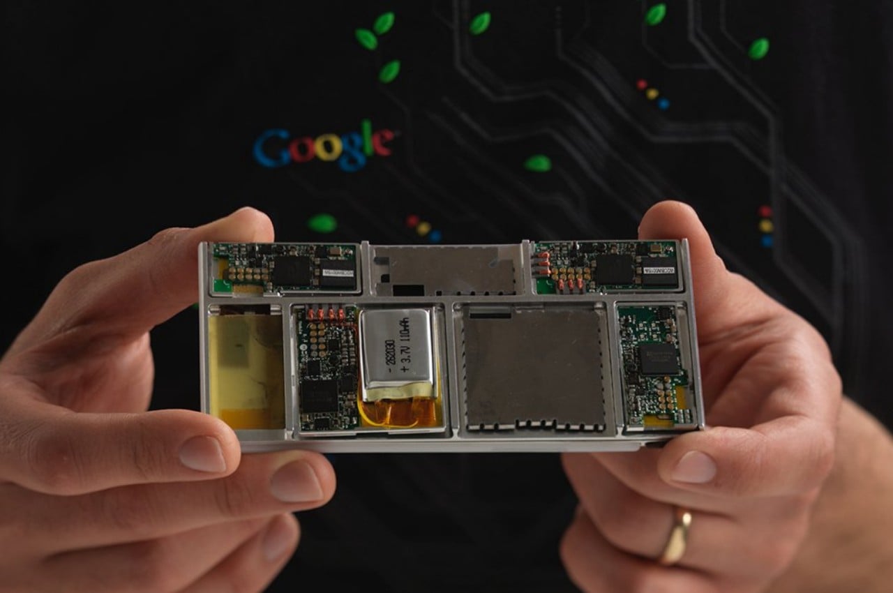

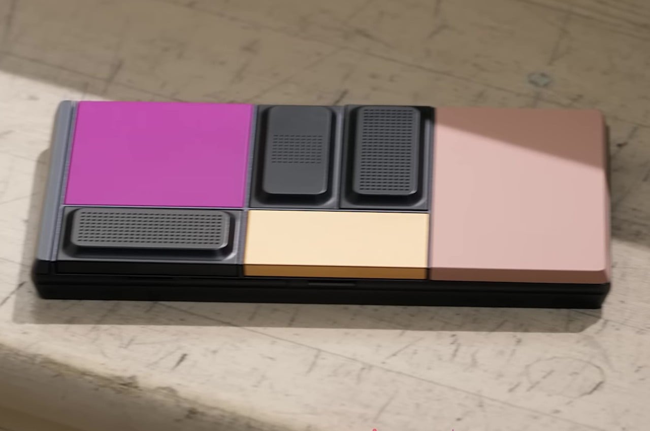
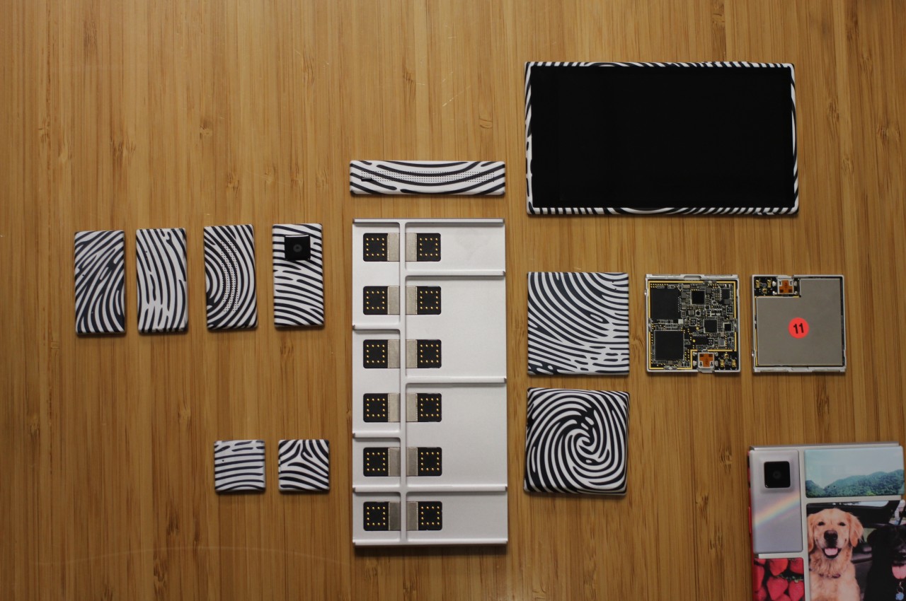
Google’s Project Ara inspired the idea of a modular smartphone whose components you can easily swap to upgrade or repair parts. In theory, this would make the phone last forever, or at least as long as the base is intact and parts continue to be manufactured for it. In practice, it was a very ambitious endeavor that could neither meet expectations nor present a viable business model that wouldn’t bankrupt manufacturers. In the end, that sustainable and immortal smartphone remained just a dream, at least in that idealistic and perfect form.
Alternative: Fairphone 5
Designer: Fairphone
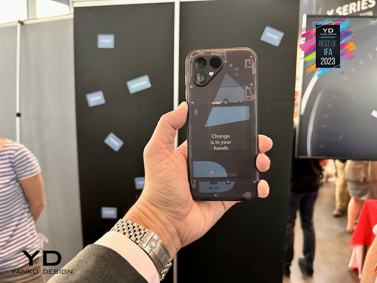
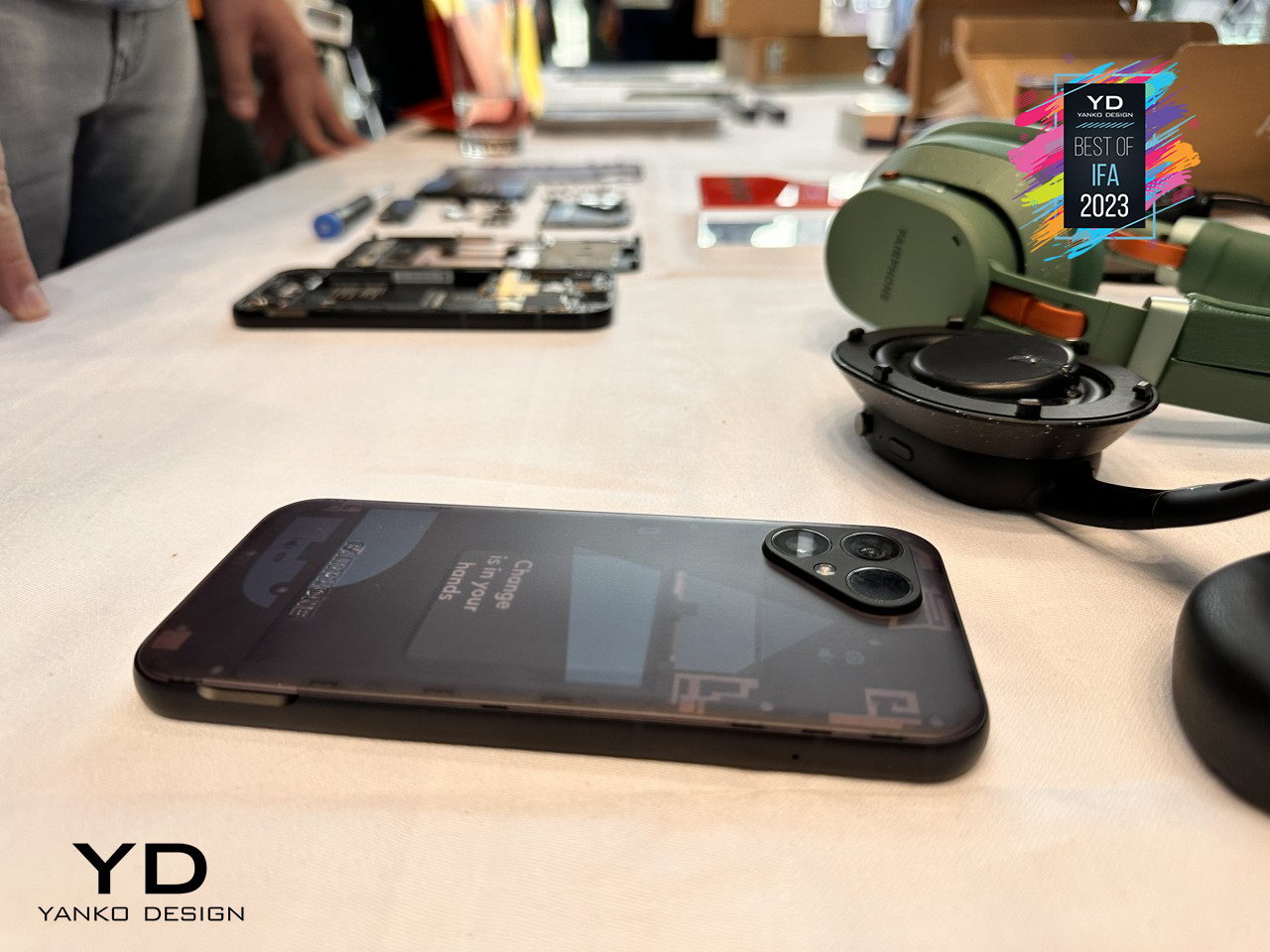
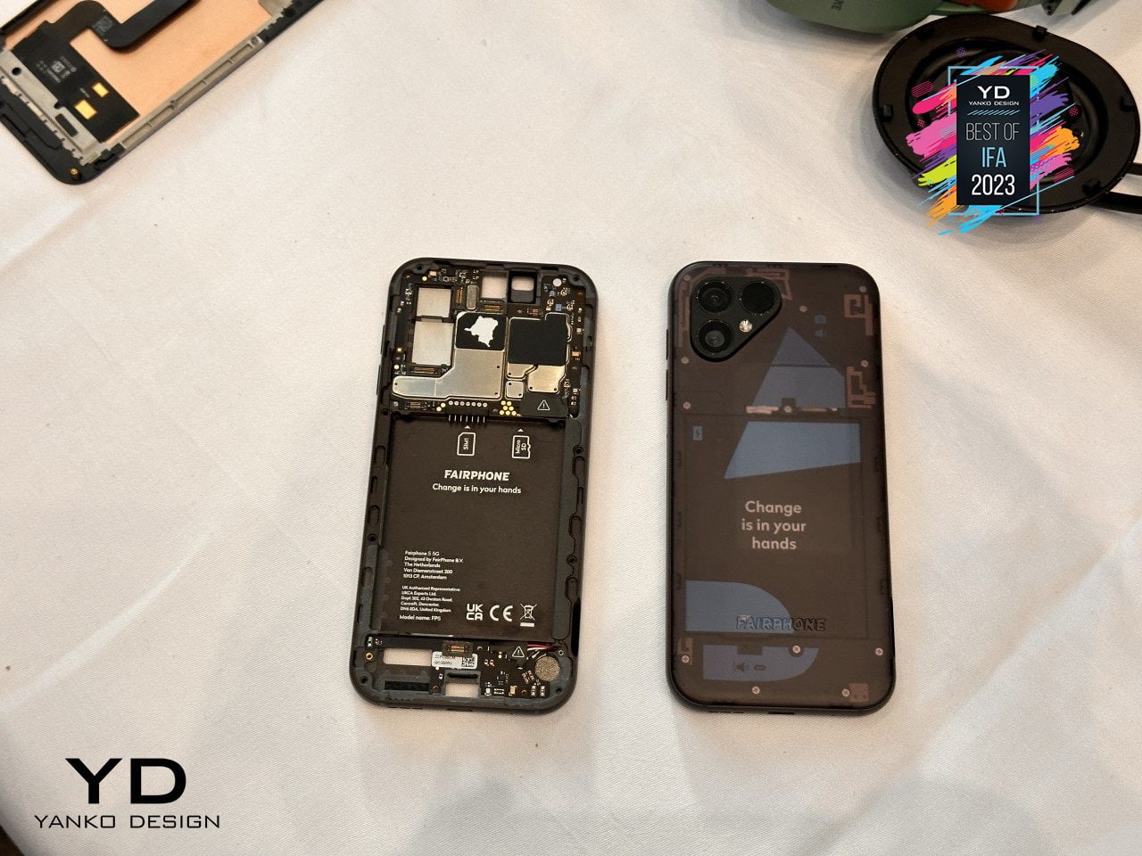
Fortunately, a part of that dream is actually possible and even sustainable in more ways than one. Although you can’t hot swap components on the fly, the Fairphone 5 at least offers a way for owners to change important parts of the phone, like batteries or even cameras, to keep them running almost forever. There are some limitations, of course, but if all you want is a phone that will last you for almost a decade instead of just two years, this self-repairable design pretty much has that in the bag.
Mobile Shutterbug: Nokia N90
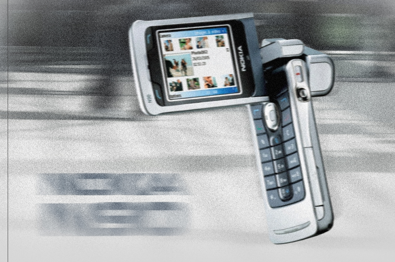
One of the biggest uses for smartphones today next to social media is taking photos and videos. In the days even before the term “smartphone” was coined, even the most advanced handsets from the likes of Nokia could barely hold a candle to point-and-click cameras. That’s why the quirky Nokia N90 was prophetic and way ahead of its time, envisioning a day when smartphones would be used like camcorders, though with a bit more awkwardness due to their inflexible designs.
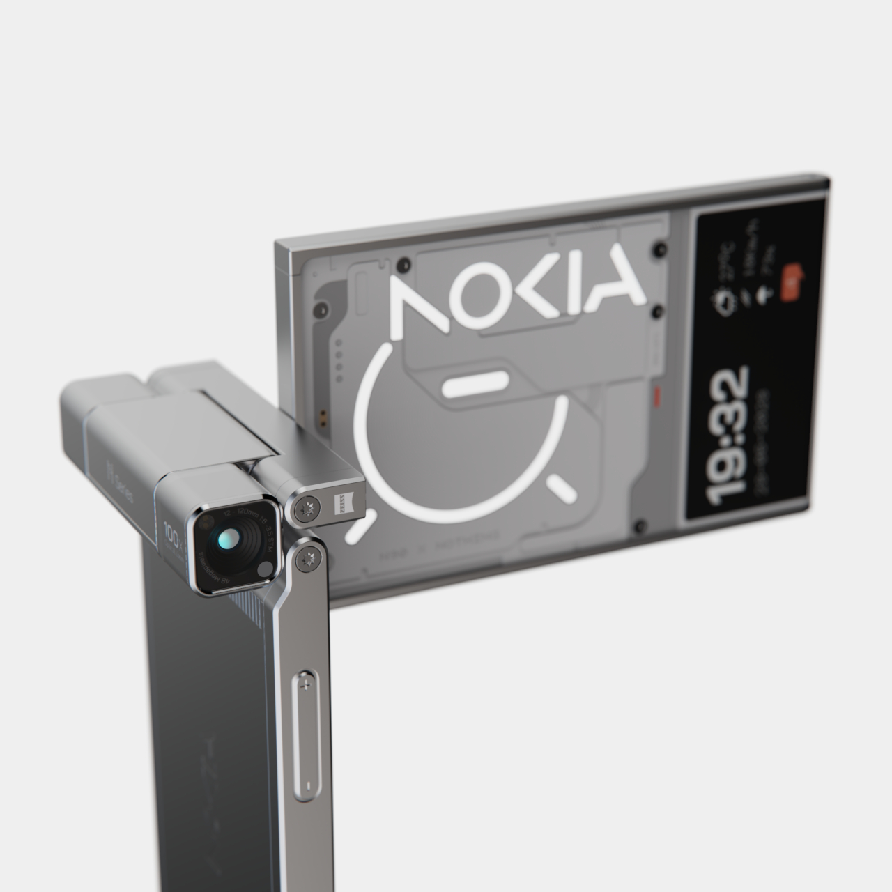
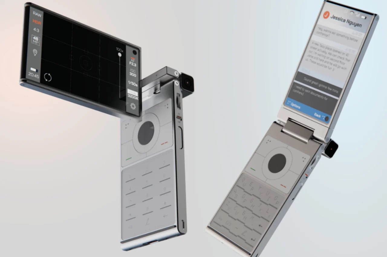
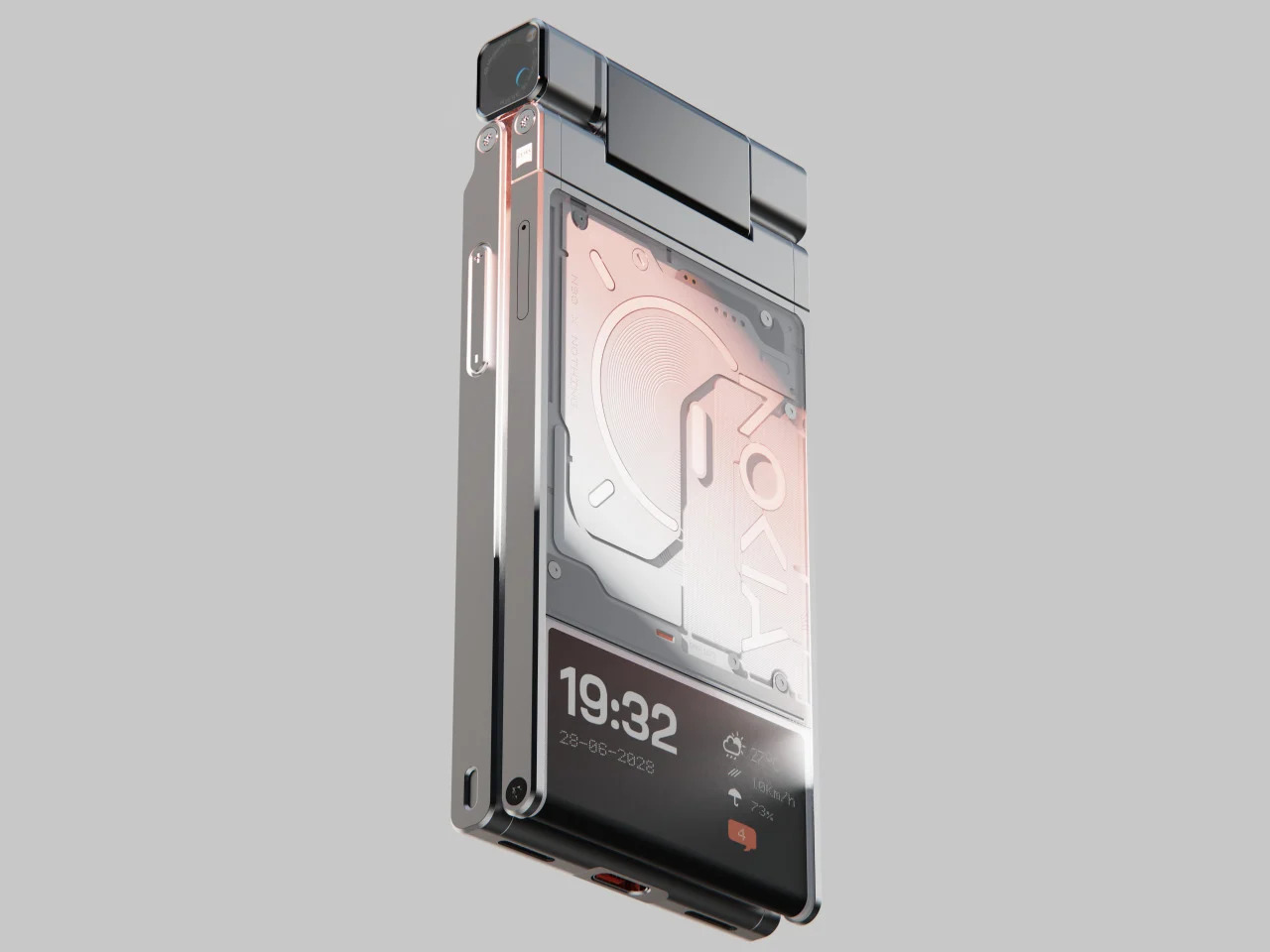
Alternative: Nokia x Nothing Concept
Designer: Viet Doan Duc
While clamshell phones are back in season thanks to foldable screens, the folding and twisting design of the original Nokia N90 remains a distant memory. This concept tries to answer the question of “what if?” and mixes two famed brands’ design languages to craft what could be the perfect camera phone. It makes you feel like a pro photographer or cinematographer, holding up your phone not with shame but with pride, capturing not only the moment but also people’s attention in a good way.
Pocket Book: YotaPhone Dual-Screen Phone
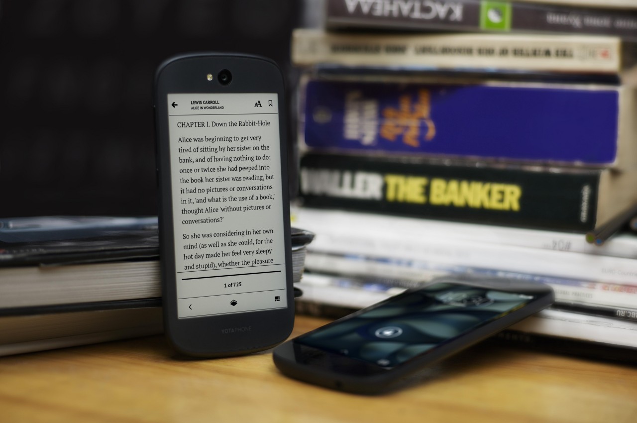
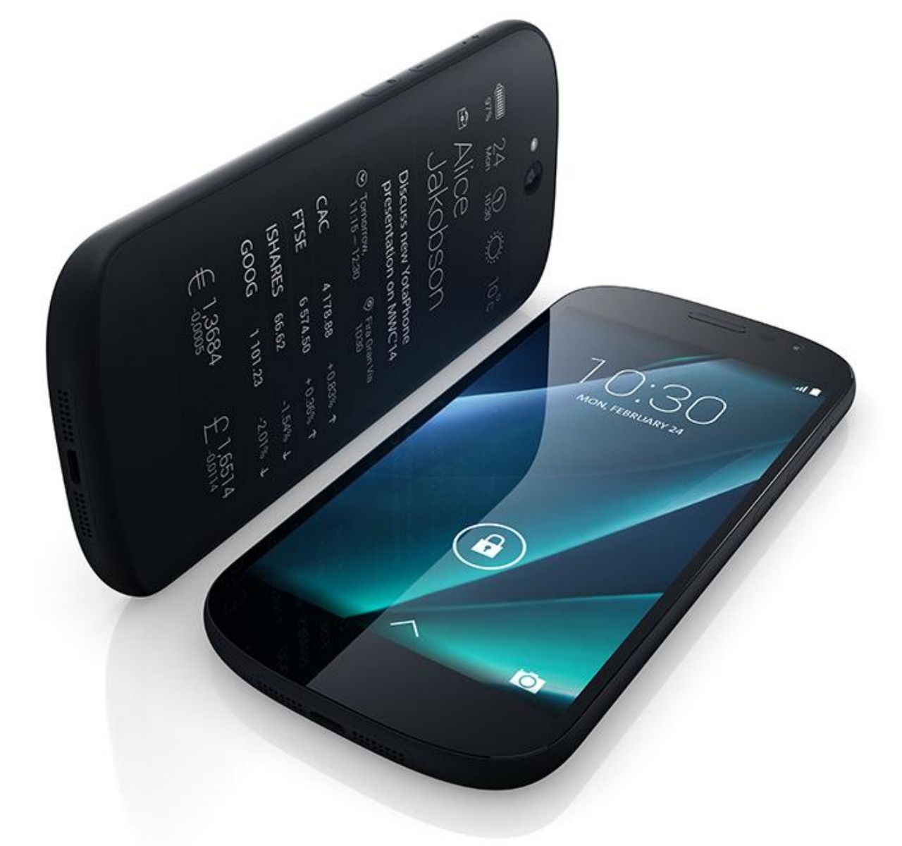
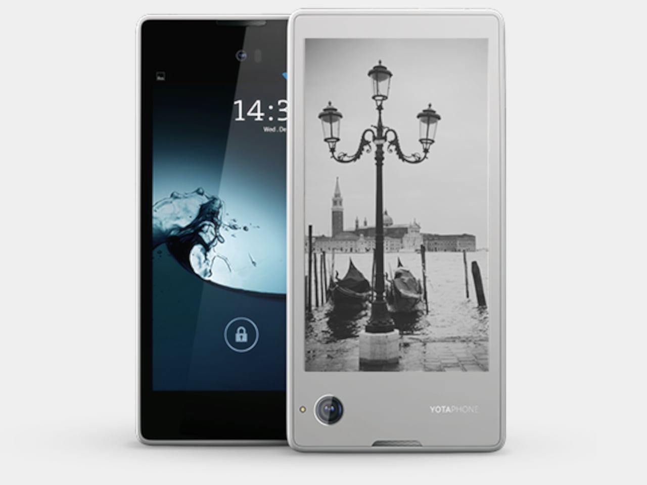
Designer: YotaDevices
E Ink devices are becoming more popular these days, especially after the addition of features like stylus support and color. These displays are easy on the eyes and the battery, allowing the screen to show the same thing for days without requiring a recharge. A few years back, a small company tried to bring those benefits to the smartphone in the oddest way, by putting an E Ink screen on its back. Although it can be used for reading e-books on the go, its main purpose was to have a battery-saving always-on display that is a bit more dynamic and useful than typical AOD implementations.
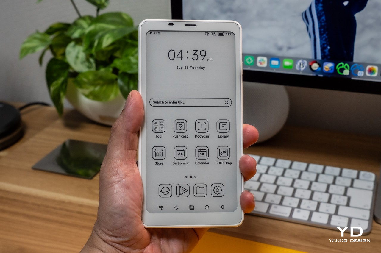
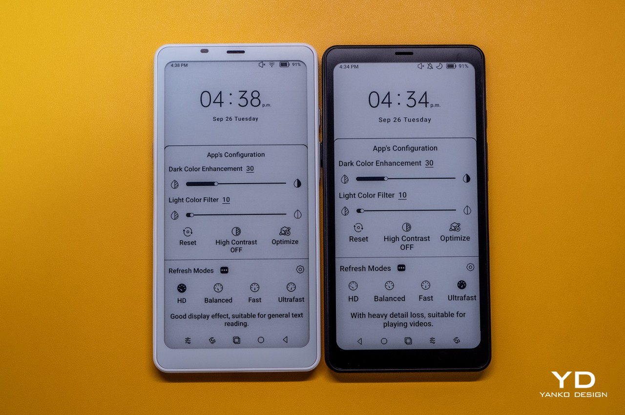
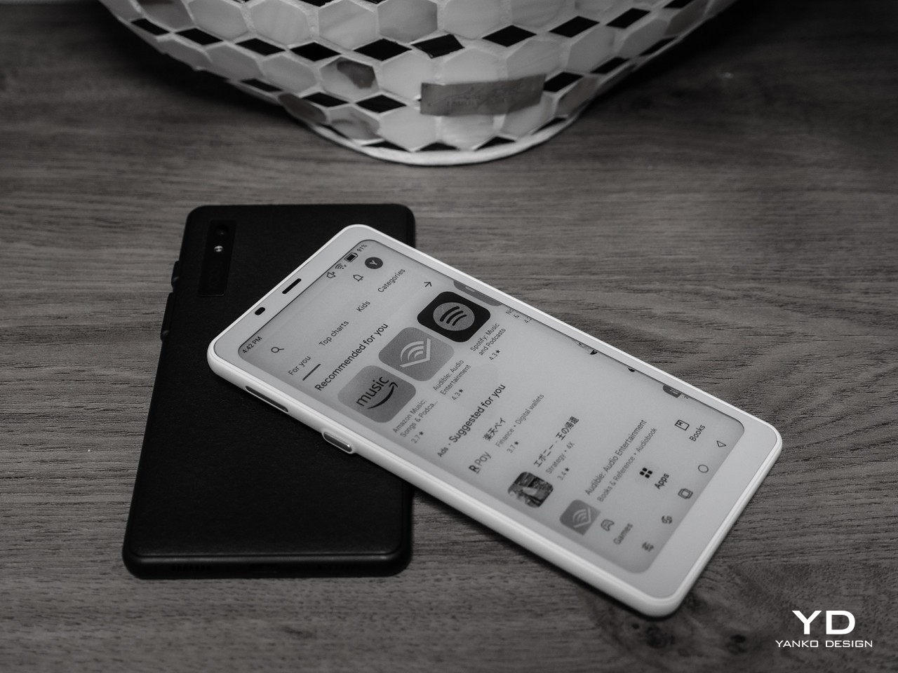
Alternative: Onyx BOOX Palma
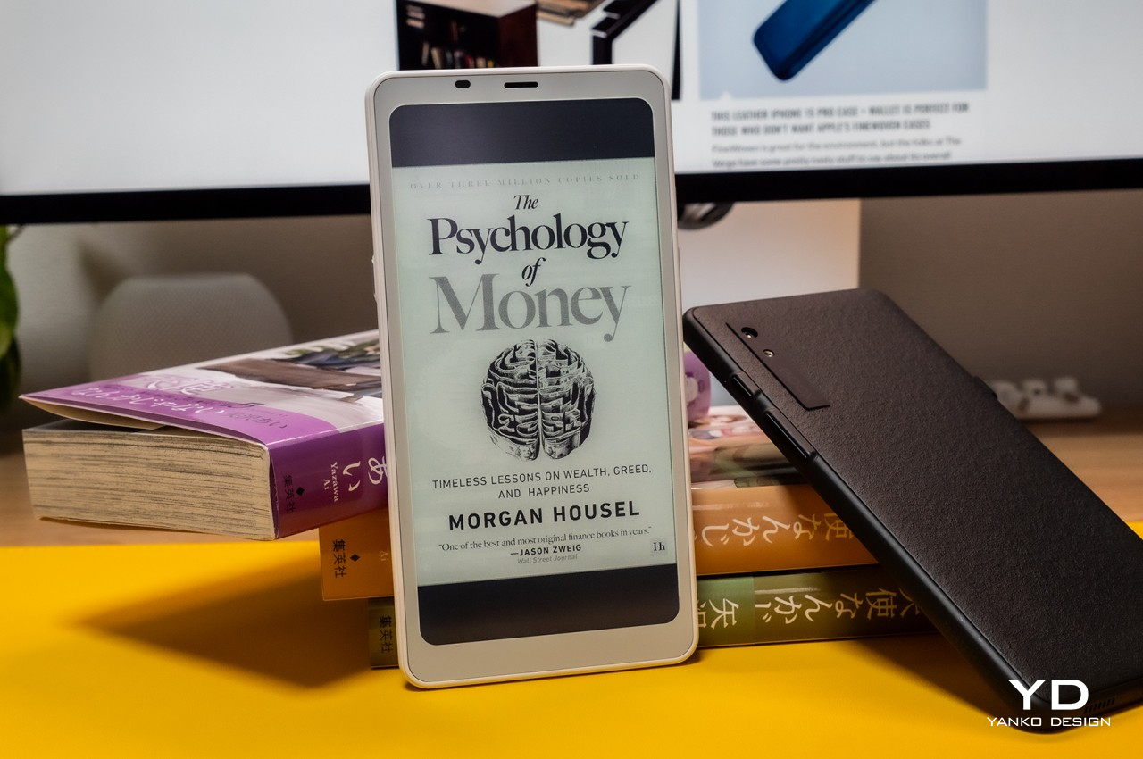
Designer: BOOX
That said, a phone-sized Android device with an E Ink display might be an even more efficient design, which is what the Onyx BOOX Palma is offering. Technically, it’s an e-book reader that’s the size of a regular phone and actually runs Android, which is the standard for BOOX’s devices. This means it has access to the same apps you have on your regular phone, but without color. You also don’t have cellular connectivity via a SIM card, which might be a deal-breaker for a phone but a great deal for distraction-free reading and mobility.
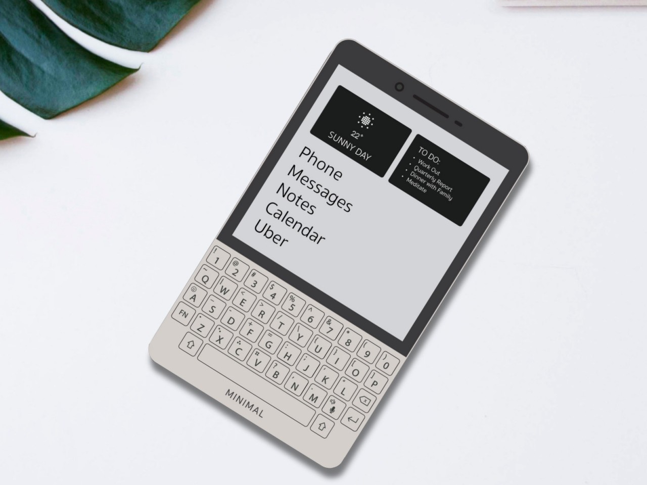
Productive Minimalism: Minimal Phone

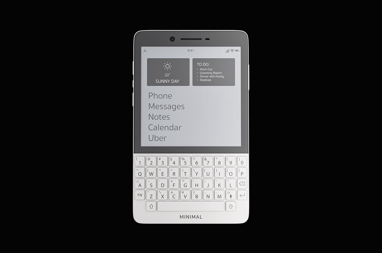
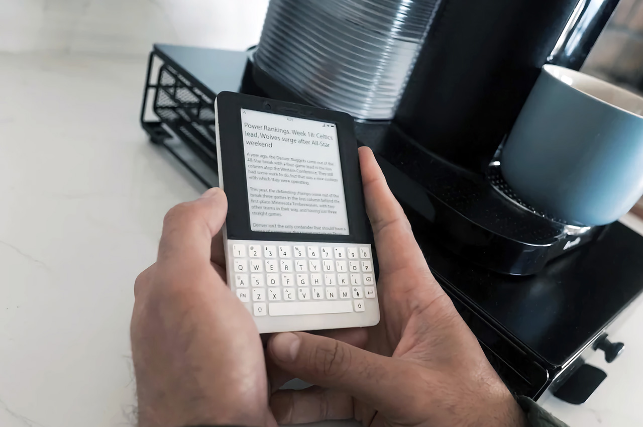
Designer: The Minimal Company
BlackBerry might have joined the likes of Nokia and LG as just parts of the annals of mobile history, but its squarish shape and QWERTY keyboard are forever etched in the consciousness of even the least tech-savvy person on the planet. Many have tried to recreate that magic, but this rather elegant yet odd phone puts a twist to it. It combines the iconic BlackBerry design with an E Ink screen and a minimalist aesthetic, promising distraction-free productivity by actually limiting what you can do on the device. It can even make it easier to actually reply to or post on social media, though the drab grayscale screen is probably going to make that a little less enjoyable anyway.
Alternative: Clicks QWERTY Case
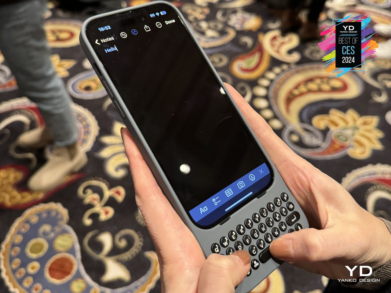
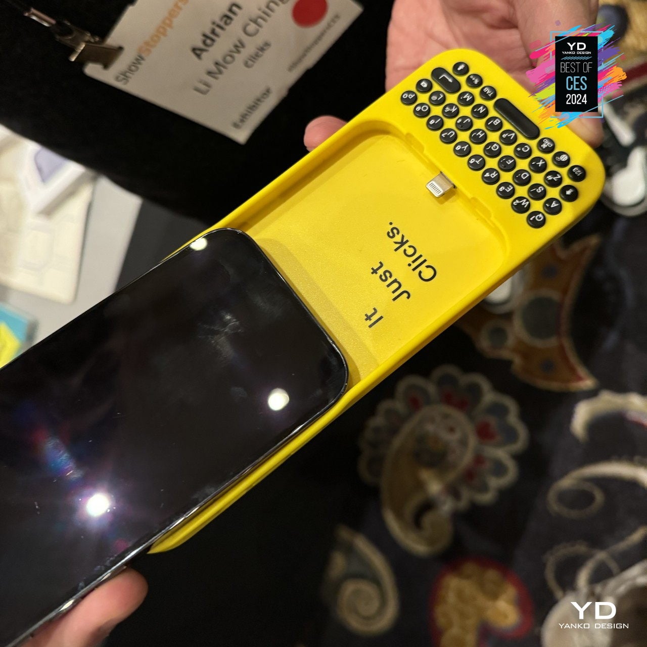
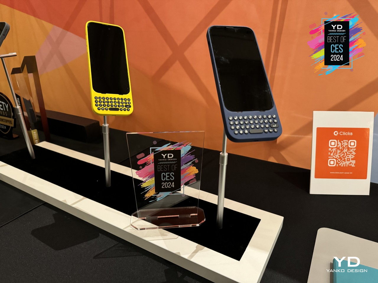
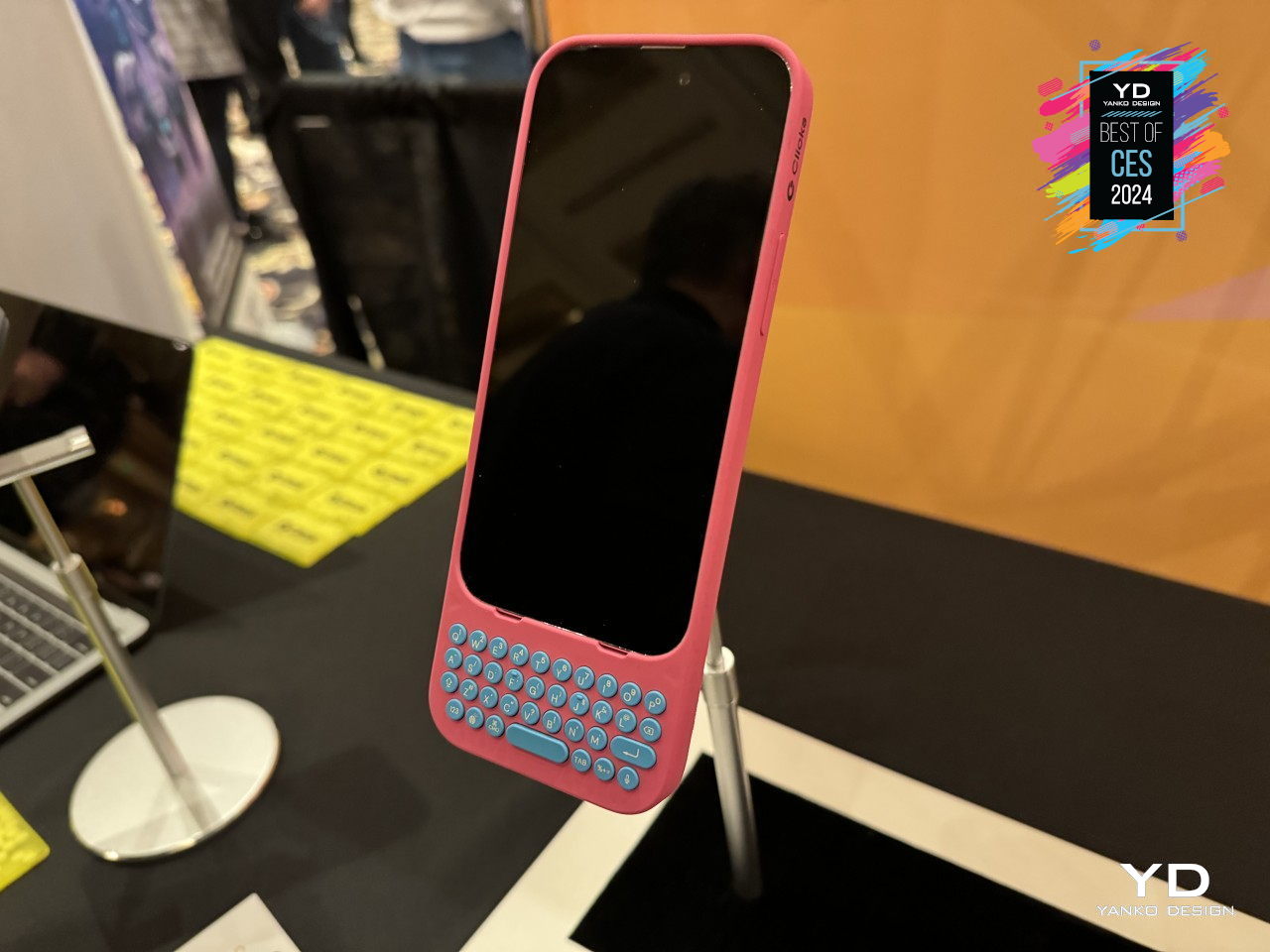
Designer: Clicks
The idea of a BlackBerry-like experience might tickle the fancy of smartphone users, but none of them will be willing to ditch their powerful, colorful, and highly functional smartphones. Clicks is a case that tries to bring the best of both worlds, and it’s practically just a case that slides onto an iPhone to provide that tactile typing experience. You won’t have to give up your favorite apps, especially the ones you need to actually be productive, but the burden of being disciplined and ignoring distractions is now on you instead.
Shapeshifting Multitasker: Astro Slide 5G

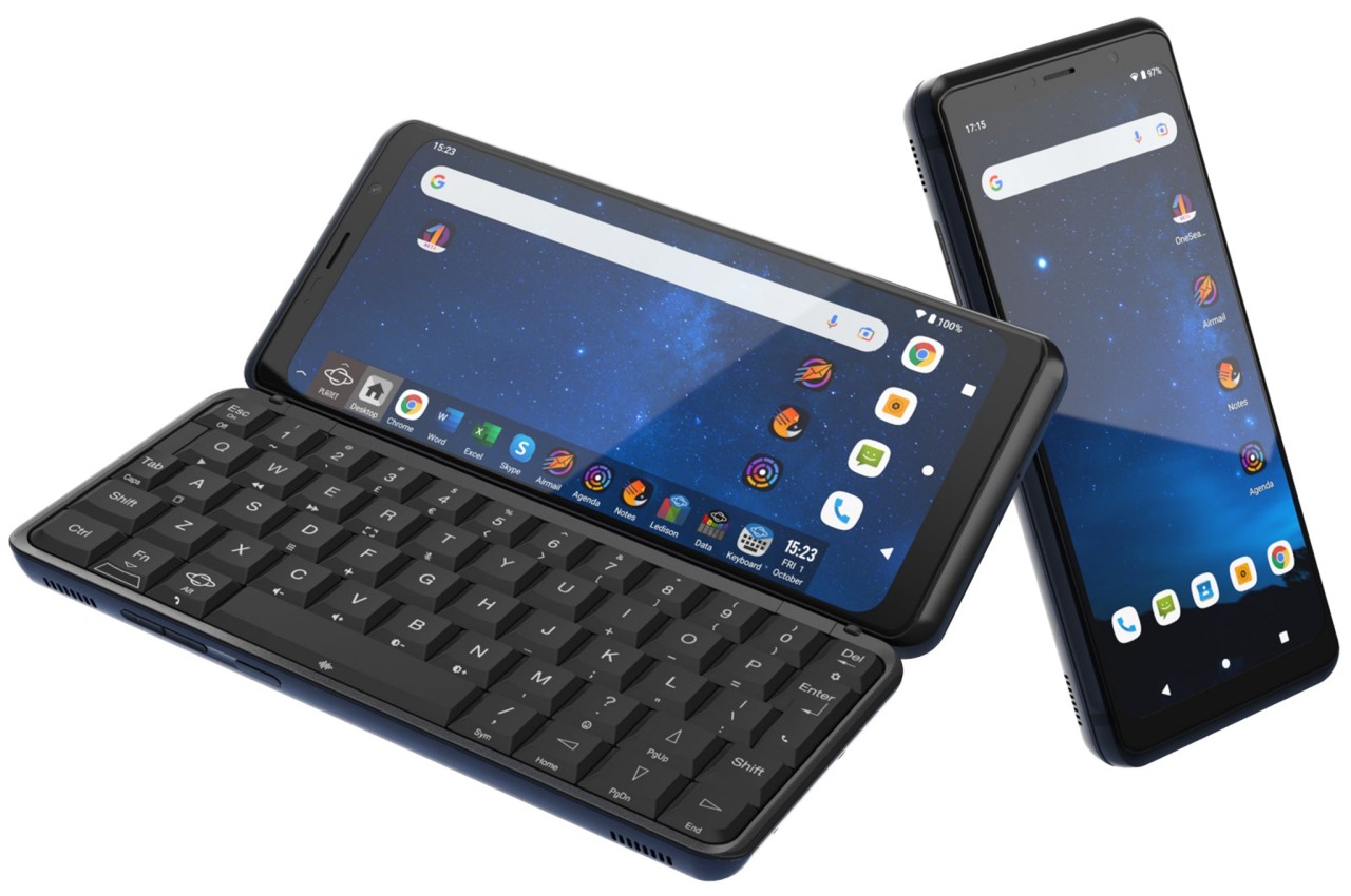
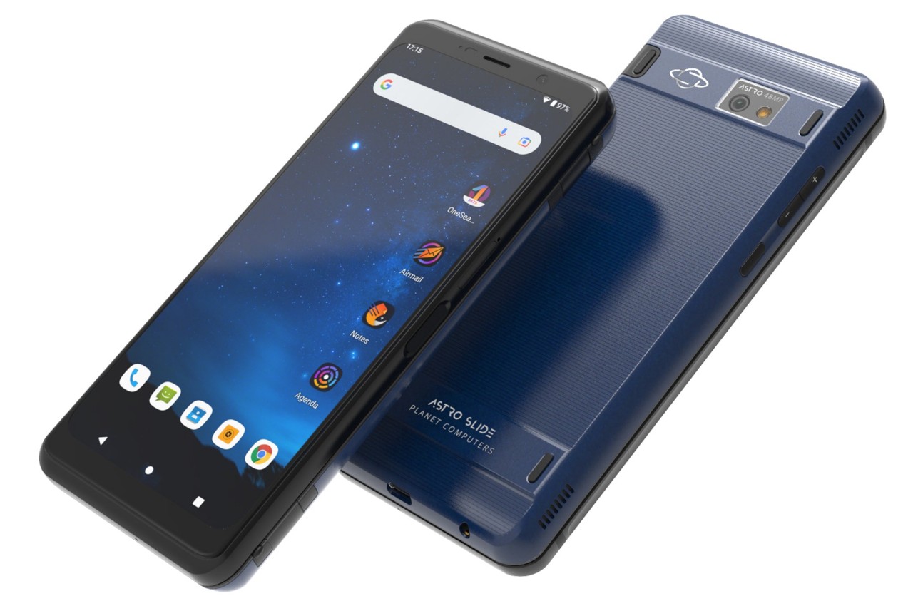
Designer: Planet Computers
A phone that opens like a mini typewriter has actually been around since the days of the Nokia Communicator and its kin, but that design proved to be more complicated than they’re worth. After playing with that same design, PlanetComputing shifted to a slider that still provides that typing experience while retaining the exact same functions as a phone. Unfortunately, such a mechanism proved to be just as clunky and unreliable, and the software platform didn’t exactly lend itself well to a landscape screen.
Alternative: Any Foldable Phone
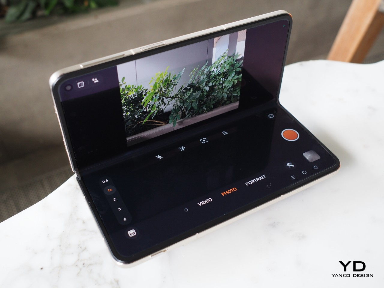
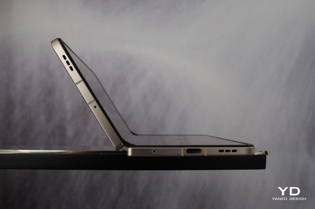
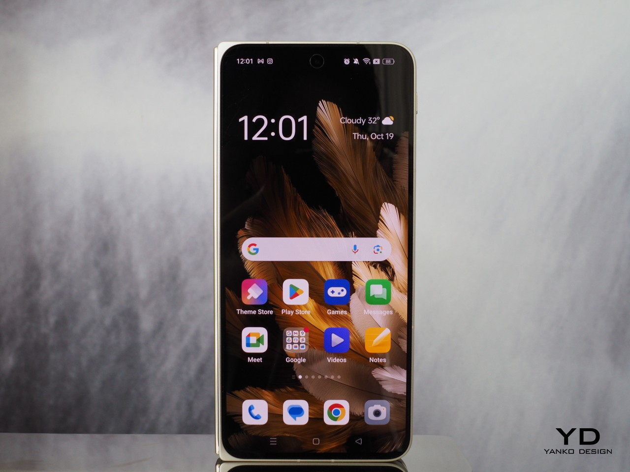
Designer: OPPO
These days, you don’t have to rely on a physical qwerty keyboard to have that same mini laptop experience. With foldable phones now more common, you can tap away on a more flexible on-screen keyboard when the device is only half-folded. At the same time, however, you have both phone and tablet functionality in your hands. Admittedly, the design is far from perfect, and we’re still waiting for more affordable foldables coming in the very near future.


