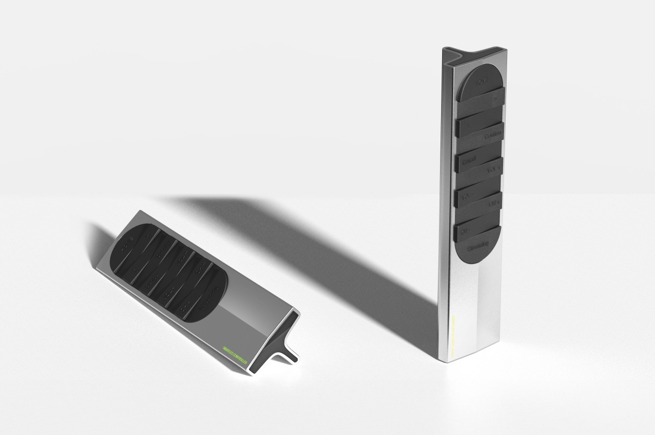
Even with the advent of smart TVs and streaming, remote controls are still an indispensable part of that user experience, imperfect as it may be. The basic design of remote controls has changed very little, save for the extra minimalist variants that, in exchange for simplicity, sometimes make you crawl through menus and options just to get to the function you need. More importantly, however, the complexity of these electronic accessories has made them too stressful to use, and their tendency to get stuck in the corners of couches was a meme even before there were memes. This concept tries to revolutionize the remote control design to deliver a more tactile experience that lets you operate or even pick it up without looking at it at all.
Designer: Gisung Han
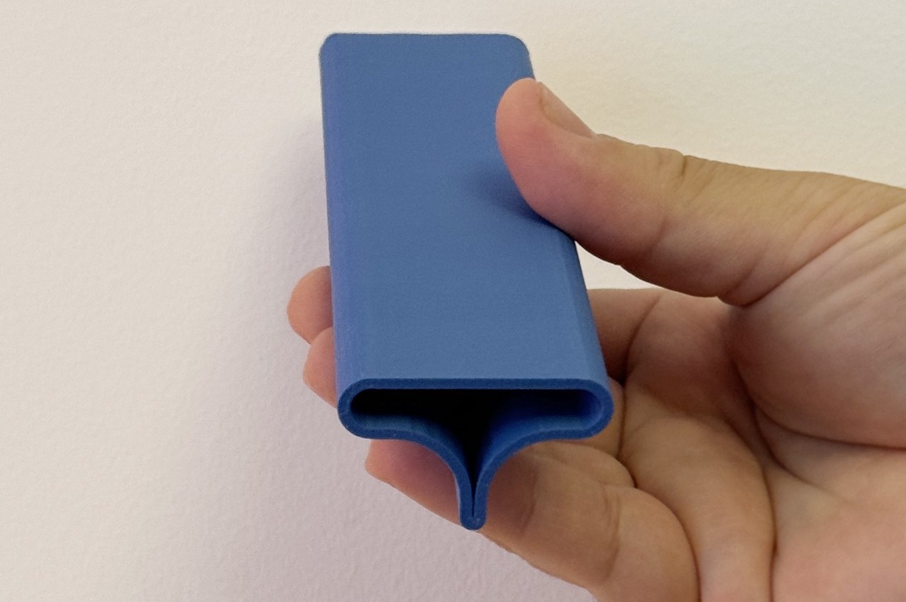
The traditional remote control design has always been one of practical convenience rather than comfort or enjoyment. It’s meant to let you quickly change channels or the volume, but the irony is that it often takes more time to look for the right button or, worse, look for the remote itself. Even with more minimal designs that reduce the buttons to half a dozen or so, the rectangular shape of the device itself lends it to being lost too easily.
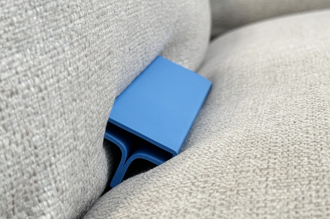
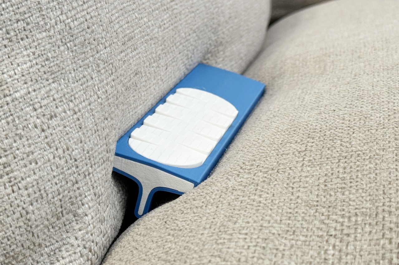
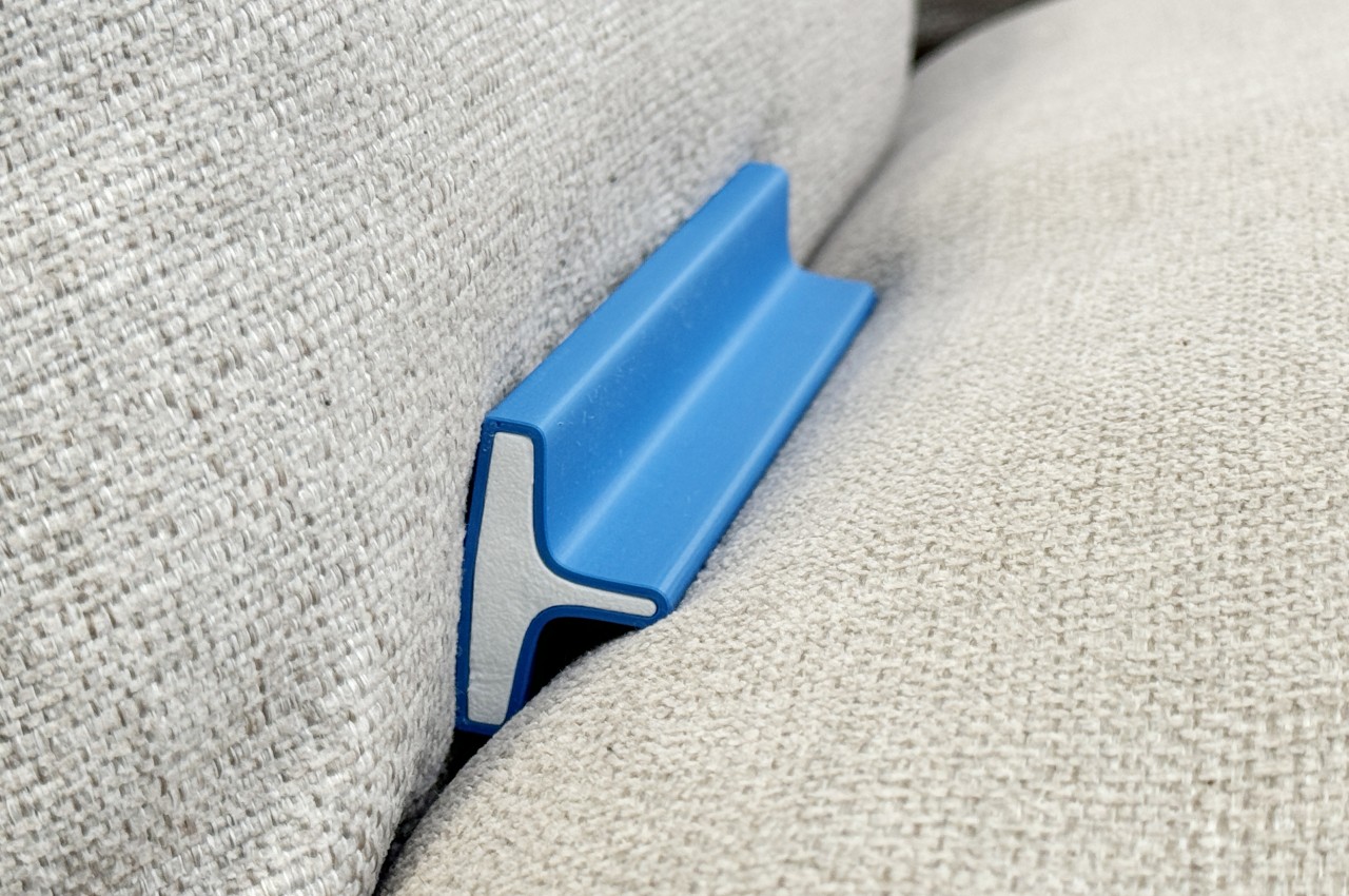
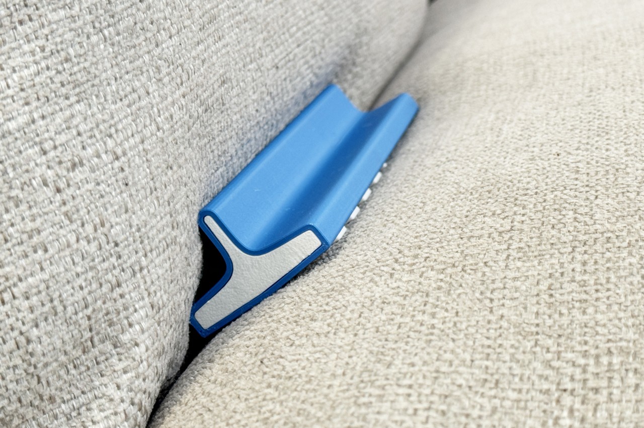
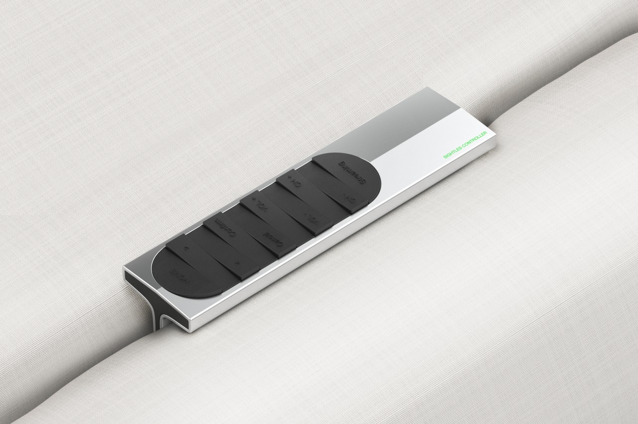
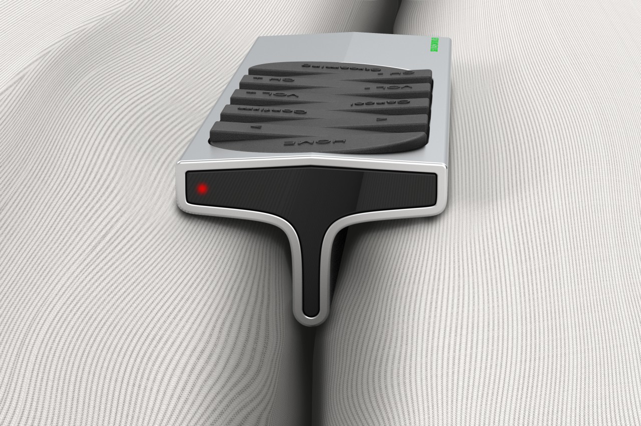
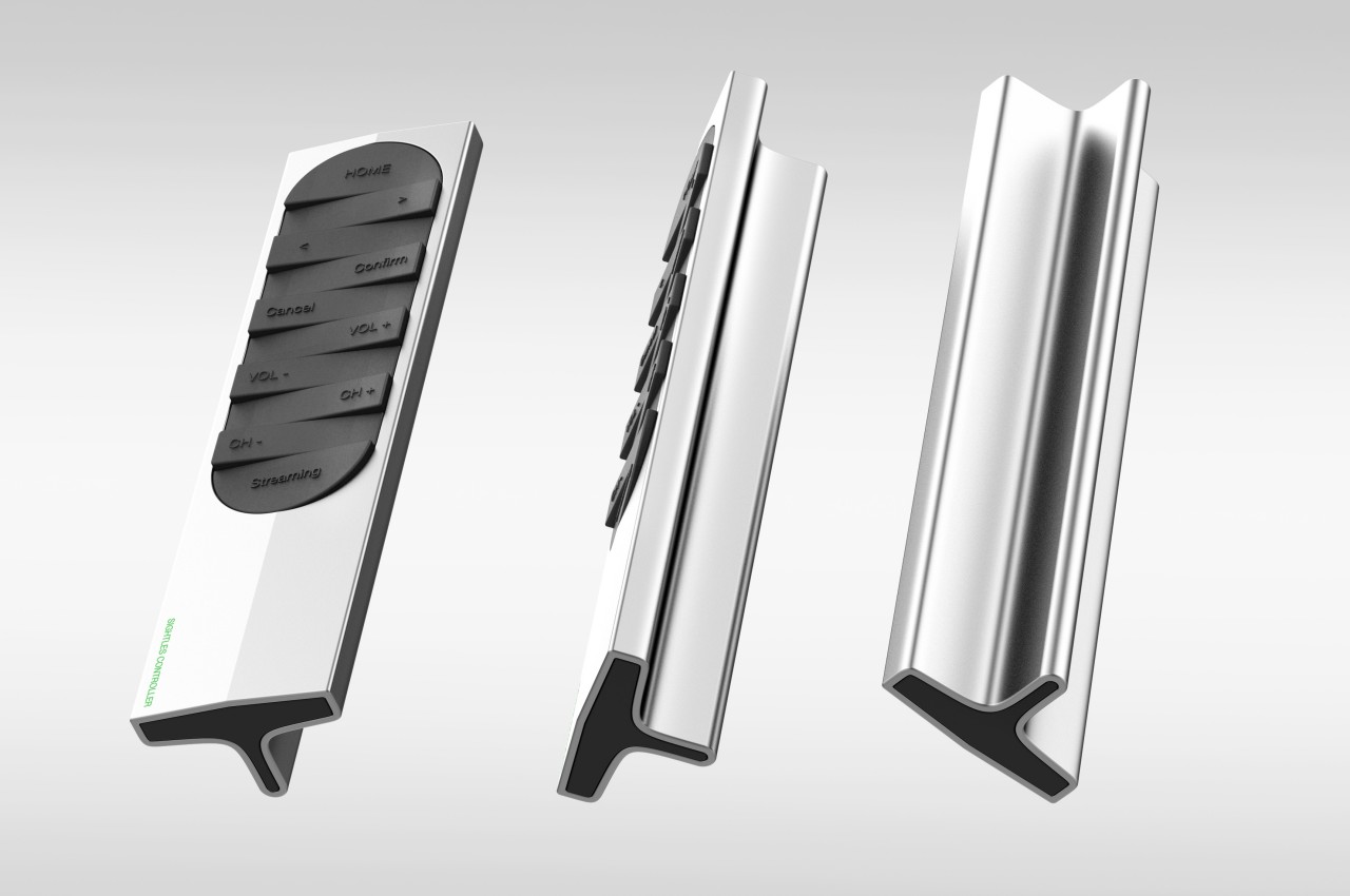
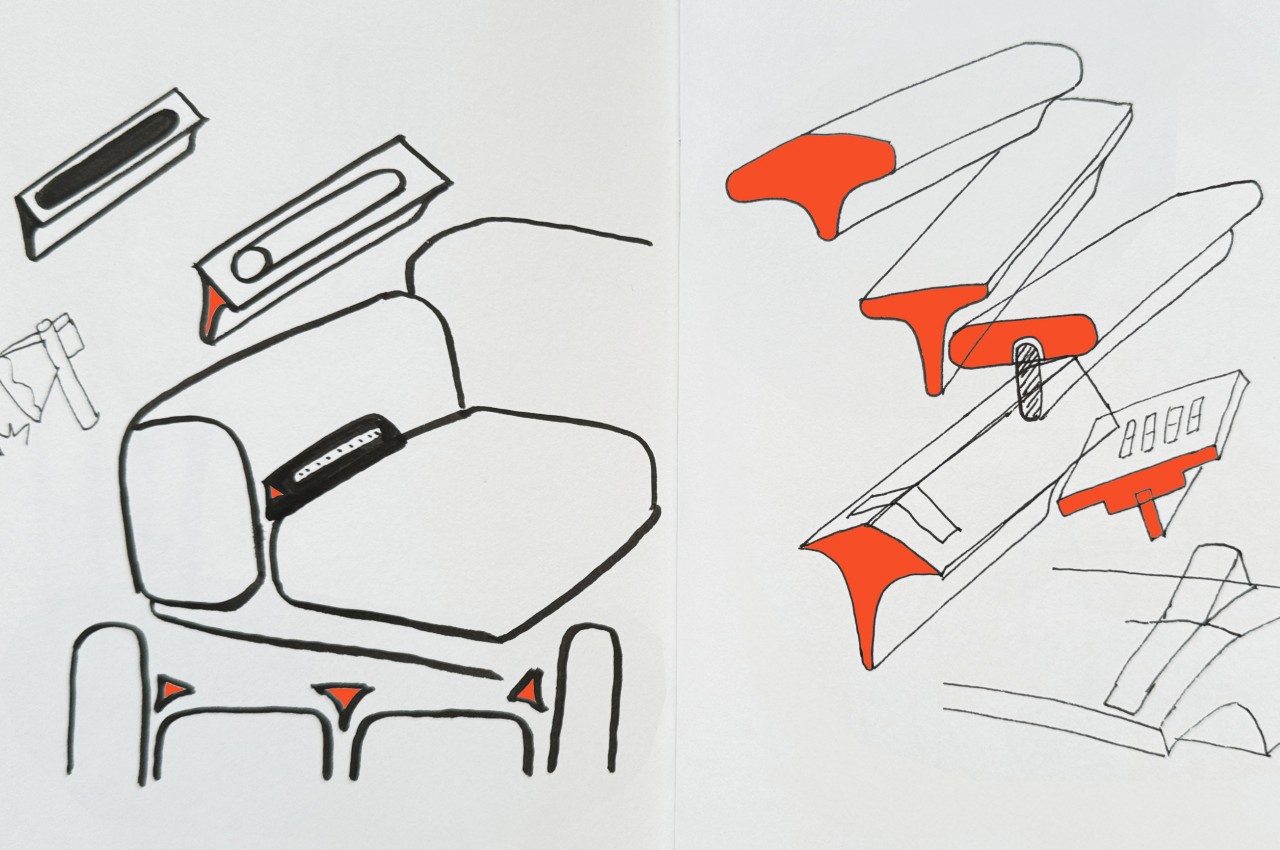
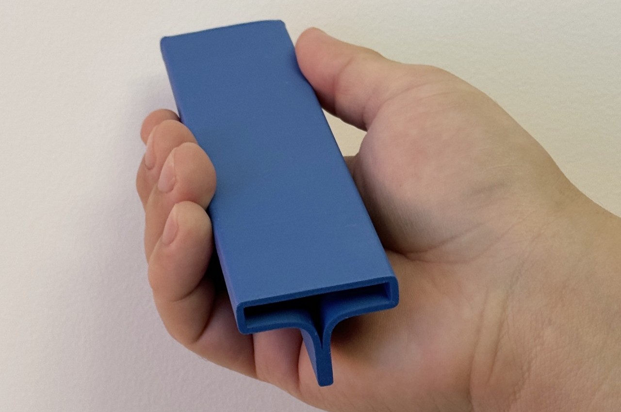
The Sightless Remote Control proposes a rather drastic change to the standard design in order to address these issues. Instead of a flat rectangle, the remote has a T-shaped form that ensures it won’t slip through the gaps in couches and chairs. It also makes it easy to pick up the remote, whether from those corners or from the top of a table, all without even looking at the remote and just using our sense of touch instead.
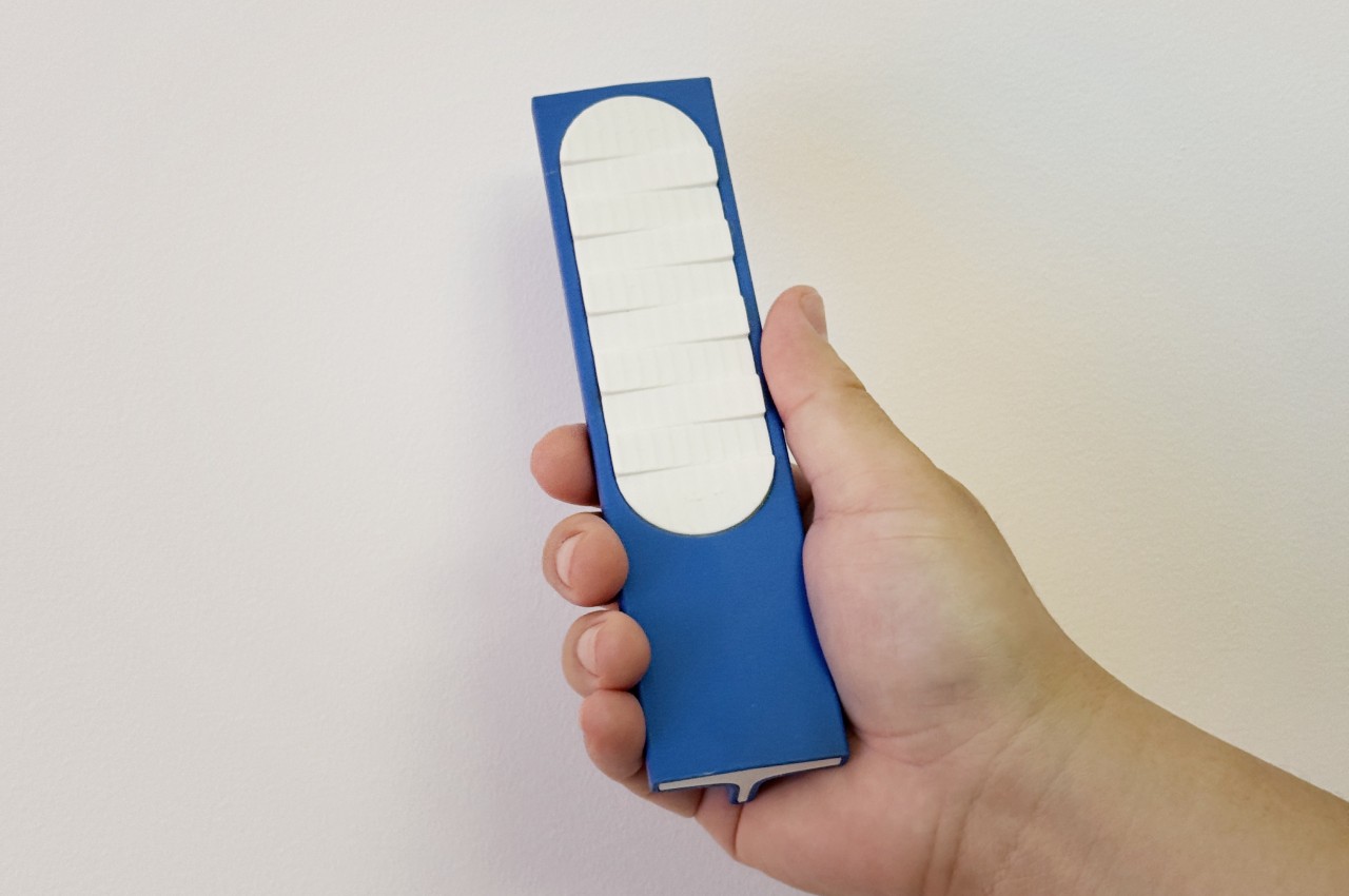
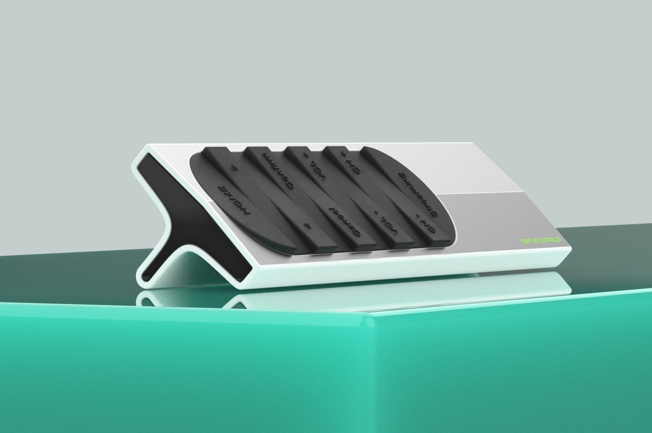
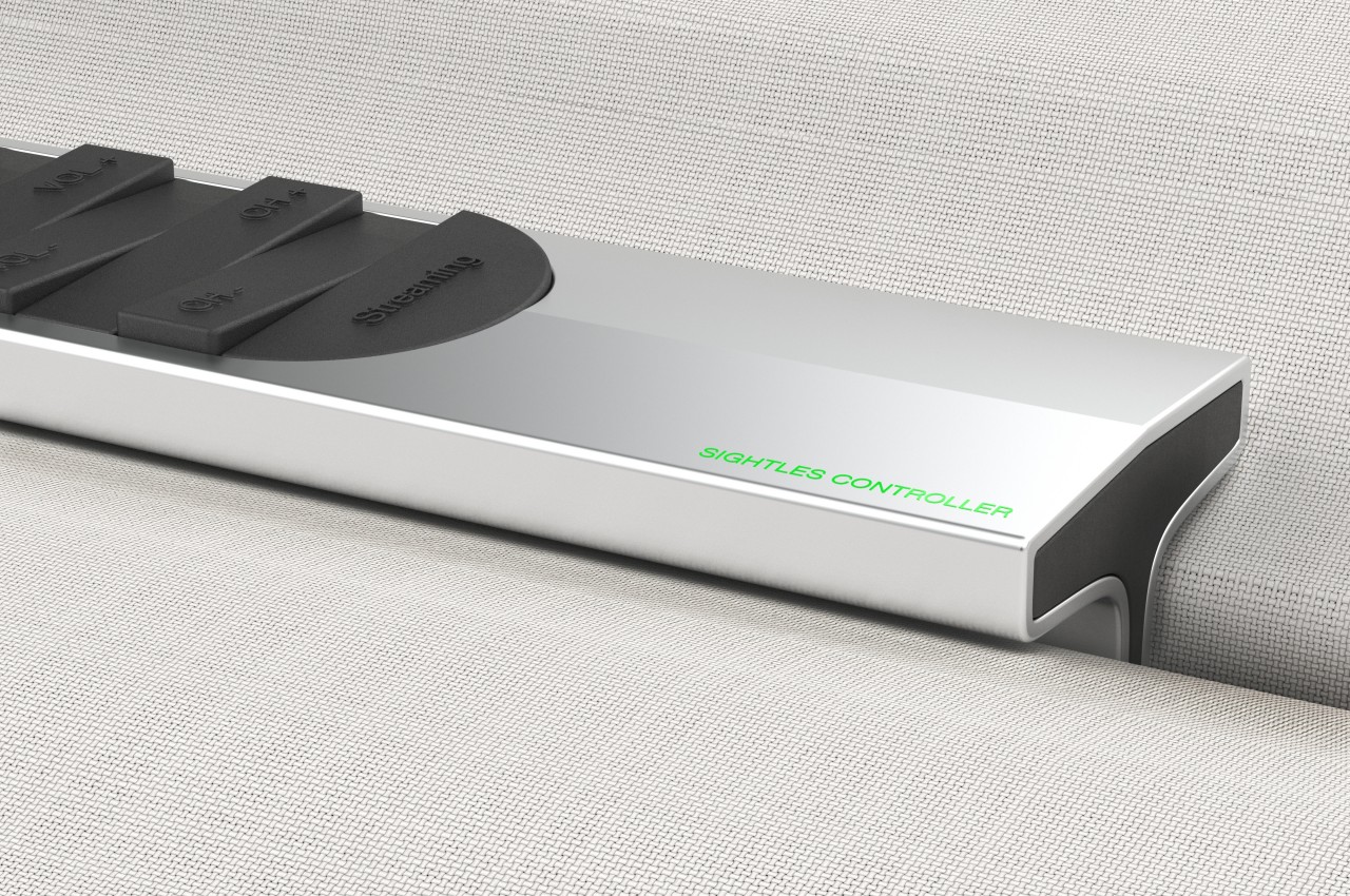
The same is true for the buttons themselves, which are no longer distinct circles or ovals. Instead, there’s a single column in the middle of the remote’s top surface with wedge-like shapes rising on opposite sides almost like waves in the ocean. Instead of using printed icons, text representing the functions are instead embossed, again allowing for “blind” use by letting your fingers do the seeing. It will still require a bit of muscle memory to help place that finger in the right area, but it won’t be as tedious as on a typical remote with very smooth buttons.
More than just enabling sightless use of the device, this design tries to bring back the joy of using an analog device in an age of smartphones and touchscreens. It makes entertainment not just a pleasure for our eyes and ears but also for our sense of touch, all while helping reduce the cognitive overload that multi-functional screens and phone apps bring to our brains.
