There’s something about metallic furniture that is completely undeniable. Although metallic furniture wasn’t always considered the ideal fit for residences and homes. The first piece of metal furniture dates back to 1820, and it was a round three-legged table designed by Karl Friedrich Schinkel of Berlin. With time this genre of furniture took over industrial buildings, outdoors/streets, and the kitchens of restaurants. However, it broke through its industrial and utilitarian stereotypes and eventually found a place in interior design by the 1950s. Today metallic furniture can be found in many homes and offices, since it is durable, strong, and functional, and can be finished in multiple ways. And, we’ve collected some excellent metallic furniture designs for you – from a coffee table inspired by the simple shape of a safety pin to a unique shelf that attempts to preserve your work-life balance.
1. Morph Chair
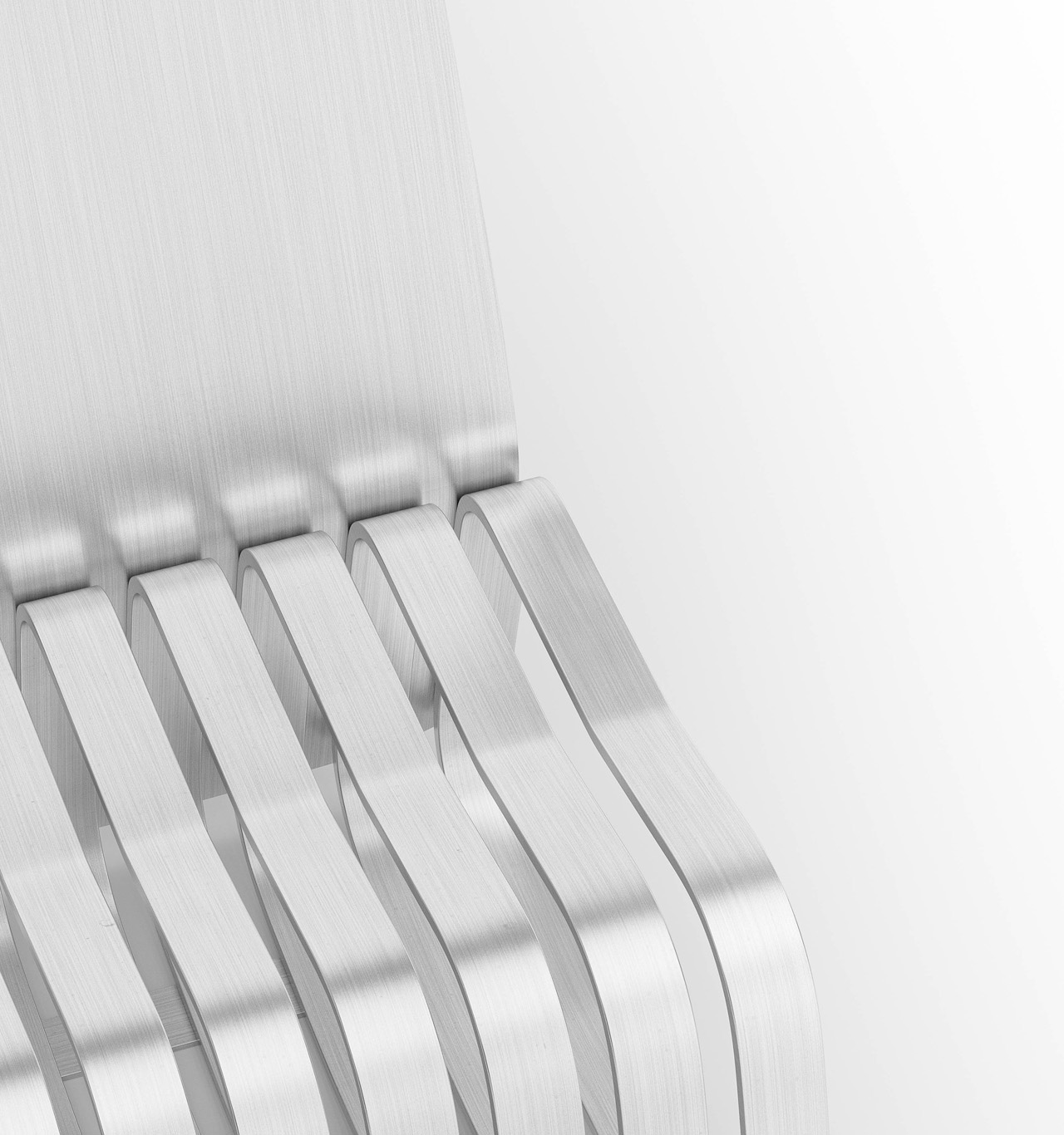
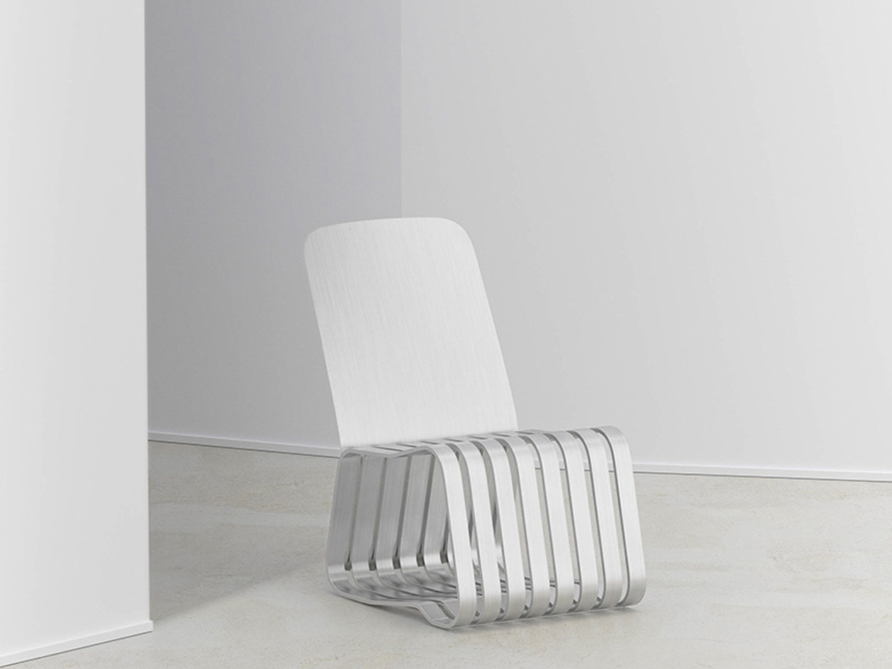
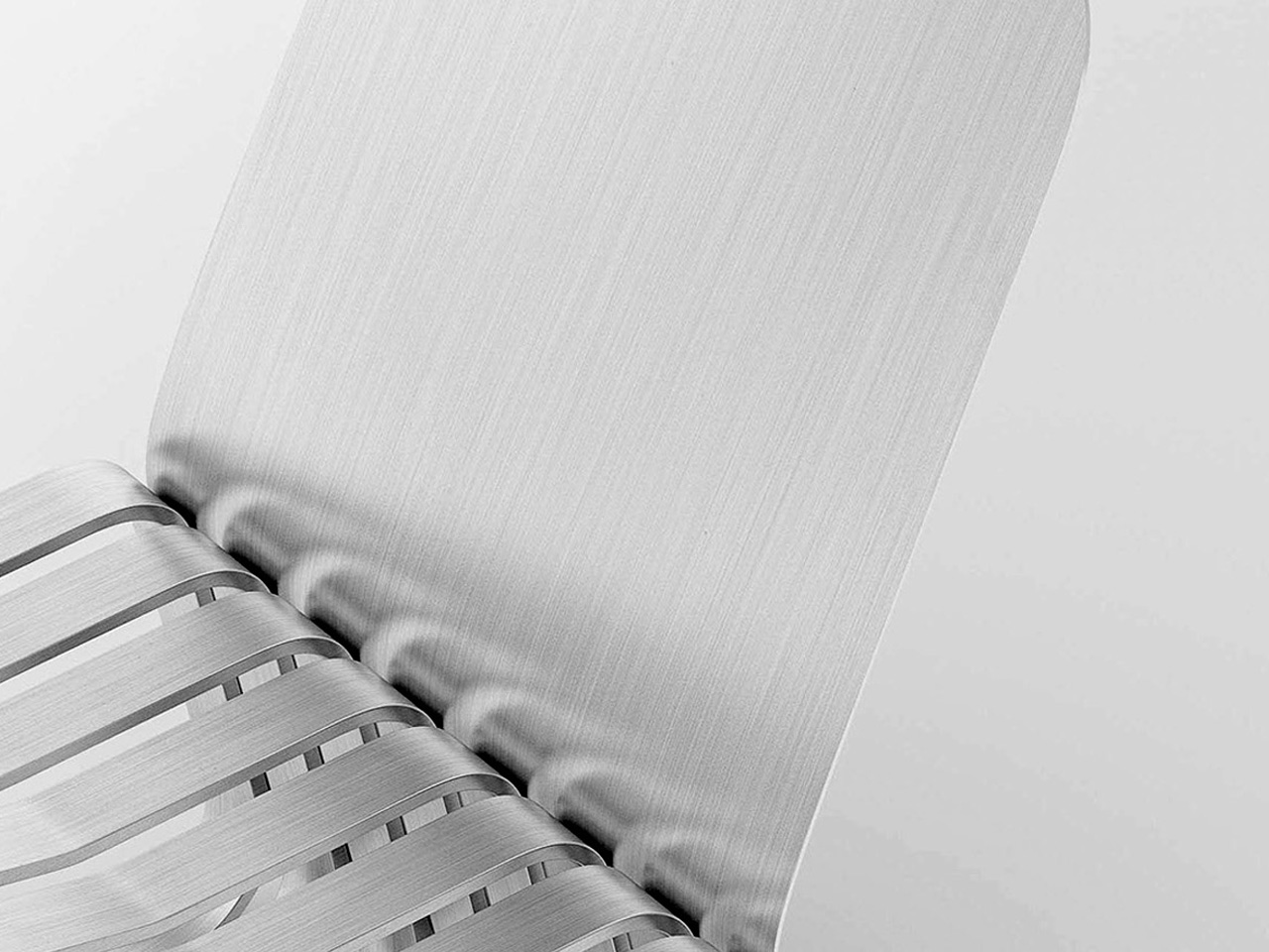
Named the Morph Chair, this metallic furniture piece was designed by Jiung Yun and Minji Kim for some quiet contemplation, since our everyday lives can become quite chaotic and busy. The subtle Morph Chair is designed for those moments where you really just need to take a break and relax for a bit.
Why is it noteworthy?
It is created for moments of peace, allowing you to take a break, and rest on it. The chair serves as a space of calmness, enabling users to organize their chaotic worries and thoughts, taking down their stress a notch or two.
What we like
- Features an integrated storage section beneath the seat, which can be used to store books and other miscellaneous items
What we dislike
- Aesthetics can be dull and stark for some people
2. Foundation Bar Stool
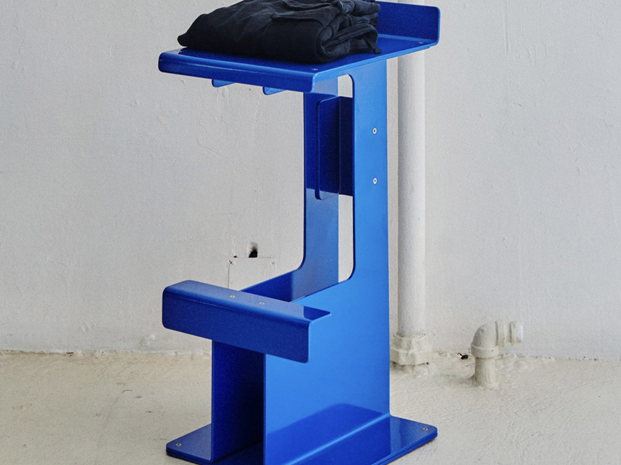
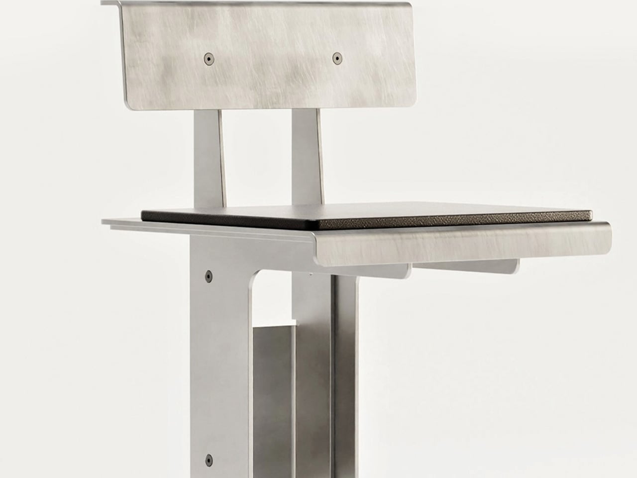
The Foundation bar stool is a stunning stool designed by the American brand Bestcase to be a beautiful celebration of the rawness of aluminum, and the simple manufacturing techniques used to construct it. It is part of a collection that was made entirely from aluminum sheet material.
Why is it noteworthy?
The stool is equipped with scaled-up sheets bent through a technique traditionally used to add structure and solidity to thinner materials. This quality showcases aluminum’s structural and decorative traits, displaying how durable and strong it can be.
What we like
- Celebrates the exceptional material properties of aluminum
What we dislike
- It is only available in aluminum, no other option in material
3. Camber
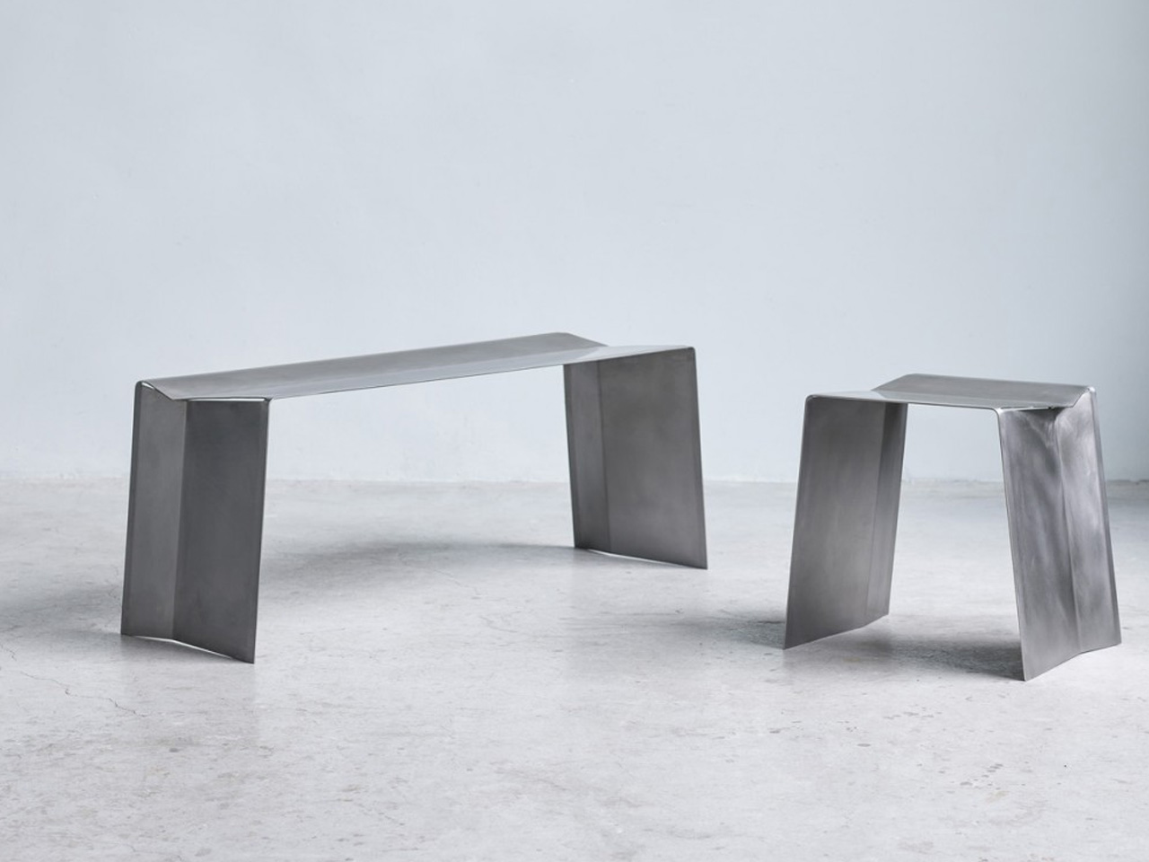
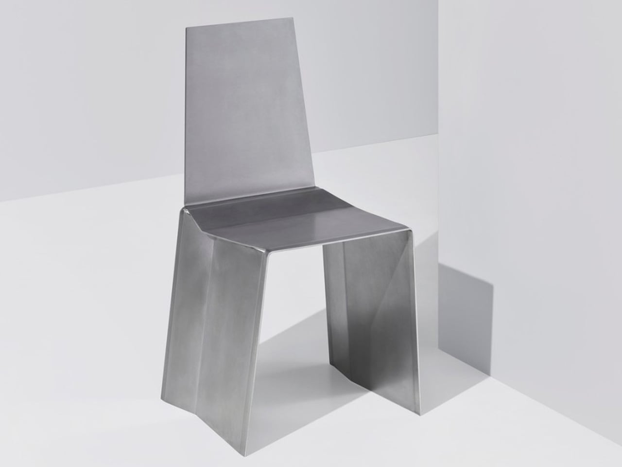
Camber is an innovative collection of seats that are created by cutting and bending a single sheet of stainless steel. The design involves making two angular cuts where the folds would happen if you would just bend the two ends to form legs.
Why is it noteworthy?
Camber is simple, almost brutalist in its appearance, but its appeal goes beyond looks, offering a design that isn’t only efficient but also, in some odd way, charming in its own right.
What we like
- The two angular cuts give the chair and stool some stability
- Simple, functional, and efficient design
What we dislike
- Stainless steel is not the most environment-friendly metal
4. Tablecloth Side Table
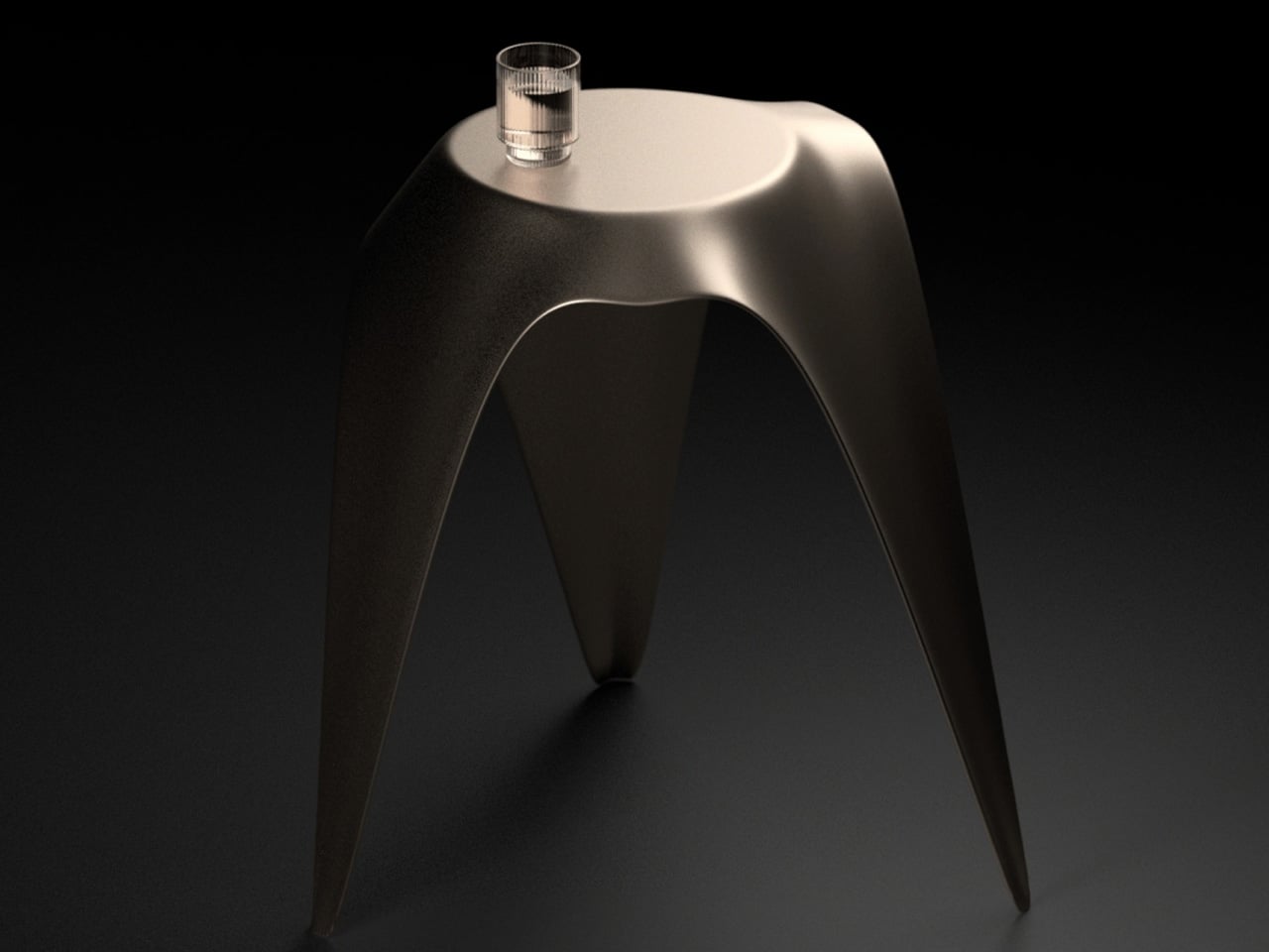
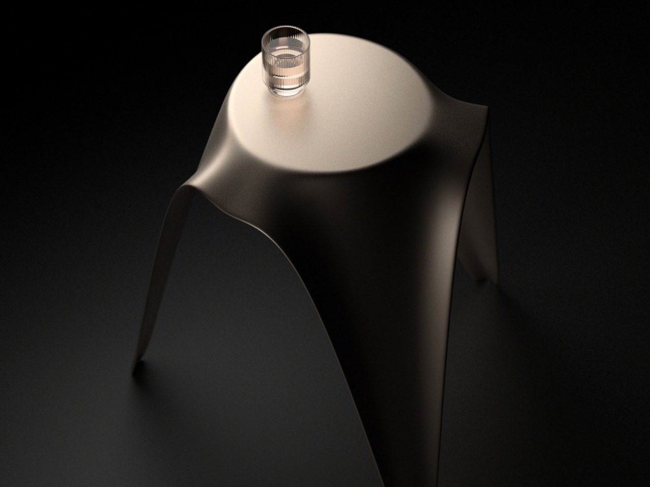
Designed by Deniz Aktay, the Tablecloth side table is designed to create contrasting images of stability and fluidity. The Tablecloth has only three legs instead of four, which truly makes it stand out. It features a metallic surface which offers it a rather rigid appearance, while the curved edges create an illusion of movement.
Why is it noteworthy?
The shape of the legs is unique as well, they taper sharply to the feet, creating an image of dynamism of even imbalance in our heads. The table is shaped like a tablecloth, but it seems to be in motion rather than rest, truly creating an innovative image in front of our eyes.
What we like
- Resembles the waves and undulating surfaces of a piece of cloth that looks like it’s falling to the ground
What we dislike
- It is a conceptual design, so unsure how well it will translate into a tangible product
5. The Tila Chair
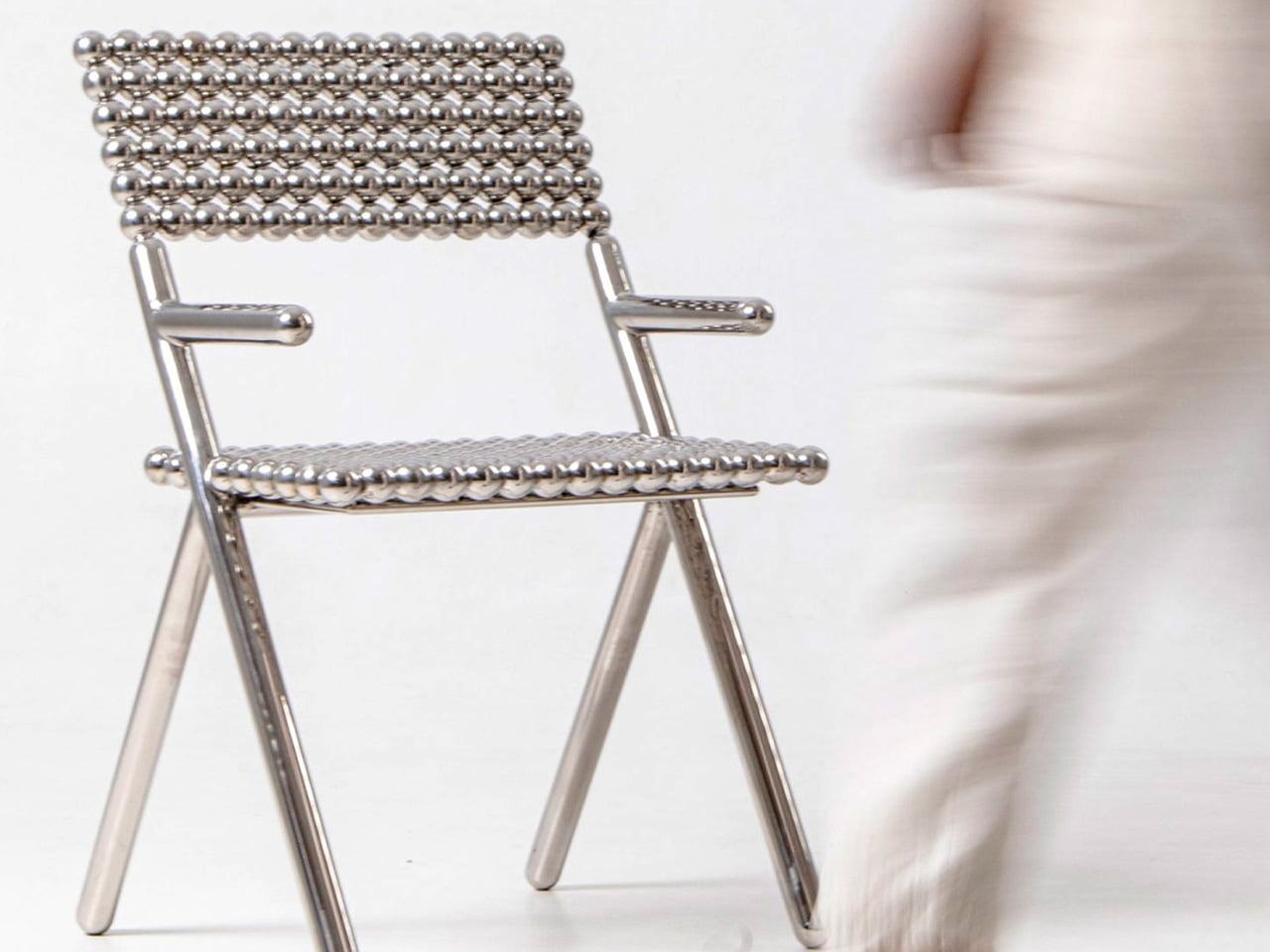
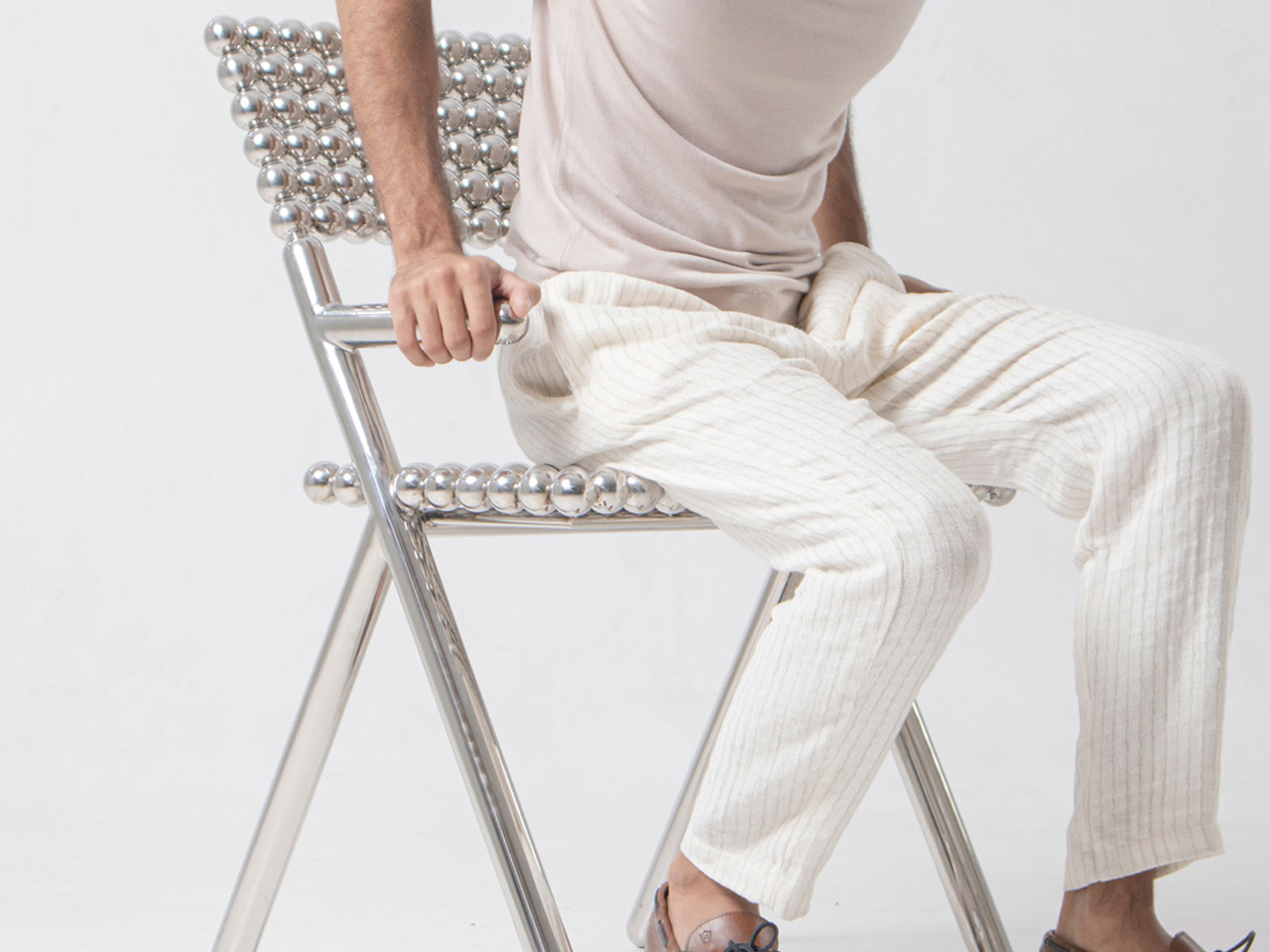
Named the Tila Chair, this innovative and unique chair design by Shepherd Studio is made using hundreds of shiny spheres and is intended to be an exploration of density. It features a one-of-a-kind form that instantly grabs attention and makes it a conversation starter.
Why is it noteworthy?
The unique-looking chair is partially inspired by the traditional game of marbles (also called Tila), and truly the chair is built using 210 stainless steel spheres that are supported by a tubular frame.
What we like
- Has an attractive chrome finish that reflects the chair’s surroundings
- Creates a visually intriguing interplay of light and shadow
What we dislike
- The tiny spheres seem tough to clean and maintain
6. Criteria Bookshelf

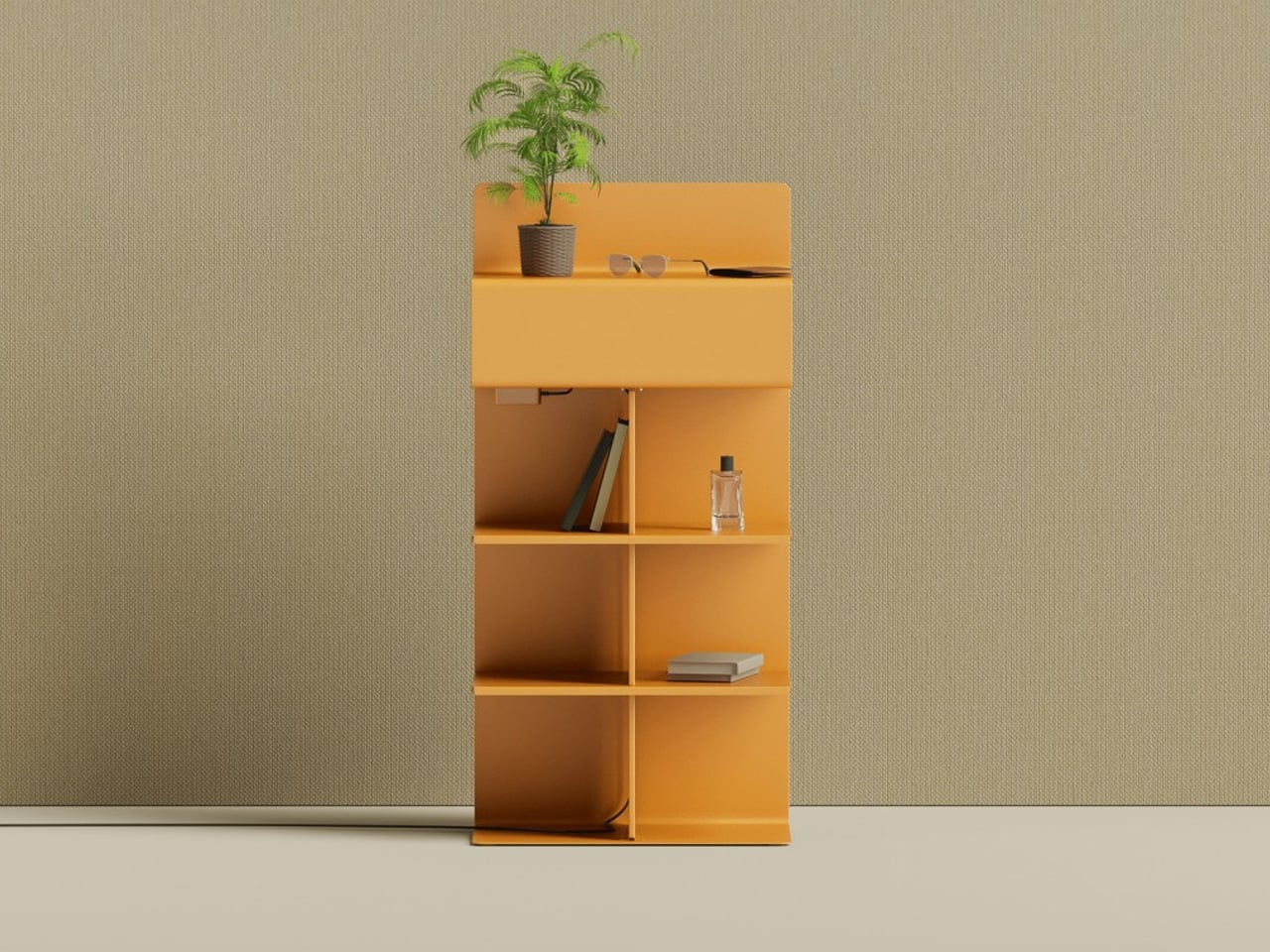
Named the Criterion bookshelf, this unique metallic shelf is designed to act as a figurative and literal separation between work and rest. The bookshelf merges two different parts of shelves for different parts of the day, serving as an innovative and super functional furniture design.
Why is it noteworthy?
One shelf is a typical shelf that stores books, stationery, and desk accessories, while the opposite end has limited space, as well as lighting that will be quite useful at night.
What we like
- It is a multifunctional furniture design
- Great at helping you maintain a work-life balance
What we dislike
- It’s a conceptual design, unsure how well it will translate into a physical product
- The shelf has a quirky form and shape, so it could be difficult to place/fit it in your room
7. Whisk Coffee Table
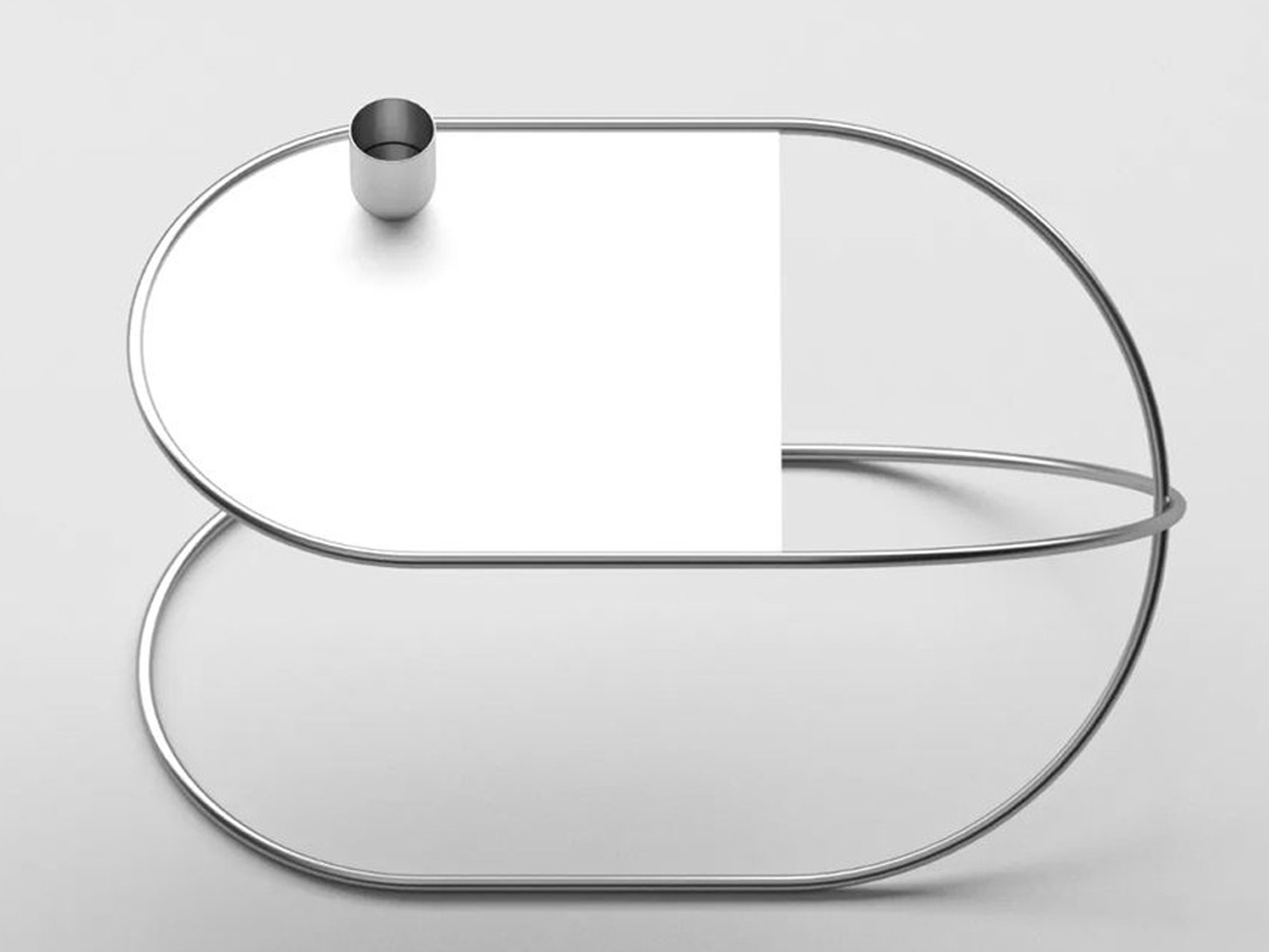
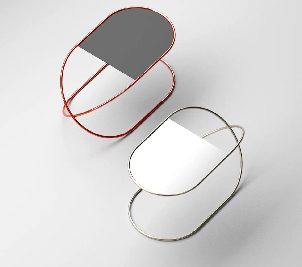
Named the Whisk Coffee Table, this furniture design by Deniz Aktay is made of an artfully shaped and twisted metal tube which serves as the major body of the design, making it an immediate and major eye-catcher, and conversation starter.
Why is it noteworthy?
The metallic form of the coffee table is simple yet twisted, reminding you of a whisk, which is probably why Aktay named it the same. If you look closely at it, it also looks like a contorted safety pin!
What we like
- Built of interesting geometric elements that perfectly complement each other
- Fine specimen of sharp form and metallic excellence
What we dislike
- The actual product could differ after manufacturing since currently, it is only a concept
8. Non-Square
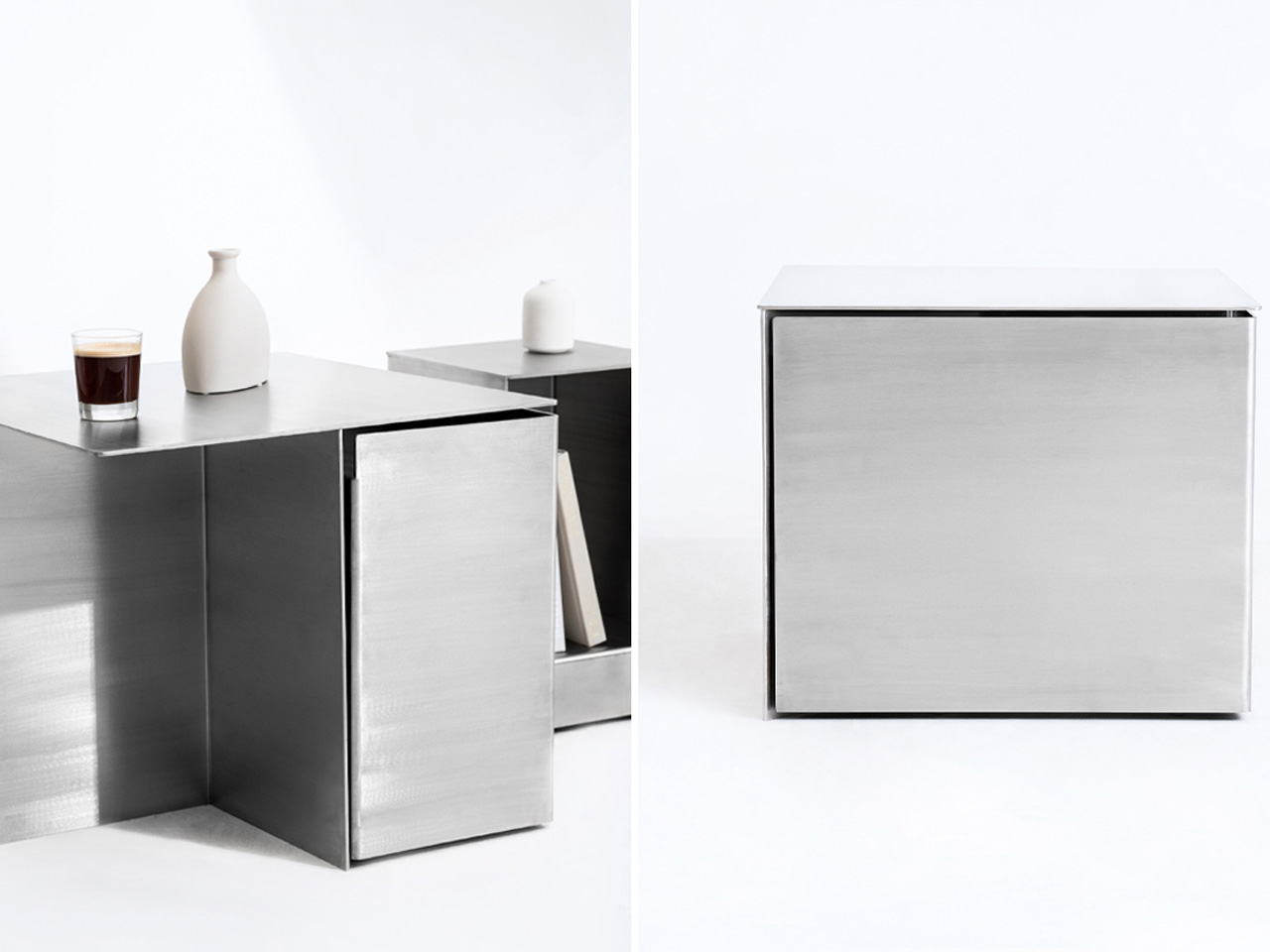
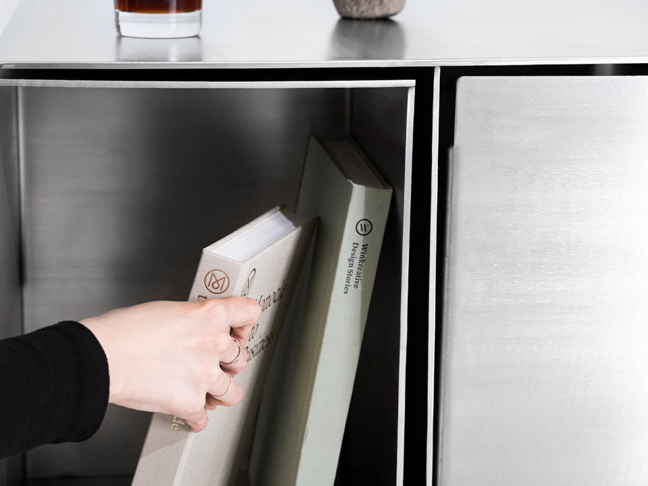
Called Non-Square, this metallic furniture piece has a minimal and stainless steel aesthetic, which makes it look like an ordinary side table dressed up as a cube. As you look closely at the side table, you realize it has a deeper purpose.
Why is it noteworthy?
Designed by Hyunjun Yu, Soojin Jung, and Kyoungseo Paek, the Non-Square is a conceptual furniture design which perfectly merges side tables and stools in the form of a stainless steel hexahedron structure.
What we like
- Hidden storage compartments
- Modular design
What we dislike
- Bulky & space-consuming design
9. Strap Furniture Collection
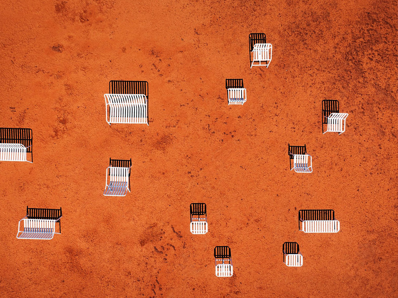
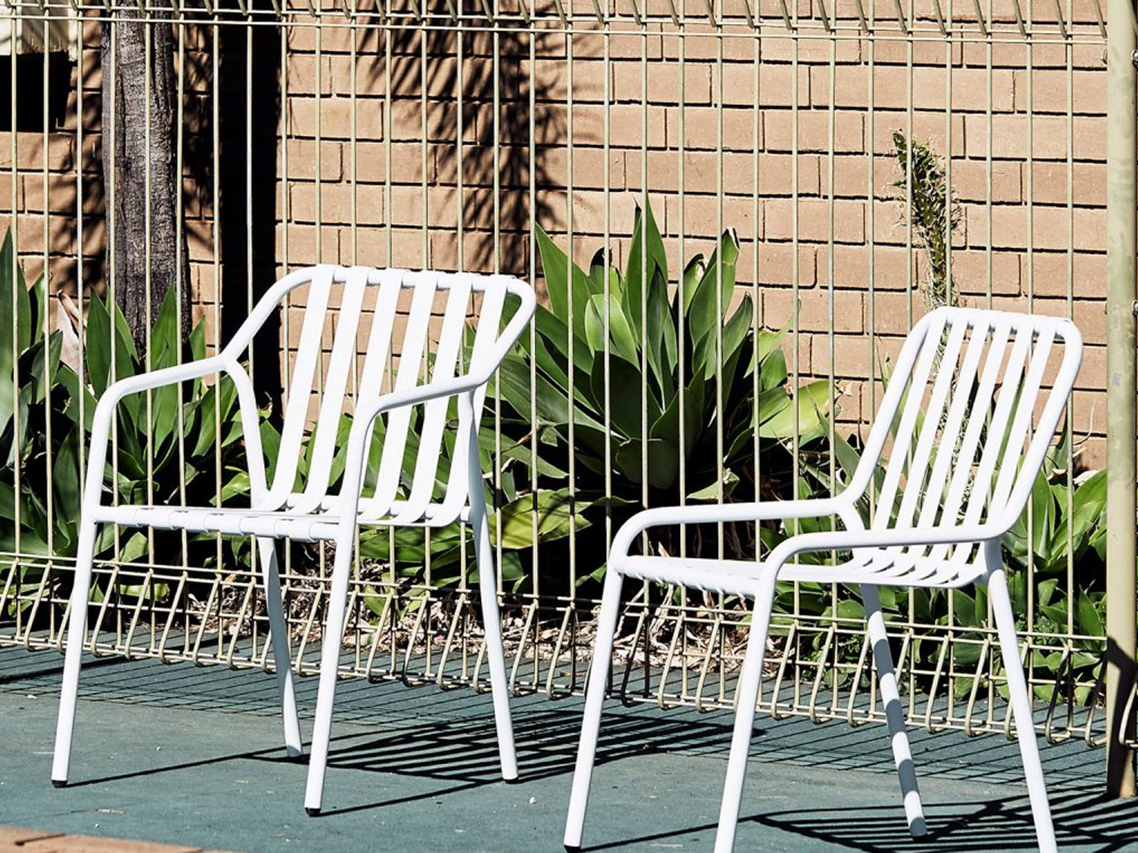
Named the Strap furniture collection, this outdoor furniture collection is inspired by the 1970s poolside furniture. Called the Strap furniture collection, it involves 11 seating designs such as benches, stools, armchairs, loungers, and stackable chairs. They bring the 1970s charm to your backyard.
Why is it noteworthy?
The metallic chairs are made from aluminum straps, which seem to be quite tightly wound around simple tubular frames. The furniture pieces draw inspiration from the designer’s childhood memories of sun loungers around the local pool.
What we like
- Takes you on a trip down memory lane, evoking childhood nostalgia
- Not only limited to your backyard, can be used even in university campuses, shopping districts, and other urban spaces
What we dislike
- The aesthetics definitely need some work and innovation, as they are a bit dry and boring
10. 4-AL Stool
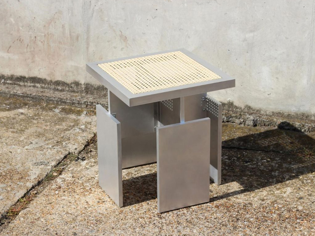
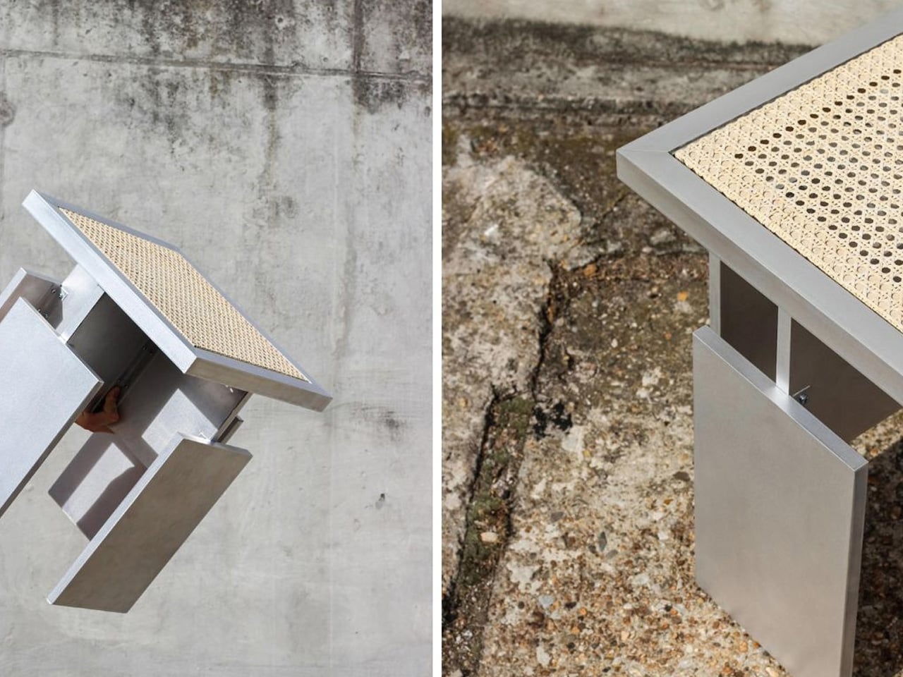
Designed by Vienna-based Paul Matteo Wesser, the 4-AL stool is designed to be a fine specimen of eco-friendly furniture. Not only does it showcase eco-friendly practices, but it also redefines how we perceive and utilize repurposed materials. It shows us how sustainable furniture can be made from repurposed elements.
Why is it noteworthy?
Wesser repurposed metal balcony cladding elements and converted them into the stool’s main structure. An aluminum profile was selected for the frame, which showcases a devotion to stability durability, and water resistance.
What we like
- Inspired by coastal architecture
- Showcases the potential of repurposed elements in modern design
What we dislike
- It is currently only a prototype, not a final product


