
Smartwatches today have evolved from miniature smartphones on our wrists to miniature health clinics on our wrists. The design of these wearable devices has finally settled down to a handful of designs, most of which try to mimic the appearance of classic timepieces. There is, however, still plenty of room for exploration, for designs that redefine the product category or challenge the status quo. This design concept, for example, tries to look farther ahead into the future, when conventions no longer hold water and where today’s unfamiliar, alien aesthetics would ironically look more natural and more human.
Designer: Olga Orel
Smartwatches had a hard time finding its niche in the market. They were too technological to match the majesty of mechanical watches, but also too underpowered to be the multi-purpose wrist-worn communicators of science fiction. In the end, smartwatches today adopted the core design convention of traditional wristwatches, be they the sporty kind or the luxurious timepieces. But does it really have to be that way? Do smartwatches need to look like, well, watches?
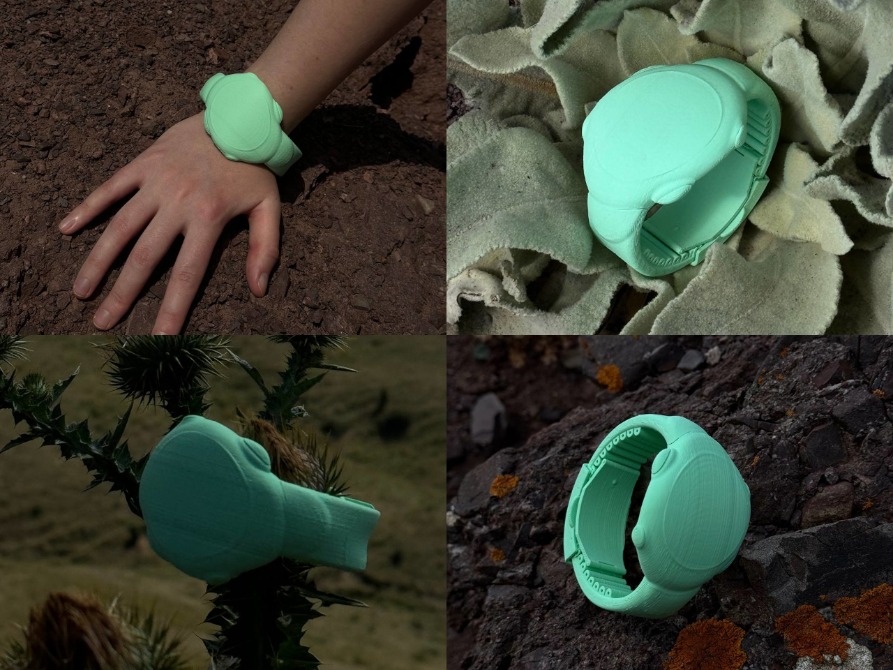
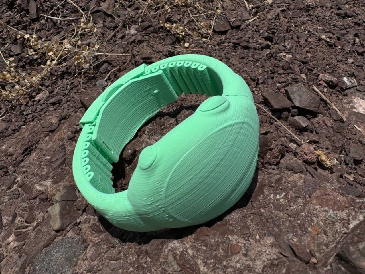
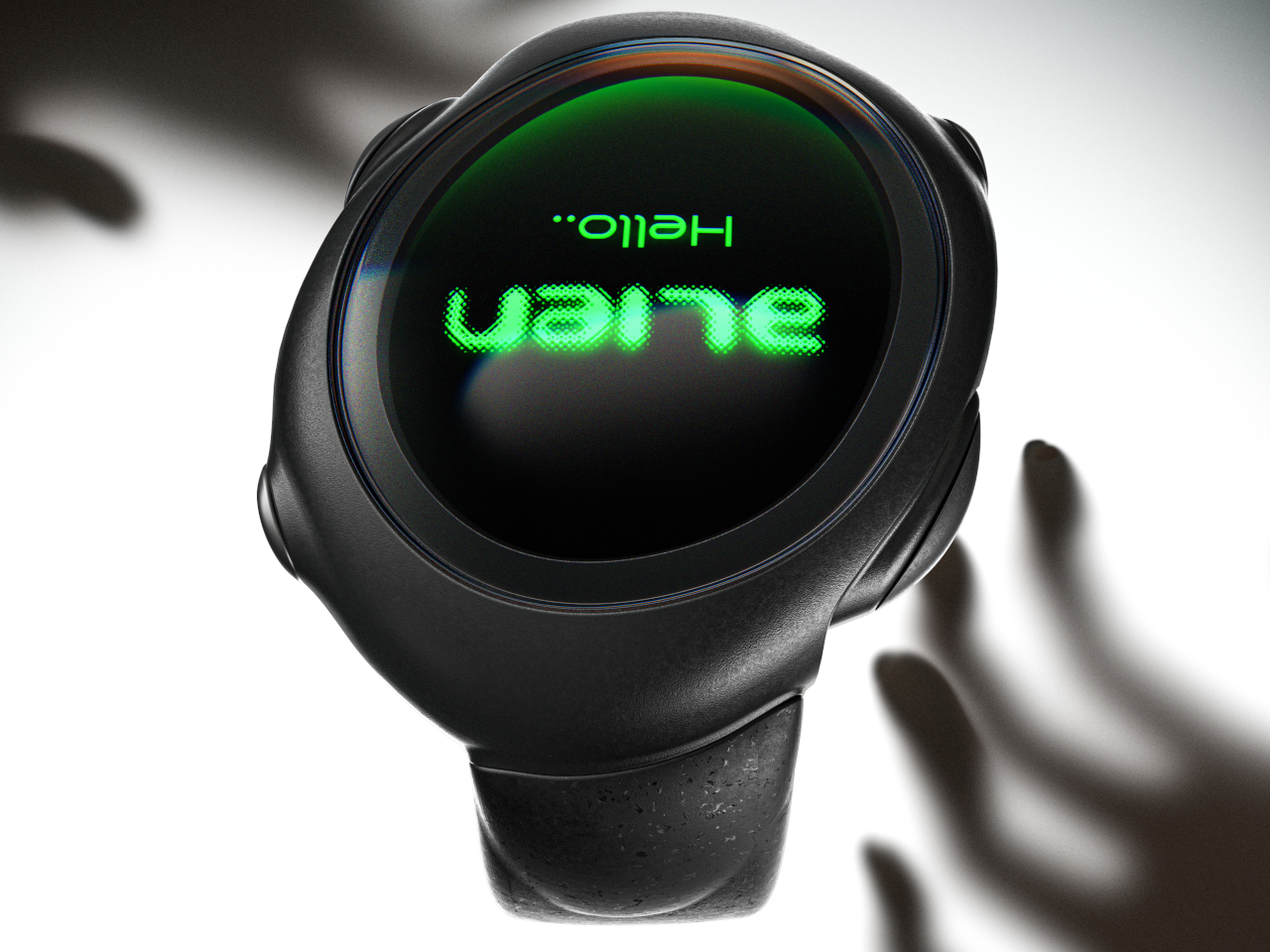
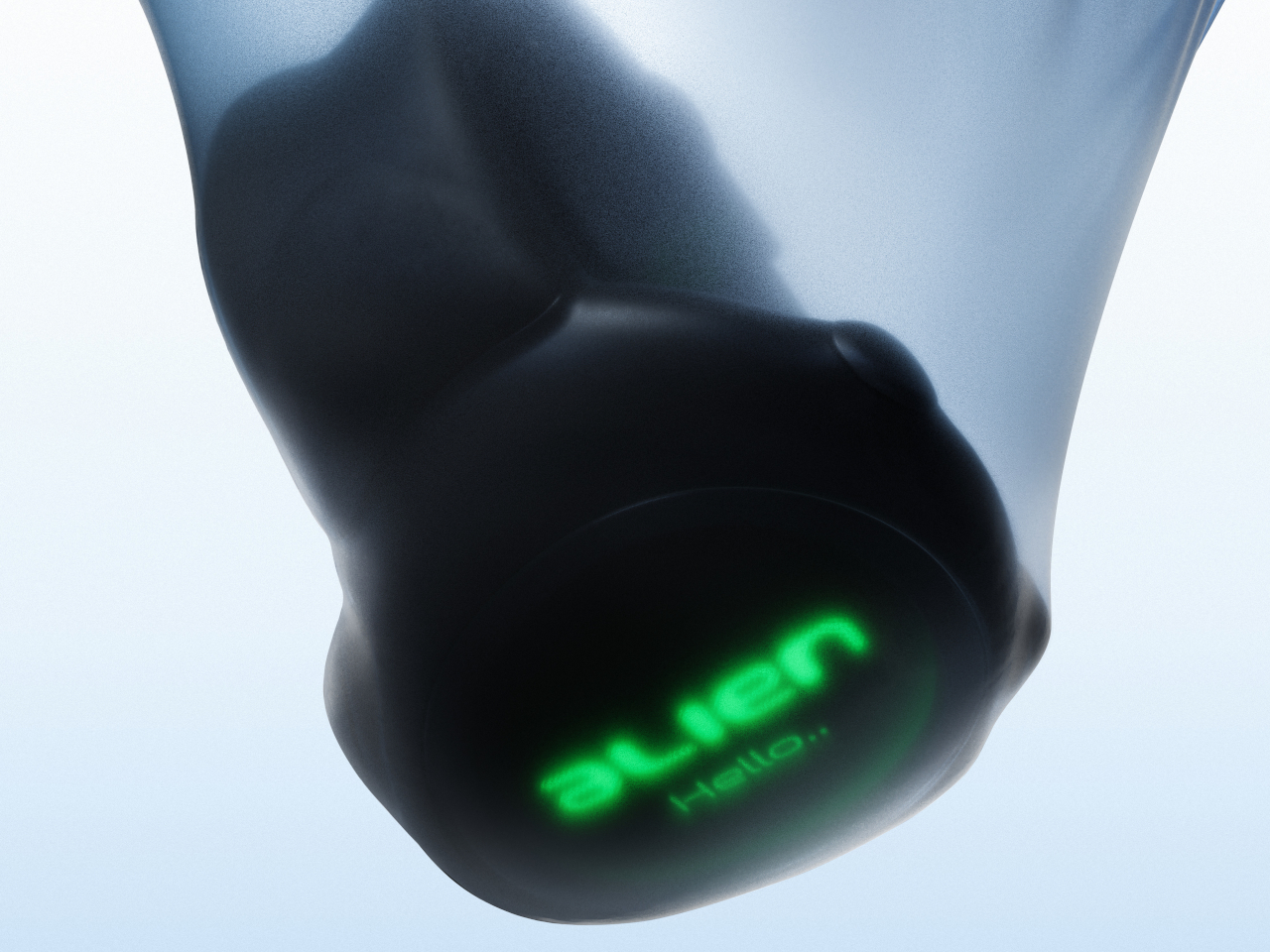
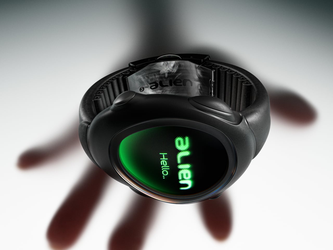
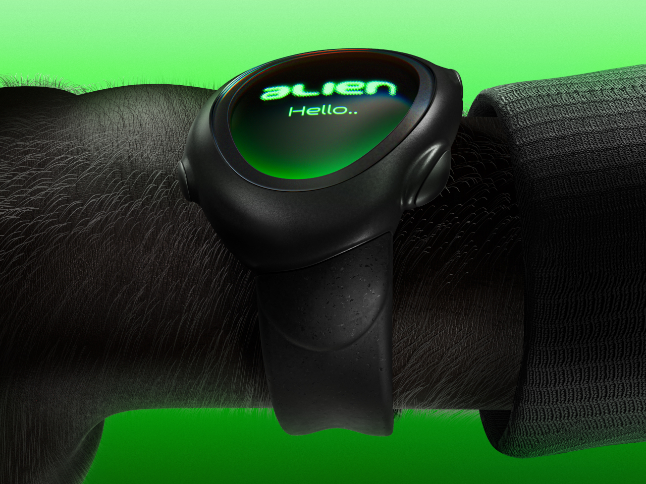
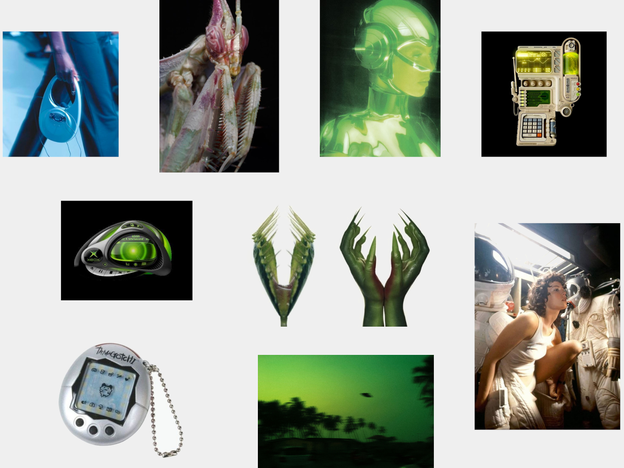
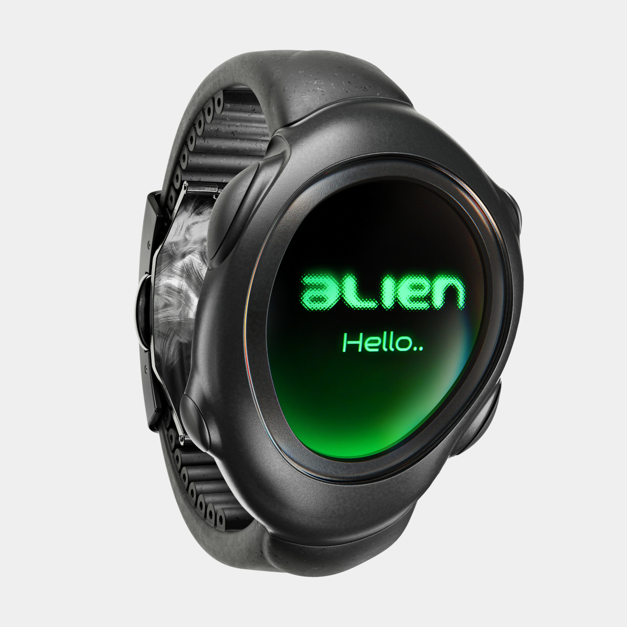
The ALIEN concept gives an empathic “no,” embracing a design language that is more organic and ironically closer to us than its extraterrestrial name would suggest. Its asymmetrical and amorphous design, not to mention the matching domed display, gives it that otherworldly character seemingly pulled out from some 90s sci-fi flick, with its eerie green glow and dark brushed metal surface. Of course, there’s nothing to stop a manufacturer from using other color motifs or materials, but it would still look alien compared to common smartwatches.

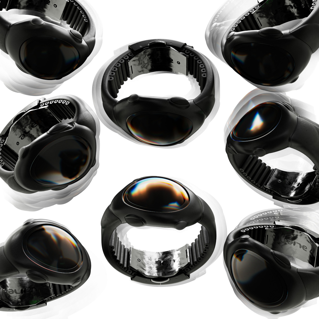
The irony is that, freed from the restrictions of circular and square watches, ALIEN can take on shapes that better conform to people’s wrists, offering a more natural, more ergonomic, and more pleasing curvature that is more human-centric. Even the buttons seem to organically grow out of the watch’s body rather than just jutting out like an artificial add-on. And unlike most smartwatches today, it isn’t content to have just one button but can have as many as four in each corner.
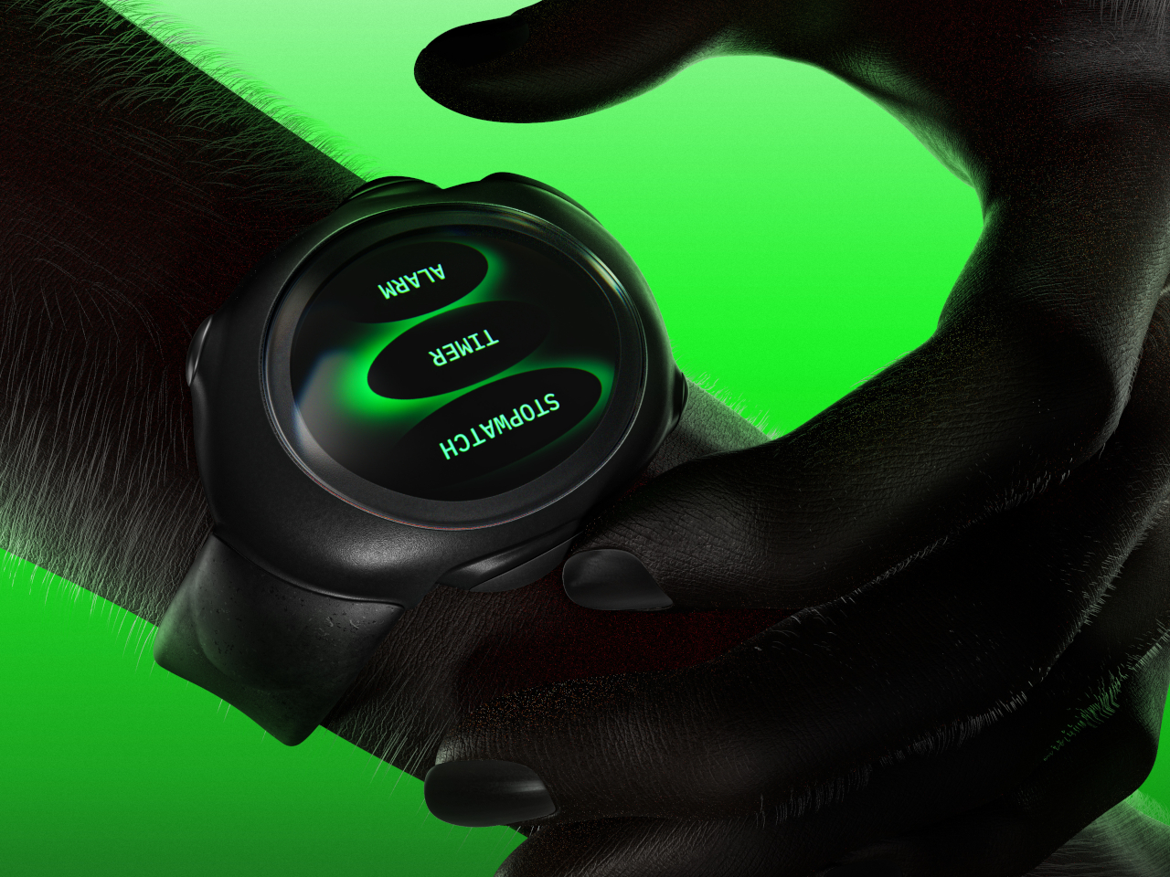
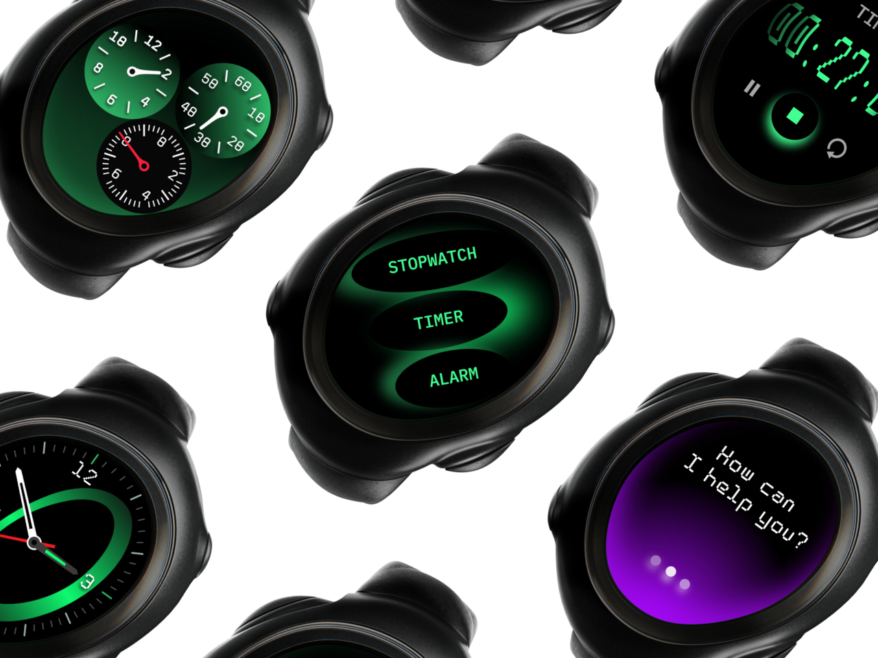
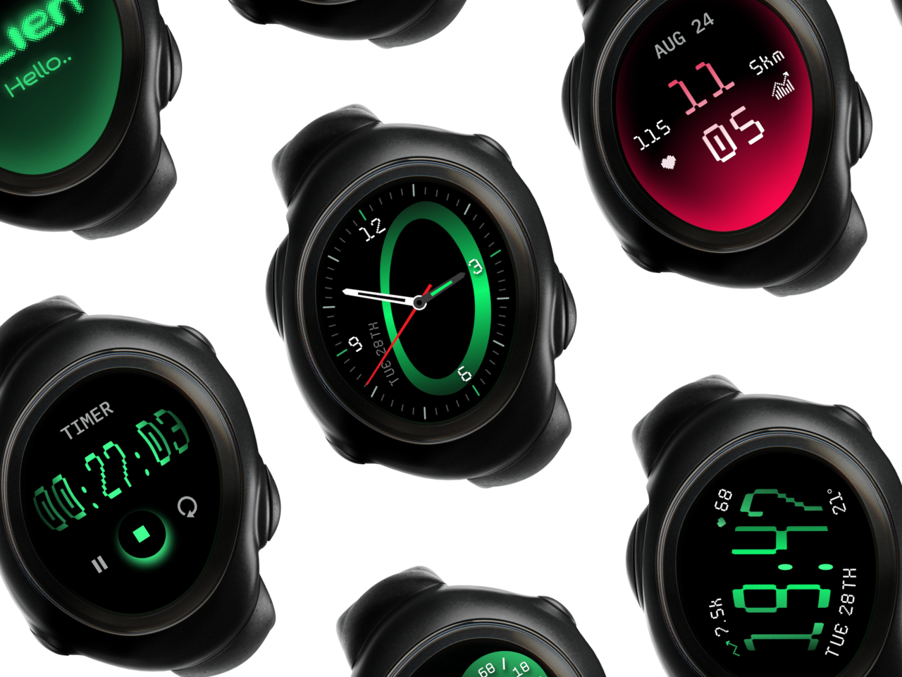
This unconventional design also changes the user experience, though not always in good ways. Because the shape of the screen is non-standard, there is more flexibility for different UI elements and arrangements, but it can also make things more confusing as well. Humans are creatures of habit, and smartwatches try to offer a uniform experience across different models or even platforms to make it easier for owners to switch from one watch to the next. That is, unfortunately, one of the disadvantages of this concept design, making the interaction and experience a little foreign and, well, alien.