In today’s world, tech tends to run complex rather than simple, and this is where the brand ‘Nothing’ has been marking its presence, and distinguishing itself. Founded in 2020 by Carl Pei, Nothing has adopted a refreshing design philosophy that focuses on transparency, minimalism, and a seamless user experience. Nothing’s flagship products merge a distinctive aesthetic with innovative functionality, and they are a source of major inspiration for the design and tech community. Conceptual designs centered around Nothing’s approach and philosophy are currently running rampant on the internet, and we’ve curated some of our favorites. We hope to see these concepts as real tangible Nothing products someday!
1. Nothing x AIAIAI Headphones
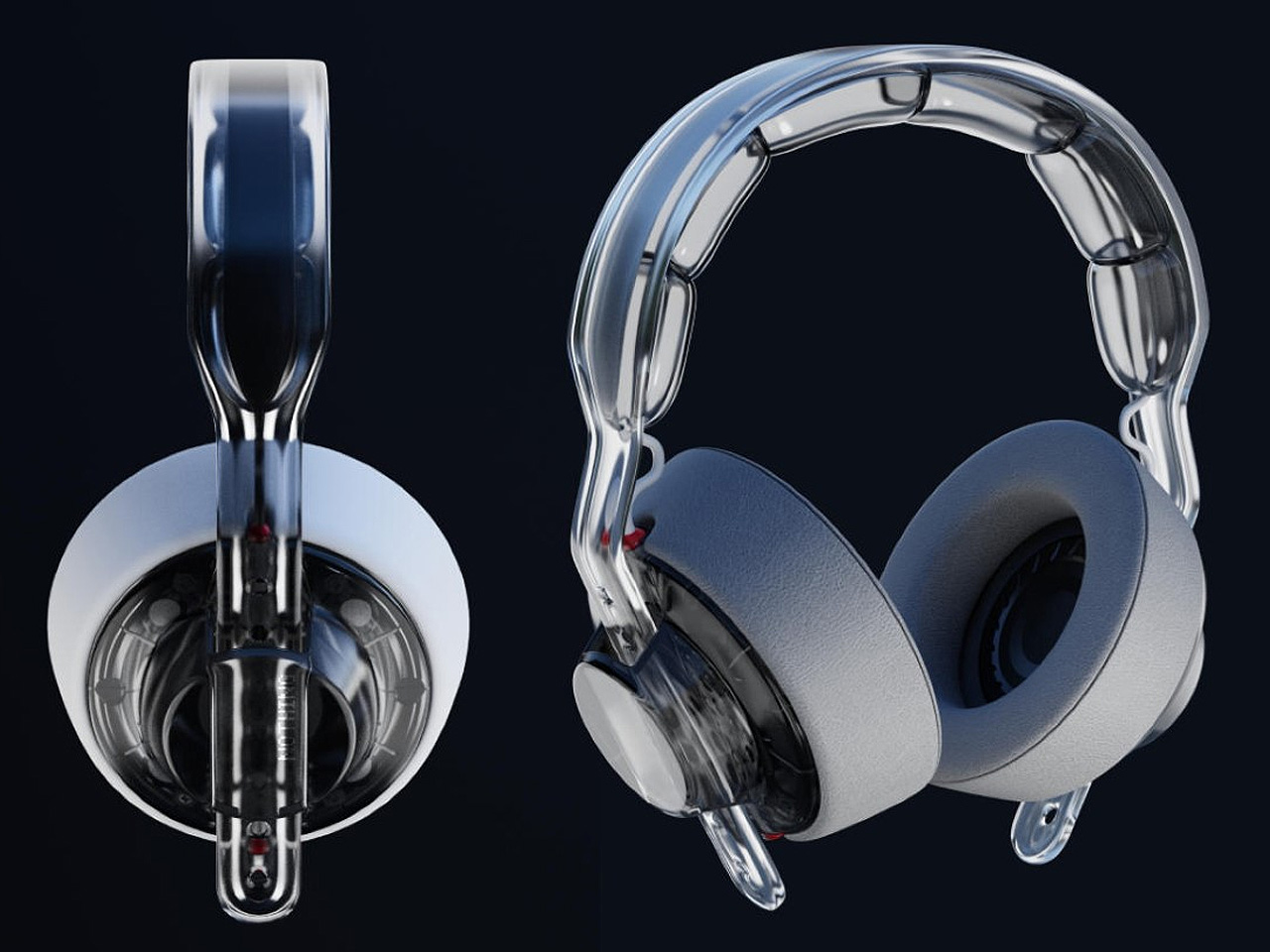
Called the Nothing x AIAIAI Headphones, this cool concept perfectly represents how two companies’ visions can be combined to create one functional and good-looking product. The headphones incorporate individual details like the AirPods Max, but they also retain the transparent beauty of Nothing. The accessory is built of modular parts that can be replaced and swapped as needed.
2. Nothing Power Bank
Dubbed the Nothing power bank, this handy little gadget is the perfect companion for your jet-setting adventures. It boasts a transparent aesthetic, which showcases the innards in all their glory. The insides are illuminated with little warm-toned LEDs, which provide the design with a futuristic and Cyberpunkish aesthetic, on the inside and out. It is designed to complement the Nothing Phone (2), making it a great fit for Nothing’s growing line of products.
3. Nothing Phone (3)
Designed by AndroidLeo as a visual exercise, the Nothing Phone (3) is a deeper refinement of Nothing’s iconic style. The Glyph interface’s shape has been modified, without compromising on the character. The Glyph has an O-shaped arc, placed around the wireless charging coils, as well as inside them. The camera is equipped with a redesigned LED array and a 3-lens setup, while the phone features an almost clover-meets-fidget-spinner type layout.
4. Nothing CMF Speaker
This conceptual CMF speaker breaks the conventional of a typical portable speaker design, and it merges function and form beautifully. The speaker displays the playback information including Albumart, now playing controls, and track selection buttons on the touchscreen. It has a Bluetooth toggle and volume knob on one side. A frosted cover panel maintains a semi-transparent surface on the innards, while a USB-C charging port is placed on the rear section to ensure visual integrity.
5. Head.Phone (1)
Dubbed Head.Phone (1), these conceptual headphones use the Glyph interface pretty smartly. The Glyph is physically moving, and it can be customized to send cool messages to the on-lookers. It offers a more aggressive appearance, and the texture is pretty cool too. The materials have an impressive color and finish, accentuated by the right detailing in the right places. Transparent design elements have been incorporated, retaining the typical DNA of the brand.
6. Nothing Bass (1)
Named the Nothing Bass (1), this portable speaker is designed in Black or White color, making it an excellent conversation starter for a house party. The speaker pairs up with the power of LED lighting, which syncs perfectly to the rhythm of beats, ensuring the device captures everyone’s attention. The speaker’s cone is transparent, protecting the innards from the outside elements. The appeal of the speaker is pretty classy, and it will elevate the vibe of any living room.
7. Nothing Sound (1)
Named the Nothing Sound (1), this portable speaker has a fantastic visual design language inspired by Nothing. It has the style that a real Nothing portable speaker would adopt. It is a fashion accessory designed for home and outdoor use, and it is also pretty practical as well. It is designed to be portable, and easy to use, and is a refreshing change from the typical portable speakers we often find on the market.
8. The Nokia N90 x Nothing Concept
This conceptual design gives the outdated Nokia N90 design a whole new makeover. It borrows inspo from Nothing’s iconic translucent glass design and focuses on three important concepts: mechanical precision, the spirit of exploration, and a minimalist design language. The phone adopts a clean and minimal appearance, ensuring the details are focused only on the essentials while ditching the noisy details that were often seen in Nokia’s design language.
9. Nothing Npod (1)
Named the Nothing Npod (1), this resurrected iPod by Shreyansh Onial and Aditya Pandharpure draws inspiration from Apple’s iPod Shuffle, and Nothing’s iconic transparent aesthetic and glyph interaction. The Npod (1) features a signature control panel on the front, while a matching circular glyph interface is placed on the back. This innovative product is the perfect mix of tech and nostalgia and could be a unique undertaking for Nothing.
10. Nothing headset (1)
The Nothing headset (1) concept is designed to deliver high-fidelity audio right to your ears. It has a detachable amplifier to amp the quality as and when needed. You simply need to attach the amplifier to the outside of the headphones, and it instantly elevates your audio experience. You don’t need any steeply-priced AMPs, DACs, or high-fidelity cables.