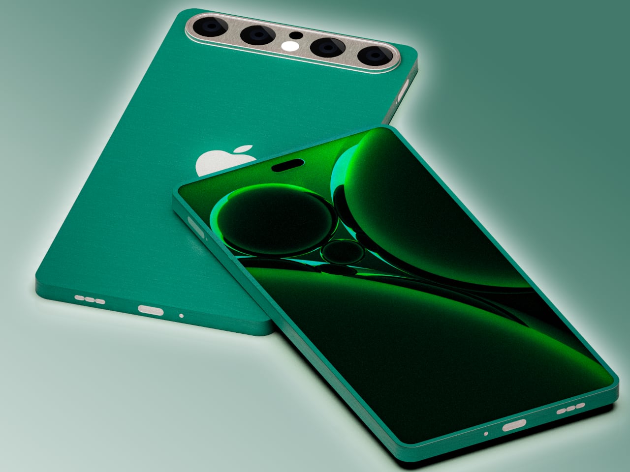
Apple is both famed and notorious for its meticulous attention to detail and it has been hailed as a champion of product design in the tech industry. It rarely makes big changes to its design language, but when it does, it holds on to that aesthetic for years. It held onto the notch for six years before giving way to the island on the iPhone 15, and it still uses the square camera design it first introduced on the iPhone 11 back in 2019. That’s not to say that the iPhone 17 next year couldn’t be different from this year’s iPhone, and this concept tries to explore designs that could make sense but will probably never happen under Apple’s watch.
Designer: Mohamed Mahdy
Apple has championed minimalism for its most recent products, barely adding any vibrant colors or textured finishes to its iPhones and MacBooks, save a small number of special editions. It has left the doors wide open for case makers to offer those flavors to people who do want them, but it has reserved for itself classier aesthetics. Of course, it’s not like Apple has never embraced more eye-popping hues before, as proven by the candy iMac G3, the colorful iPhone 5c, and the current generation of vibrant flat-screen iMacs.
This Apple iPhone 17 conceptual design dares to venture into unknown territory with a design that, almost doesn’t look like Apple if not for the telltale logo. It does have the flat design of the current iPhones, but rather than a smooth and featureless chassis, it adds a bit of texture that looks almost like fabric. This can perhaps be an opportunity for Apple to use more sustainable recycled materials rather than just plain metal.
The biggest deviation, however, is the camera design, a pill shape that runs across the width of the phone. It has four cameras, something that has yet to happen on any iPhone, arranged in a row with the LED flash and 3D time-of-flight sensor in the middle. This design is one possible solution to the design puzzle that Apple will have to face when it does add another camera sensor to next year’s iPhone. It also fixes the wobbling problem that most smartphones have because they push the thick camera bump off to the corner.
Interesting as it may seem, it does feel unlikely that Apple would go this far if it ever does finally change the iPhone 17’s design. The changes are far too great and the benefits are far too few. It’s still an interesting thought experiment, of course, one that does try to at least stick to the general design of current iPhones. Chances are, however, that the company won’t be ready to make such a drastic leap, even with sustainability and ergonomics at stake.