Juxtopposed’s redesign of the Panels app is a literal chef’s kiss if you love a good review. Just like MKBHD politely dismantles bad design, Juxtopposed brings the same calm demeanor to her review of the Panels app, while simultaneously redesigning literally every page to make the app MUCH better. Not only does the new app have a better UI, it’s more feature-packed, less buggy, more visually efficient, and even proposes a new way to monetize the app that makes it, well… less offensive.
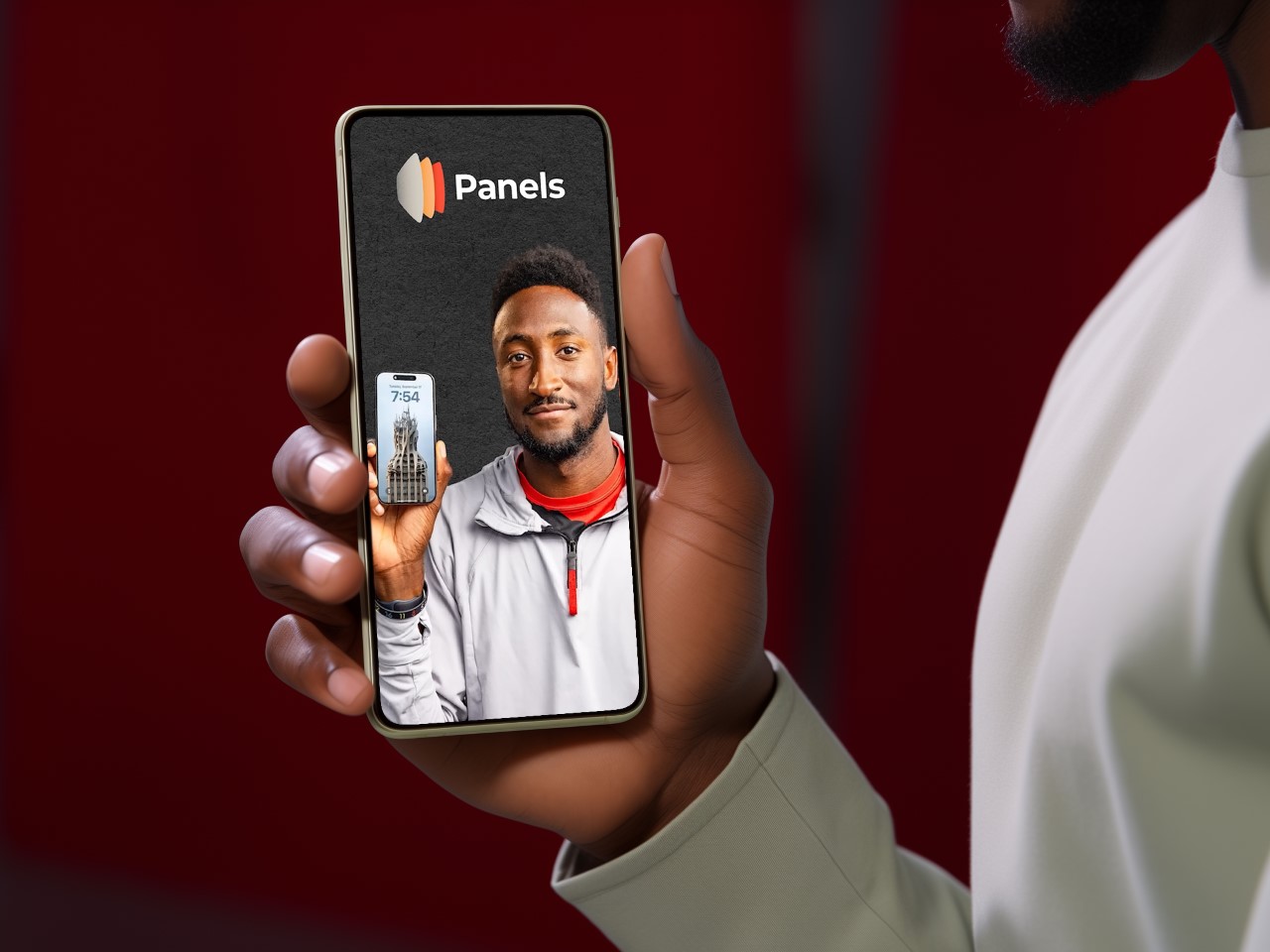
MKBHD announced his first ever product last week – an app that gives you access to a wallpaper marketplace featuring wonderfully curated artist-made wallpapers that come personally approved by YouTuber and tech-culture icon Marques Brownlee. The problem, however, was that the app was a fraction of what we expected from tech’s greatest reviewer. It was buggy, had ad-ware, tracked personal data (which a wallpaper app definitely shouldn’t do), and tried to monetize jpegs by asking for $12 a month or $50 a year… something that was simply outrageous for essentially a bunch of wallpapers. The internet revolted in massive swathes, raking MKBHD’s credibility over fire for what seemed like a very obvious cash-grab. Moreover, people somehow managed to reverse-engineer the app and extract the wallpapers for free as a form of protest. Paying $12 a month for wallpapers isn’t something that makes a lot of sense to most people, considering Netflix, Spotify, hell even MKBHD’s own YouTube Premium cost the same amount. However, this isn’t about the app’s launch or its pricing model – it’s the fact that the app itself could be better designed. Taking things to task, YouTuber and UI designer Juxtopposed decided to quickly critique and redesign the Panels app. For UI/UX designers, this video is an absolute masterclass in great design, as she breaks down her entire process, providing constructive criticism of the existing app and fixing every flaw with simple design tweaks. If you’re a UI/UX designer or just an enthusiast, grab a coffee, sit down, and enjoy the next 5 and a half minutes of the video above… or scroll through to quickly read how Juxtopposed took the most polarizing phone app of last week and turned it into a well-designed experience that any tech YouTuber would recommend.
First off, the website—a brand’s first handshake with its audience—felt like a bit of a fumble. Given MKBHD’s production quality for his videos, you’d imagine expecting precision, but instead you’ve got a layout that feels like a rushed draft. There’s an odd flatness to the design, where headings blend into paragraphs and links lead you down rabbit holes of nowhere (it’s also incredibly heavy and doesn’t scroll smoothly on weak internet connections). It’s strange, considering MKBHD’s professional video production setup. But to be fair, this is just the website, not the app itself. And if there’s anything we know about the tech world, first impressions on paper (or screen) don’t always define the real experience.
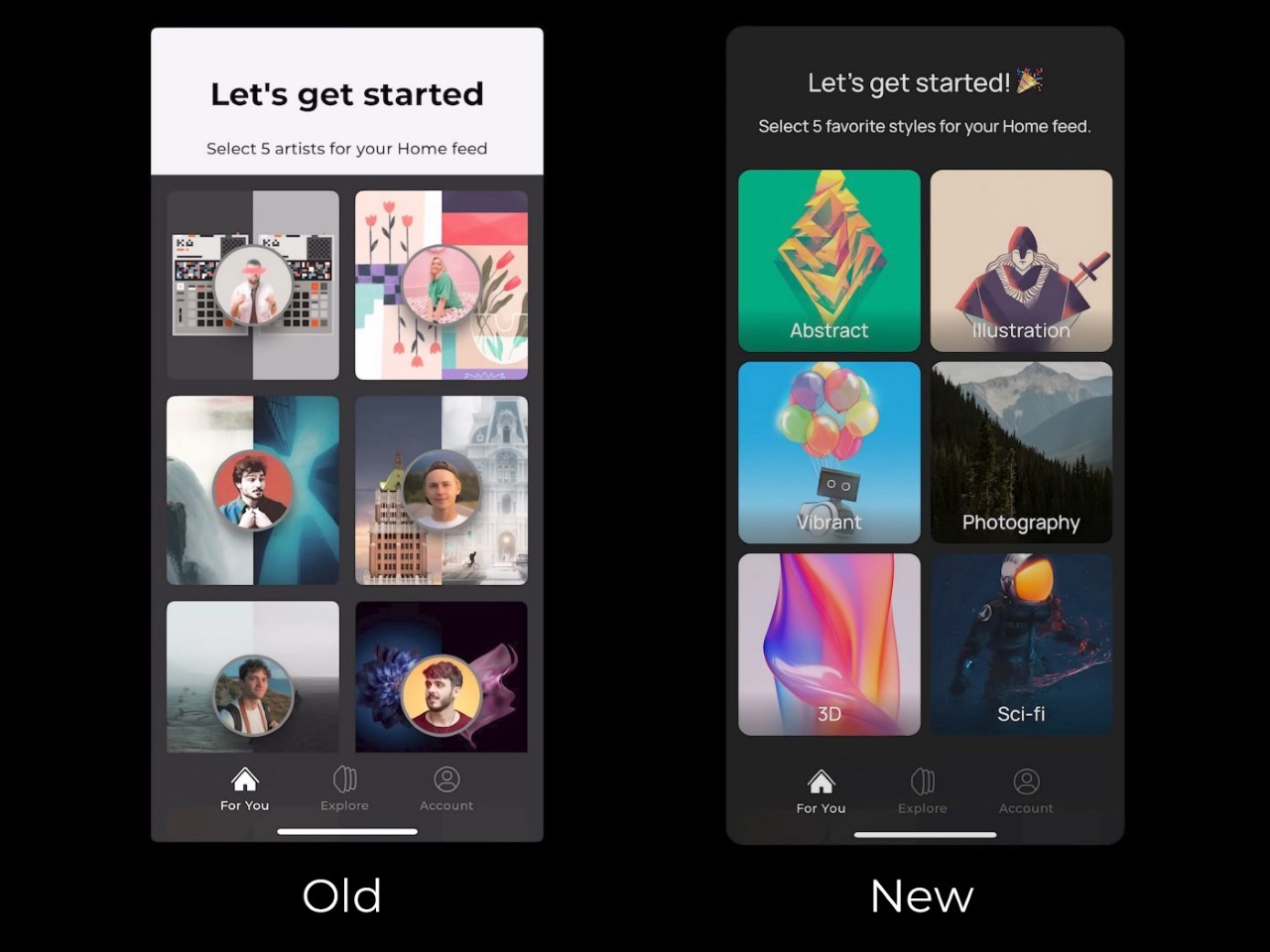
Once you install the app, you’re greeted with a setup process – and here’s where things feel, well, clunky. To create a personalized home feed, users are asked to select five artists from a list of fourteen. Sounds simple enough—except there’s a catch. You can’t actually explore these artists’ work before choosing. No profiles, no descriptions, just a gallery of unfamiliar names, leaving you to essentially take a shot in the dark. Wouldn’t it be easier to offer some style or mood-based suggestions? Especially for an app built around personalization, this initial friction feels like a missed opportunity to connect with users from the get-go.
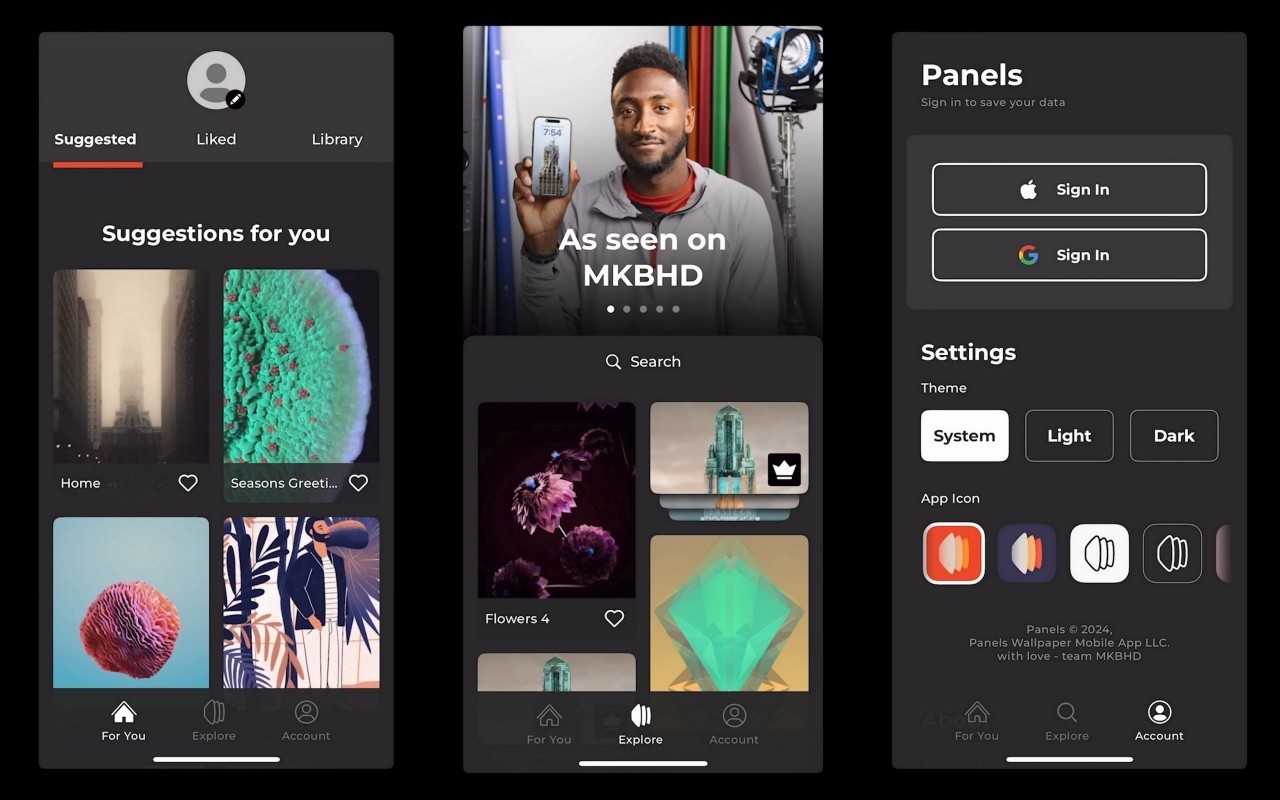
The three core sections of the Panels app
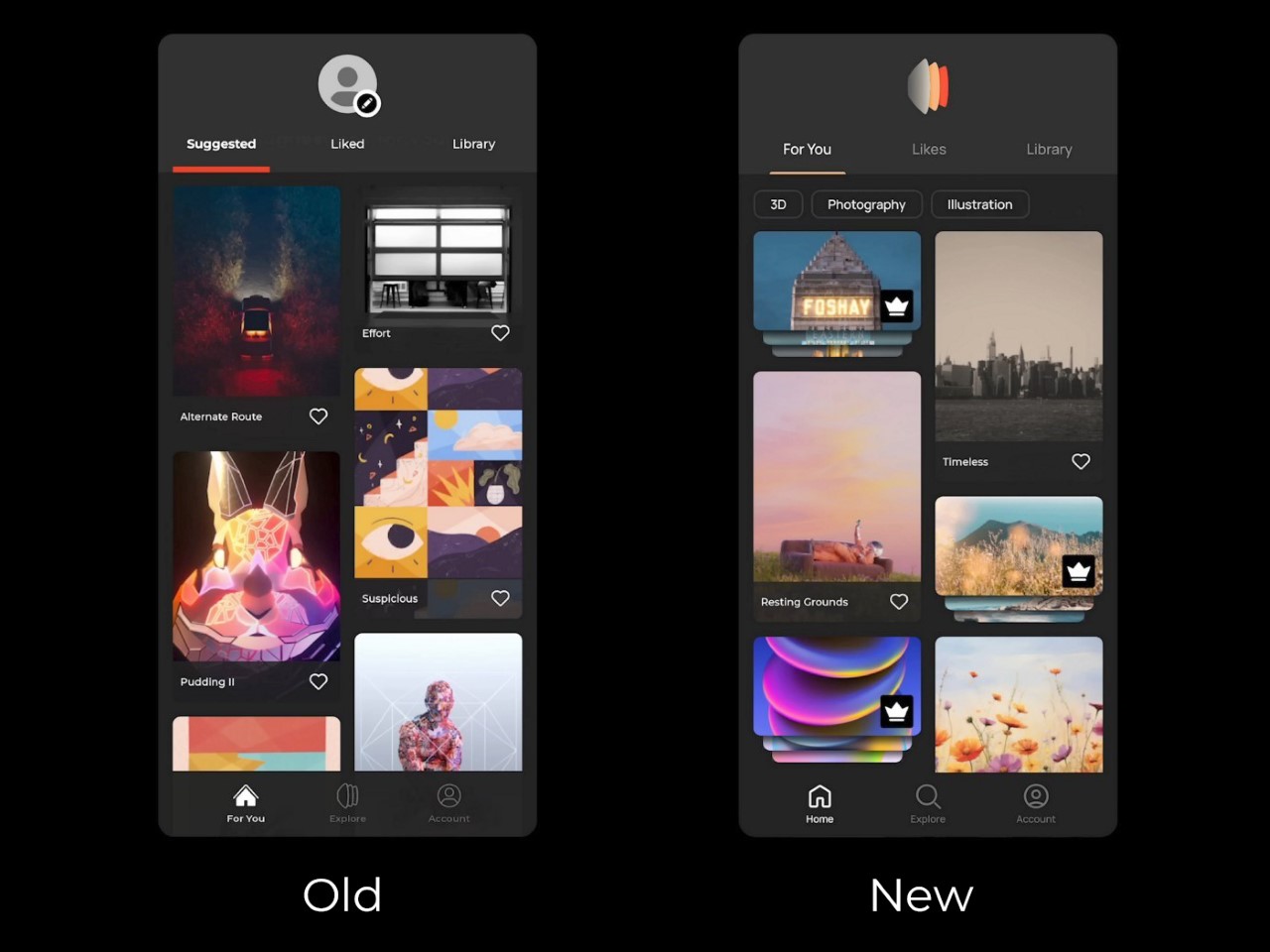
Navigating through Panels, you’re introduced to its three core sections: Home, Explore, and Account. It’s a simple enough structure, but it doesn’t quite land. The Home page, intended to show personalized suggestions, feels more like a placeholder, with user favorites and purchases awkwardly scattered. Meanwhile, the Explore section, where discovery should thrive, suffers from design missteps. A small, nearly invisible search button? In 2024? Come on. Even the icons seem to have skipped the quality check, with mismatched styles and inconsistent border thicknesses. It’s hard not to feel like this is still a work in progress—one that launched too soon.
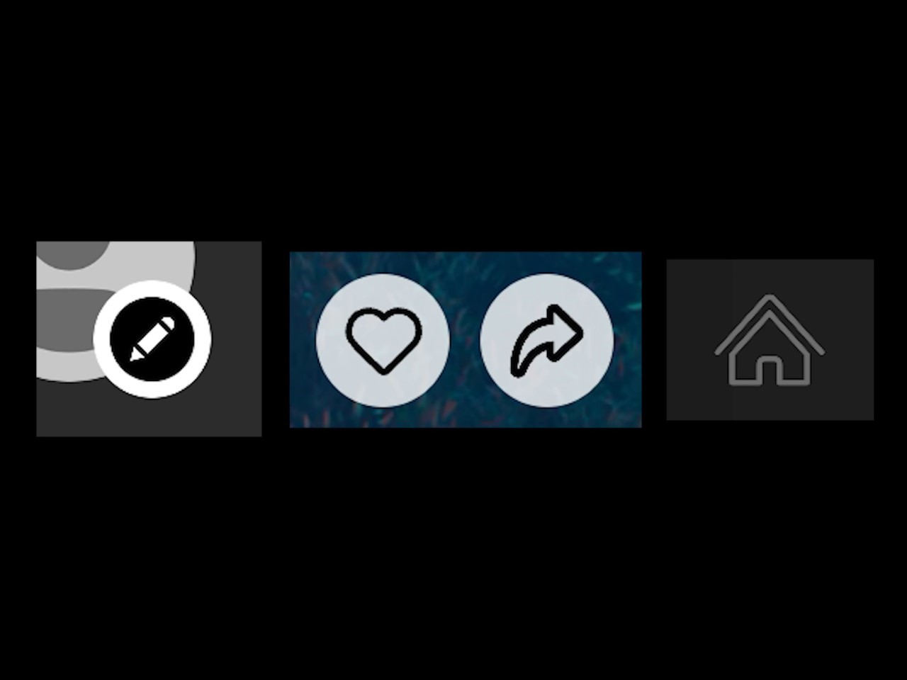
Inconsistent icon styles
But here’s where the real frustration sets in – pricing. For an app that delivers digital art, the monetization strategy feels surprisingly tone-deaf. Want standard wallpapers? Watch an ad. Want premium ones? That’ll be $50 a year or $12 a month (this is AFTER Marques reduced the prices following a blowback). Compared to other apps in this space, many of which offer free ad-supported options with lower subscription rates, Panels’ pricing feels excessive. It’s not that the app shouldn’t charge, but the balance between free and paid features needs rethinking. Locking everything behind a hefty subscription might scare off users before they even have the chance to engage with what could be a fantastic product. Remember, nobody buys NFTs anymore because of how inherently people feel JPEGs shouldn’t cost so much money. For $12 a month, you can either have a premium wallpaper app subscription or pay $2 extra for YouTube Premium. The math isn’t mathing, as people on the internet say nowadays.
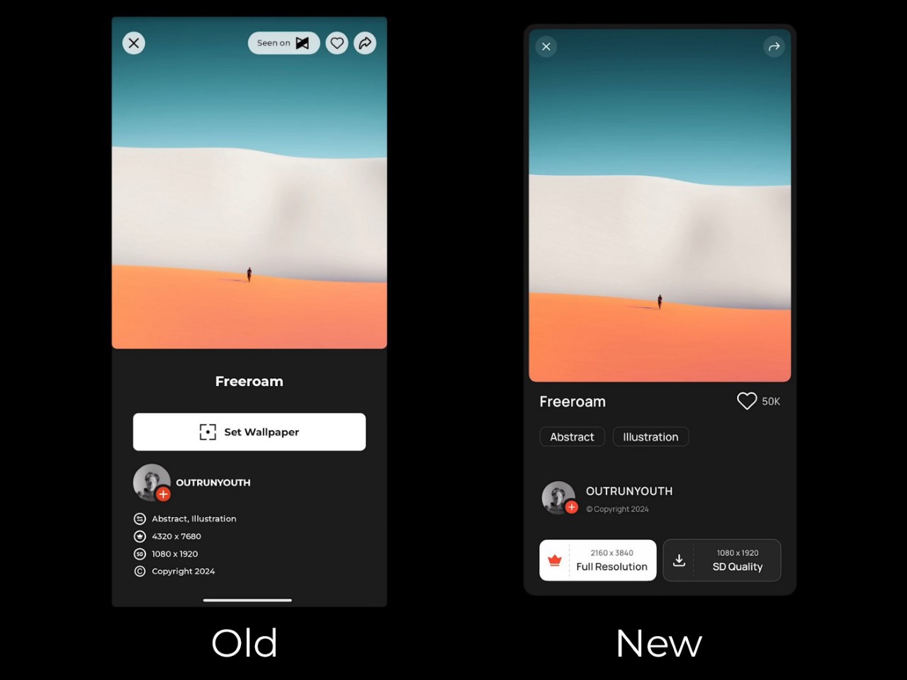
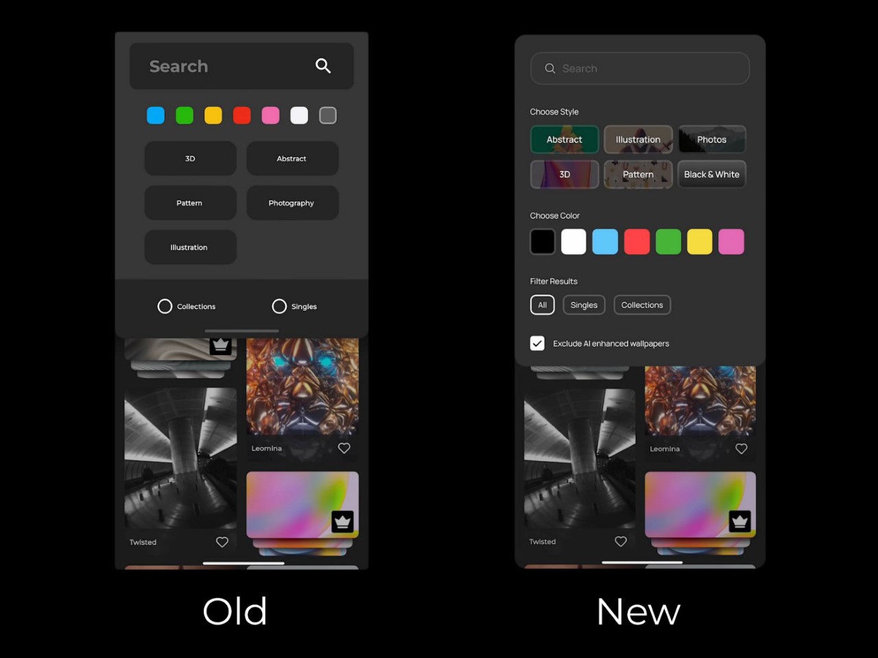
Technically, Panels offers some good ideas, but they’re overshadowed by awkward execution. There’s no flexibility in how wallpapers are applied—no option to choose between home screen or lock screen. The search functionality is limited, forcing you to abandon filters if you want to type a new term. And for a wallpaper app, isn’t search everything? Refining the search experience and adding sorting options like relevance or popularity could make a huge difference in how users interact with the app.
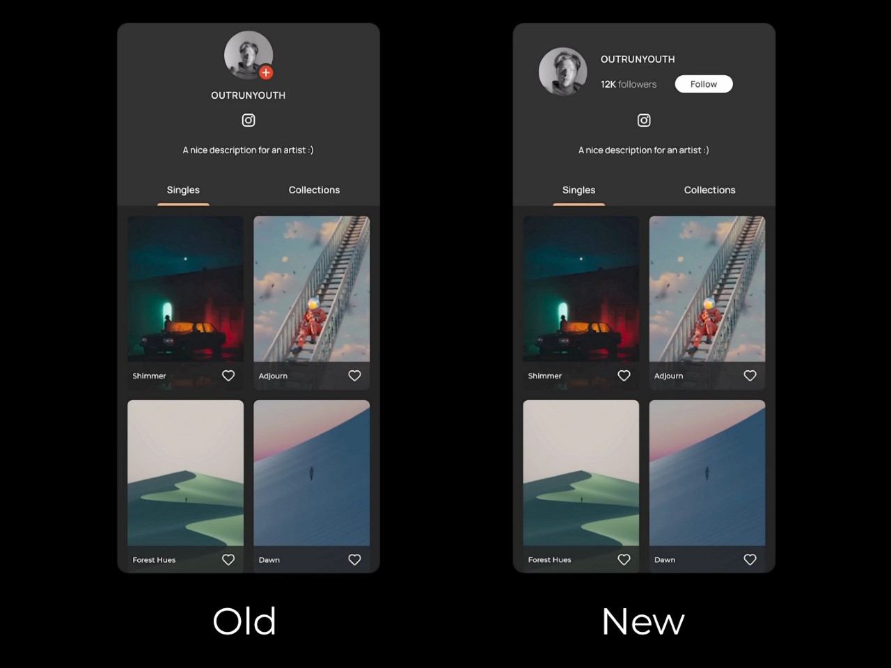
In fact, Juxtopposed even proposed turning the Panels app into a de-facto social network where people can build out a proper profile and create and share their own wallpaper designs (sort of like how OnePlus did with their community). It’s a clever idea that offers the ability to strengthen MKBHD’s own 19.5 million-strong follower base, effectively also becoming a place where Marques can share exclusive content with Panels+ members. But alas, the app currently is a victim of Marques’ success as a YouTuber who puts quality above all. It’s a shame the app didn’t reflect that.
Ultimately, Panels is a solid idea that just needs time to mature. It’s not there yet—the design is inconsistent, the pricing feels off, and the user experience needs a serious overhaul. But as with most things Marques touches, there’s potential. Feedback from the community could steer the app in the right direction. For now, though, Panels feels like a promising beta rather than a polished product… but hey, the redesign feels like a major improvement, doesn’t it?
Images via Juxtopposed