Almost all homes have one or more wall clocks to tell the time, but if that’s all they ever did, they would be a waste of precious space. They’re also a missed opportunity to add more value to a space with their presence, which is why there are plenty of clock designs that span a wide range of motifs and styles. Some are spartan and minimalist, while others are luxurious and elaborate.
Still, others are simple yet bear a lot of meaning to those who dare to look closer. This design, for example, might simply look like a beautiful yet ordinary clock. At least until you realize that it’s almost like it’s staring back at you, inviting you to get lost in its fusion of art and functionality.
Designer: Ivan Llaneza


Although there are people who prefer digital watches or even smartwatches, it seems that the majority still lean toward the timeless appearance of an analog wall clock. Even if it doesn’t offer a precise reading, especially from a distance, these circular objects with their thin moving hands convey a more relatable concept of time compared to changing numbers. There’s an almost mystical aspect to the notion of time, and analog clocks are able to capture it better than digital ones.
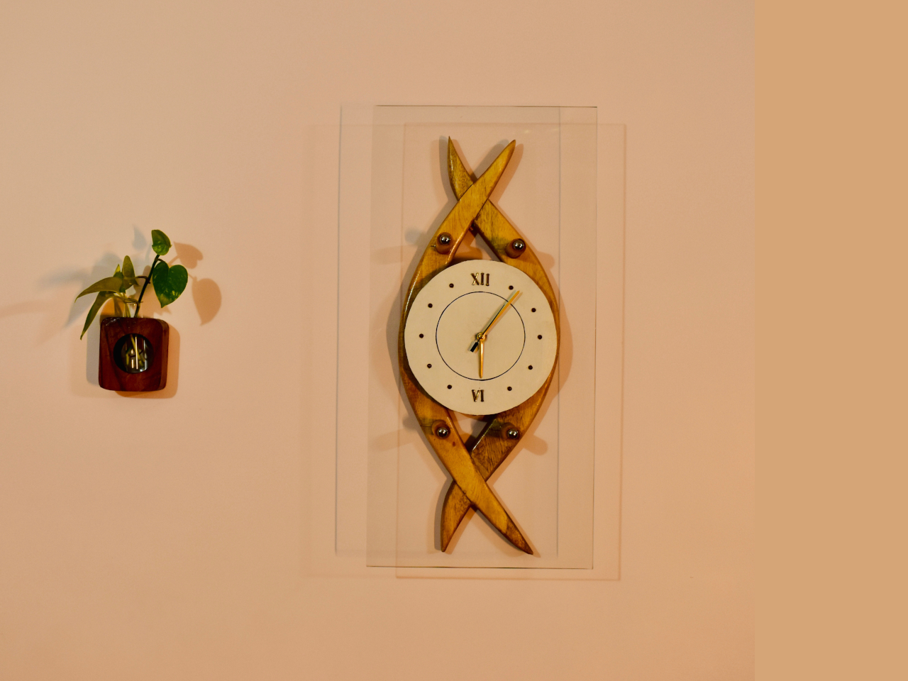
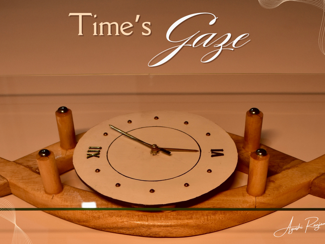
Time’s Gaze is a design that tries to express that character in a striking yet subtle way. While the clock face itself is a simple circle with golden accents for the hands and markers, it’s the combination of the intersecting wooden arcs behind it that gives it a more interesting appearance. Although its default installation is vertical, turning it sideways reveals a shape similar to an all-seeing eye gazing back at you.
Another and more subtle symbolism expressed by this clock design is that of the broken infinity symbol. The regular looping iconography represents eternity and a continuous flow of time. Breaking it at the ends, so to speak, captures a small segment of that, like a snapshot of time to represent the present moment.
Even without these deeper meanings, the Time’s Gaze clock design is definitely an eye-catching (pardon the pun) design object. It’s a bit strange that it’s not designed to be mounted in a horizontal position, which would make its “eye” metaphor more evident. Perhaps that stops it from being a little too obvious and unsettling, like some otherworldly being spying on you all the time.