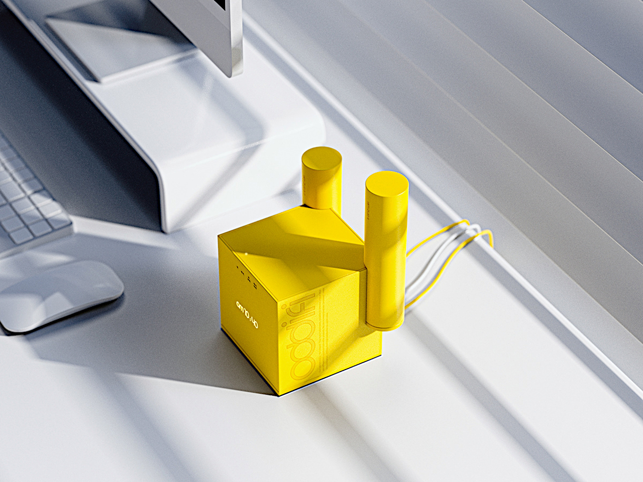
Usually, we don’t really think of where to place WiFi routers since they just look like ordinary devices. It doesn’t matter where they are placed as long as it does what it’s supposed to do. They’re also not that well-designed anyway so it’s better to hide them away. But what if the router’s design is actually well thought out and can actually be part of your decoration?
Designer: In Je Lee
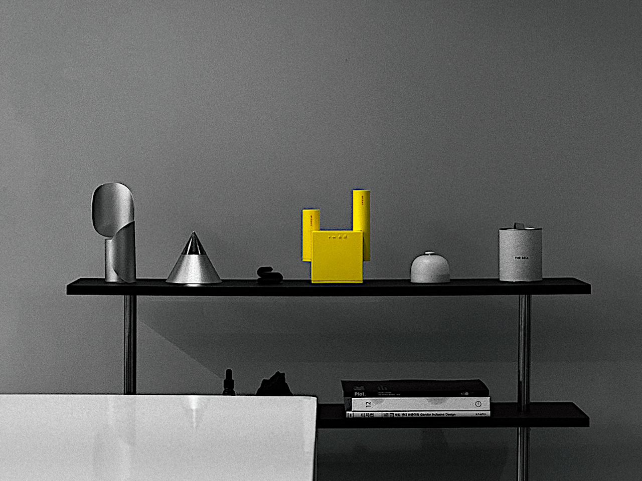
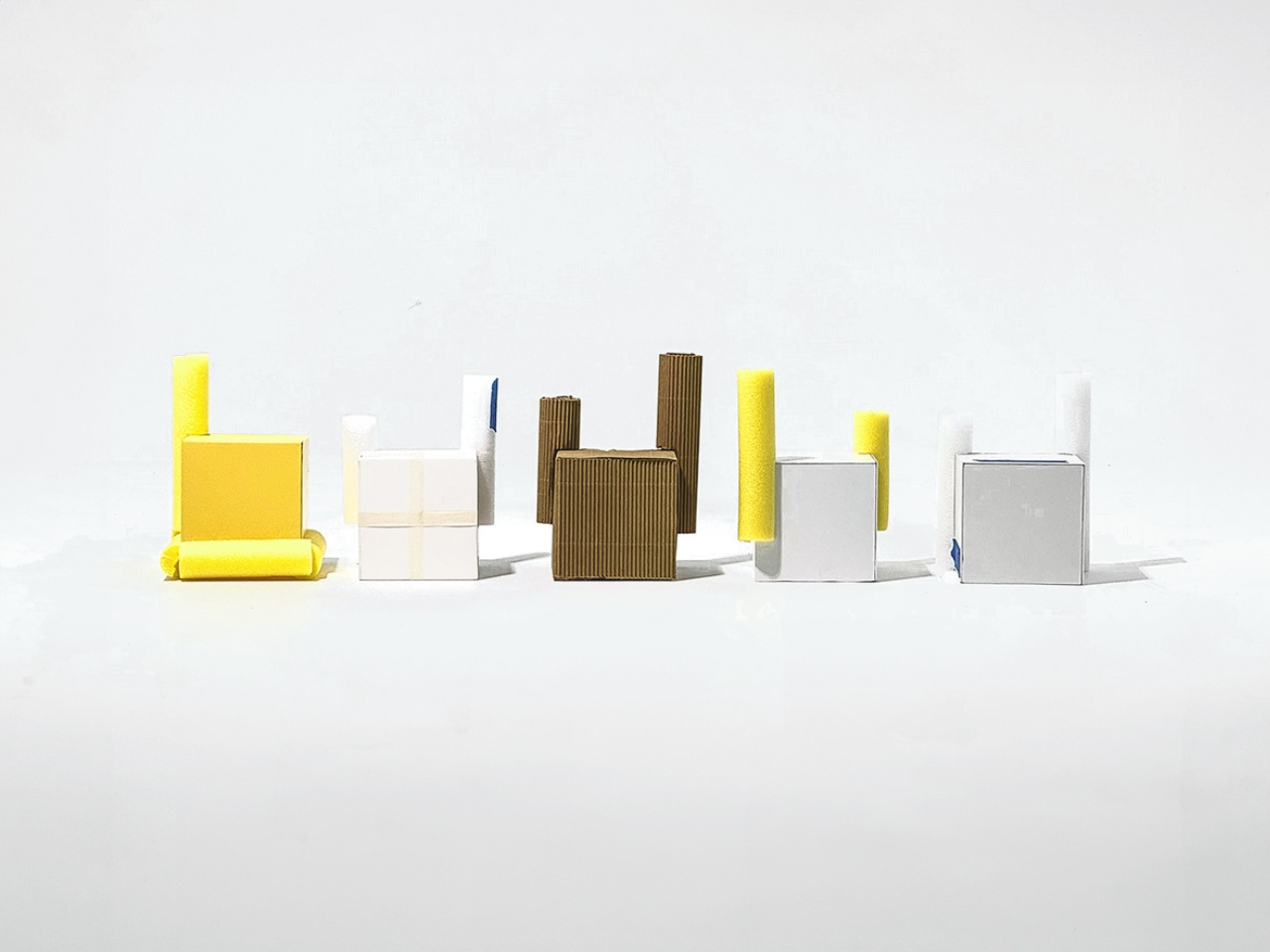

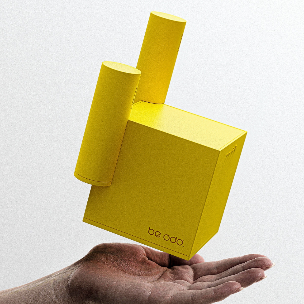
This is the idea for the Wi-Fi router concept called Complex ‘1’ which has found inspiration in the most unlikely places: a factory smokestack. The designer says that just like the chimney diffuses the smoke, the antenna of this router spreads the Wi-Fi signal throughout your space. There is really no direct correlation between the two of course except that he got the cylindrical shape inspiration from the smokestacks.
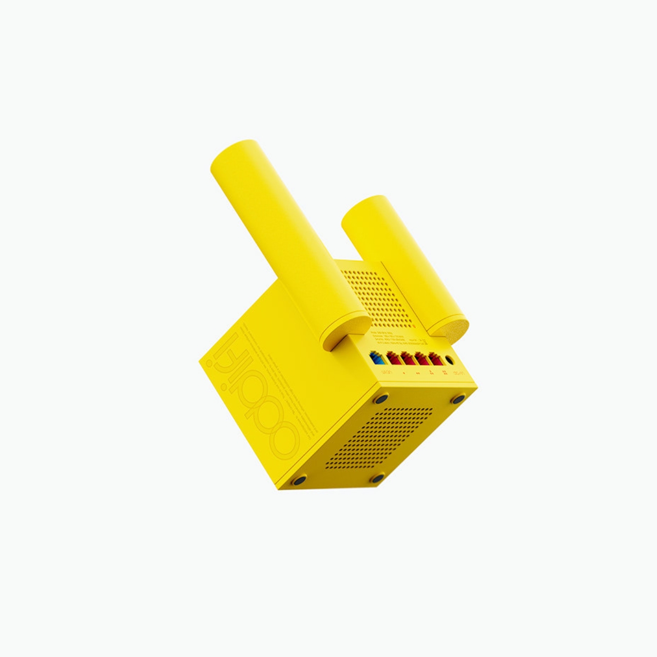


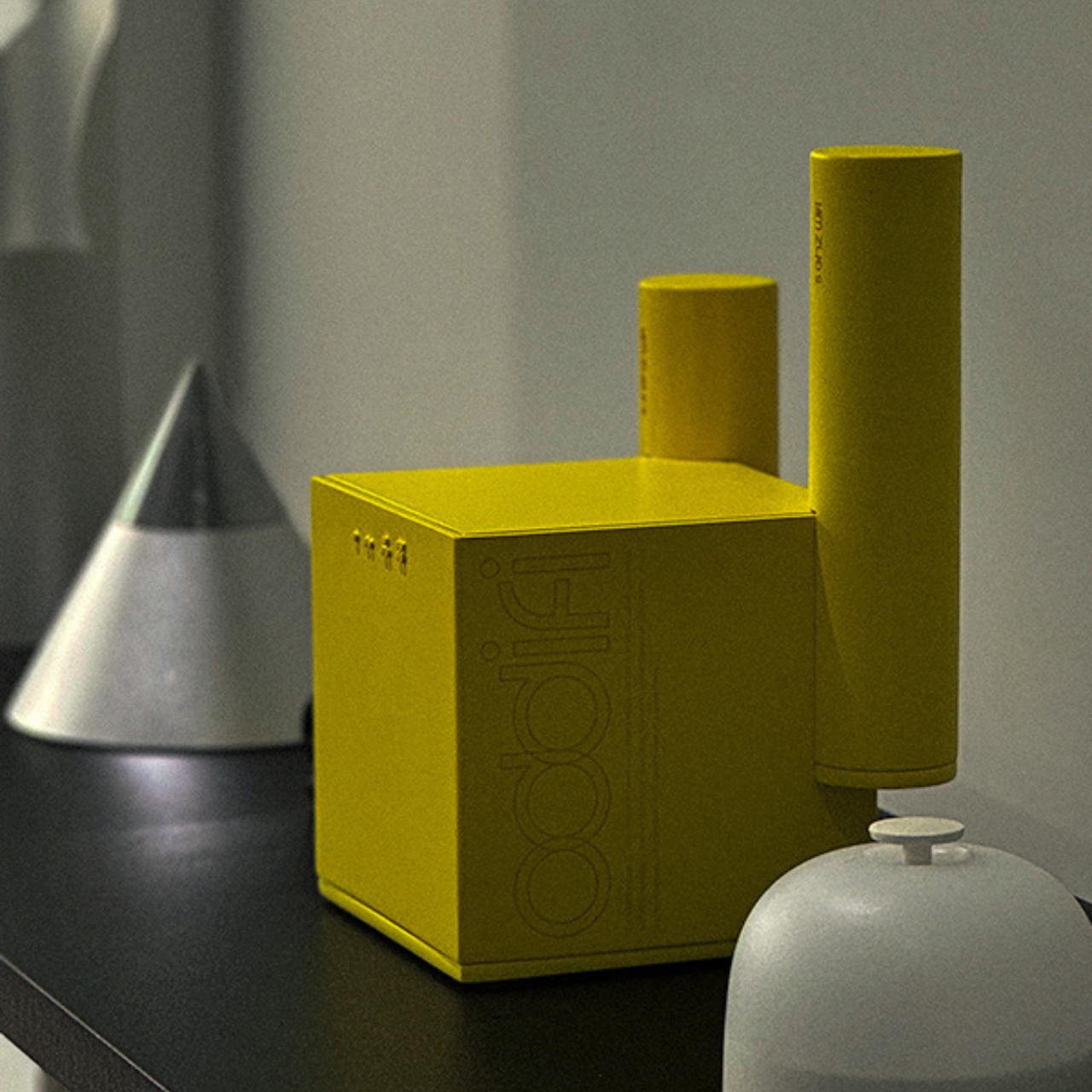
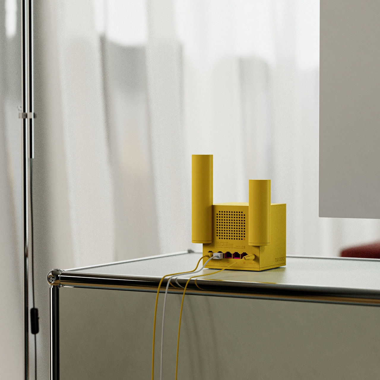
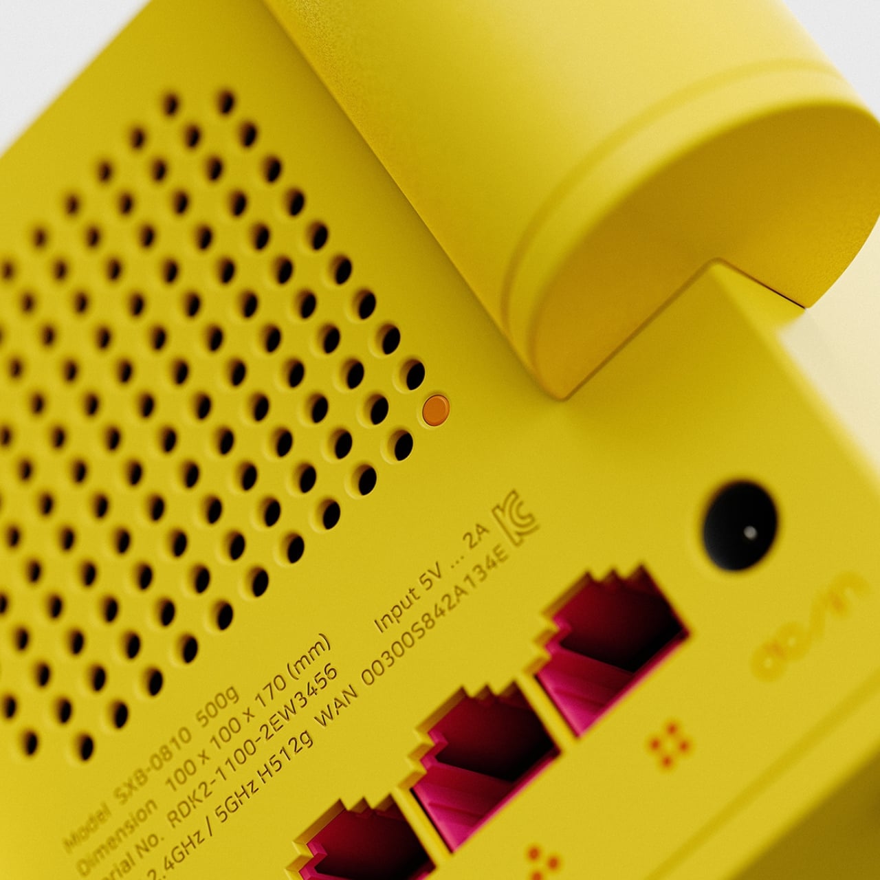
Instead of the usual slim antennas that you see on routers, this one actually looks like a lego piece, with the square body and the two cylindrical and asymmetrical antennas. It also comes in a bright, yellow color so if you display it on your desk or shelf, you can get a spot of color in your space. It also has a clock on it so you can use it for another purpose. There’s a small, orange button at the back for resetting or toggling the clock on and off.
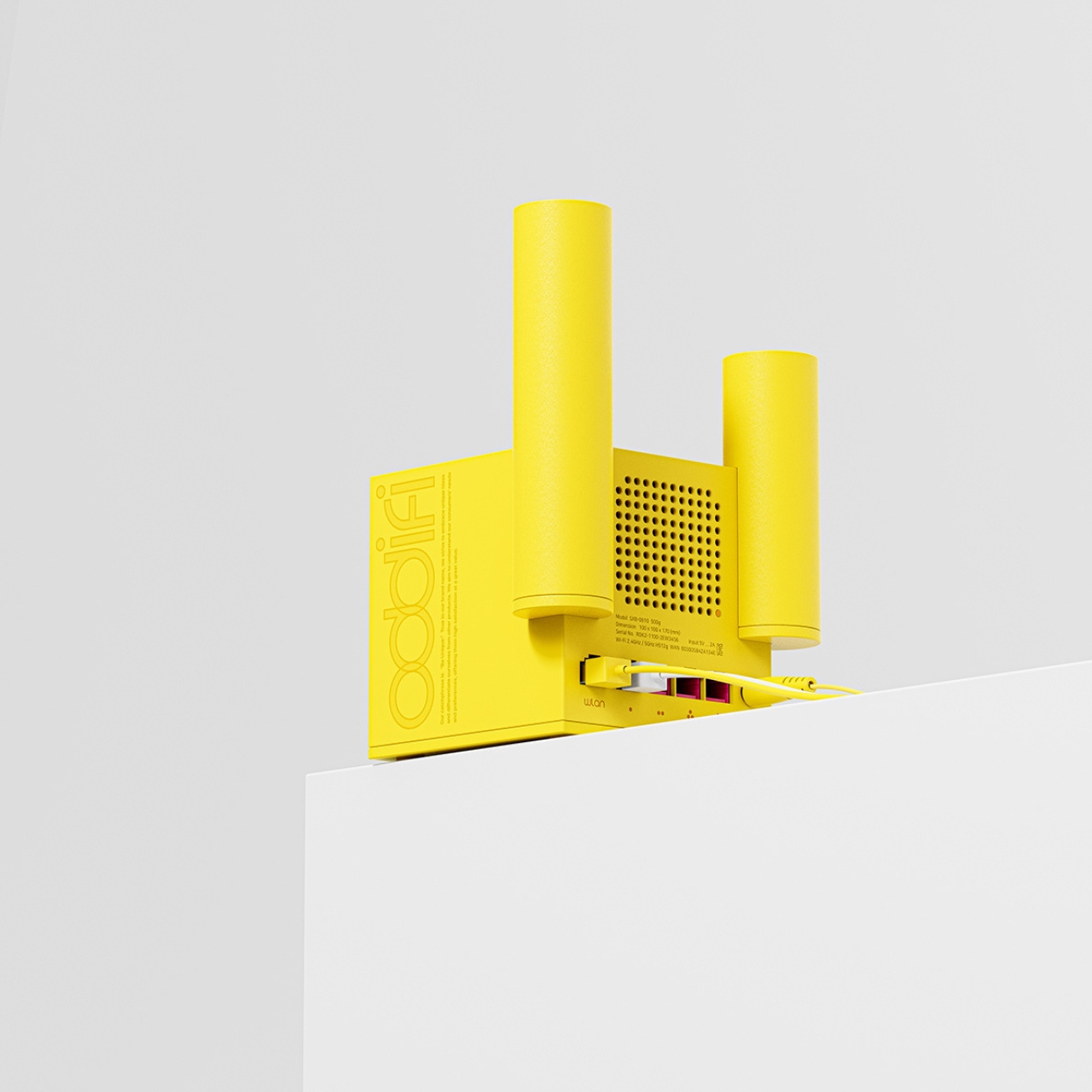
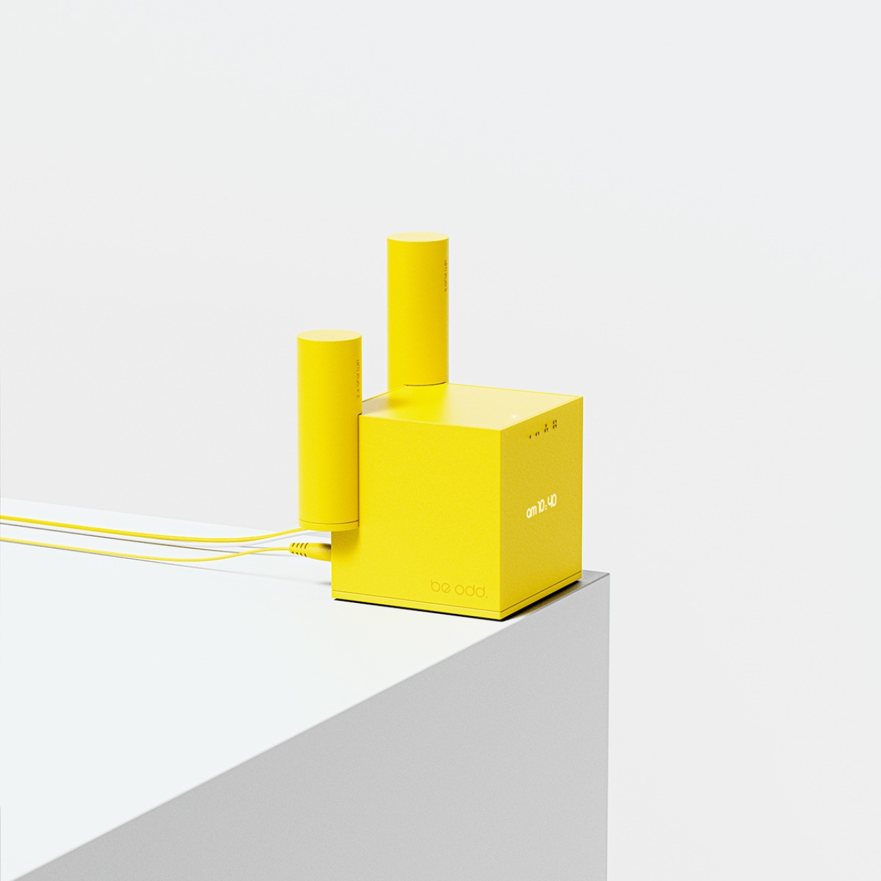
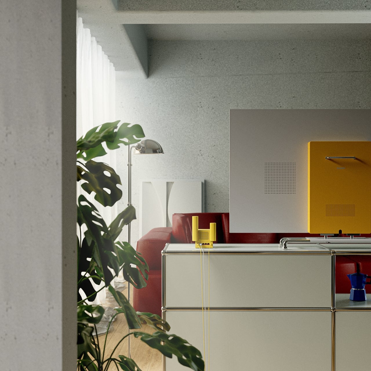
This is an interesting take on the common router, which is usually hidden under or behind stuff because it’s not that aesthetic. This way, since you’ll display it in the open, there’s no interference with the signal reception. Well, hopefully there will also be other colors since not everyone is fond of this kind of yellow.
