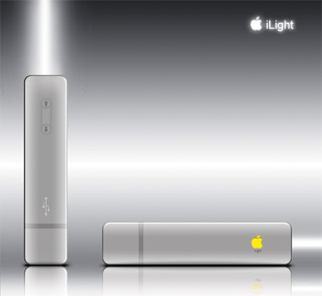
I’m going to start this post with an IMHO because it’s a great example of how simplicity in design means complication in function – which ironically is the opposite of what Apple stands for. Designer Miyoshimasato envisages the iLight, an Apple designed flashlight.
Step 1: Make it look like an Apple product. Put a check here because it really does look like an Apple product. You’ve got the slim slick body devoid of any switches and buttons.
Step 2: Give it an Apple logo and “i” meme. Put another check here because this concept fulfills both prerequisites.
Step 3: Integrate current Apple technologies so the user interface feels familiar. This deserves a big ‘x’ because adding a touch interface with multiple inputs does little to make the product better. In this case, a single touch turns on the light. Tap it again and the light turns off. To increase the luminance, flick your finger forwards and conversely flick is backwards to decrease luminance. To prevent it from turning on accidentally, double tap to lock it. The glowing Apple logo indicates battery status and a single tap on that turns on the emergency light flashes for ‘HELP’ in morse code.
Step 4: No user replaceable battery. It recharges via USB. Put a check here because that’s something Apple would definitely do.
Needlessly complicated? You decide.
Designer: Miyoshimasato


